
Keeng, designed to ring out
Keeng is Viettel's music service for young Vietnamese, stepping into a crowded market. Sinh Vũ shaped the name, the interface and the promotional system so Keeng could ring out clearly, then grow beyond a listening app.
The problem
Keeng is the ring of a note just struck. Naming a product after that very sound is a promise: open it and there is music. But the year Keeng was born, the digital music market was already crowded, young people had settled into other places to listen, and a good name alone was not enough to make them switch.
The brief was demanding: an interface simple enough that anyone could start listening at once, moving in the same rhythm across web, iOS and Android so no one had to relearn it, and a name distinctive enough to remember in a crowd. Harder still, the system had to be open, leaving room for a listening service to grow into a place where people gather around music.
The approach
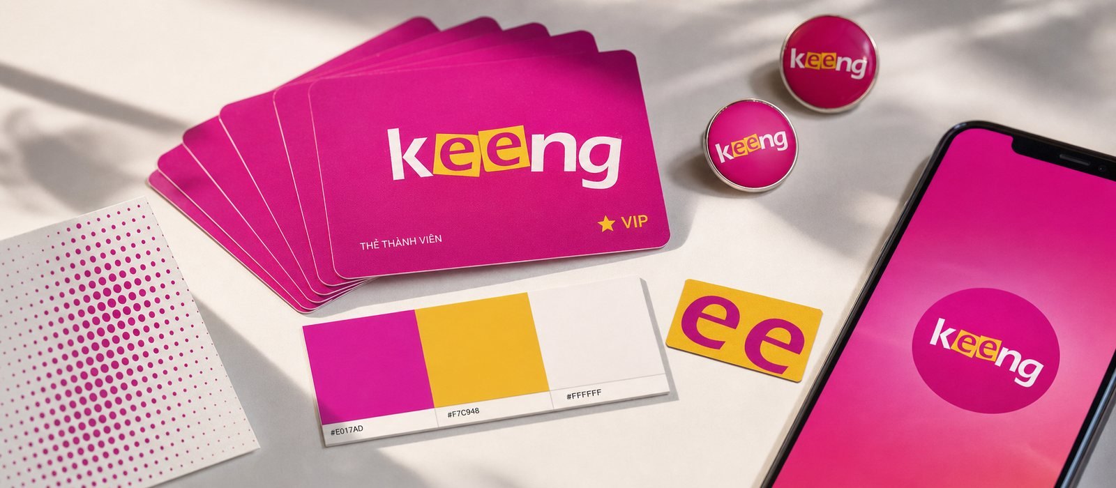
Sinh Vũ tilted the two ee letters in the middle of Keeng off the line, tucking each into a rounded yellow square. The whole name seems to vibrate, exactly the sound it is named after. Breaking the alignment was not for novelty, but to make the name sound out on the page itself.
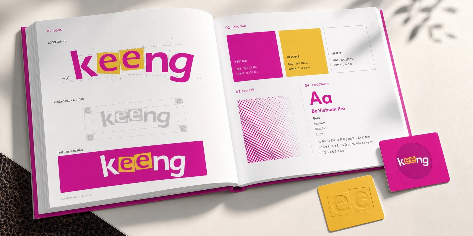
The colour chosen is a vivid magenta on white, with a lemon-yellow accent in the two ee tiles: young and playful, true to the spirit of a place for music, bright enough to stand out among the familiar logos of the field. From that name grew a working system, a wordmark, a round badge, a halftone dot pattern, so Keeng is recognised wherever it appears without repeating the full logo.
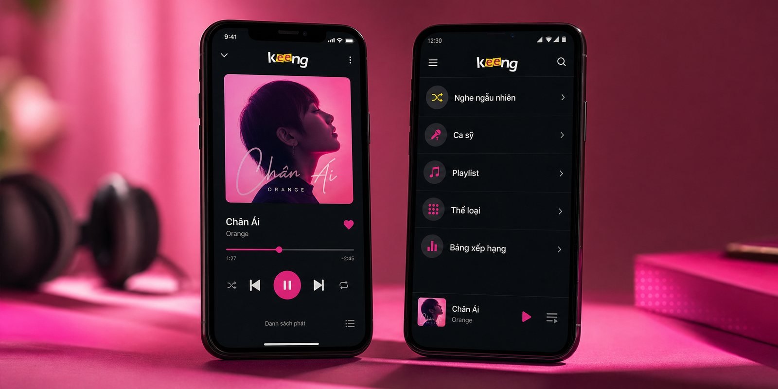
In a market full of listening apps, Sinh Vũ chose the opposite of clutter: a minimal interface that puts play and the song first and pushes everything superfluous behind. Young people open Keeng and are listening at once, with nothing to hunt for. A dark interface lets cover art and brand colour glow like stage light.
One interface, two platforms: iOS and Android in the same rhythm, so switching phones still feels like the same Keeng. The whole system was built in Sketch, its parts kept as a reusable library, so the engineering team could take it over quickly and later units could extend it without drifting out of shape. Design here does not stop at a handsome screen, it is the frame that lets a product grow in order.
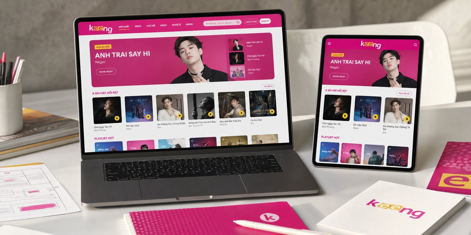
Not everyone listens on a phone. Sinh Vũ built the Keeng website as a wider stage: artists and songs laid out with room to breathe, clear paths, a favourite song or a new playlist always a few clicks away. Sharing one identity with the app, the site and the app reflect each other like two faces of the same listening place.
The web interface scales gracefully from a large screen down to a tablet, keeping its clarity at any size. For a service that lives on daily plays, an easy website is not decoration, it is the door through which newcomers step in and stay.
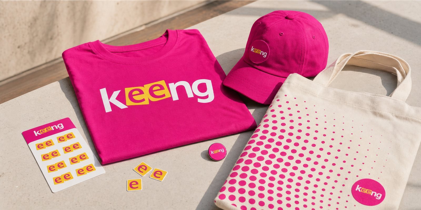
A place for music lives by being talked about. Sinh Vũ carried Keeng off the screen with a promotional system: t-shirts, caps, tote bags, membership cards, stickers, each in the signature magenta and dot pattern, so that young people wearing them carry Keeng everywhere.
What set the system apart was its consistency: whether a gift box, a card or a shirt, all still speak in one Keeng voice, so every small object adds to one coherent whole. The name no longer sits still inside the app, it goes onto the street, into the classroom, onto the stage, ringing further with every glimpse.
The result
What Keeng gained was not a cheerful logo, but a name that sounds itself out and a system open enough to grow. Young people meet Keeng on the app, on the web, on a friend's shirt, and it is still one Keeng, one voice, one unmistakable magenta.
Even then, the Viettel team could see this system had the reach to become a music social network. That came true: Keeng today is where Vietnamese people listen to music and gather around it. A foundation built solidly from the start, so the name would not only ring out, but ring on through the years.
One unmistakable magenta across every touchpoint
Keeng in young people's lives

In their own words
Sinh Vũ delivered a cohesive design, fast and impressive. The promotional system stood apart, with the reach to grow into a music social network.
Built on Sketch, the design was easy to hand over, supported our units well and lightened the load on the engineering team.
Is your problem similar to Keeng?
Tell Sinh Vũ about the digital product you are building and what is keeping it from standing out. Sinh Vũ will point you to the right direction right away.