
IT LEARN, an identity for the craft of looking closely
IT LEARN teaches career changers their way into software testing, the craft of people willing to look closely. Sinh Vũ built the identity and a bespectacled mascot to give that scrutinizing eye a friendly, trustworthy face.
The problem
Software testing is a backstage craft. Users only see an app run smoothly; no one sees the person who sat and scrutinized every button, tried every way to break it so it would not break in the customer's hands. It is meticulous, quiet work, and to outsiders it can feel dry and hard to picture. IT LEARN chose exactly that difficult craft to teach, and to teach it even to career changers who have never written a line of code.
The brand challenge therefore pulled in two directions. A vocational academy needs to feel trustworthy: real mentors, a clear path, a proper international certificate. But most learners are young people changing careers, anxious, needing this place to feel close and within reach. A face too technical and newcomers hesitate to step in; too casual and the craft loses its credibility. IT LEARN needed a standing that was both rigorous in expertise and warm in spirit, so its invitation to explore the tech world would sound both credible and welcoming.
The approach
We began with the name and the promise. IT LEARN is short, easy to read even for those not fluent in English, and already carries the spirit of the trade. Beside it sits the line Explore IT World, less a slogan than an invitation, fitting for someone standing at the threshold of a career change. The brand voice follows in two registers: confident when speaking about expertise, encouraging when speaking to newcomers.
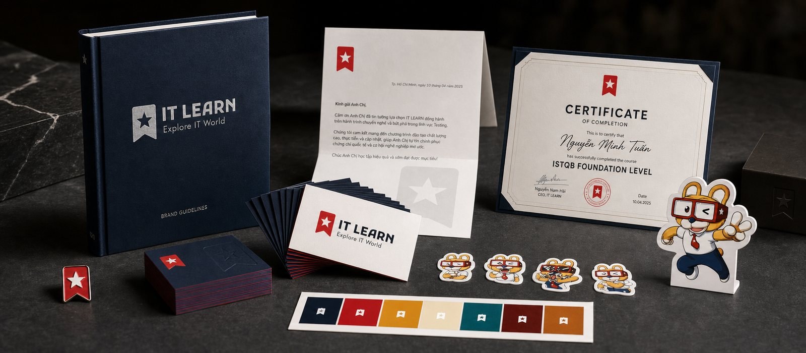
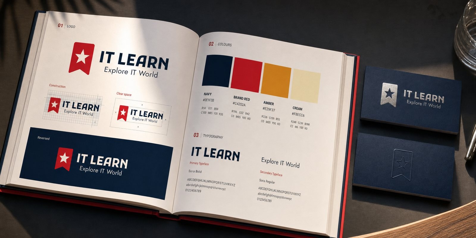
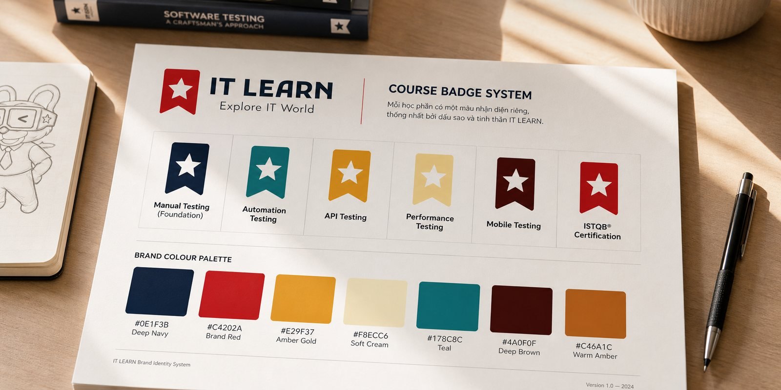
The mark that makes IT LEARN recognizable is a red star on a ribbon, like a stamp of quality pressed onto every course and every certificate. Testing is, after all, the craft of seeking out what falls short in order to keep what holds, so a quality star is exactly the right symbol. Alongside the core set, we drew a hand-lettered 1st infinity mark, its strokes curling into an endless loop, evoking the never-ending learning of anyone working in technology.
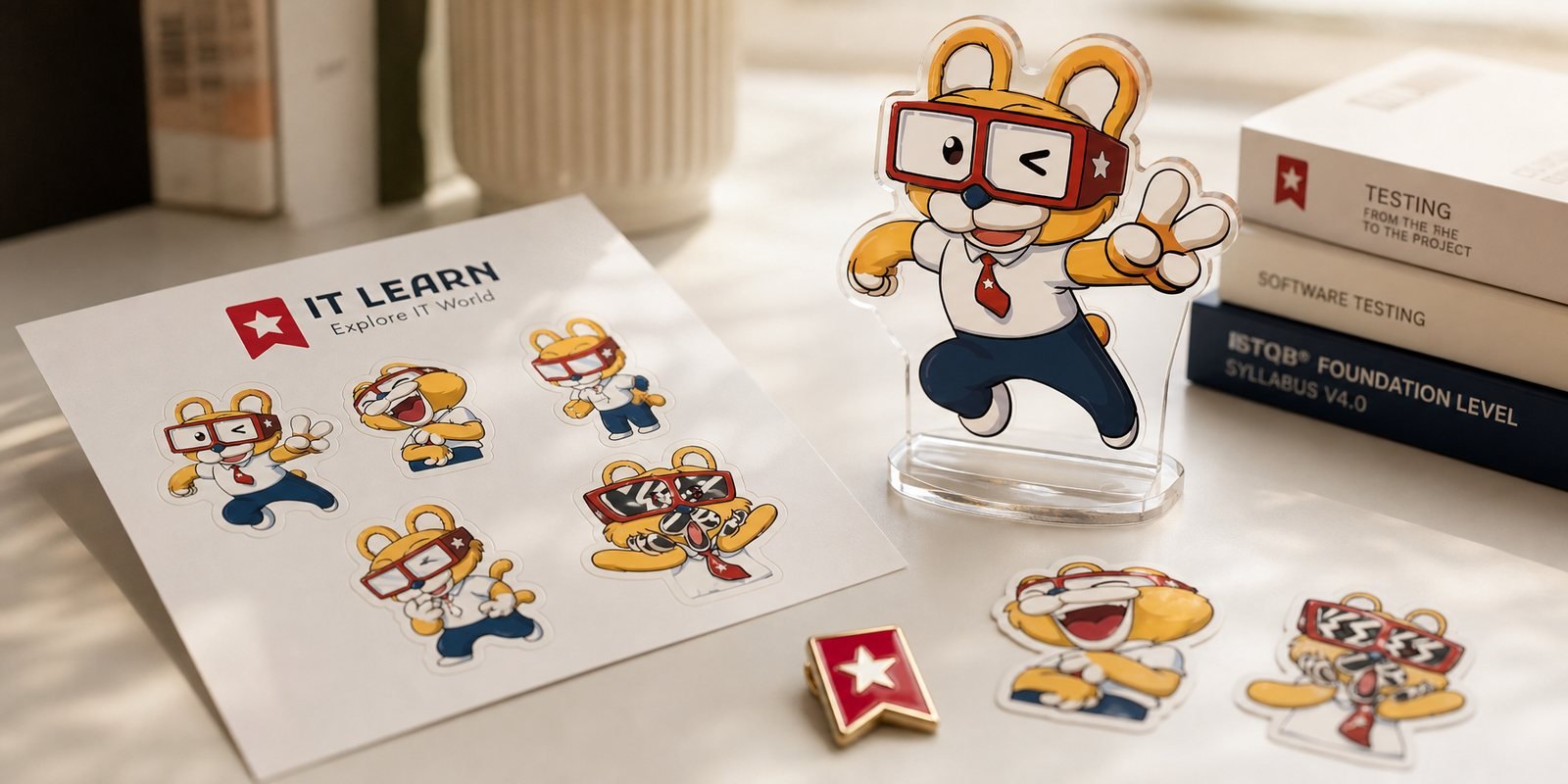
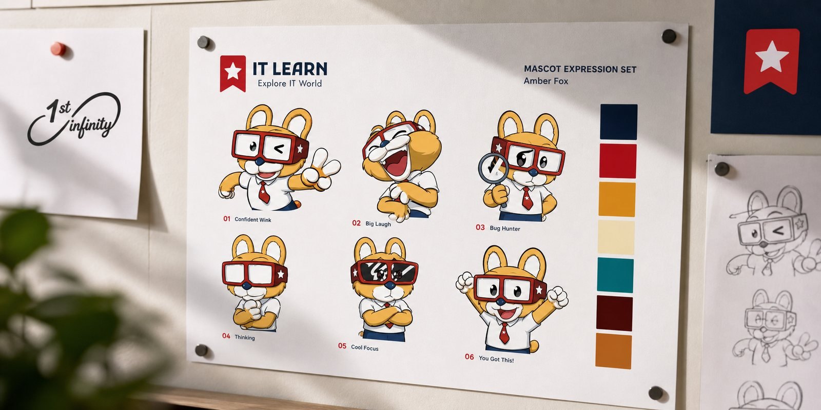
Testing is abstract, so we gave it a face. The IT LEARN mascot is a small, nimble creature wearing a pair of bold red-framed glasses, exactly the gaze of a tester: attentive, curious, scrutinizing down to the smallest detail. The brand star sits on the frame of the glasses, so quality shows up whenever the character does. A white shirt and a red tie give it the bearing of a young professional just starting out, serious without being stiff.
We did not stop at a static figure but built a whole set of expressions: a confident wink, a burst of laughter, the tension of hunting a bug, the elation of finding one. Those are the real emotional beats of learning the craft and practicing it. That expression set turns the brand from a logo into a character that walks alongside you, appearing in lessons, on social media and within the learner community like a classmate.
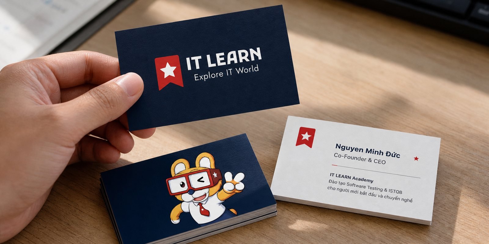
An academy lives through real people, so the brand has to be polished wherever it meets a hand. We designed a double-sided business card for the founding team: a navy face carrying the name and the star, a light face with room for details and a QR code back to the academy. That small card is the first handshake when a mentor meets a learner or a partner, speaking on their behalf that behind the classroom are people serious about their craft.
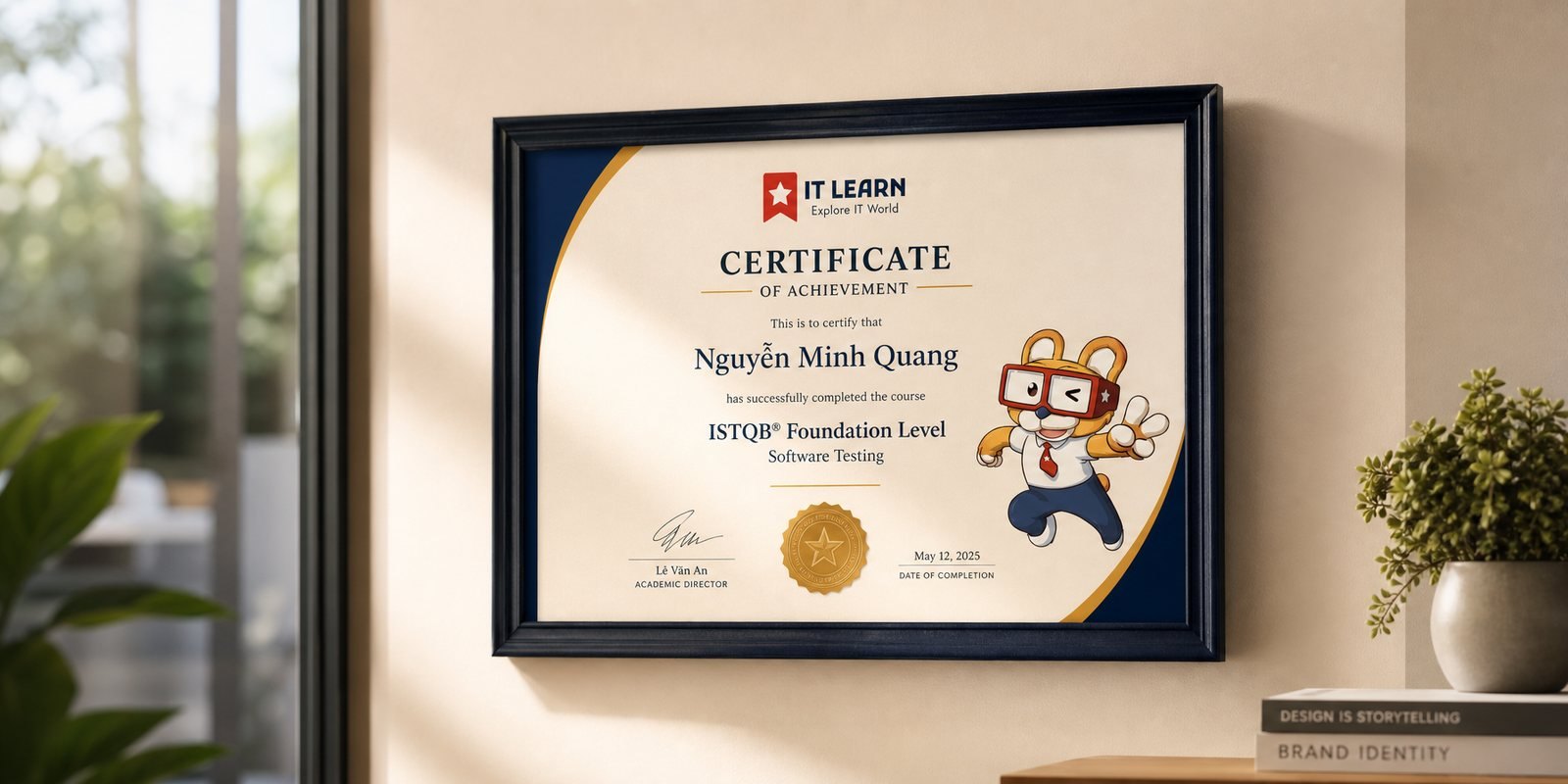
The most important touchpoint of an academy is the certificate. We designed a Certificate of Achievement carrying the full identity, so the moment a learner holds it up at graduation feels both formal and proud. For someone who has just changed careers successfully, that sheet of paper does not only confirm a skill; it is the visible proof of a journey seen all the way through.
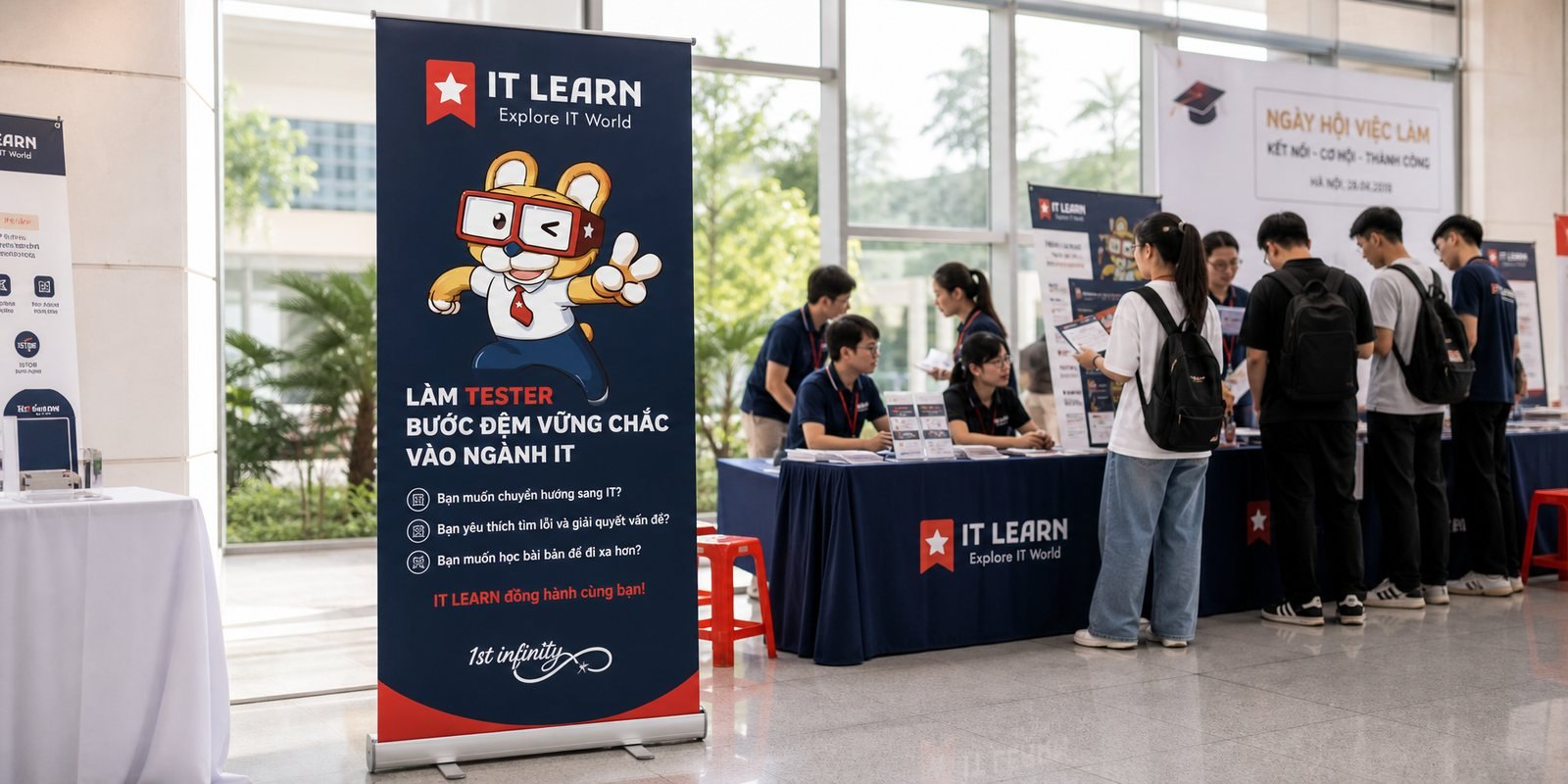
A training brand has to step off the screen to meet its learners. We built a standee for IT LEARN to bring to the Thang Long University Job Fair 2023, where soon-to-graduate students were looking for a direction. On the standee, the mascot stands out to welcome them, with a few questions that scratch exactly where a newcomer itches: what is a tester, what does the path look like, can it pay well.
Bringing the character and the identity into a crowded space is the real test of a brand. There, among dozens of booths, IT LEARN is recognizable without shouting, thanks to its red, its star and its familiar mascot. A good brand is one that can introduce itself, even when its founder is not standing right there.
The result
What IT LEARN gained was not a logo, but a character and a system of signals that tell the true spirit of the craft: rigorous in expertise, warm in how it reaches learners. From the quality star, the bespectacled mascot, the business card and the certificate to the fair standee, everything speaks in one voice, so a craft that once felt dry now has a face and is easy to approach.
For an academy that has already taught hundreds of learners and is still growing, that clear identity is what keeps trust from thinning as it adds courses, mentors and touchpoints. The eye for looking closely that IT LEARN trains in its students is now also the eye the brand turns on itself: solid in the craft, and always friendly to whoever has just knocked at the door.
Recognizing IT LEARN in every detail
Mascot expression set
A color system by course
Graduation certificate
Does your challenge look like IT LEARN?
Tell Sinh Vũ what is on your mind about your brand. Sinh Vũ will point you to the right direction right away.