
HPU2 Faculty of English, one face, two voices
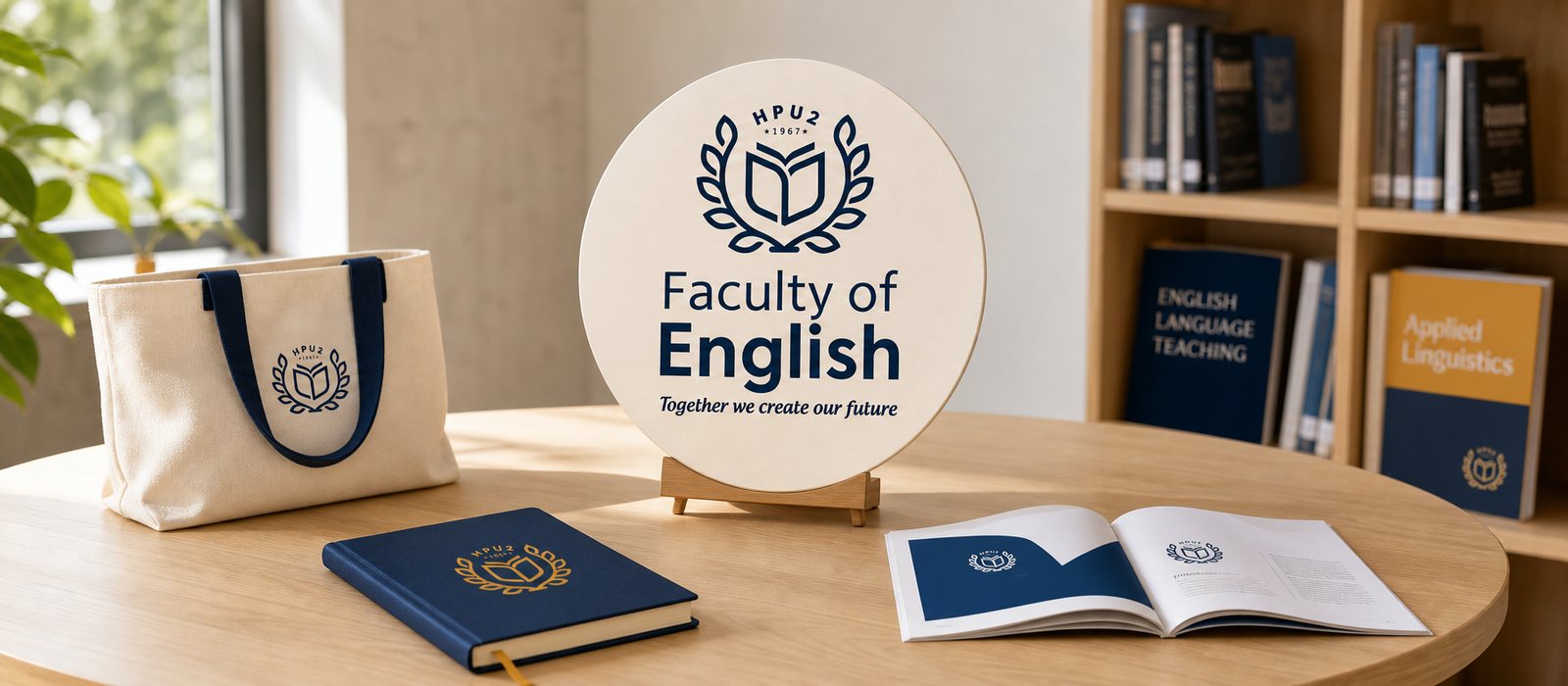
The HPU2 Faculty of English, training English teachers since 1967, now has a visual identity that knows how to shift tone: serious in the lecture hall, youthful on the admissions page.
The problem
A faculty inside a large university usually has no face of its own. It borrows the university's shared seal, and to outsiders, one faculty looks much like another. But the Faculty of English lives by attracting learners: young people choosing where to become English teachers, looking out toward a wider world. It teaches a global language while sitting inside a very disciplined structure. That is where the tension sits: it has to be young, warm and open to an eighteen-year-old, while still carrying the weight of a school founded in 1967.
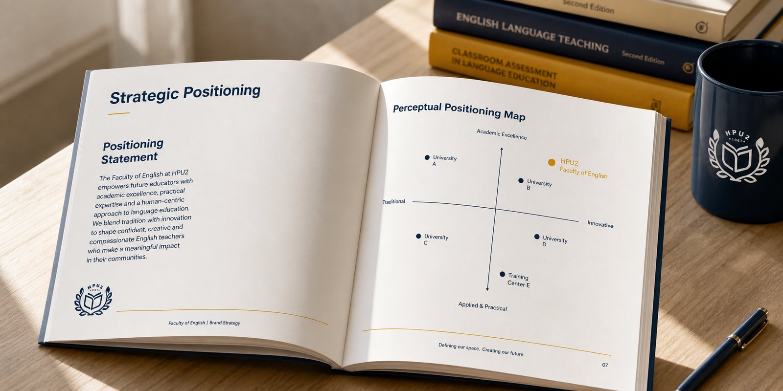
A seal on a diploma is not what makes a student fall in love. The faculty needed a mark that works as well on an admissions flyer as it does on a textbook cover, a color palette lively enough without turning shallow, a voice that speaks of building a future together without losing academic credibility. The problem was to give an academic unit a face young enough for people to choose, and solid enough for people to trust.
How we worked
Before drawing anything, we sat down with the faculty's team to name who the faculty speaks to and in what voice. The answer was not to look more like a university, but to sound like a place that believes in its own students. We put four words on the table: youthful, friendly, passionate, professional. The real work was in the order and the balance: young and close came first, because an eighteen-year-old chooses with the heart; professional sat underneath as the foundation, because a faculty that trains teachers stakes its entire credibility on it.
To find that balance, we tested three color directions, not one. An orange and jade direction, warm like a language club; a bold deep pink direction, like a startup project; and a navy paired with gold direction, of a school with a future. Placed side by side, the choice revealed itself: navy for academic depth and credibility, gold for the warmth and optimism a young person wants to walk toward. The two directions we set aside were not wasted, they marked the line the brand should not cross.
The logo returns to the oldest image of learning: an open book, held within a laurel wreath, under the line HPU2 · 1967. But the book here does not sit still, its pages lift as if something is taking flight, echoing the faculty's own promise, building a future together. The laurel wreath holds the formal, academic part; the open book holds the forward-looking part. The mark carries both depth and horizon.
We built it to live in two colors. Gold for moments that need warmth and invitation: welcome banners for new students, events, admissions flyers. Navy for moments that need gravity and steadiness: diplomas, academic papers, official correspondence. Still one logo, still the words Faculty of English, only the temperature changes for the same face. The faculty can be warm without being casual, formal without being cold.
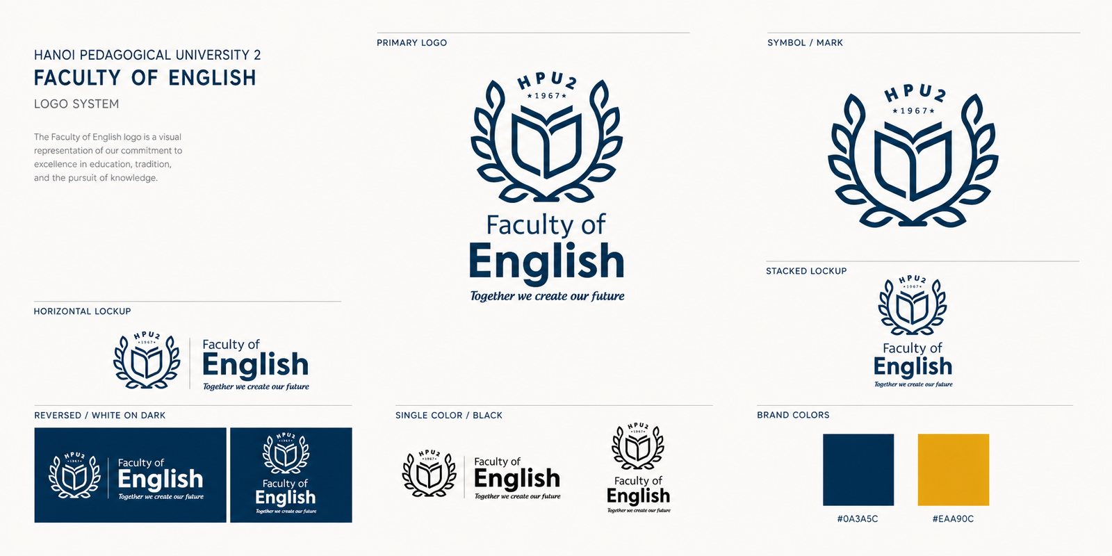
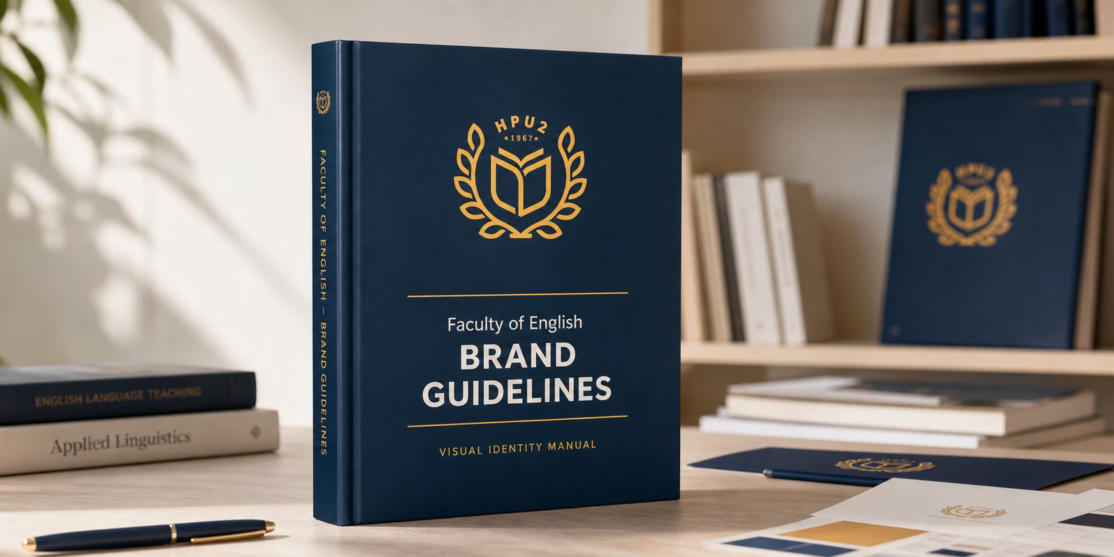
The faculty reaches the world through many hands: a student club building an event poster at midnight, an office printing letterhead, a lecturer making a lesson slide. Left alone, each of these would bend the logo a little, and the face would slowly blur. We wrote a guideline to keep the mark standing still: how it sits on a grid, the minimum clear space, which color goes on a light background and which on a dark one, which uses are allowed and which are crossed out.
A guideline is how a brand protects itself when the designer is not in the room. Because of it, a poster made by a second-year student and a certificate printed by the office still read as the same faculty. For an academic unit whose entire asset is its credibility, that consistency is not decoration, it is how the faculty keeps its word every time the name appears.
The brand of a teaching faculty proves itself in the very material of teaching. We carried the identity onto the cover of the textbook Media Literacy and Technology in English Language Teaching, where the logo sits with the dignity a published work deserves, and onto lecture slide templates, so every slide a lecturer opens already carries the faculty's face. The identity stops being just a logo on a wall, it becomes a surface students read and learn from.
It also steps into the space where the faculty teaches and inspires. On the lectern, on the lecture hall wall, the laurel logo is present as a quiet reminder of tradition and ambition, turning the faculty's spirit into something students feel before they even hear the lecture. Between the textbook and the lecture hall, the same face speaks in two voices: one to teach, one to call.

The result
What the faculty gained was not a logo, but a face that knows how to turn to a new page. On a diploma, a textbook, an admissions flyer or a lecture slide, it is all still one Faculty of English: young enough for students to choose, steady enough for families to trust. An academic unit that once borrowed a shared seal now speaks in its own voice, before anyone in the faculty has said a word.
For a faculty that lives by attracting the right learners and keeping their trust, a face that reads as both lively and trustworthy is an advantage at every open day, every admissions season, every hallway. It turns a serious school into a place a young person wants to build a future in. The faculty invites students to build a future together, and our part was to give that invitation a face worth walking toward.
The identity, out in real life
Academic publications

Faculty signage

Does your problem look like HPU2 Faculty of English?
Tell Sinh Vũ what is on your mind about your brand. Sinh Vũ will point you to the right direction right away.