FreshRice, keep the fresh taste
FreshRice sells packaged rice on exactly one promise: good rice is rice that stays fresh. Sinh Vũ built the identity and packaging so that promise shows clearly right on the shelf.
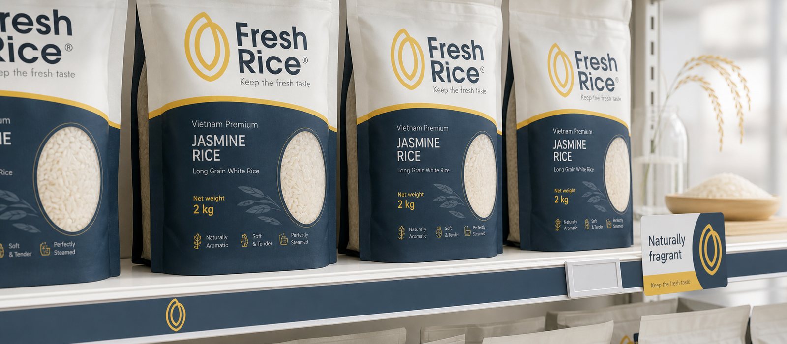
A shelf in uniform
Rice is one of the hardest goods to brand. Standing at the shelf, buyers see dozens of nearly identical bags: clear plastic, red lettering, a rice stalk, a golden field. When everything looks the same, there is nothing left to choose by trust, so people choose by price, and the whole category pushes itself down toward the bottom of its own value.
FreshRice had a real advantage: good rice and a genuine promise to keep it fresh. But that promise had no shape yet. On the shelf it was as invisible as every other bag of rice, and buyers cannot taste before they pay. Our job was to make it visible and believable from the first glance.
Holding on to one word
We did not start from what looked good, we started from one word: fresh. It was something FreshRice genuinely had, and something few competitors dared to claim because it is hard to prove. A narrow claim that is true is always stronger than a broad claim that is vague, because buyers only remember one thing about a brand.
That positioning became the ruler for every decision after it. Every choice of shape, color and type had to answer one question: does it make the word fresh show more clearly and more believably. Whatever did not serve that, however good it looked, was set aside.
Letting one grain of rice speak for itself
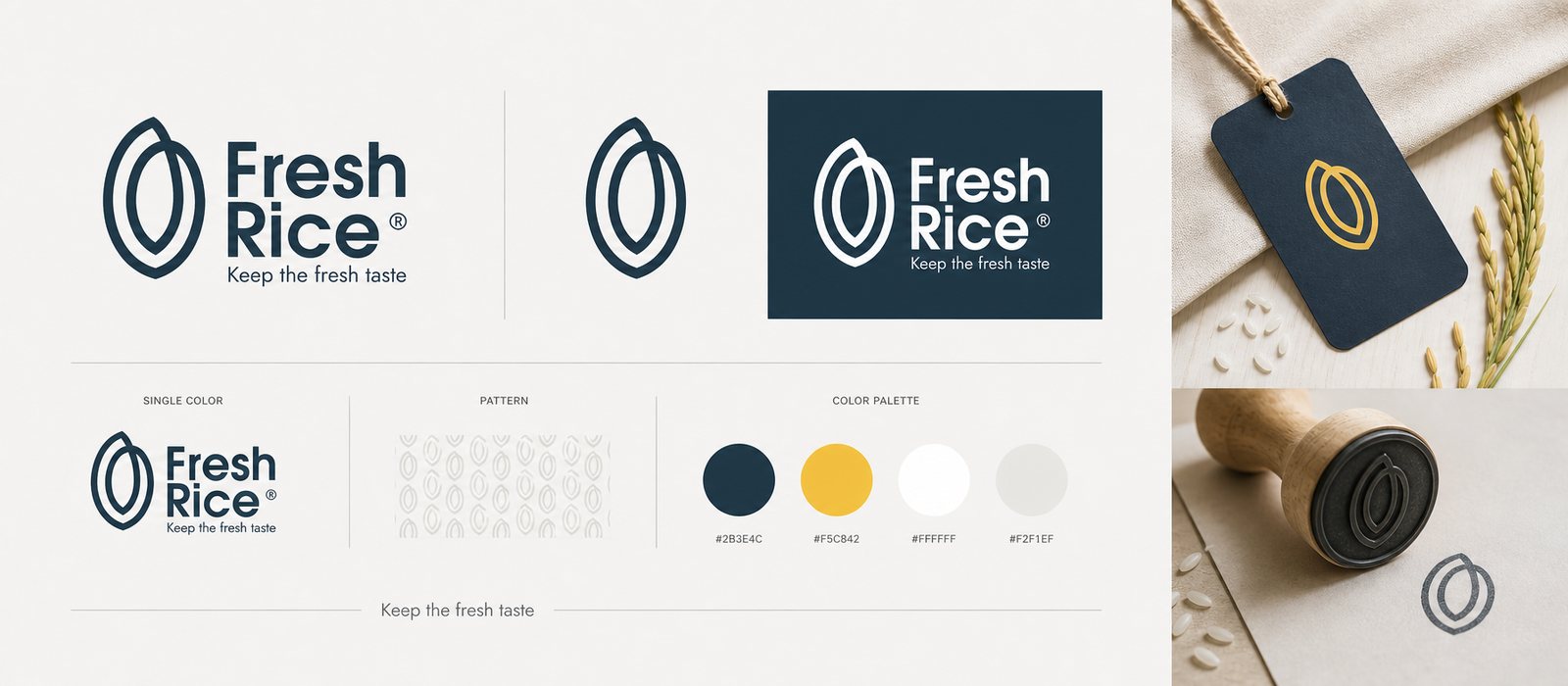
The mark distills down to a single grain of rice, drawn from nested outlines, like a husk wrapped around the grain to hold in its aroma. The shape says the word fresh without a line of explanation needed. This is also where we drew the line between logo and identity system: the logo is only for looking at, the signal is for repeating.
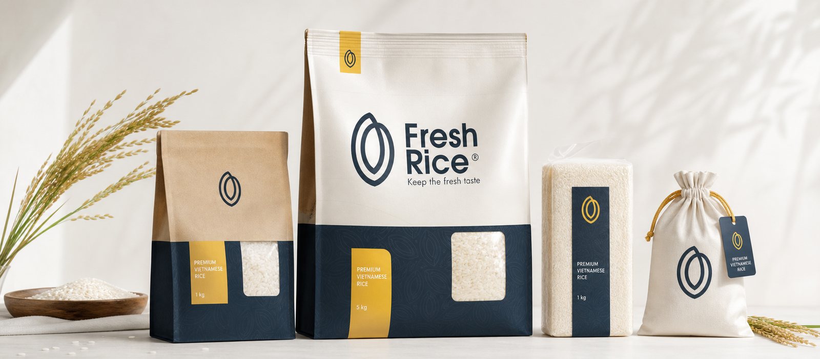
That grain of rice appears, understated, on the seal, the hang tag, the shelf strip, then settles into a background pattern. The rule we held to firmly: the full logo appears only a handful of times, the rest of the work is carried by the shared signal. That is how the system reads as refined without being loud, its separate pieces recognizing each other as one system that the eye catches before it even reads the name.
The language of an honest brand
Color is what takes FreshRice out of the crowd. We chose a deep navy ground for a sense of trust and quality, avoiding the red that already covers the rice shelf, then added a harvest yellow to point back to its agricultural roots and keep some warmth. Every bag opens a small window onto the real grains inside, because with food, being seen is already half of being believed. The material leans toward raw kraft paper, so that quality still feels close, not cold.
The brand voice follows the same path: say little, and say it true. The line "Keep the fresh taste" alongside a few short lines of description stand in for the loud adjectives other brands reach for. An honest rice brand does not need to shout to be believed, and that composure is itself the difference on a shelf where everything else is competing to speak louder.
Working together, handing over an open system
We locked the positioning first, then built the visual form, and tested the system across real formats: one-kilogram bags, two-kilogram, five-kilogram, gift bags, gift boxes. Every change in size was a test of whether the signal still held, because an identity system only stands firm when it can live at both its largest and its smallest scale.
What we handed over at the end was not a handful of pretty images to look at, but an open system built to last: an identity kit, a brand voice and a packaging system with clear principles, so FreshRice can extend itself to new rice lines without redrawing from zero.
Value
What FreshRice gained was not a good-looking bag, it was a place to stand. In the middle of a shelf in uniform, there is now a name buyers recognize and trust before they even open it to cook. Every time a new rice line launches, FreshRice does not have to start over, it only has to carry that familiar signal one step further. That is the difference between a single design job and a brand asset that keeps paying off for years.
Where everything gets tested for real
An identity system is only worth trusting once it can live where it has to stand: on a crowded shelf, where buyers decide in a few seconds.