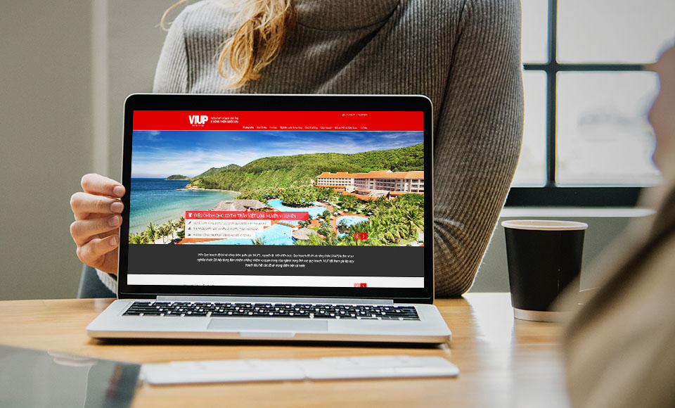
VIUP: the homepage of a planning institute
VIUP is the short name of the National Institute of Urban and Rural Planning. Sinh Vũ designed the homepage interface of the Institute's website, shown on laptops.
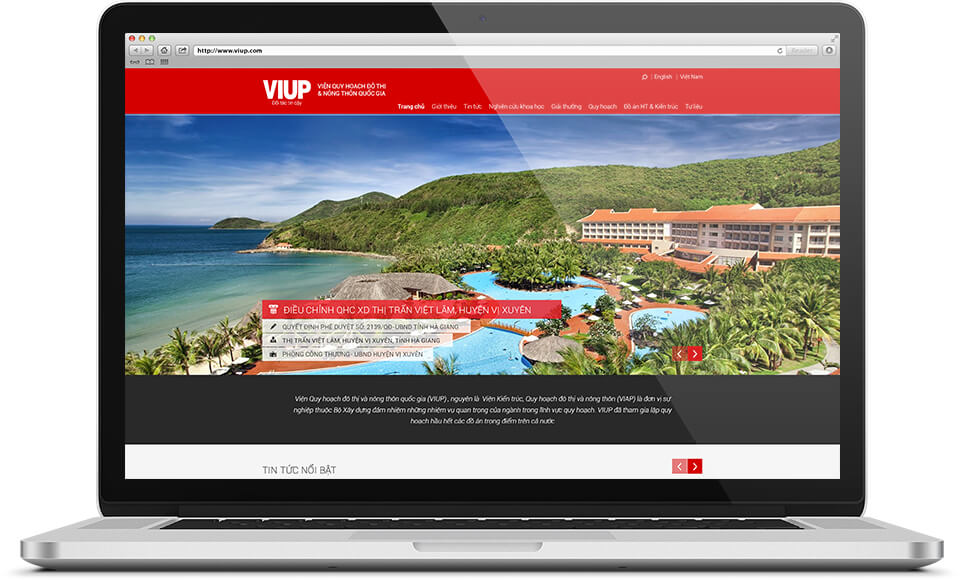
The top of the page: the Institute's name and eight main sections
The homepage opens with a red band running across the page. On the left is the large white word VIUP, beside it the Institute's full name. Just under VIUP is a small line reading "Trusted partner". In the right corner are a magnifying-glass icon for search and the words English and Việt Nam for choosing a language.
Below the Institute's name is a bar of white text with eight sections: Home, About, News, Scientific research, Awards, Planning, Infrastructure and architecture projects, Archives. A visitor needs to read only one row to know which areas of work the Institute covers.
A large picture with a block of text over it
In the middle of the page is a landscape picture spread across the full width: a coastline, green hills and a resort with a swimming pool. In the lower-left corner, a red block of text sits over the picture. It gives the name of a planning project (a design plan for how a piece of land will be laid out): the adjustment of the general construction plan for Viet Lam town, Vi Xuyen district.
Under the project name are three small lines, each with its own icon: the approval decision number, the location and the agency involved. In the right corner of the picture are two red arrow buttons for moving to another picture.
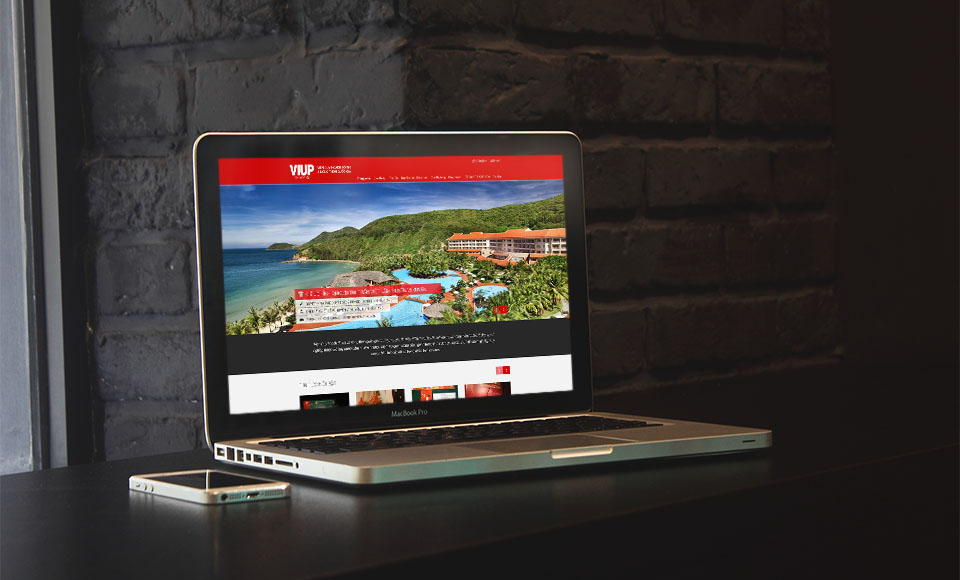
The introduction band and the featured news area
Below the large picture is a dark grey band with white italic text, holding a short introduction to the Institute. Next comes the "Featured news" area on a white background. The small pictures for each story sit in one horizontal row, with two arrow buttons in the right corner like those on the large picture.
From top to bottom, the page divides into four layers. The red band holds the Institute's name and the menu. The large picture presents one project. The dark grey band holds the introduction, and the white ground holds the latest news. Each layer does one job, so readers never have to hunt for information.
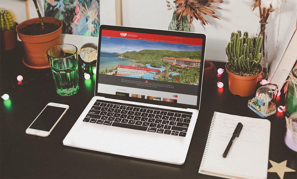
One homepage, set in three scenes
Sinh Vũ presents this homepage with mockup images (pictures that place a design on real devices): a laptop in front of a dark brick wall, in the middle of a work desk, or in a person's hands.
This homepage uses one main colour, red, one large picture and one row of menu sections. For a research institute, a layout with few parts lets the Institute's name and its planning projects get noticed first.