
Viettin: a logo that puts trust first
Việt Tín is an agricultural start-up that wants to export Vietnamese honey, produce it at industrial scale and make further products from honey. The team asked Sinh Vũ for a logo that says what they put above everything else: keeping people's trust.
A new team that puts trust first
Việt Tín is a start-up in agriculture. The team wants Vietnamese honey to be exported, produced at industrial scale, and developed into further honey-based products.
Honey is something people buy only if they trust the seller. So the team set a clear brief for the logo: show that reputation is the first principle, use green, and use a centred layout, meaning the parts of the logo all gather around one middle point.
Six points aimed at the middle
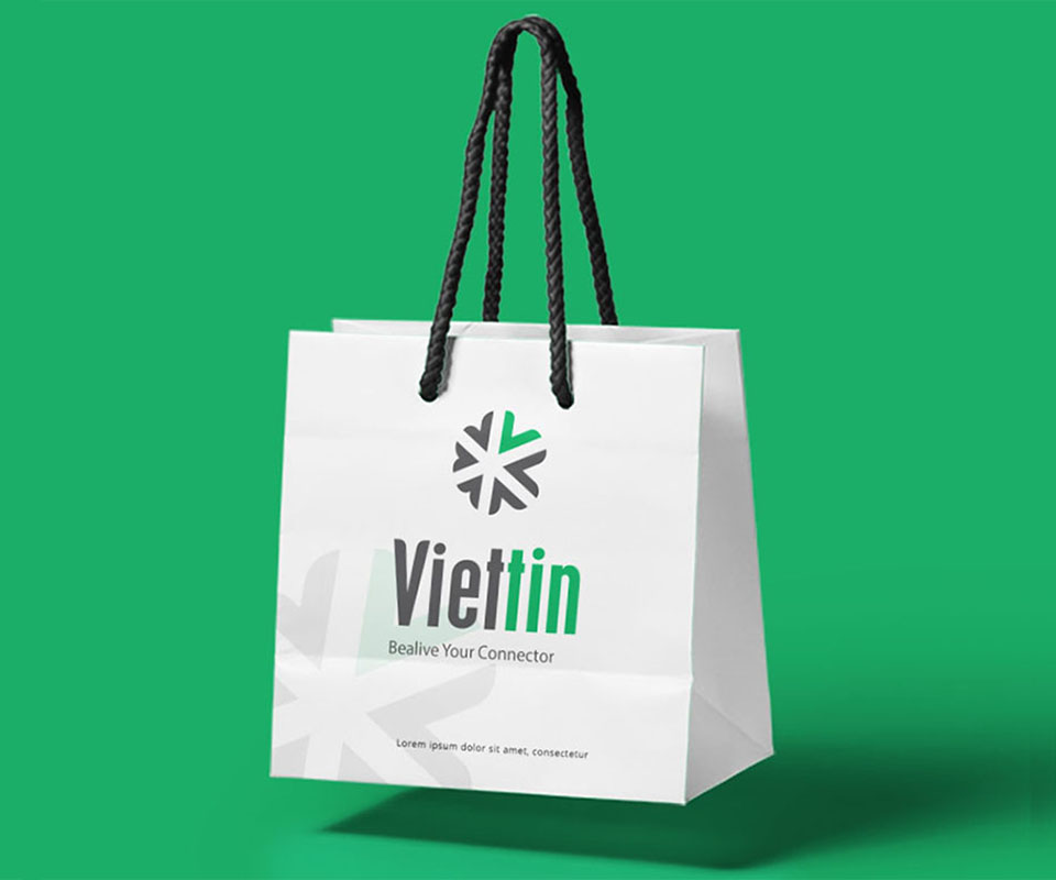
The Viettin symbol is made of six points arranged in a circle, each one aimed at the centre. According to the Việt Tín team, the six points are the team's six missions. Six points facing one place match the brief for a centred layout.
One point is leaf green and the other five are dark grey. The drawing uses only a few simple shapes, so printed small on a business card or large on a paper bag, each point still reads clearly.
Trust sits inside the name
The wordmark reads Viettin. "Viet" is dark grey and "tin" is leaf green, so "tin", meaning trust, comes forward first. The letters are tall, narrow and bold, set close together, and look solid. Under the name sits a small English tagline in a lighter stroke so that it does not overpower the name.
The logo uses just two main colours, leaf green and dark grey. Fewer colours make the logo easier to print, and it stays clear on white, green or dark grounds.
Works on many grounds
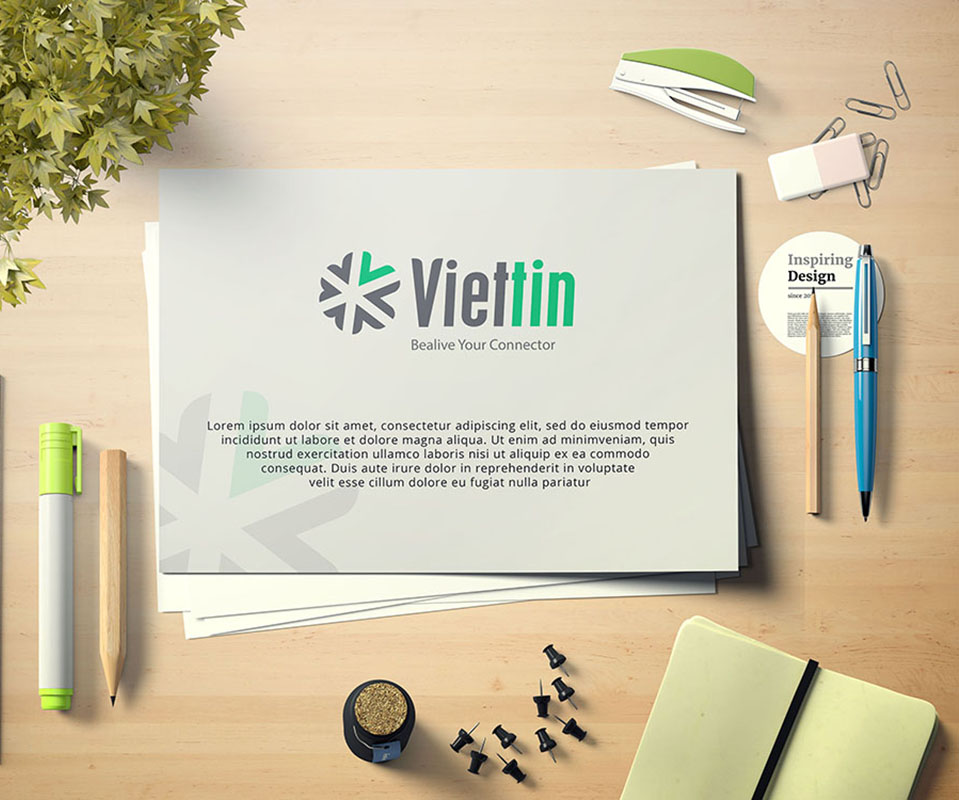
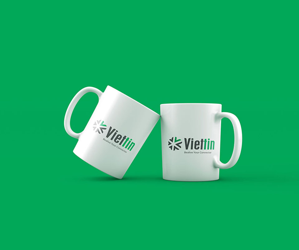
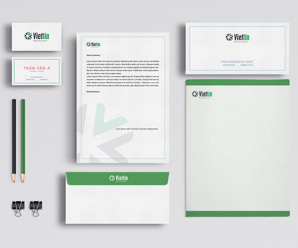
Sinh Vũ built test images of the logo on the things a new team uses most: paper bags, cups, business cards, envelopes, letterhead and file covers. On green, the logo switches to a white version. On dark paper it is gold foil stamped, meaning a heated die presses a layer of gold foil onto the paper so the logo stands out and shines.
Whatever the ground or print method, the six points and the position of the wordmark stay the same. That way the team can print the logo on many different things and people still recognise one brand.
The value
Việt Tín has a logo that matches the brief the team set: green, centred, and with trust made prominent in the name itself.
For a team that has just started, the logo has to work straight away on the first things to be printed, such as business cards, envelopes and paper bags. The Viettin logo has little detail and few colours, so it works on both light and dark grounds.
The logo on each material
In their own words
Thank you, Sinh and Sinh Vũ, for supporting the Việt Tín team. The logo says exactly what we put first, keeping our word, and gives us a firm footing as we prepare to export Vietnamese honey.