Viettel International: a website where the right section is easy to find for international telecoms services
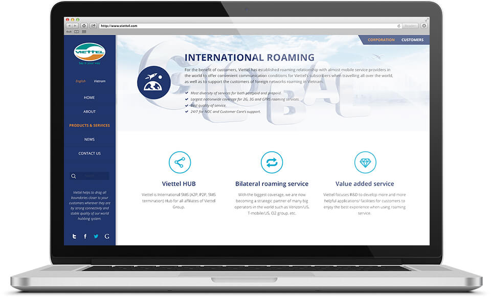
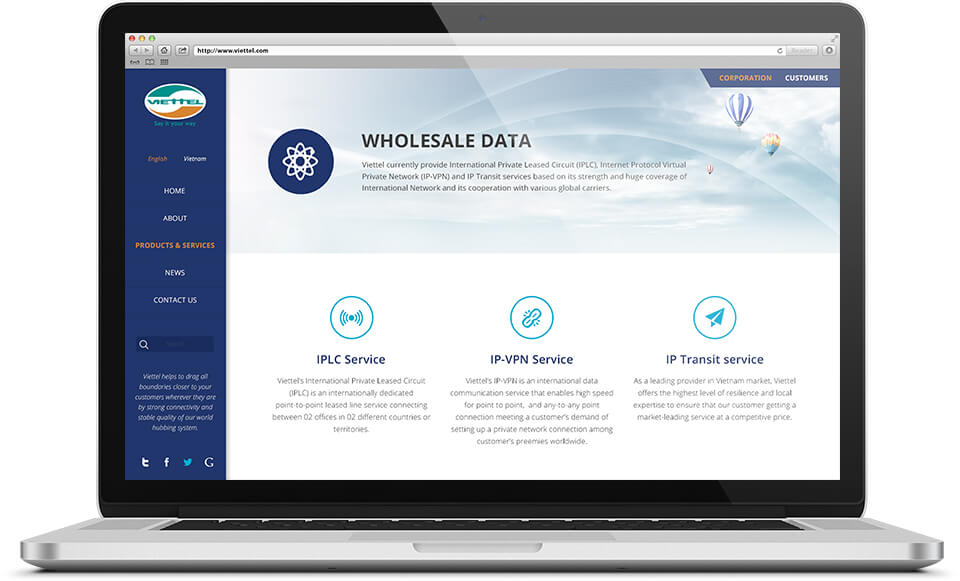
This is the website introducing Viettel's international telecoms services: international calls, international roaming (keeping your own phone number when you travel abroad) and leased international data lines. Sinh Vũ designed the interface around a blue menu column that always stays on the left. The section being viewed is shaded orange, so visitors know which page they are on and can move to another section easily.
Home page and two ways in
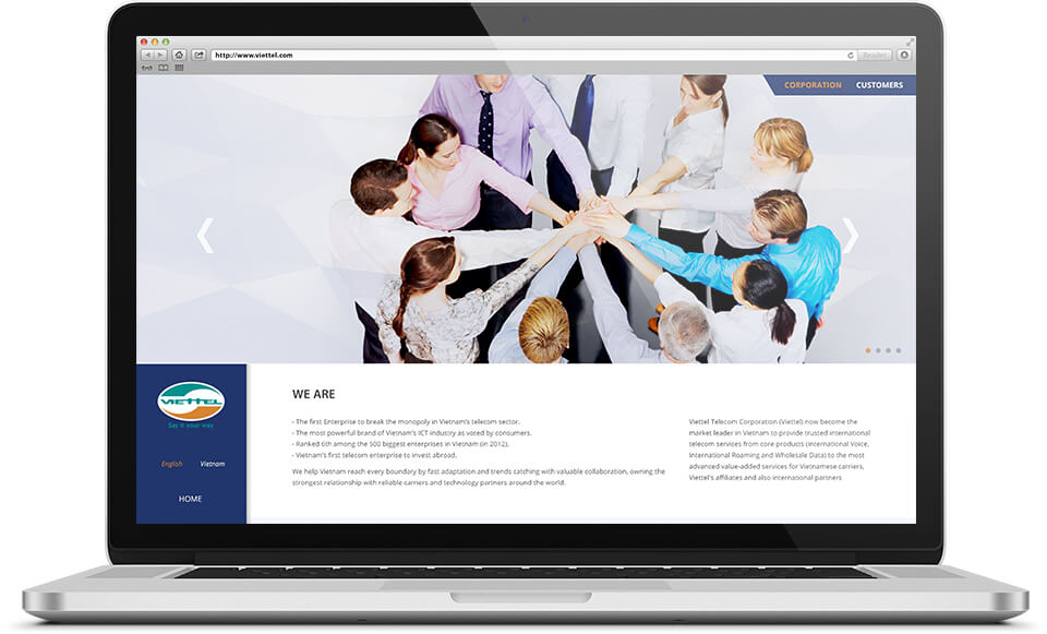
At the top right, the website has two tabs, "Corporation" and "Customers". The Vietnamese version labels them more plainly: businesses and individual customers. Visitors choose their own group right from the top of the page.
The home page opens with a large photo of a group of people putting their hands together, with arrows on both sides to move between pictures. Below it is a "We are" section introducing the group, with the text split into two columns. Visitors see at once that this is the site of a large group, before they read about any single service.
A menu column on the left, three branches on every service page
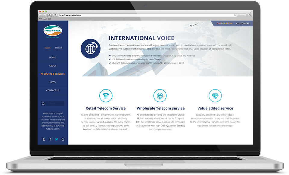
A deep blue menu column sits on the left of every page. At the top is the logo, then a switch between English and Vietnamese, then the sections Home, About, Products and services, News and Contact. The section being viewed is shaded orange. Below are a search box and social media icons.
Every service page shares one layout. The top of the page has the service name, a round icon and a few short lines of introduction. Below are three columns, each about one branch of the service and each with a fine-line icon. The international calls page, the roaming page and the data transmission page are all arranged this way, so reading one page teaches visitors how to read the rest.
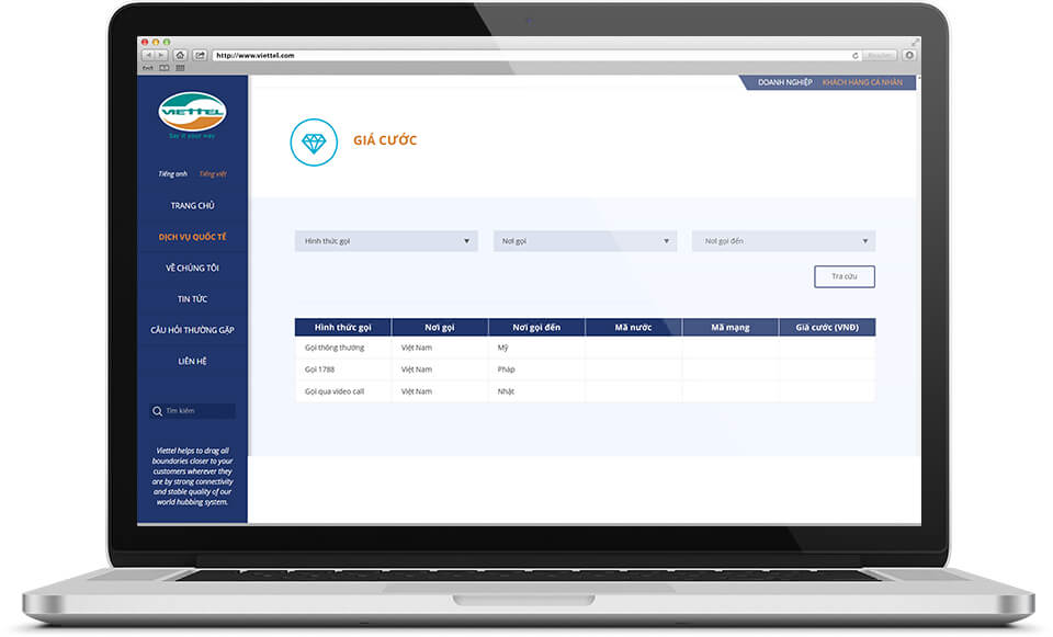
A price lookup table in Vietnamese
The Vietnamese version of the website has a Tariffs page. Users choose three things in three boxes: the type of call, where they are calling from and where they are calling to, then press the Search button.
The result appears as a table of six columns: type of call, calling from, calling to, country code, network code and the price in dong. The header row of the table uses the same deep blue as the menu column, so the lookup page still matches the other pages.
News and the contact page
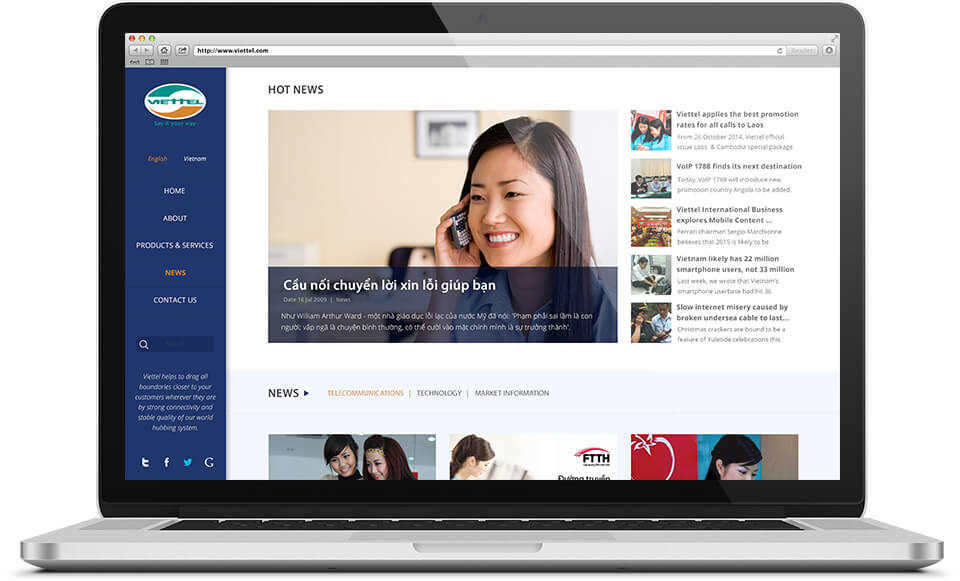
The News page places one large featured story on the left, with a photo of a person on the phone. On the right is a list of recent stories stacked vertically, each with a small picture. Below are filter tabs that sort news by group: telecommunications, technology and market information.
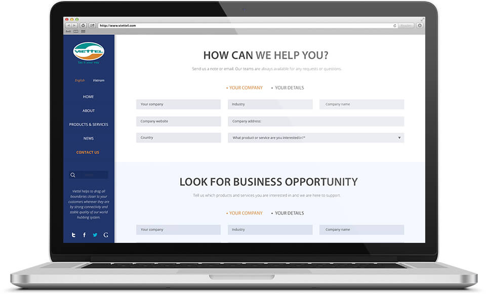
The Contact page opens with the line "How can we help you?". The form is split into two parts: company details and contact person details. The input boxes are arranged in three even columns. Below is a second part for visitors looking for business partnership opportunities.
The value
The website holds many kinds of content: a group introduction, service pages, news, a tariff table and a contact form. Sinh Vũ kept one menu column, one service page layout and one deep blue throughout, so the pages look like they belong to the same home.
Visitors do not have to learn the site again on each page. They find the section they need in the left column, then read in the way they already know.
Pages that share one layout