VietAd: an ad network trusted from the first meeting
VietAd is an online advertising network that places businesses' ads in front of the right readers across many websites. Sinh Vũ designed the logo, website, sales documents and merchandise so VietAd looks professional and trustworthy when pitching to businesses.
Selling something clients cannot hold
Online advertising is an invisible product. Businesses pay but hold nothing in their hands, only figures for views and clicks. They give their budget only to a network that looks professional and transparent.
So VietAd's image had to do the job of a good salesperson: neat, clear, saying at once what VietAd does. Everything a client picks up, from business cards and folders to the website, had to match for them to trust it.
An @ with a mouse pointer
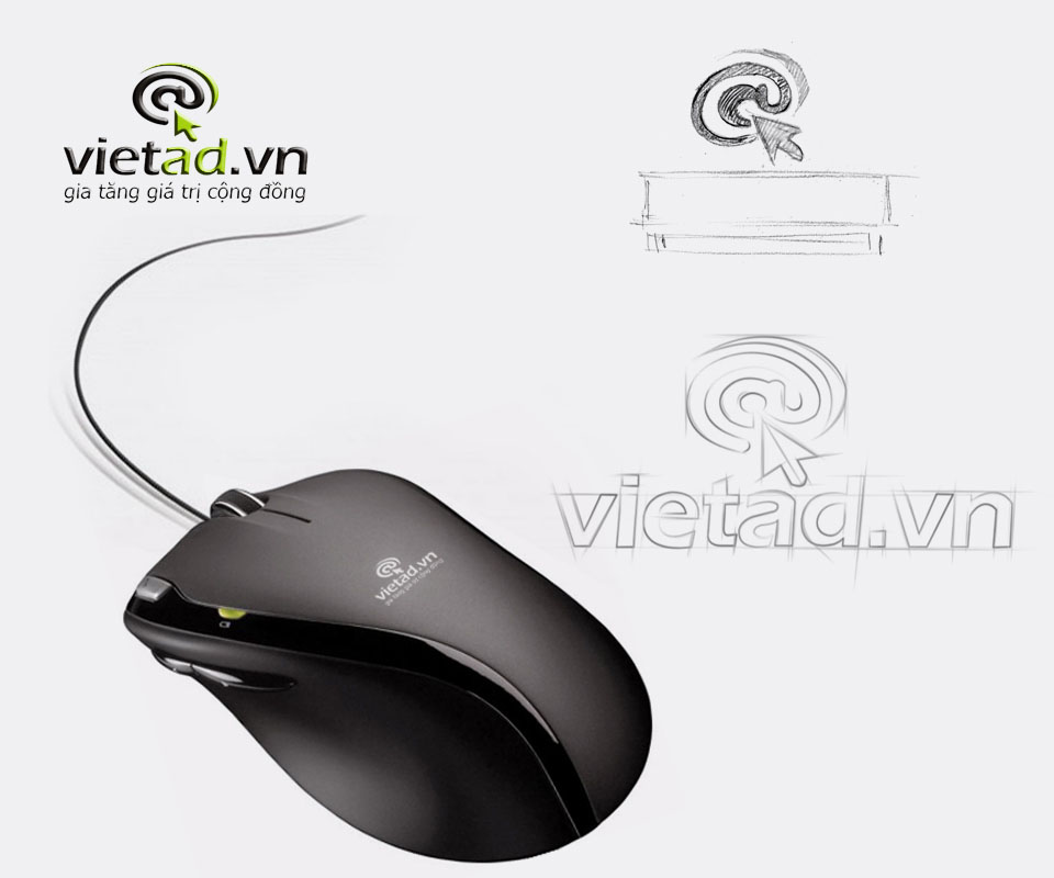
Sinh Vũ sketched from the two most familiar shapes of the Internet: the @ sign and the mouse pointer. The @ spirals like a target and a green arrow points right at its centre. One image carries the meaning: ads that hit the people who need to see them.
The lowercase vietad.vn wordmark colours ad in green to stress what VietAd does. The line gia tăng giá trị cộng đồng, adding value to the community, sits beneath. The palette is just fresh green, black and white, clean and easy on any ground.
A pitch kit
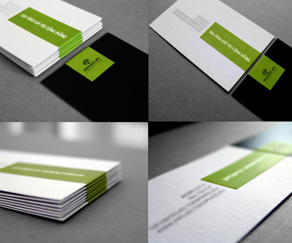
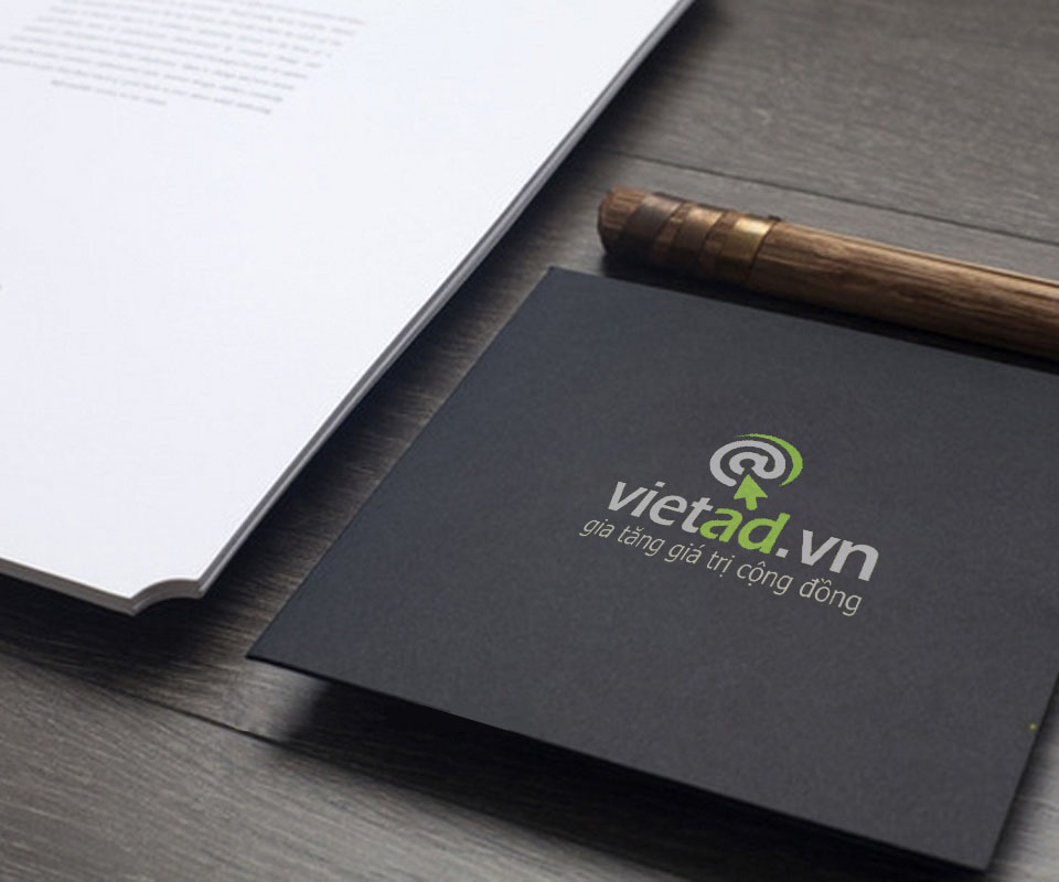
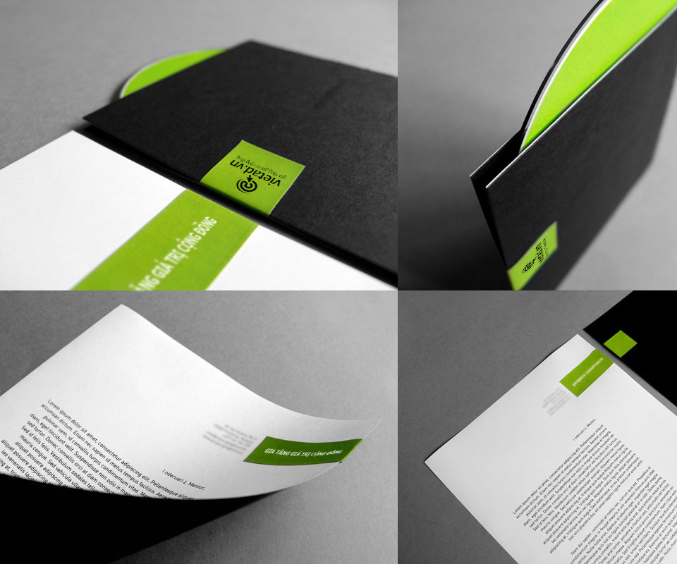
The stationery is black and white with a diagonal green band as the accent. Business cards, letterhead, envelopes and folders all carry that band in the same corner, so laid side by side they form a set.
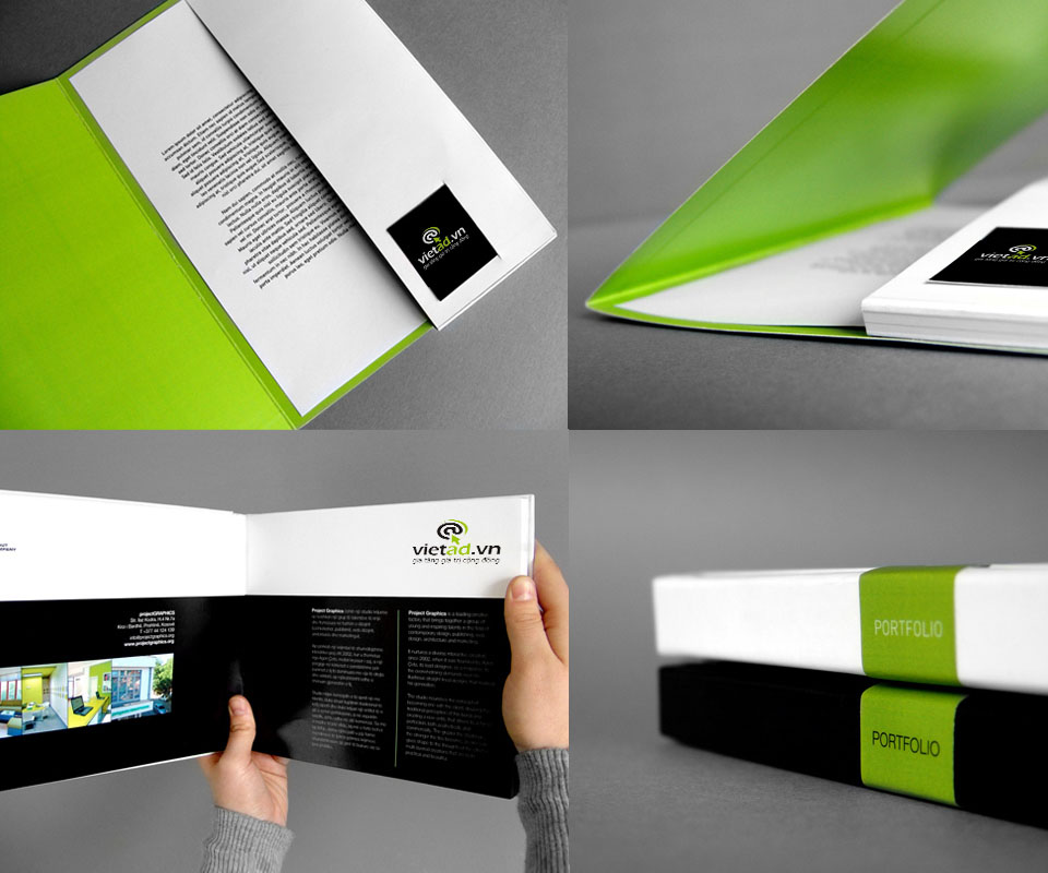
The folder opens to a green interior, and the capability brochure, the document that shows what the company can do, uses black pages, large images and white text. When VietAd staff put the kit on a client's desk, every piece speaks in the same voice.
Website and merchandise
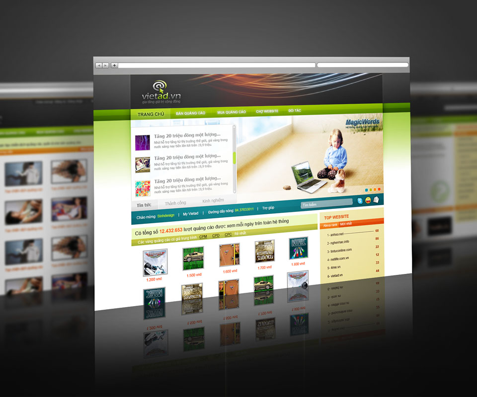
The VietAd website uses a light ground and a green menu bar, setting out each ad package and display example clearly. Businesses visiting understand where and how their ads will appear before they call to ask about prices.
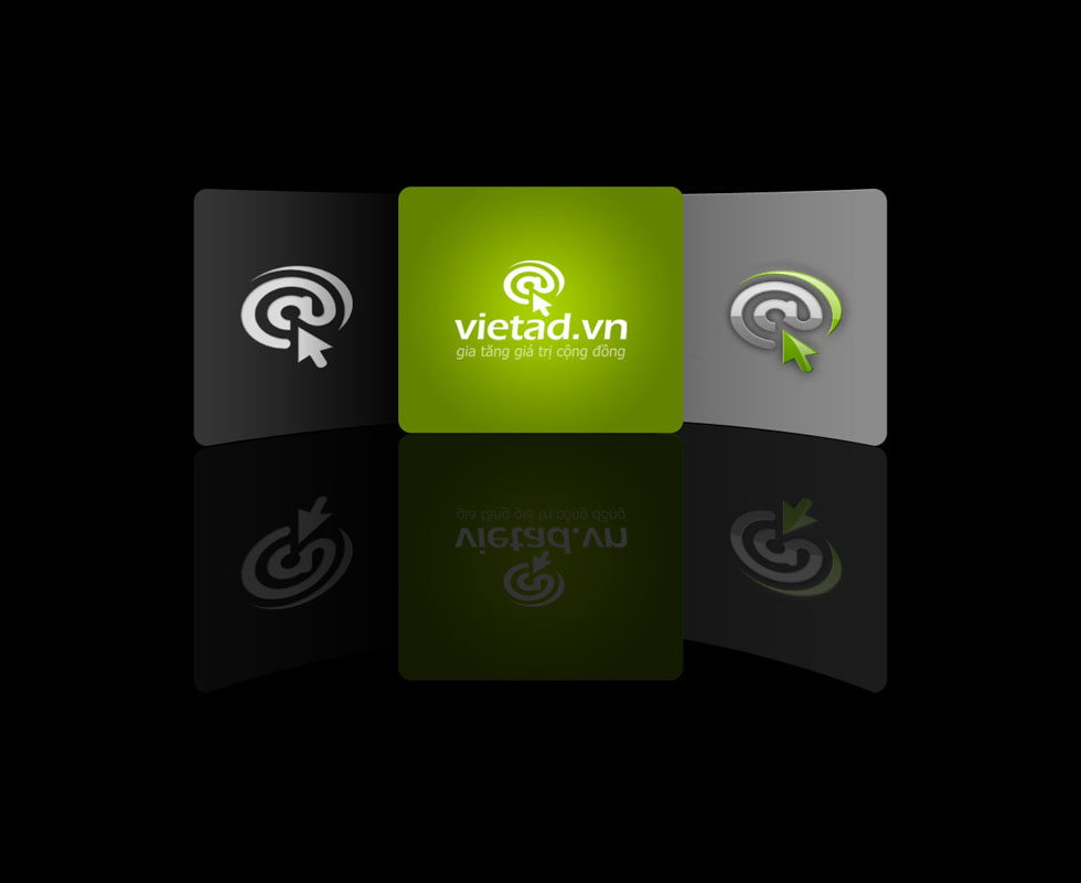
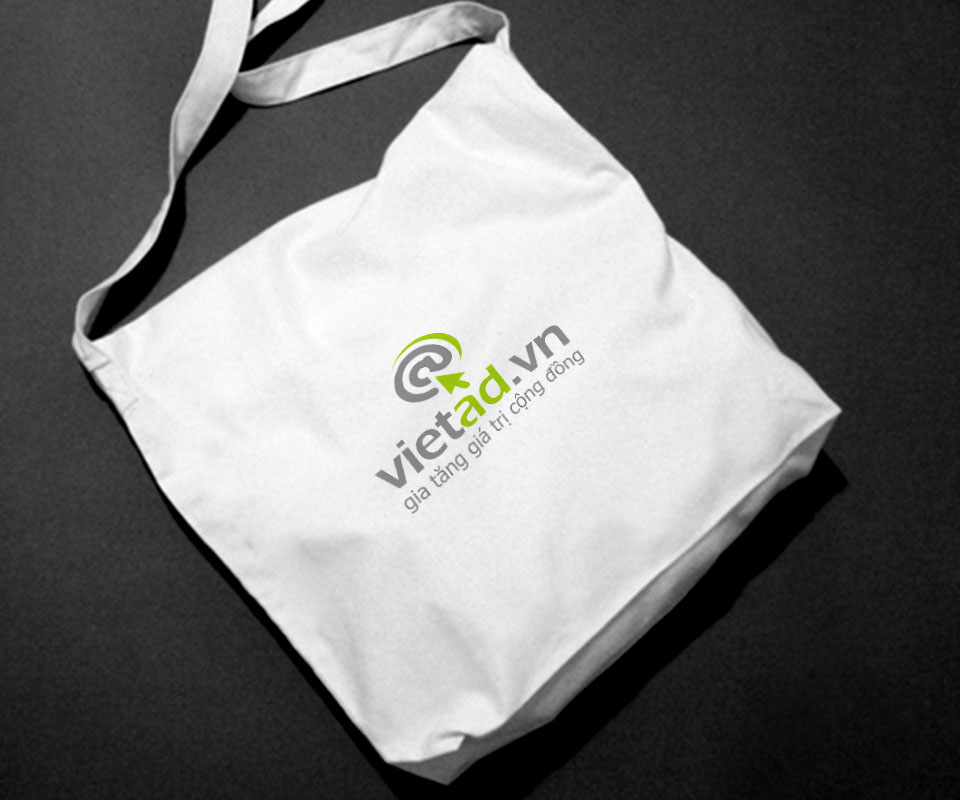
The app icon comes in three versions on black, green and grey. A white canvas bag printed with the slanted logo is used at seminars and events, carrying the VietAd name out with clients.
The value
VietAd gained an image that states its trade within the logo, and a consistent kit professional enough to meet businesses. Clients see the same @ with its arrow and the same green band on cards, folders and the website.
When the product is invisible, the seller's image is what clients look at to decide. Sinh Vũ built VietAd into a unified visual system, so trust arrives before the client even sees the price list.
A green band on everything clients hold