
Vay nhanh: a dollar sign with two arrows in opposite directions
Vay nhanh is a technology platform that helps people who need a loan find people able to lend. It also scores borrowers' credit reputation so lenders can review it before deciding. Sinh Vũ designed the logo and identity (the logo, colours, lettering and how they are used everywhere) so the brand looks trustworthy and transparent.
A platform standing between borrower and lender
Vay nhanh does not lend money itself. It is a technology platform that connects people who need a loan with individuals or organisations able to lend. It also scores the borrower's credit reputation, so lenders get an overall picture before they commit their money.
With a financial service, what users need first is reassurance. So the client's brief was a logo that feels trustworthy and transparent, true to the nature of finance. The logo and identity also had to be used consistently both online and in print.
A dollar sign with two arrows
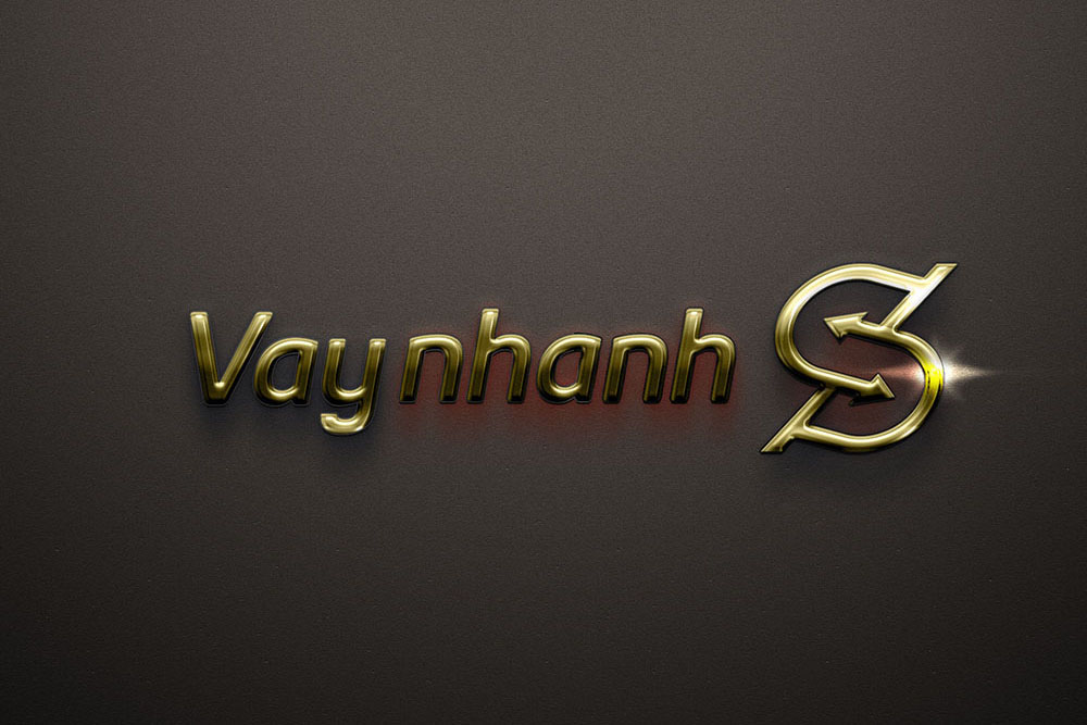
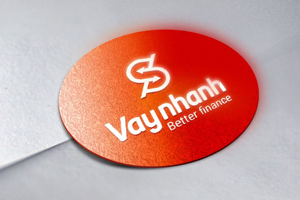
Sinh Vũ redrew the dollar sign ($) in its own way, then ran two arrows in opposite directions through the slash (/) in the middle. The arrows show money moving back and forth between borrower and lender. The slash is where Vay nhanh stands: the party in the middle, scoring borrowers' reputation for lenders to consult.
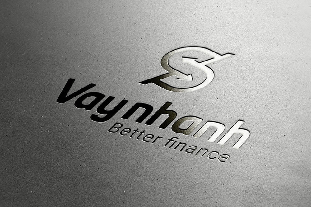
The words Vay nhanh lean slightly forward, with a small line beneath reading Better finance. The image below shows the logo embossed on grey paper, with no colour: the dollar sign and the two arrows are still plainly recognisable.
Two main colours: deep blue and orange-red
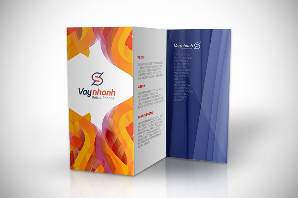
The colour logo uses deep blue for the word Vay and the dollar sign, and orange-red for the word nhanh and the arrows. Deep blue suits the solidity people expect from a financial service, while orange-red keeps the brand from feeling stiff. Placed on a block of colour, the logo switches to its white version, as on the round red stamp.
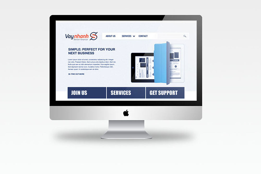
The introductory leaflet shows both colours on paper: one side covered in sweeping orange and red bands, the other a deep blue ground with the white logo. The same logo also sits on the website, meeting the requirement for consistent use online and in print.
The value
The Vay nhanh logo says what the platform does: money moving both ways, with an assessor standing in the middle. Anyone seeing it knows this is a financial service, just as the client asked.
Sinh Vũ handed over brand guidelines (a document explaining how to use the logo, colours and lettering) and a video, so Vay nhanh can use its logo consistently across the app, website and printed materials.
One logo used everywhere
In their own words
Well-finished design that captures the nature of the product. The logo and identity make Vay nhanh look trustworthy and transparent, which matters most for a lending platform.