
Top50: the number 50 set inside the word TOP
Top50 is a site that gathers the 50 leading products and services, giving users an overview before they choose. Sinh Vũ designed the logo and the identity, meaning the shared rules for logo, colour and layout, so that anything bearing the Top50 name is recognised at once. Alongside came office stationery and promotional items, the things carried out to meet customers.
One page to take in at a glance
Top50 gathers the 50 leading products and services in one place, so users get an overview they can compare. People who visit are usually weighing several options and want to look quickly.
For this kind of site, the number 50 is the name. The logo has to let viewers read the word Top and the number 50 and remember it at once, with no further explanation.
The 50 as the letter O
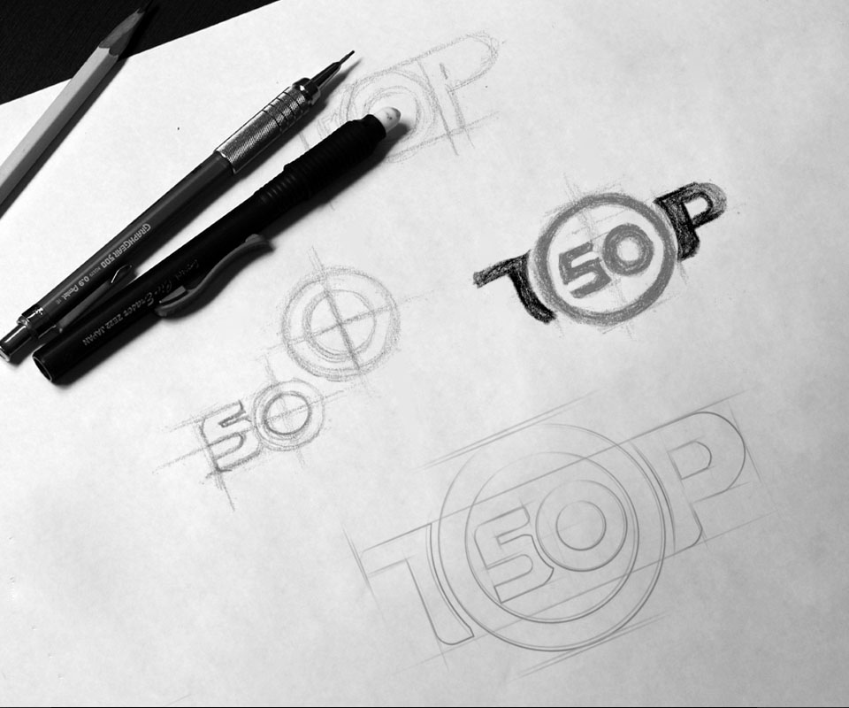
The pencil sketches show Sinh Vũ trying several ways of placing the number: the 50 standing alone beside a circle, then a large circle replacing the O of TOP. The final version took the latter route: a solid black T and P with a circle holding the 50 between them.
The circle is both the letter O and the frame around the number. Viewers read it straight away as Top 50, with no guessing.
Orange-yellow on white paper
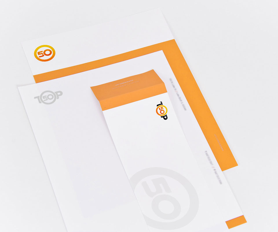
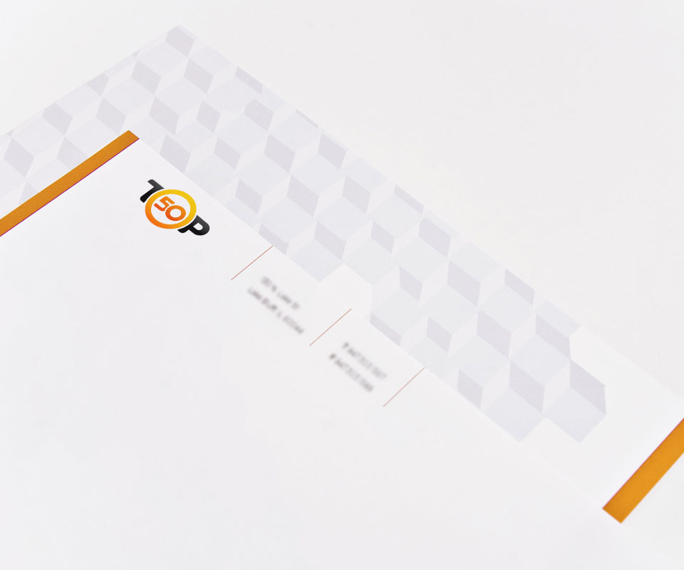
The circle and the number use a colour that shifts from yellow to orange, set beside two black letters. On the office stationery, orange is also used as flat bands of colour along the paper edge and on the envelope flap.
The logo is used in different ways depending on where it sits. The letterhead carries only the circle with the 50, while another sheet is printed with a pale grey logo. The envelope uses the stacked logo with a large faded 50 circle as a background. So the whole set is clearly Top50, yet no two pieces repeat each other exactly.
From paper to bag, T-shirt and screen
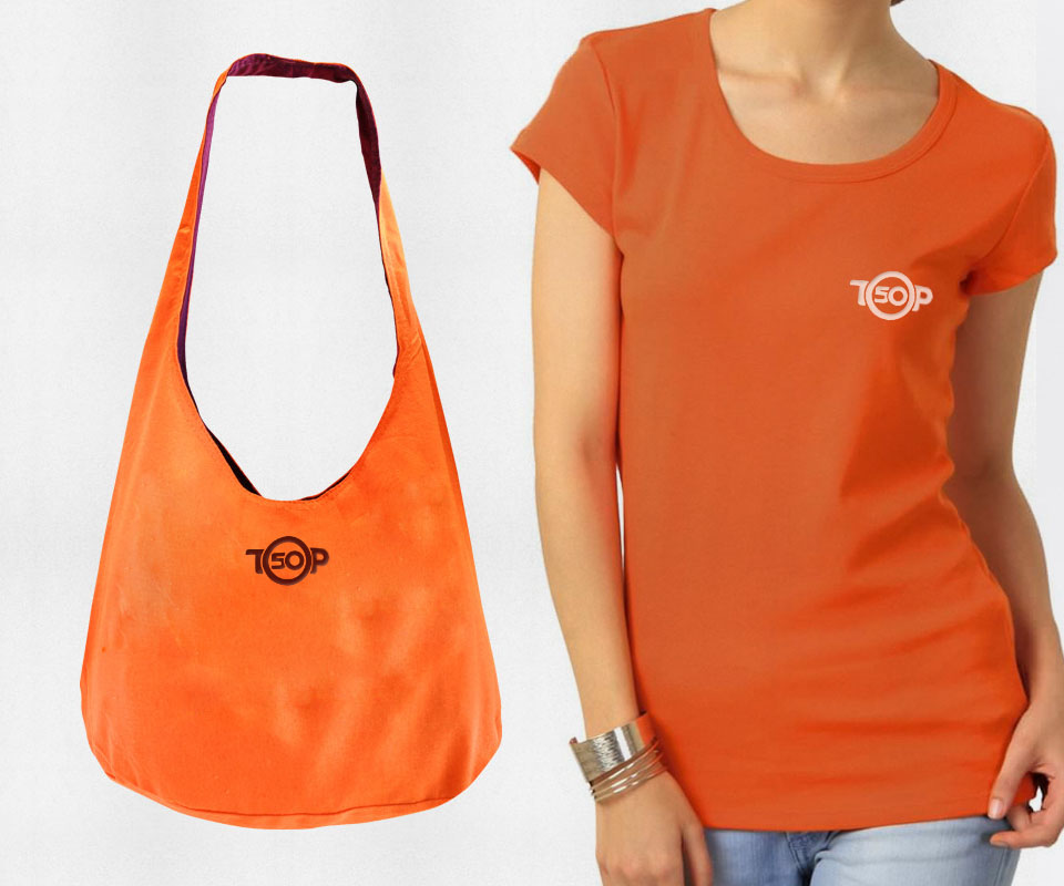
The logo was carried onto promotional items, meaning things taken out to meet customers: an orange tote bag and T-shirt. On the bag the logo is printed in dark brown; on the T-shirt it is white and small, on the left chest.
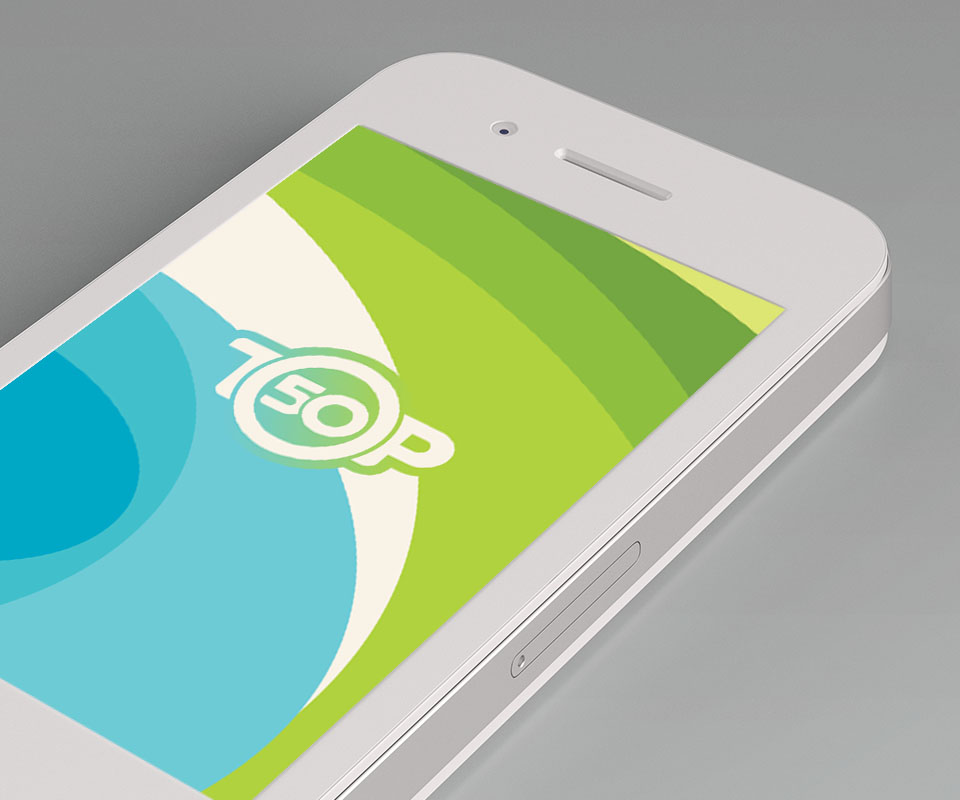
Sinh Vũ also placed the logo on a phone screen, in light colours on blue and green. So one logo works on paper, on fabric and on screen.
The value
Top50 has a logo that reads as its name at once, and a consistent set of stationery from letterhead to envelope. The client described the design as beautiful, concise and clear.
For a ranking site, the number is what users remember most. Sinh Vũ put that number in the middle of the name, so the logo itself says what the site does.
The 50 inside TOP, on paper and on screen
Logo

Letterhead
In their own words
A beautiful, concise and clear design. The logo and identity make everything carrying the Top50 name, from letterhead to tote bags and T-shirts, recognisable at a glance. Thank you, Sinh Vũ.