
Teaching app: an interface easy for teachers to use
Teaching app is a teaching application for tablets, made for teachers. Sinh Vũ designed the interface for Zinza, a company that writes software to order. The aim was for teachers to see a whole lesson and move between lessons and content, while the controls stay simple.
An app for teachers
Zinza is a young start-up whose main work is software outsourcing, that is, writing software to order. The users of Teaching app are teachers. Zinza asked Sinh Vũ to design the UI UX of the app, meaning the interface seen on screen and the way people use it.
The brief had four parts. Teachers could review the whole content of a lesson. Lessons were put in a sensible order. Switching units (blocks of a course) and switching content within a lesson had to be quick and easy. All lessons followed one shared template, so every lesson is presented the same way.
Timeline on the left, lesson on the right
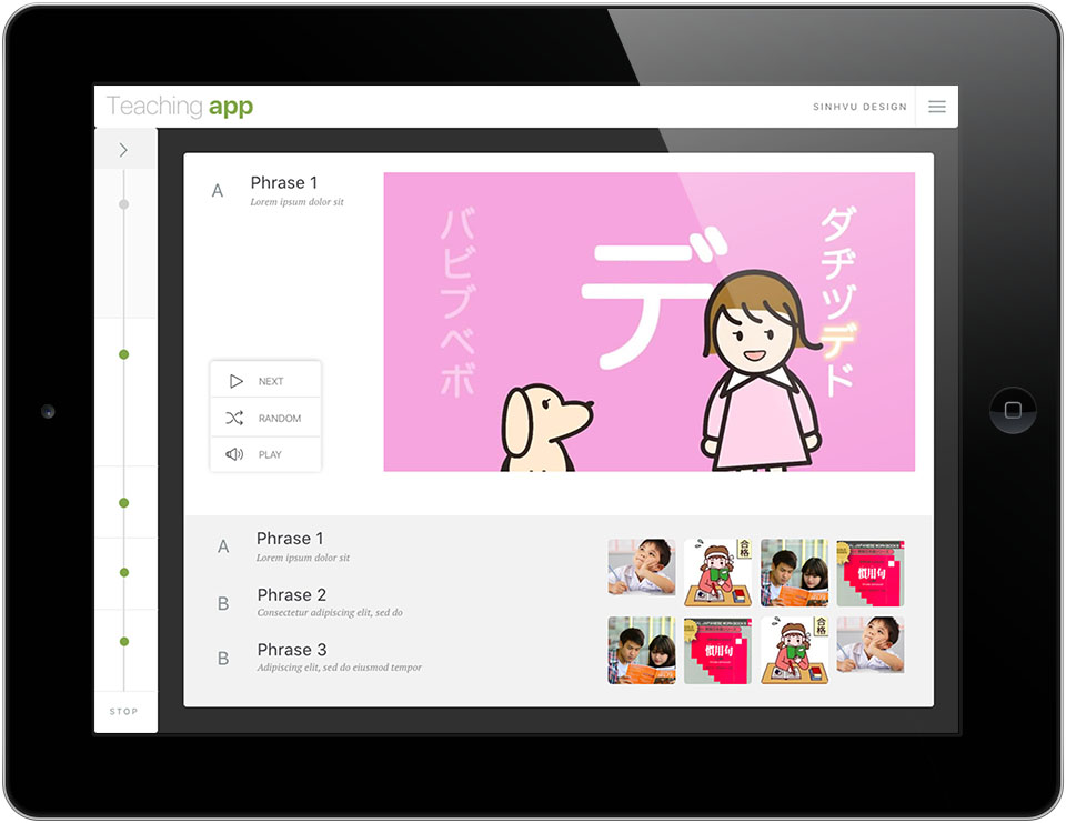
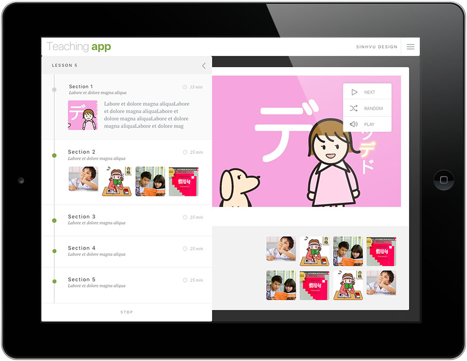
Sinh Vũ laid the interface out in landscape, the tablet's wide format, so the timeline and the lesson content sit on one screen. The timeline is a vertical line along the left edge, and each part of the lesson is a round dot on it. Tapping it opens the line out into a list of parts, with the minutes for each.
The right side is for the content being taught: one large illustration and three buttons, Next, Random and Play. Below are the sentences of that part and a strip of small pictures. By looking at the timeline, teachers know which part of the lesson they are in.
Large buttons, clear states
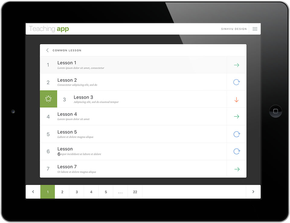
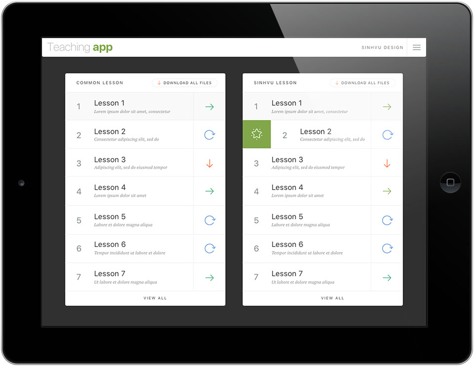
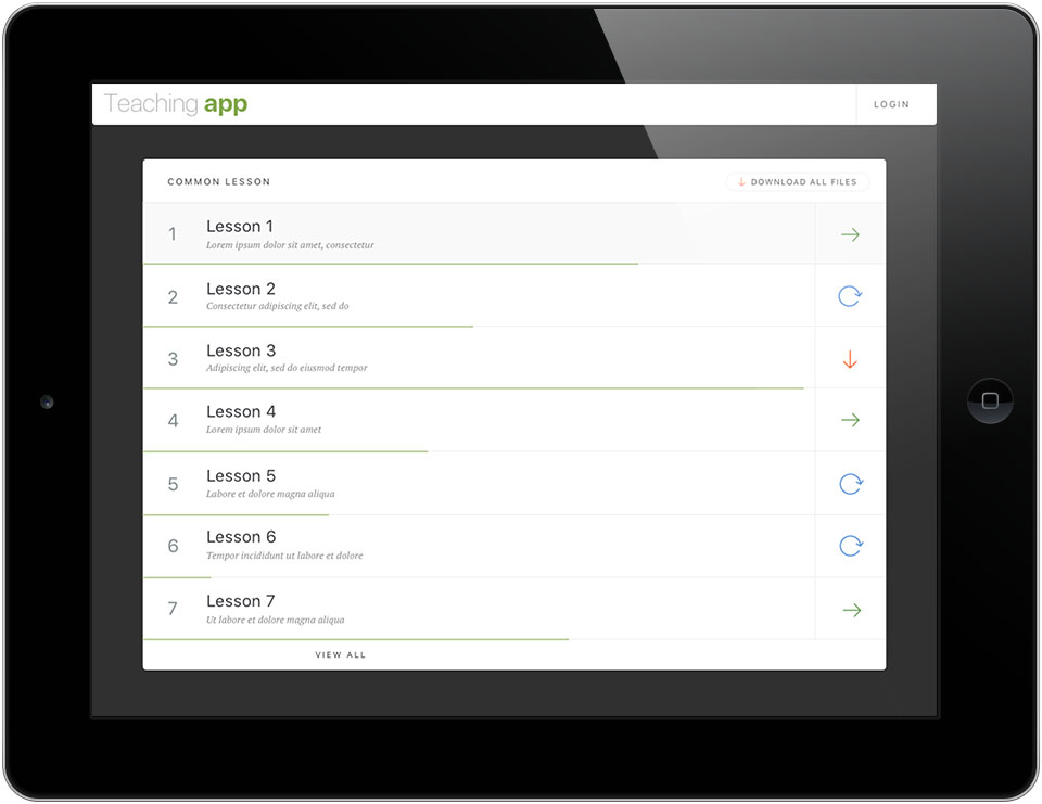
The interface is simple, with large buttons that are easy to press with a finger. At the end of each row in the lesson list is an icon: a green arrow, a blue circular arrow or an orange downward arrow. Each state of a lesson has its own colour, with strong contrast, so teachers can tell them apart at a glance.
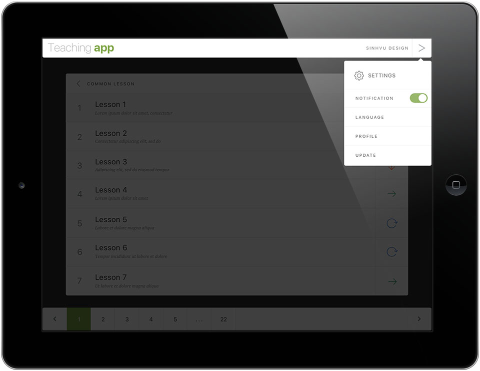
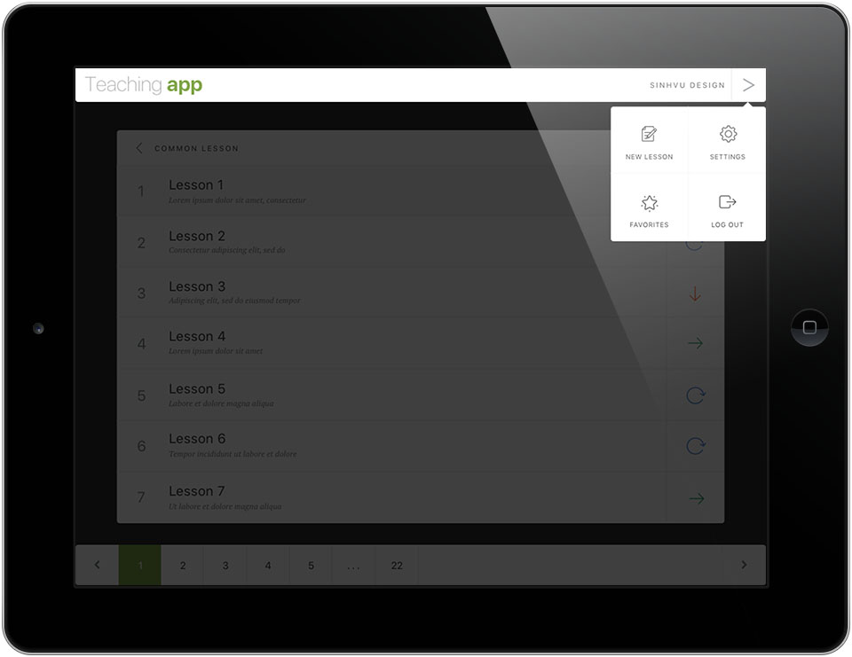
A lesson marked as a favourite has a green square with a star at the start of its row. At the bottom of the screen is a page bar for moving through the pages of the lesson list.
Sign in, register, download
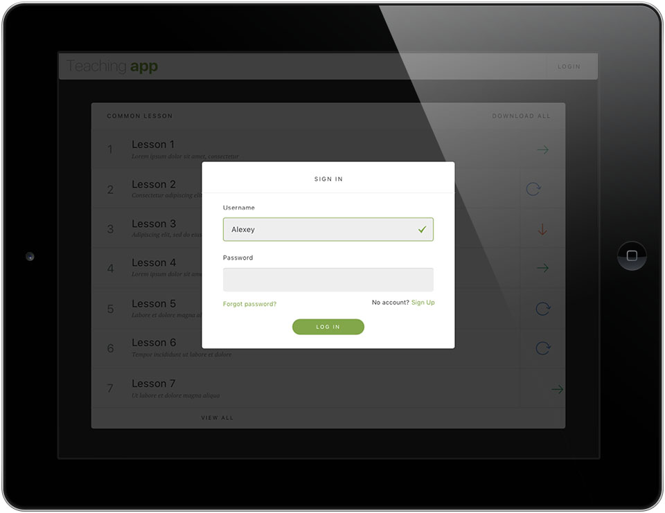
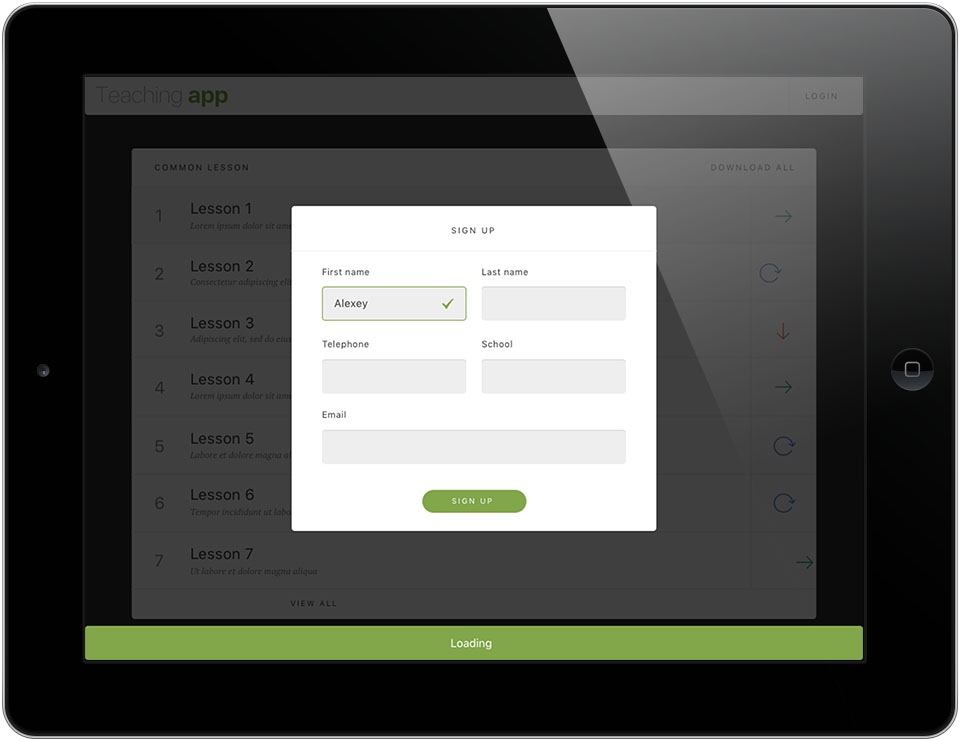
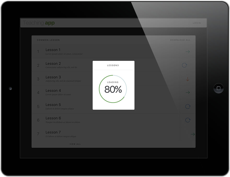
The secondary screens use the same presentation as the main one. The sign-in and registration boxes appear in the middle of the screen, with the background behind dimmed. Input fields show a green tick when filled in correctly, and buttons are rounded and green. When a lesson downloads to the device, a small box with a progress circle shows how much has been downloaded.
Every screen uses one green as its accent, with plain text and plenty of space. As a result, any screen is recognisably part of the same app.
The result
Teachers have an app arranged in the order they teach: the lesson list, the parts of a lesson, the content of each part. Each lesson follows one shared template, so moving between lessons is easier.
Zinza received a coherent set of screen designs for the app. After the project, Zinza's chief executive sent thanks to Sinh Vũ.
A teaching app understood at a glance
In their own words
Thank you, Sinh Vũ, for working with Zinza on this project. The interface lets teachers view lessons and move between lessons and content on a tablet with simple controls, exactly what our client needed.