
Suối Bu, a highland school with a new face
Suối Bu School, a new school in the highlands of Văn Chấn, carries a face rooted in the shape of the mountains and the stream, built by Sinh Vũ from the school gate to every document.
The problem
Suối Bu is a primary and secondary school newly built in the middle of a highland commune. The walls still smelled of fresh lime, the corridors were straight and clean but empty, and the doors carried no names. The school had its architecture, but not yet a face.
The difficulty was not decorating a wall. It was giving a public highland school an identity as unified and orderly as any school in the city, while drawing that identity from this place itself, so students would look at it and see their own homeland, a place worth being proud of, not a generic template pasted anywhere.
The approach
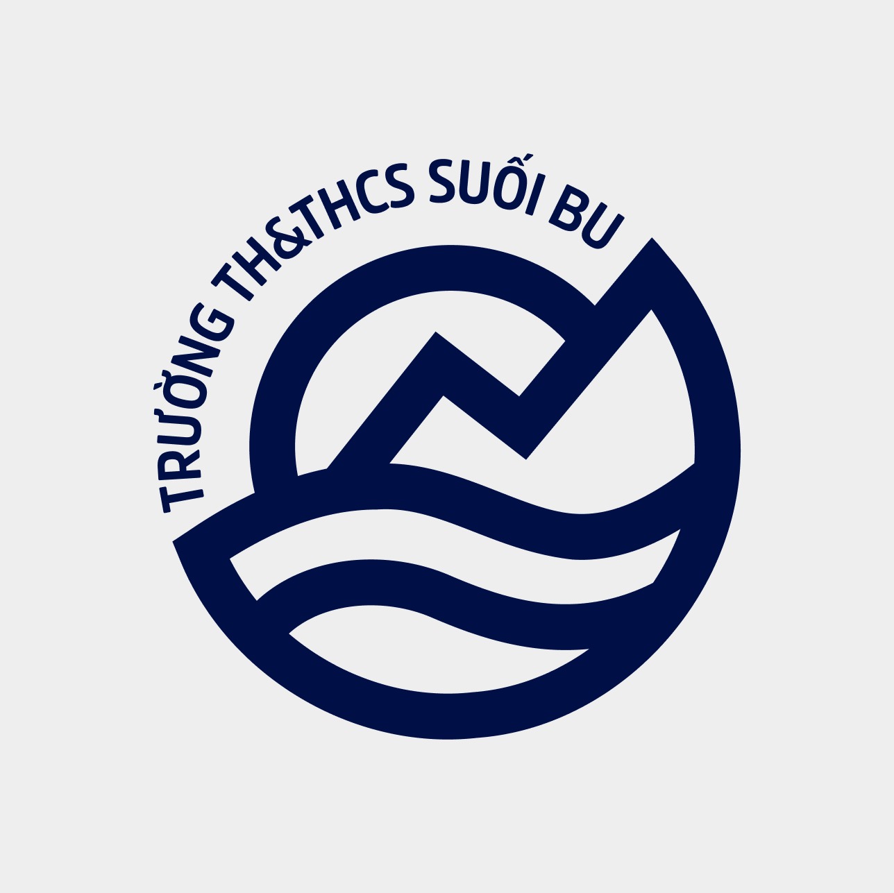
Before touching a single sign, we went looking for a shape. The name Suối Bu already suggested the stream and the mountains around it, so the emblem drew from exactly those two forms: a peak rising like a path of learning, a stream curving below, held within a round badge. The mountain for steadiness, the stream for freshness, the rising path for aspiration.
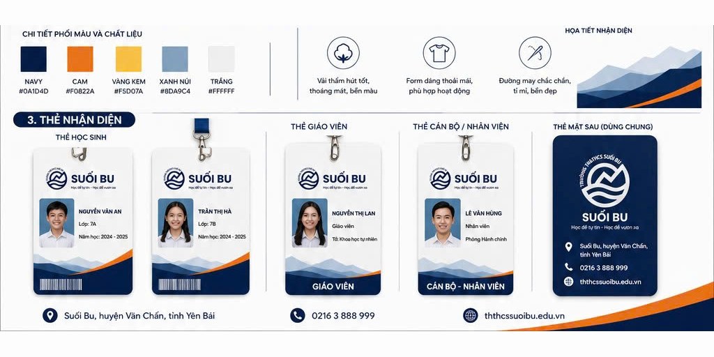
From that mark came a palette rooted in deep charcoal blue, with warm orange as an accent, plus cream yellow and mountain green for transitional layers. A stylised, layered mountain range became a shared background pattern, so that everything bearing the Suối Bu name, whether an ID card or a backdrop, would be recognised at first glance.
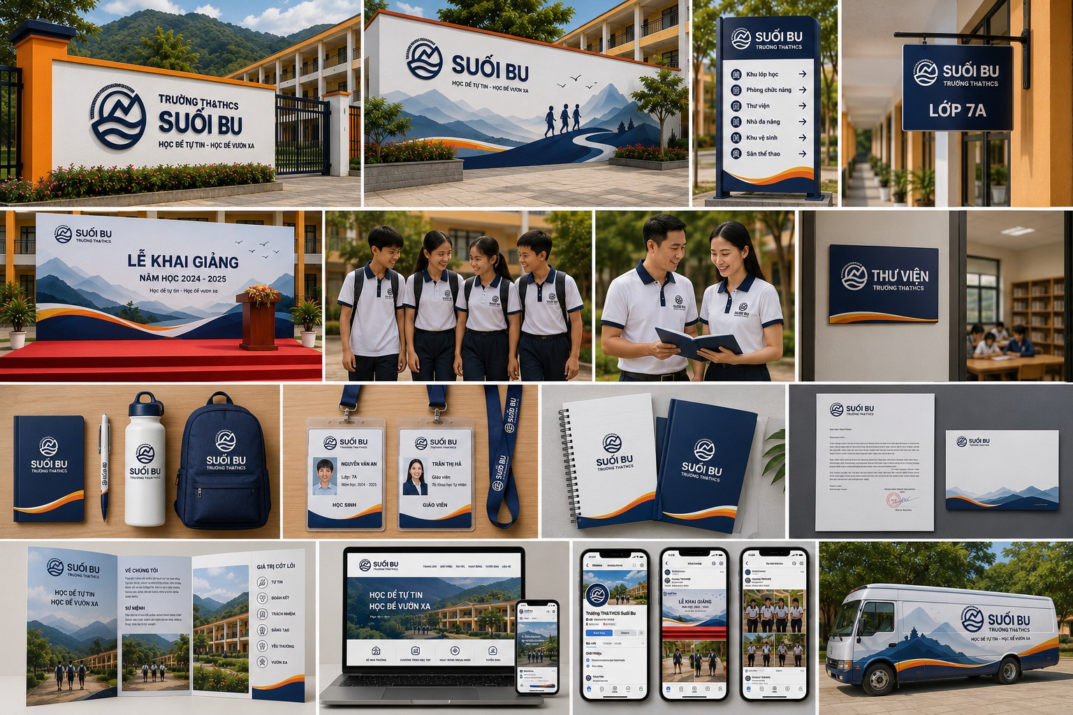
That face stepped onto the ground first at the school gate. The name sign was placed prominently at the entrance, so that from the top of the slope, people already knew this was Suối Bu Primary and Secondary School. Inside, a mountain relief depicting a student walking a path toward the peak turned an empty wall into a quiet message about the journey of learning.
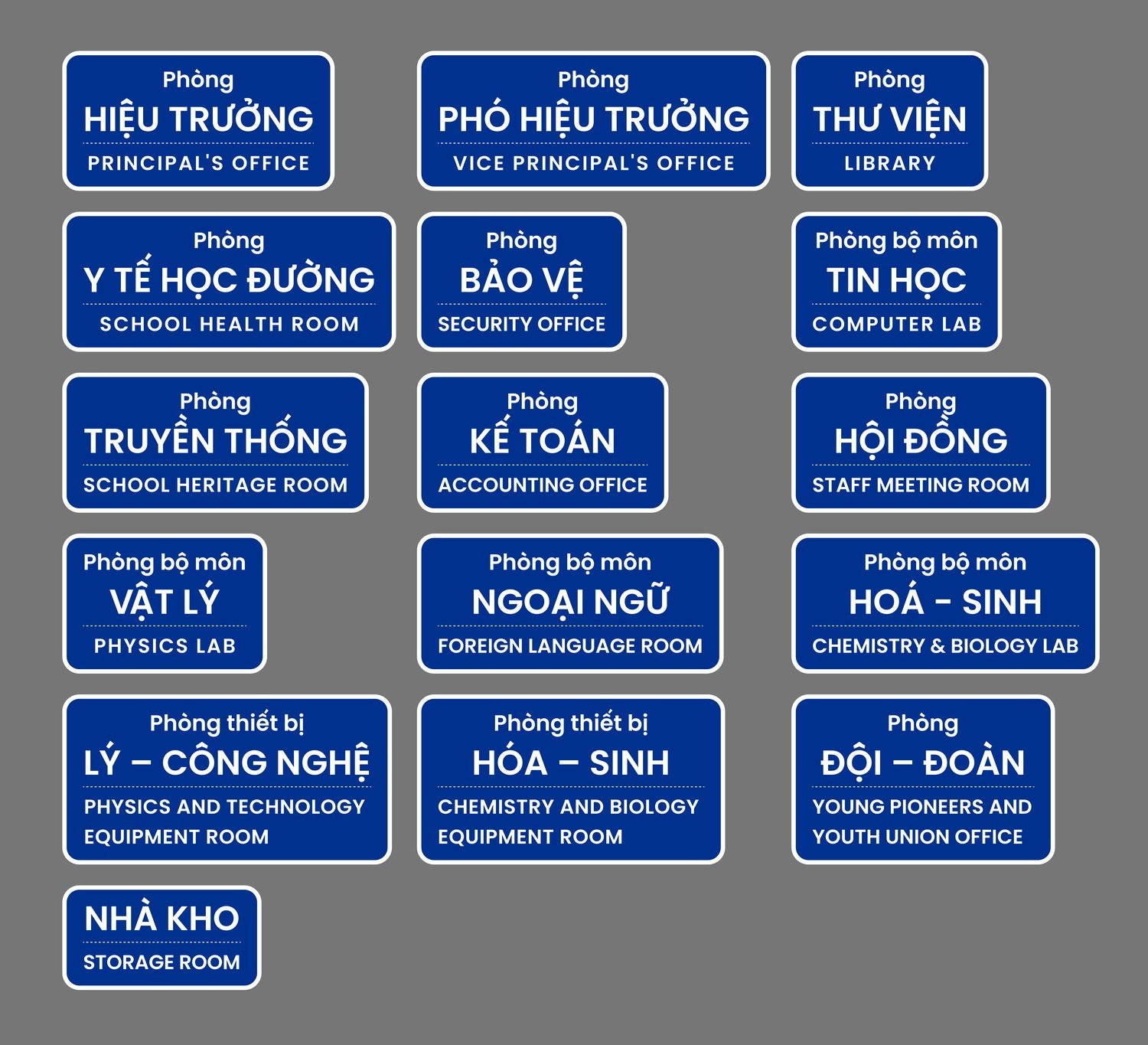
Then the wayfinding system moved into every corridor. Directory signs pointed toward the classroom block, function rooms, library, multipurpose hall, restrooms and sports yard; and on every door, a bilingual Vietnamese and English room sign, from the principal's office, library and school health room to the subject classrooms. What used to be identical doors now let everyone know exactly where they stood, and a highland school gained the kind of orderliness usually seen only in city schools.
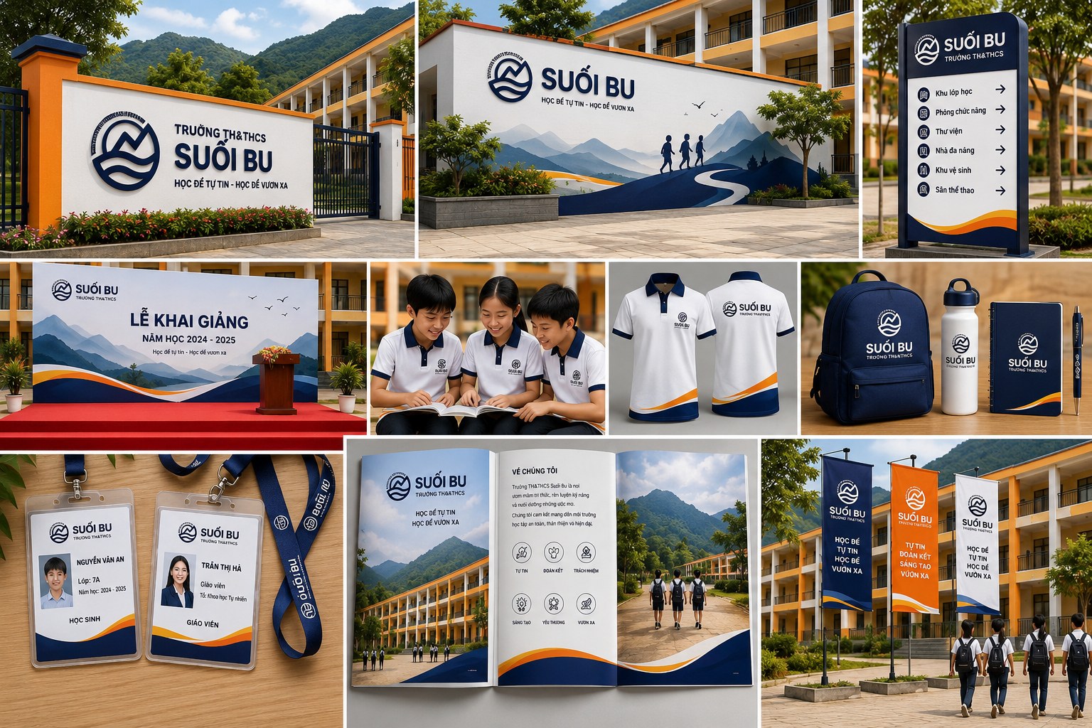
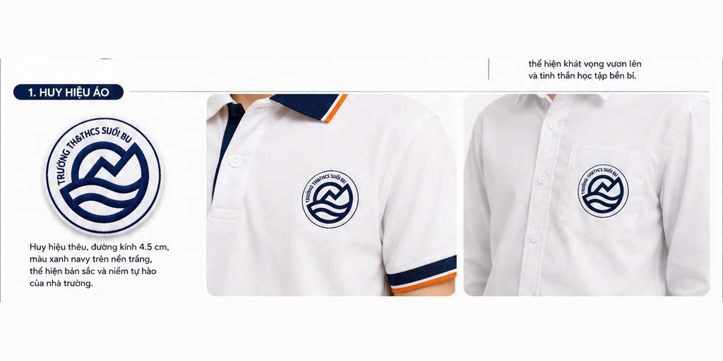
The identity shows most clearly on a person. We brought the mountain and stream badge onto the uniform, embroidered in charcoal blue thread on a white ground, so every student wearing it carries the school's name with them. The uniform set covers both students and teachers, polo shirts and dress shirts, pairing charcoal blue with a warm orange stripe, staying youthful yet orderly.
Alongside it, an ID card system for students, teachers and staff, sharing one format and one mountain range at the base of every card. A small card says a great deal: it gives every person a named place within the school, and gives a visitor a mark of trust.

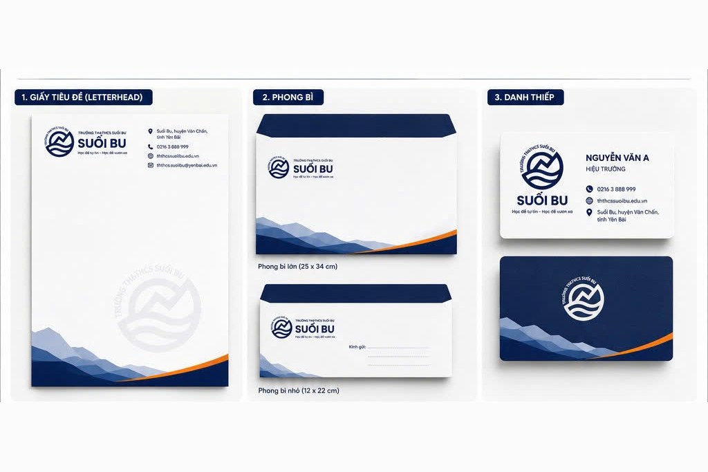
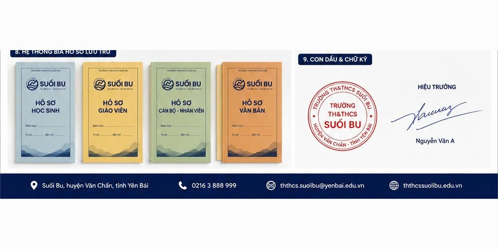
A school runs on more paperwork than people imagine: official letters, student records, ledgers, forms. We carried the identity through that entire trail, from letterhead, envelopes and business cards to folders, document clips, forms and duty logbooks, all sharing the same mountain range, the same charcoal blue.
Even the archival folder system was colour-coded by category for faster retrieval, and the seal and signature were set within one unified format. Administrative paperwork, usually prone to looking untidy, now carries an orderly look, and that order itself is the school's way of saying that things here are done properly.
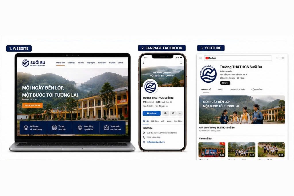
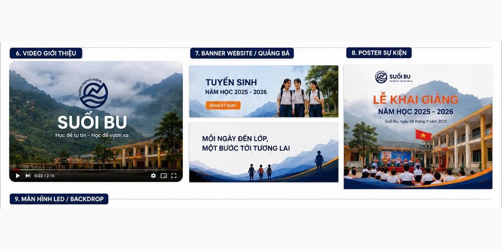
Finally, the school's face stepped beyond the campus. We built a template set for the school's website, social media pages and video channel, down to the email signature, so that every time Suối Bu appeared on screen, it stayed consistent with the sign at the gate.
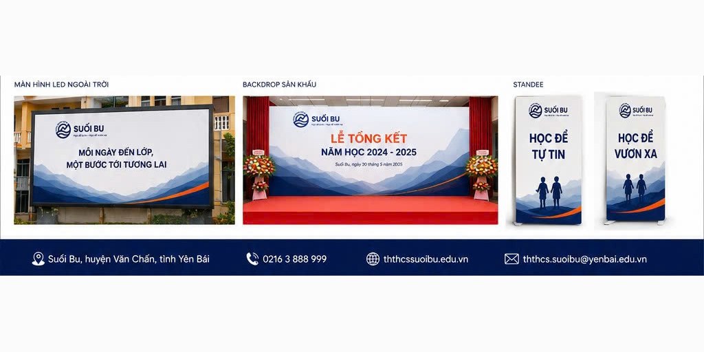
Alongside it came a set of materials for major occasions: backdrops for opening and closing ceremonies, standees, posters, enrolment banners, LED screens. The templates are ready so that each new school year, the school only needs to swap in new content rather than build from scratch, and every time, it comes out as exactly one Suối Bu.
The result
What Suối Bu gained was not a logo, but one unified face spread across the entire school. From the entrance gate, the classroom doors, the uniform, the paperwork, to the screen, everything speaks with one voice, carrying the shape of the mountain and the stream of this very land.
For a highland school newly built, an orderly and dignified identity is not decoration. It is a way for students to see that the place they study is worth being proud of, and for the promise of learning to build confidence and reach further to begin with what they see every day.
One face, across the whole school

Is your challenge like Suối Bu?
Tell Sinh Vũ what is on your mind about your organisation's identity. Sinh Vũ will point you toward the right direction right away.