Sống Khỏe: a health website worth trusting
Sống Khỏe is Viettel's health website, where readers look up illnesses, read medical news and send questions to a doctor. Sinh Vũ designed the logo, web interface and accompanying printed materials, so that wherever readers meet Sống Khỏe they see the same image, tidy and easy to trust.
A health site must reassure its readers
People who visit a health website are often worried about themselves or a relative, or want to understand an illness properly. They read carefully and doubt easily. If a page looks cluttered, uses harsh colours or is crowded with adverts, they are quick to leave.
Sống Khỏe is a Viettel product with sections for different readers: mothers and babies, women, men and older people. Sinh Vũ's task was to give the whole site one consistent image, from the logo and web interface to the leaflet and the printed book.
A heart with a cross
The logo joins two familiar symbols of medicine: the heart and the cross. The cross sits inside the heart, and the heart is outlined in one unbroken green line. Viewers see at once that this is a site about health care.
The name Sống Khỏe is set in a serif typeface (a typeface with small strokes at the ends of each line, like the type in books and newspapers), in a deep blue, on two lines beside the symbol. The web address sits small beneath it, in the same green as the heart. Green and blue feel clean and calm, so the logo needs no further detail.
An interface that is easy to find your way around and to read
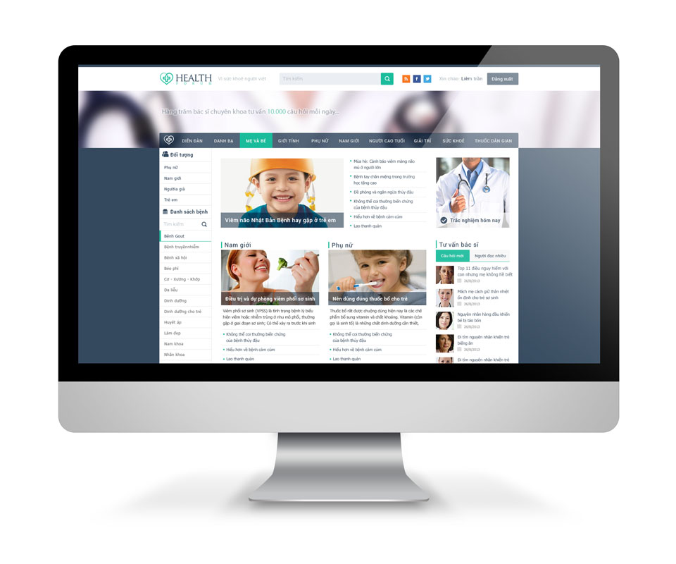
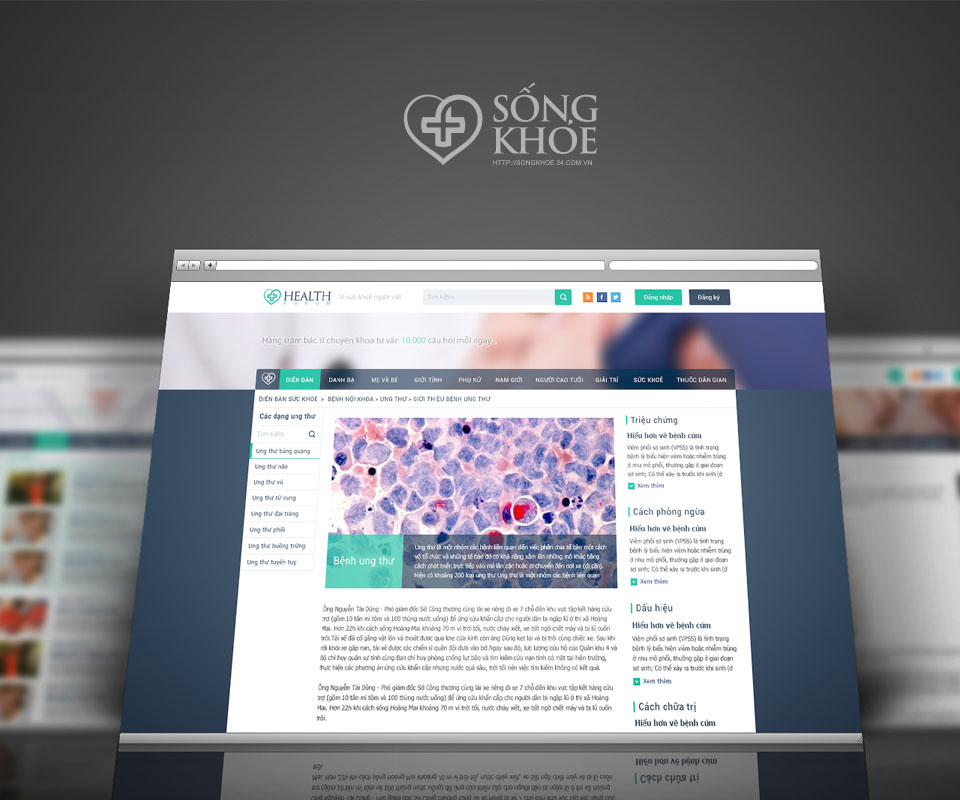
The website has a dark blue-grey section bar running across the top, with Forum, Directory, Mothers and Babies, Women, Men, Older People, Folk Remedies and a few more. The left column lets readers choose by reader group and by a list of illnesses, with its own search box. A reader who wants a particular illness simply clicks it.
The middle is arranged in blocks: a large picture with a headline at the top, and below it the news for each reader group. On the right is a Doctor's Advice panel, split into New Questions and Most Read. A white background, dark grey text and one turquoise accent let readers get through a long article without tiring their eyes.
The logo in print
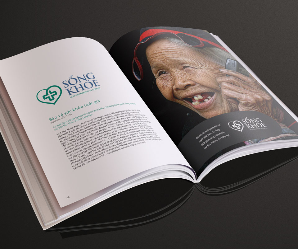
Sinh Vũ tested the logo on several materials: kraft paper (rough brown paper, not bleached white), a clear plastic card, a printed book and a leaflet. In the book, the left page is an article on health in old age and the right page is a large portrait with the logo in the corner. The logo and text sit on a dark ground and remain easy to read.
The leaflet uses curved bands of green and light blue, with a light-coloured logo in the middle. Whatever the background colour or material, viewers still recognise it as Sống Khỏe.
What Sống Khỏe gained
Sống Khỏe gained a memorable logo that can be understood at a glance with no explanation, and a clearly divided interface so that readers find the topic they need.
For a health site, a tidy interface shows readers that the site has been made with care. Sinh Vũ kept colours and details few, so that the medical content always gets attention first.
One logo on many materials