Smart Life: scan a label to know where a product comes from
Smart Life is an app that helps buyers learn where a product comes from by scanning the label stuck on it. Sinh Vũ designed the app's interface system, meaning the shared rules for colour, type, buttons and how screens are laid out, used on both phone and web.
Unsafe food everywhere, and buyers need to know where goods come from
Smart Life launched at a time when unsafe food was widespread. The app helps buyers check the origin of a product by scanning the label stuck on it.
Besides scanning, the app lets buyers chat with the seller, find shops and buy goods with a clear origin. It also has a section like a social network where people share information about clean products. With so many features, the brief for Sinh Vũ was one consistent interface system (UI, meaning how screens look and are arranged). It had to work the same way on phone and web.
Scanning must be quick and easy
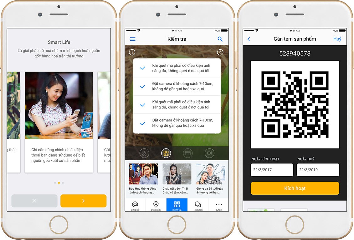
The bottom bar of the app has five sections: Share, Places, Check, Messages and More. Check, where labels are scanned, sits in the middle so users reach it fastest. The scan screen has a short reminder box: scan only in good light, and hold the phone camera 7 to 10 cm from the code.
The screen for attaching a label to a product shows each label as a QR code (a square that holds a code a phone can read). Below the code are the activation date, the cancellation date and a large orange Activate button.
From choosing goods to ordering
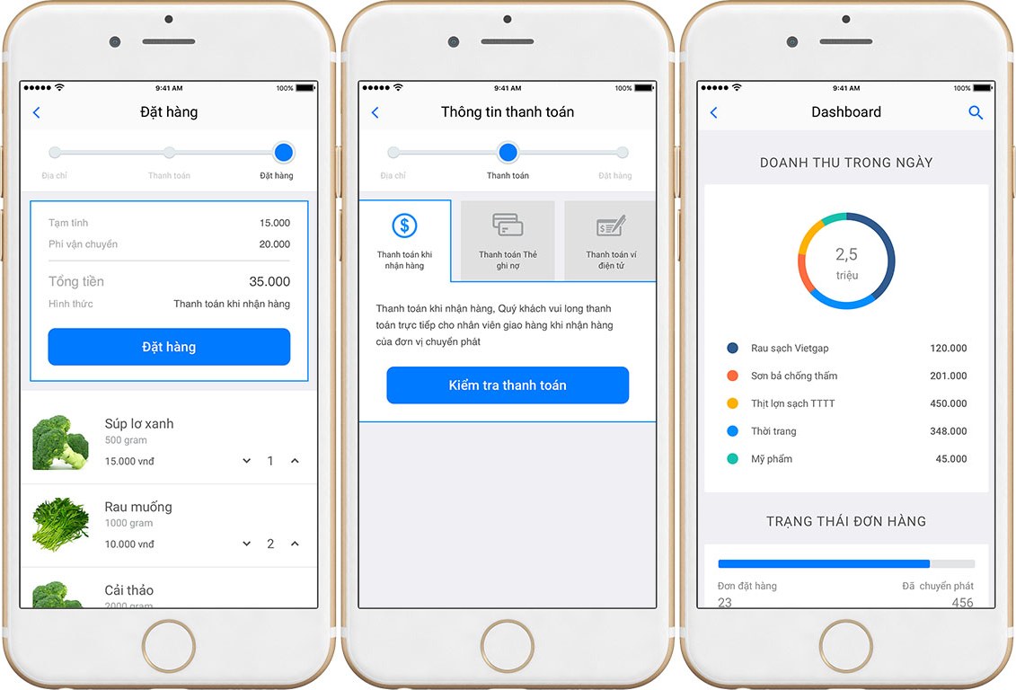
Ordering is split into three steps: address, payment, order. A progress bar at the top shows buyers which step they are on. The subtotal, delivery fee and total sit in their own panel, just above a large blue Order button. Buyers choose one of three ways to pay: cash on delivery, a debit card or an e-wallet.
The overview screen for sellers shows the day's revenue, split by product group in a doughnut chart, and a bar showing how many orders have been sent out. This screen uses the same blue, the same type and the same buttons as the buyers' screens, so the whole app looks unified.
Messaging and sharing
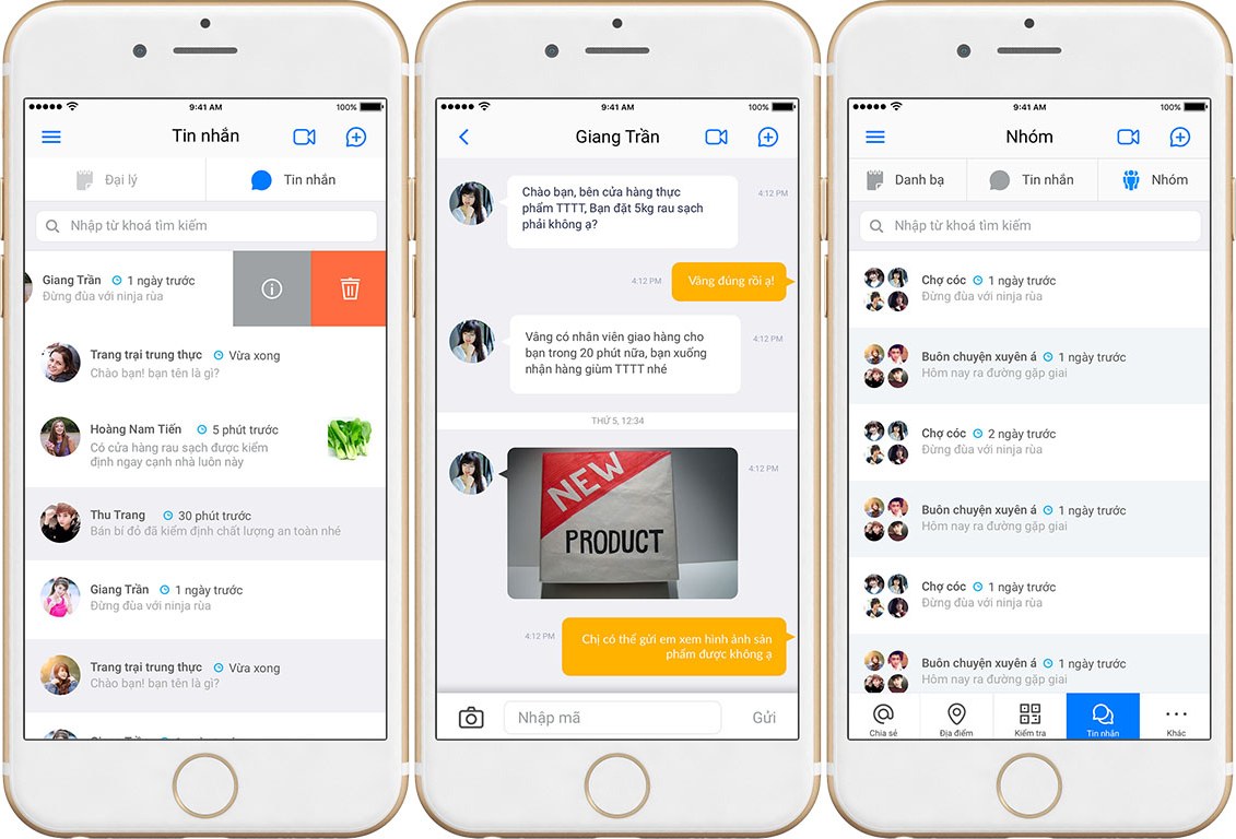
Messaging follows a pattern users already know: a list of conversations with a profile picture, time and the latest line; swipe a row sideways to see details or delete. In a conversation, the user's messages are orange and the other side's are white. A camera button in the corner lets users take and send a picture of a product.
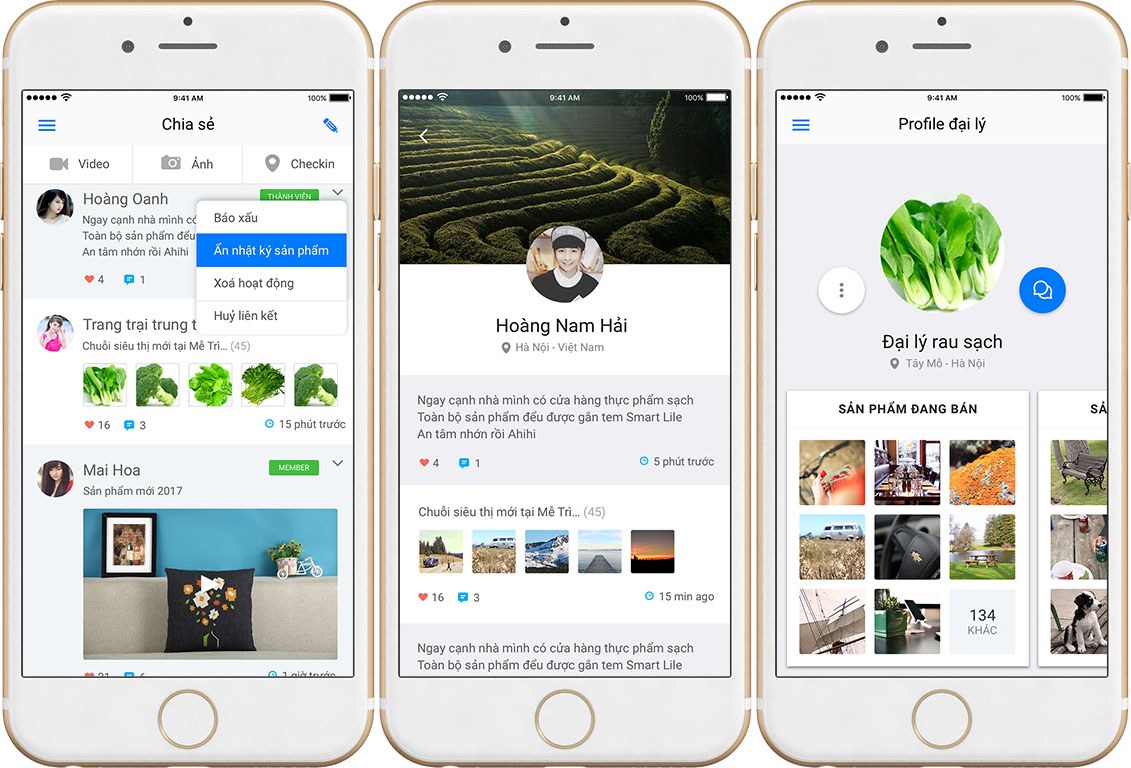
The Share section works like a social news feed: users post videos and photos, mark the place where they are standing, like and comment under each post. Sinh Vũ chose this familiar approach so users do not have to learn anything new to share information about clean products.
The value
Smart Life's interface is built from modules, meaning ready-made blocks of interface that can be combined. When the app gains a feature, the new screen reuses the existing colours, buttons and layout rather than being drawn from scratch.
For users, everything is in one app: scan a label to learn the origin, then message the seller, find a shop or place an order without switching to another app.
Scan, chat, shop in one app
Sharing and profile
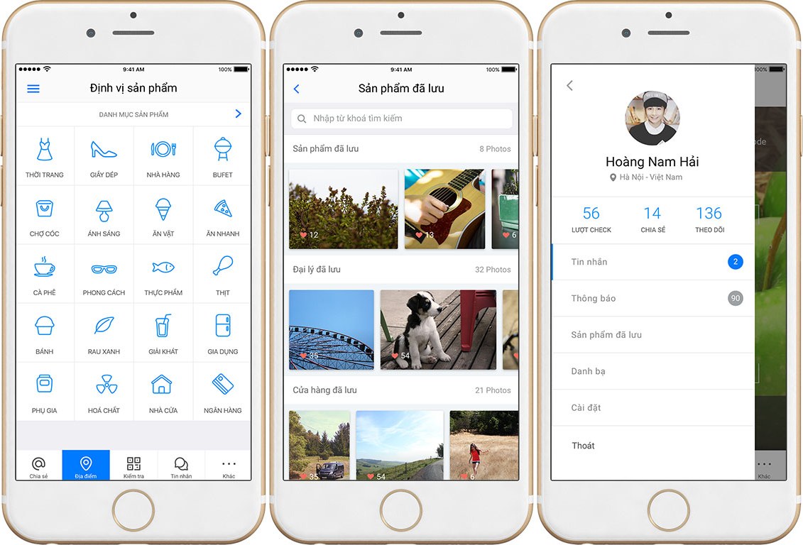
Categories and saved products