
Ratot: a logo that works on many surfaces
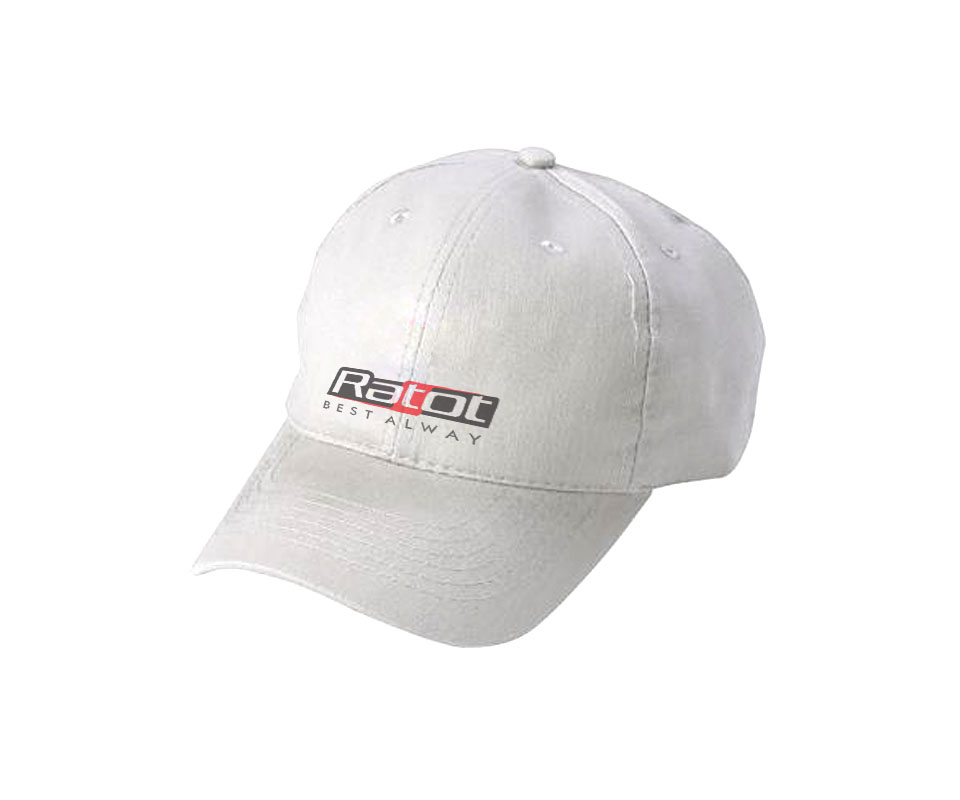
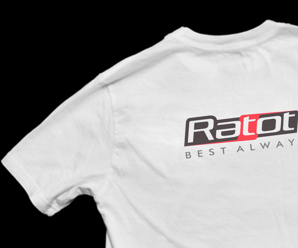
Ratot Vietnam wholesales electronic and telecoms equipment and components. Sinh Vũ designed the logo and identity (the logo plus the rules for colour, lettering and where the logo sits on each item) so that it fits neatly on the face of a small device, and equally on boxes, caps, shirts and outdoor signs.
A short name placed on a great many things
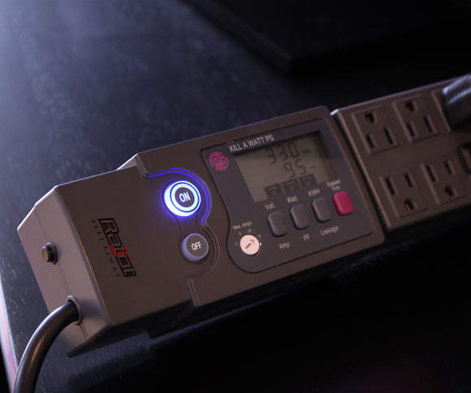
Ratot wholesales electronic and telecoms equipment and components. The goods come in many kinds and sizes: machine faces with indicator lights and dials, power sockets with digital displays, microphones. The company's logo has to sit on all of them.
Ratot needed a modern identity that suited the industry and worked on many materials and sizes. So before drawing, Sinh Vũ looked at the materials most often found in electronic components and telecoms.
From pencil line to logo
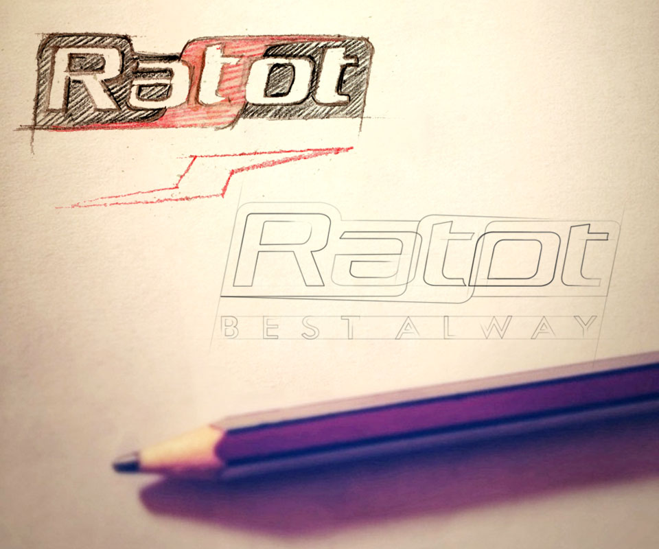
The first sketch was drawn in pencil: the name Ratot in a black block with rounded corners, the lettering leaning forward, and a red patch behind the t. Beside it was an outline-only version, with the words Best Alway underneath.
The final version kept that direction. White, bold lettering in a black block. The t sits on a red patch, and at the bottom is the English tagline Best Alway, with widely spaced letters. The heavy strokes keep the name readable when printed small. The red patch is the only accent colour, which helps people remember the logo.
One logo on three box colours
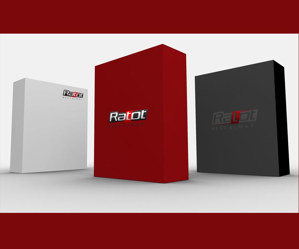
Sinh Vũ tried the logo on three boxes: white, deep red and charcoal grey. On the red box the logo keeps its colours and stands out clearly. On the white box it sits small in the top corner. On the charcoal box it turns grey, only a little lighter than the ground, discreet yet still legible.
Testing first on light, strong and dark grounds shows Ratot how the logo should change colour for each kind of box, so nothing is guesswork when it goes to print.
On the products themselves
Sinh Vũ built mockups (images that place the logo on a product so it can be previewed) on a yellow generator, a grey microphone, a power socket with a digital display and a control panel with dials. Each has a different size, ground colour and brightness.
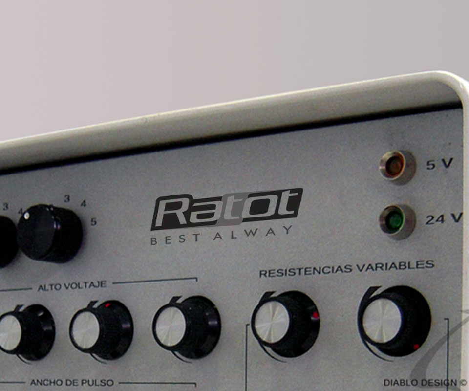
On the microphone body the logo is very small, yet the word Ratot stays legible thanks to the thick lettering and the clear separation of black and red. On the metal control panel the logo shifts to shades of grey to suit the machine face. The Best Alway line has wide spacing between letters, so the letters do not run together when printed small.

The result
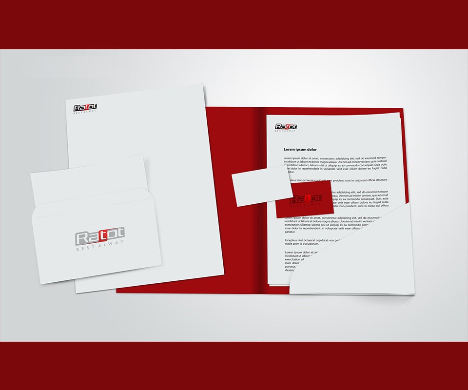
Ratot has a logo that works on equipment, packaging, uniforms, stationery and signs while keeping its shape. Ratot's director said the identity fully meets the company's requirements and suits many kinds of packaging and surface.
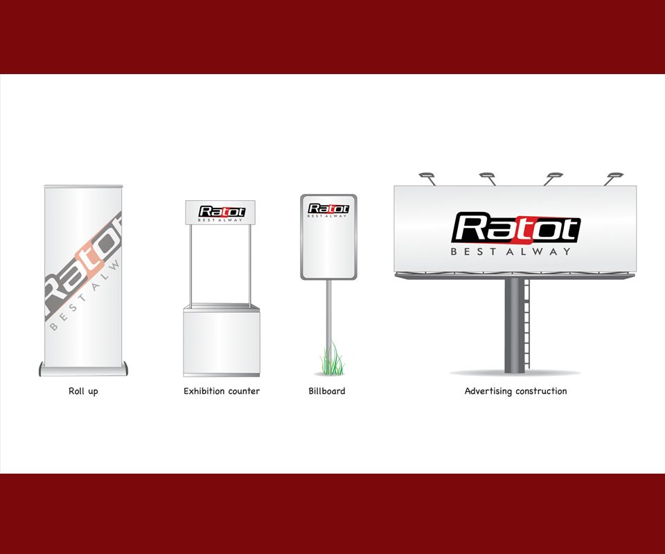
The logo has been tested on small items such as a device face and large ones such as an outdoor sign, so Ratot knows how it will look at each size before ordering print.
From the face of a device to the outdoor sign
In their own words
The identity meets our brief completely. The logo fits neatly on the face of a small device, and stays clear on boxes, caps, shirts and outdoor billboards.