
Paybet: an e-wallet lean on a small screen
Paybet is an e-wallet from a group of young entrepreneurs, used to transfer money, top up and pay from both computers and phones. Sinh Vũ designed a simple, friendly interface that is easy to use right in a phone's browser.
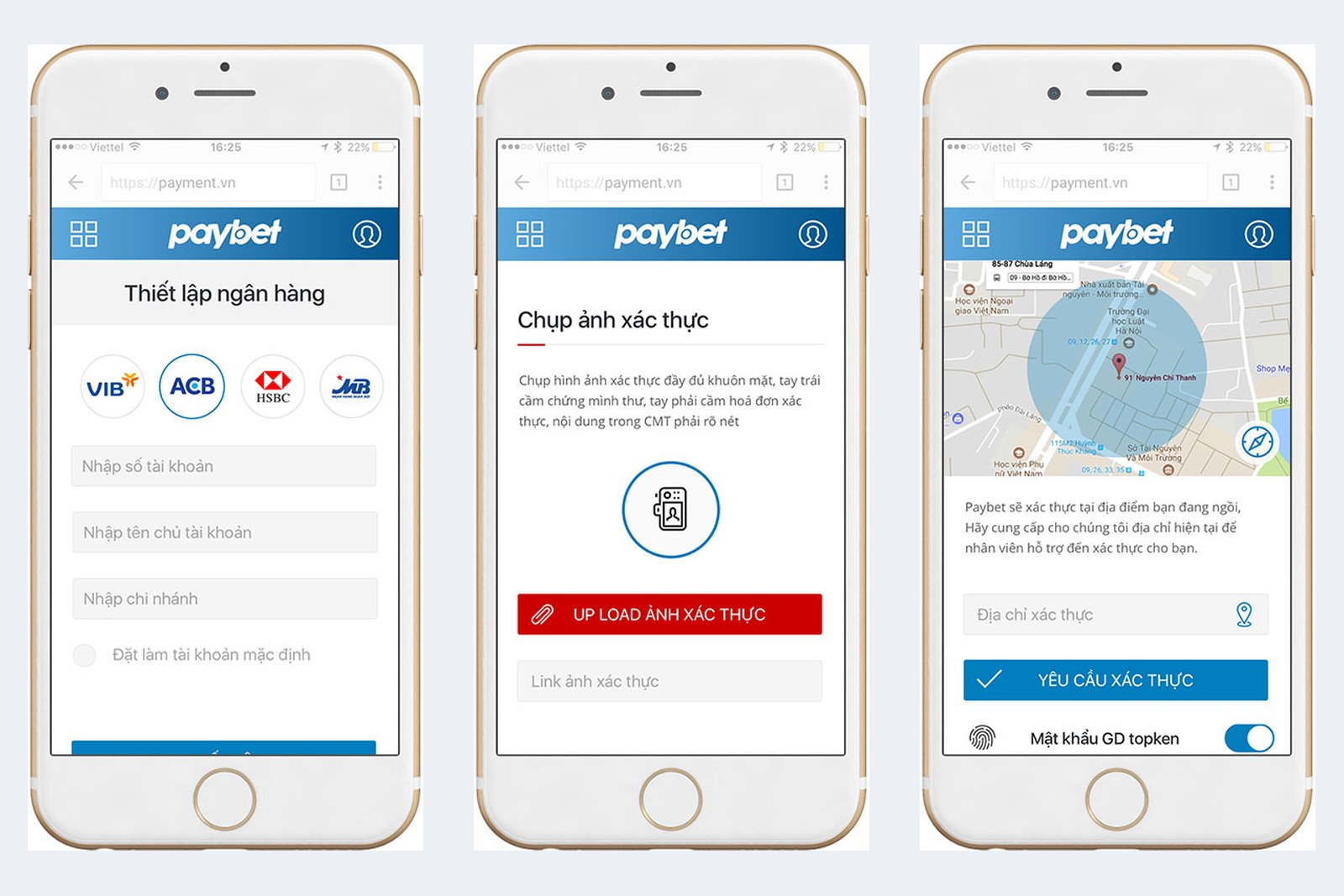
An e-wallet that runs in the browser
Paybet runs in a web browser (the software used to open web pages, such as Chrome or Safari). So one design has to display well on computers and on many sizes of phone screen.
An e-wallet is about money, so users need to see at once which step they are on and where to tap. The client asked for a design that was simple, friendly and easy to use.
One task per screen
Sinh Vũ produced this design in a short time. The interface is split into modules (independent interface blocks that can be assembled), prepared to display well on many screen sizes. Each screen does just one thing.
The top bar always has a blue background and the Paybet name in white, so users know wherever they go that they are still inside the wallet. Input fields are wide. The blue confirm button runs the full width of the screen, with a thin-outlined cancel button right beneath it, easy to press with a finger.
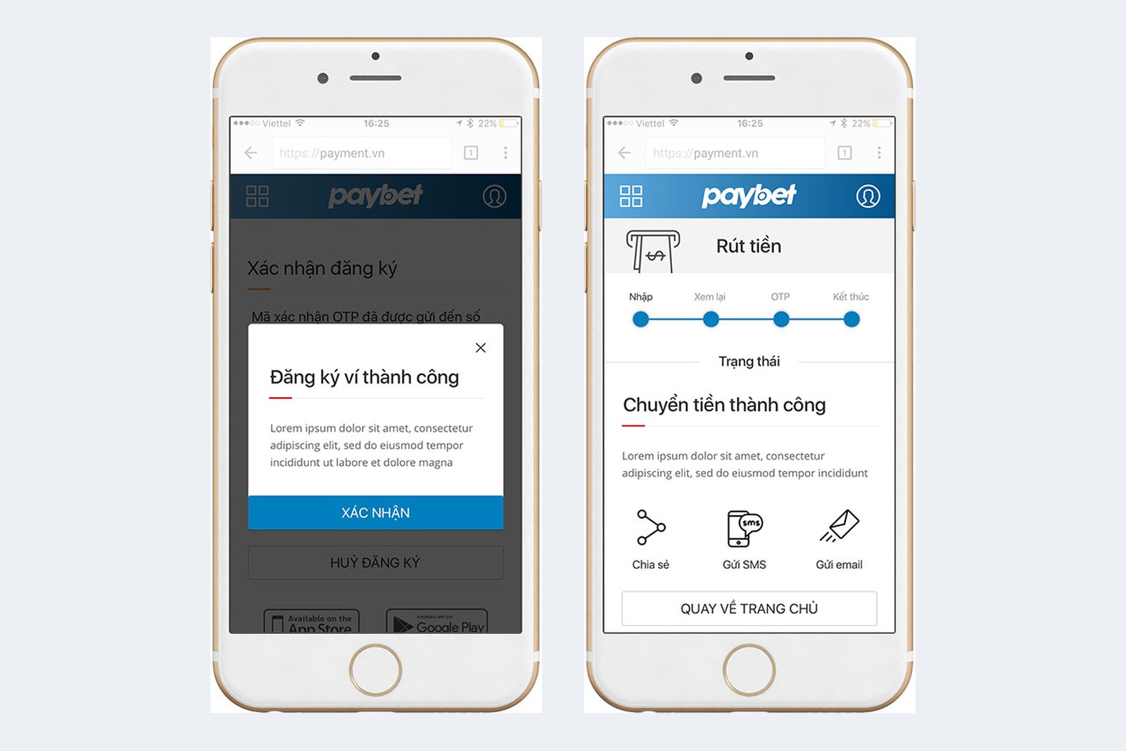
Icons in place of long text
Each service in the wallet has a simple black line icon: bank, password, fingerprint, a phone sending a message. Users see the icon and guess the task, and the accompanying line of text confirms it.
Colour is used sparingly too. Blue for the main action, on a white ground. Red is kept for a few places that need attention, such as the button to upload a verification photo and the hotline number. The two colours are very different, so users spot where to tap.
Verifying the user in three steps
A wallet must verify its user, that is, check that the person is really the account holder. This is where users easily give up halfway. Sinh Vũ placed a three-step bar at the top of the screen: personal details, upload photo, Paybet. When a step is done, its circle turns blue.
The OTP screen (a one-time code sent by text message) has a wide input field, a resend button, and the hotline number right in the top corner. Users who hit a problem know at once what to do.
The result
Paybet has a lean wallet interface, one task per screen, usable on both phones and computers.
With an e-wallet, users must see each step clearly before they feel safe sending money. So Sinh Vũ kept the interface simple, with few colours and many easily understood icons.