
Nishiki: one line of lettering that fits every part of the bicycle
Nishiki is a high-quality electric bicycle brand for Vietnamese riders, developed by Nghĩa Hải. Sinh Vũ designed the logo, shaped the bicycle for school and university students, and made the labels on the bicycle and the printed pieces that support sales.
A bicycle brand for Vietnamese riders
Nishiki is a project for a high-quality electric bicycle brand made for Vietnamese people. The main riders are school and university students.
Sinh Vũ made the full identity (the logo, colours and the way the brand is presented on everything customers see). Sinh Vũ also shaped the bicycle, its labels and the printed pieces that support sales. The whole set had to read as one brand at once, whether it sat on a frame or on a paper bag.
A wordmark drawn over several rounds
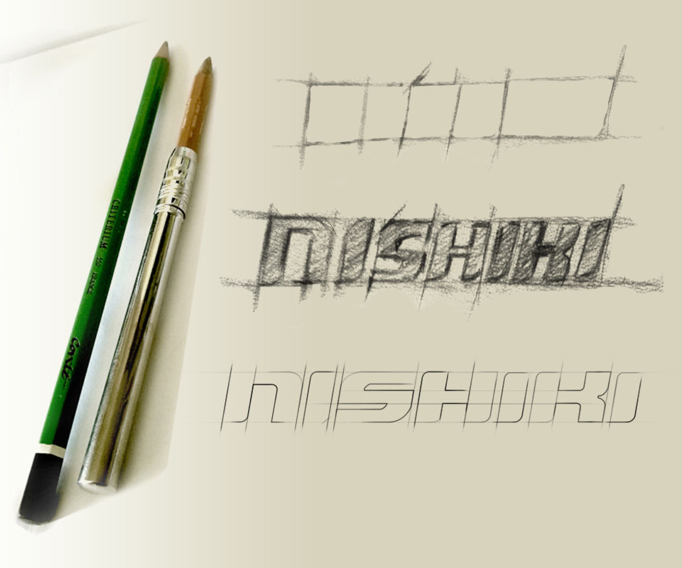
Sinh Vũ first sketched the Nishiki lettering by hand on a square grid, then thickened each letter, and finally redrew it in thin lines to fix the form. The strokes are cut at a slant to suggest movement.
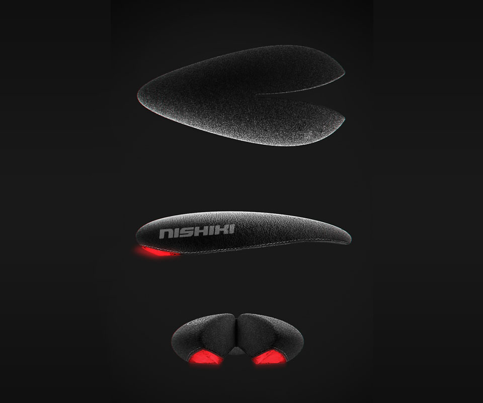
The logo is letters only, kept simple on purpose. A short word is easy to engrave on a wheel hub cap, print on a saddle or stick on a frame, and it still works well in advertising and online.
A lean frame with nothing extra
For the women's electric bicycle range, Sinh Vũ carried out the industrial design (shaping the outside form of a product so it can go into production). The aim was lean and light: cut away extra details and keep only what makes the bicycle convenient to use.
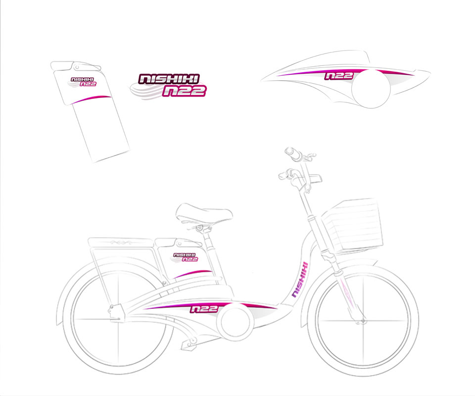
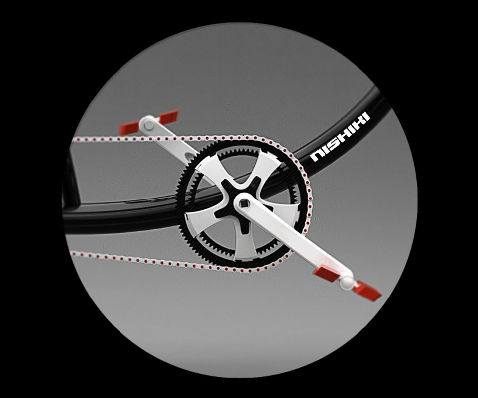
The N22 drawing shows how lettering sits on the body: a Nishiki N22 label on the box under the saddle, a pink-purple band with N22 running along the frame, and Nishiki lettering down the head tube. In each place the letters follow the curve of the part.
From the bicycle to the shop
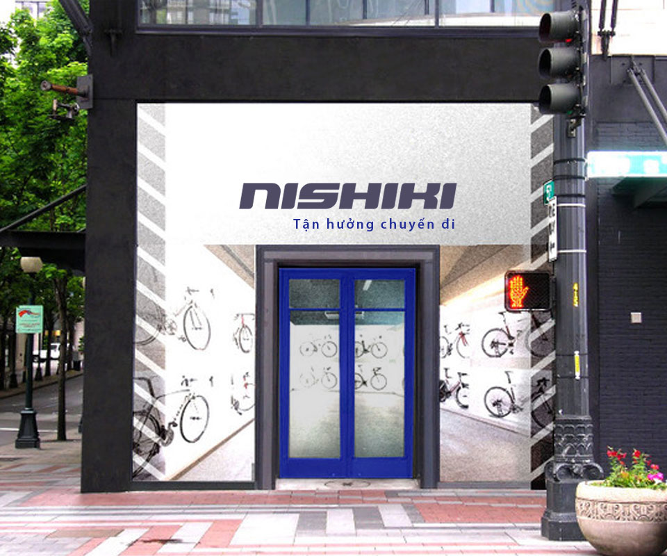
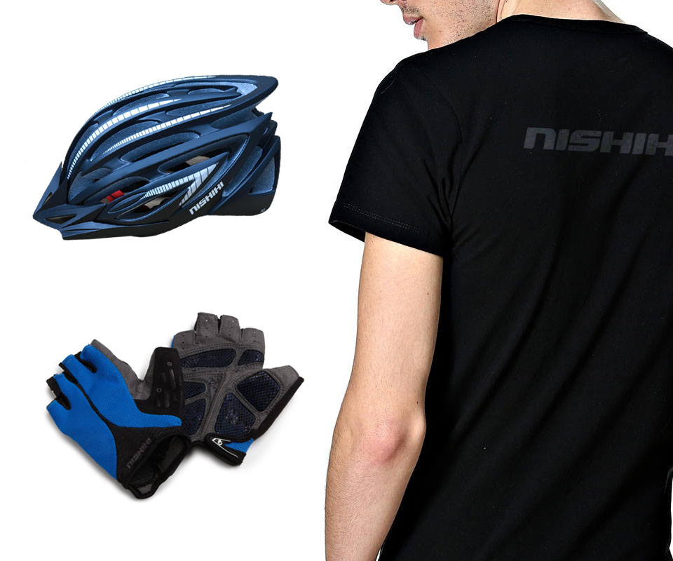
The Nishiki lettering also appears on helmets, gloves and black T-shirts. In the shop, the logo sits on a large glass front beside the line "Enjoy the ride".
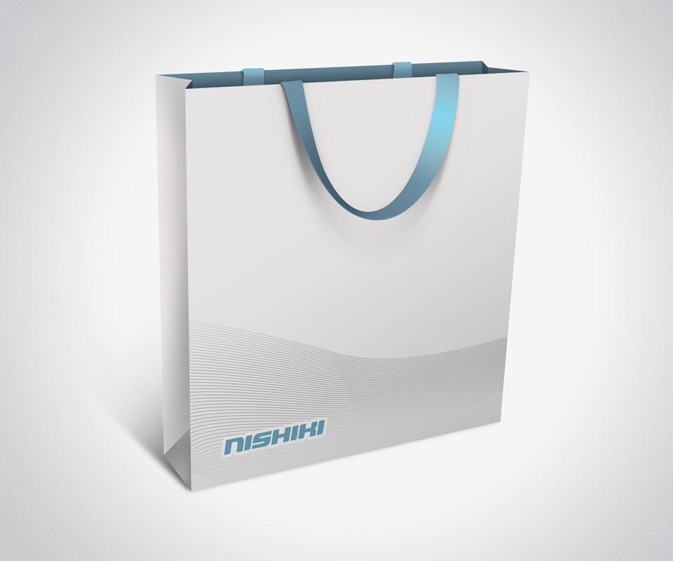
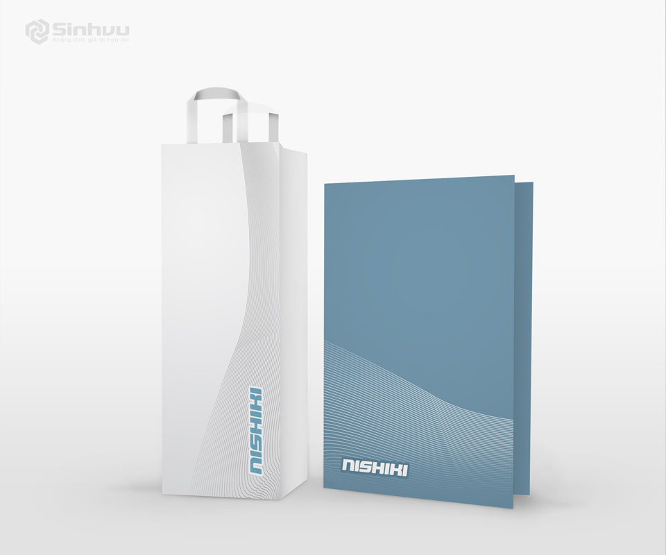
The paper bag and the document folder share one pattern: thin wavy lines along the lower part, with the blue Nishiki logo in a corner. The bag has a white ground and the folder a blue-grey one, yet at a glance they are plainly the same brand.

The value
Nishiki has a wordmark compact enough to engrave on a small part such as a hub cap, and clear enough to read on a shop front. Because the logo is a single line of lettering, whoever makes parts or printed pieces only needs to engrave, print or stick it on, with no redrawing.
From the bicycle and its accessories to the paper bag, everything carries the same line of lettering, so customers recognise the brand easily.
Nishiki lettering on every part
In their own words
I trusted Sinh's way of solving problems completely, and the final result proved that trust right. From the logo and the bike shape for students to the decals, Nishiki went to market with one unified image.