
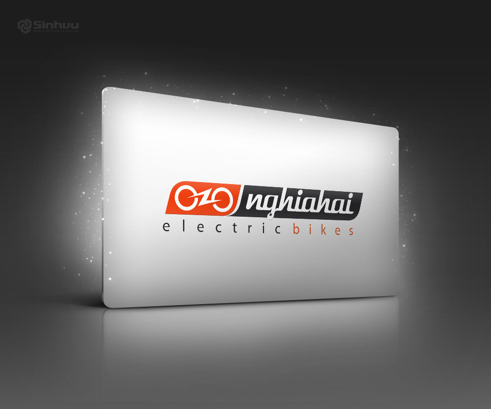
Nghĩa Hải: a logo of two wheels and a bolt of electricity
Nghĩa Hải imports and distributes Japanese bicycles and electric bicycles directly, from the makers Maruishi, Yamaha, Honda and Nishiki. Sinh Vũ designed a logo that joins the shape of a bicycle with a bolt of electricity, then carried that logo onto the website, office papers and bicycle accessories.
A distributor standing beside big brand names
Nghĩa Hải is the official distributor in Vietnam of the makers named above. On the Nghĩa Hải website, each maker's logo always stands beside the company name.
Nghĩa Hải needed a brand identity (the logo, the colours and the way they are used on everything a customer sees) and a website. The main request: at a glance, people should know the company works in electric vehicles. Standing beside big names, Nghĩa Hải also needed a logo clear enough for customers to remember its own name.
Two wheels and a bolt of electricity
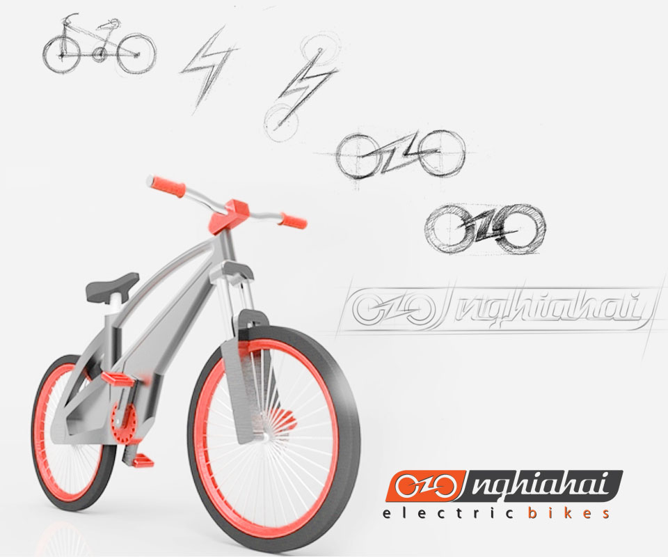
The sketches show the logo being found step by step. Sinh Vũ began with the shape of a bicycle, drew the lightning bolt on its own, then placed the bolt between two wheels. The result is one joined shape: two circles are the two wheels, and the bolt links the two circles.
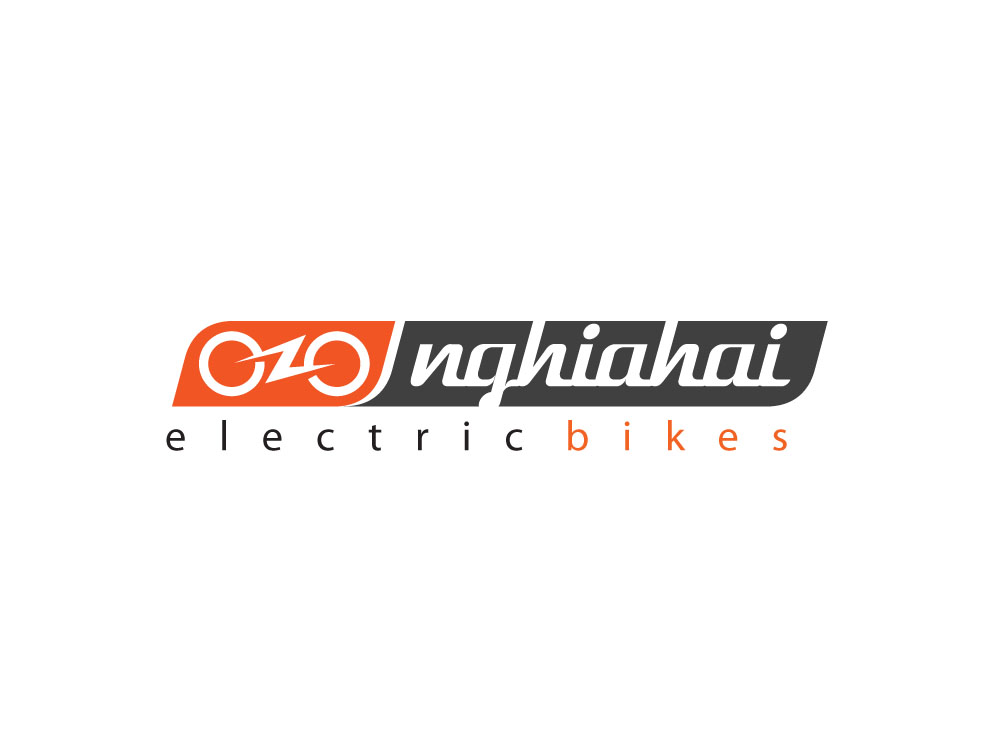
The two-wheel symbol sits in an orange block, joined to a charcoal grey block carrying the name nghiahai in a continuous script. Both blocks have slanted edges, as if rushing forward. Orange is a strong colour, as the brief asked, showing the brand's energy.
Below is the line electric bikes, with the letters evenly and loosely spaced, and only the word bikes in orange.
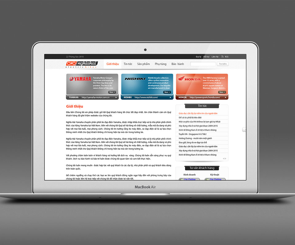
A website with the same logo and colours
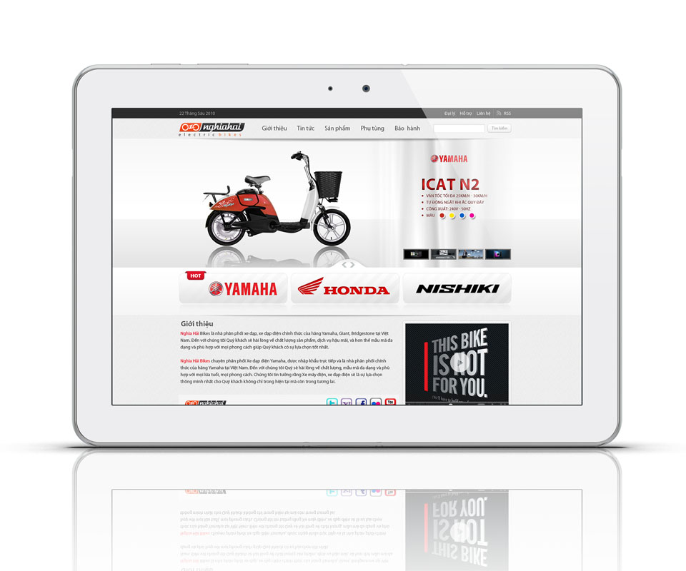
The website has a main menu of About, News, Products, Spare parts and Warranty. Just below is a large picture area presenting each model with its specifications, then three large buttons, Yamaha, Honda and Nishiki, so visitors can choose a maker.
Further down are a company introduction, a news column and a customer advice box. The logo sits at the top left. The section being viewed and the headings are coloured in the same orange-red as the logo, so visitors can easily tell where they are on the page.
From office papers to bicycle accessories
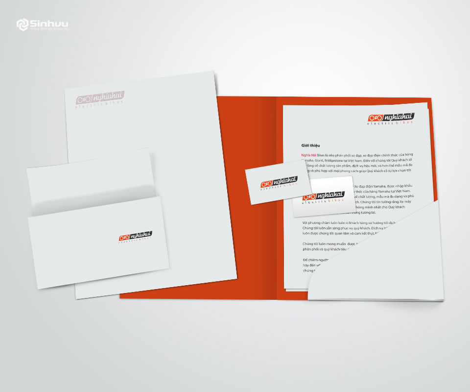
The stationery set includes letterhead, envelopes, business cards and a document folder with an orange inside. The logo sits neatly in one corner, leaving the rest white for content.
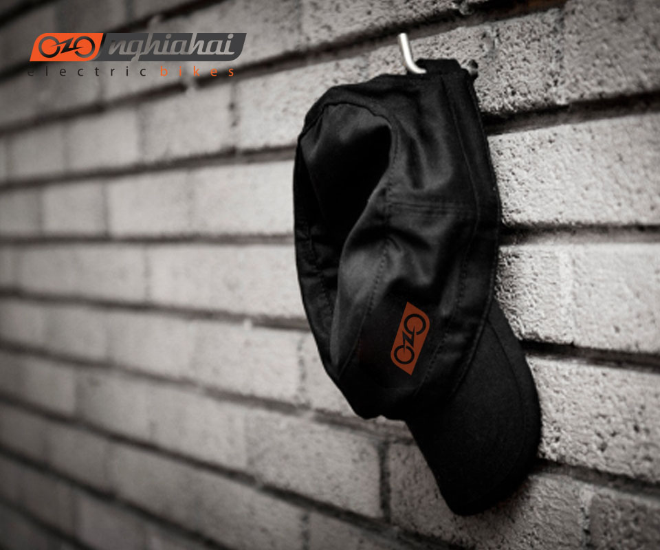
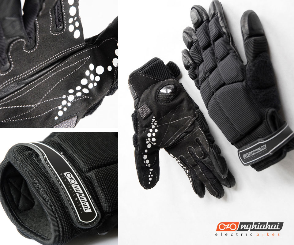
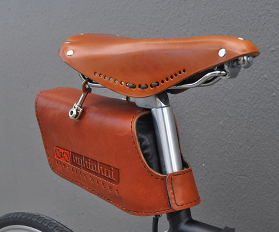
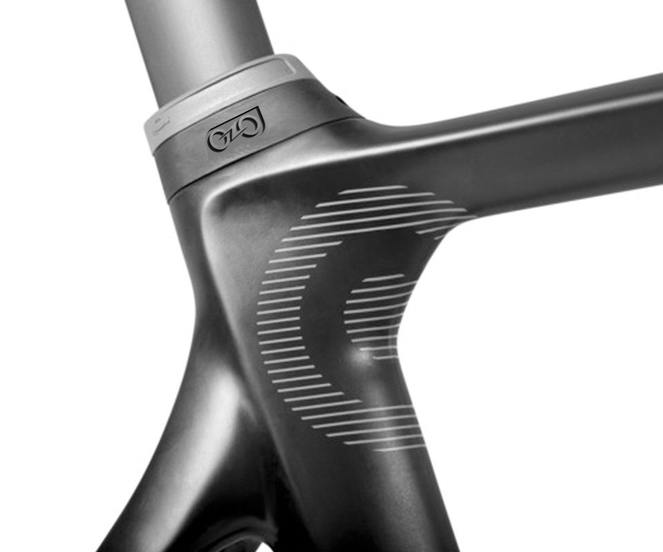
On the gloves and the saddle bag, the logo appears in full, symbol and lettering together. On the helmet and the bicycle's head tube, where the printing area is narrower, Sinh Vũ used only the two-wheel symbol. So however small the object, customers still recognise it as Nghĩa Hải's.
The value
Nghĩa Hải has a logo that says electric vehicles at a glance, and one pair of orange and charcoal grey used consistently from the website to the helmet. Wherever customers meet Nghĩa Hải, they see the same image.
According to Nghĩa Hải's Director, beyond the design itself, Sinh Vũ also helped the company bring the design set into Nghĩa Hải's own systems.
One logo on the bicycle, the web and the accessories
In their own words
I was completely convinced by the logo Sinh Vũ designed for Nghĩa Hải. Beyond the design itself, Sinh Vũ helped us roll the logo out across our whole business, from the website and stationery to bike accessories.