
Nghenhac.info: a nostalgic logo for music lovers
Nghenhac.info is a familiar, long-established online music site, one of those backed by the Vietnam Center for the Protection of Music Copyright (VCPMC). Sinh Vũ designed the logo, the website interface (what listeners see and click on the page) and the identity set, giving the site an image of its own with a flavour of older music.
A familiar music site needing a face
In the 2000s internet connections were slow and licensed music was scarce. At the time, almost every young music fan knew the site.
In 2009 Nghenhac.info passed to Moore Corp, which began investing in its image. The brief to Sinh Vũ was a nostalgic logo that was simple, light on detail, and displayed well on the website and other online channels. Logos online often appear at a very small size, so the simpler the logo, the easier it is to recognise.
Two words, stacked into one block
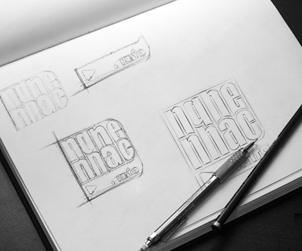
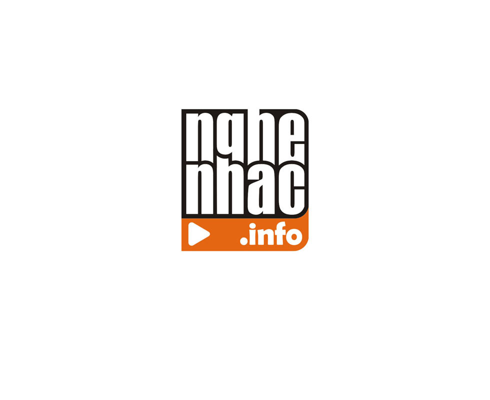
The idea began with the box that holds old vinyl records (the black plastic discs played on a record player), combined with a reworking of the two words Nghe nhạc. In the hand sketches the two words sit on two lines, one above the other. The letters are tall, narrow and close together, like records standing in a box.
The finished version sets the block of letters inside a rounded frame. Beneath it is an orange bar with a play button and the .info ending. The play button is the familiar symbol on every music player, so viewers understand at once that this is where you listen to music.
A website that is easy for listeners
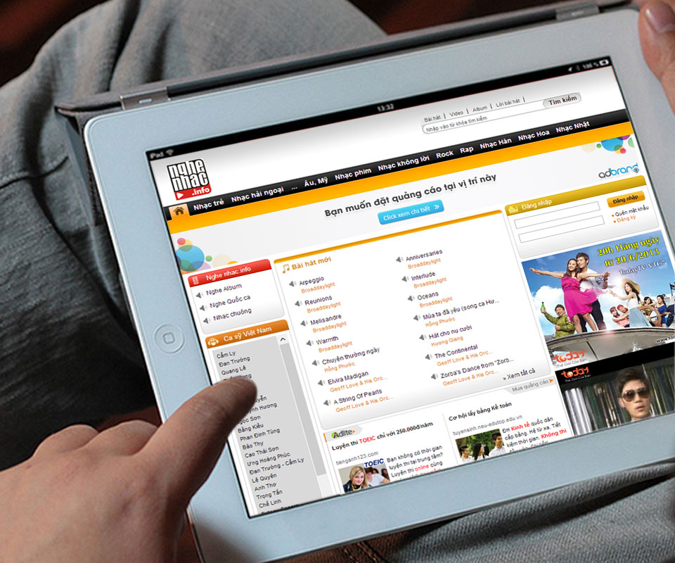
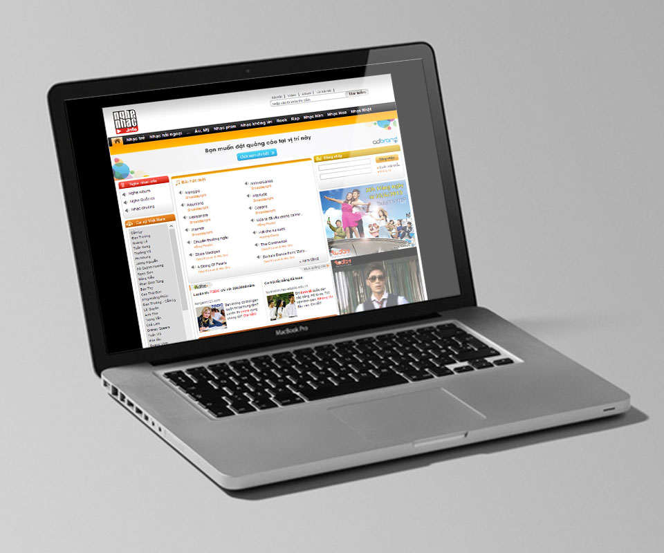
The website interface was researched to have a character of its own and to make listening online more convenient. At the top is a category bar already divided by genre: Vietnamese pop, overseas Vietnamese music, film music, instrumental, Chinese music and Korean music.
The logo stands at the left corner, joined to an orange band running across the page. The middle column lists new songs. The left column has a list of Vietnamese singers to click on. The right column holds the login box. Each area does one job, so listeners find the song they want easily.
A four-colour identity
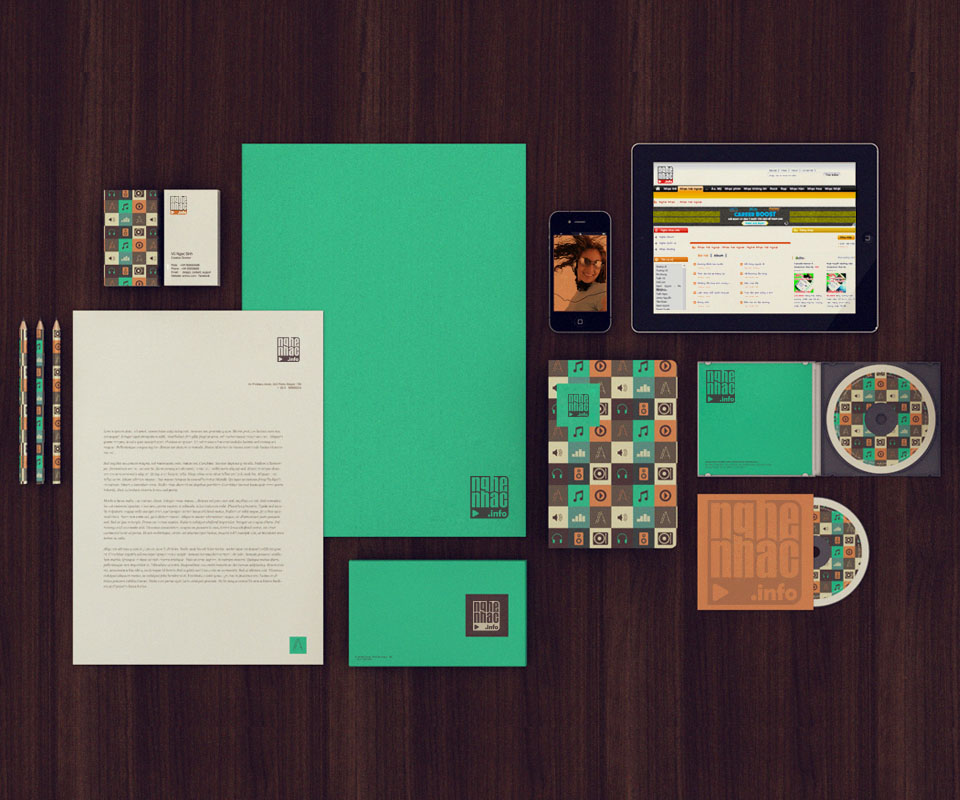
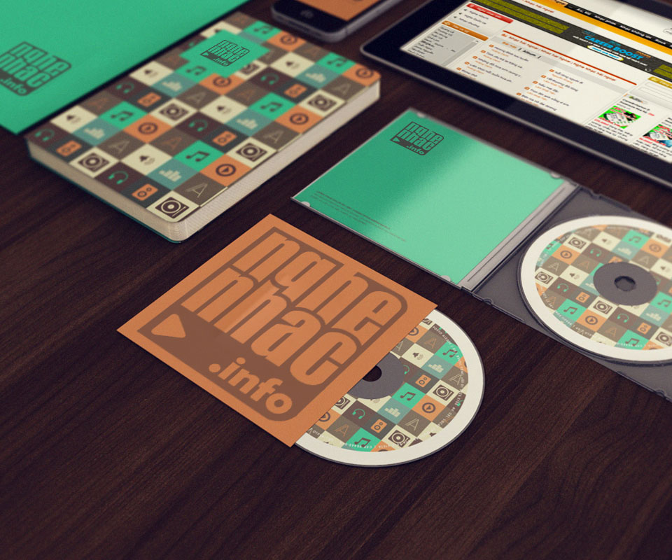
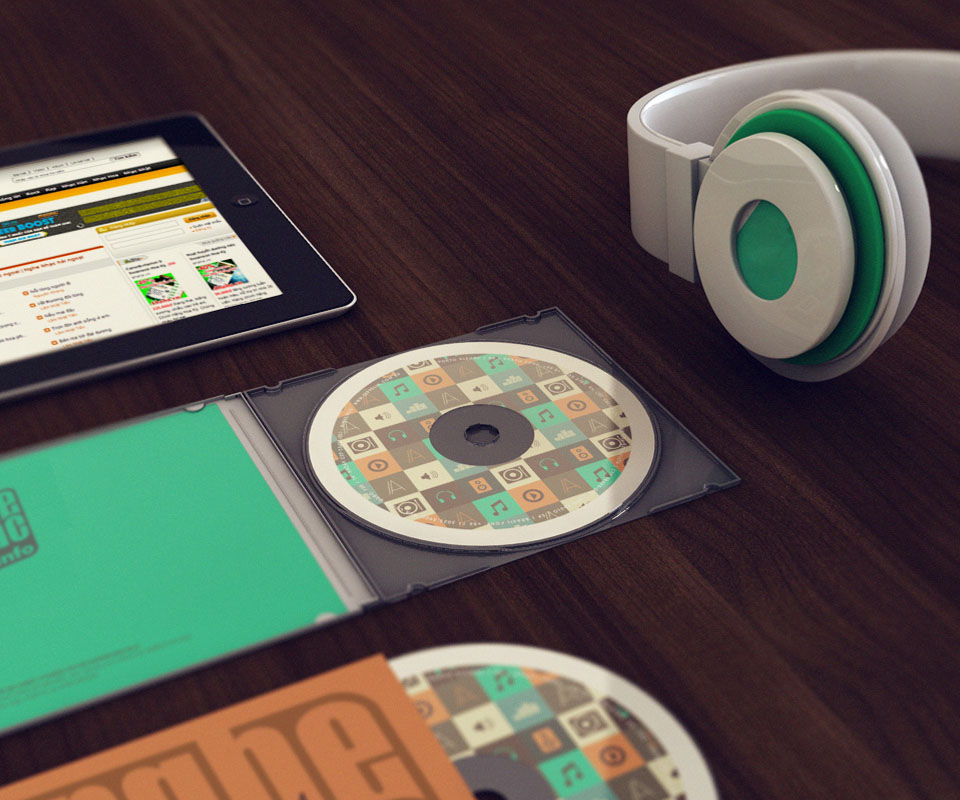
An identity set is the printed items and everyday objects that share a brand's logo, colours and pattern. The Nghenhac.info set uses four colours: jade green, dark brown, cream and orange. The pattern is a grid of alternating squares, each drawn with a music symbol such as headphones, a speaker, a note, a vinyl record or a play button.
This pattern is printed on notebook covers, CD faces, the backs of business cards and pencil barrels. The cream letterhead, jade document folder and orange disc sleeve all carry the logo. Because they share four colours and one set of patterns, items placed side by side are still recognised as one brand.
The value
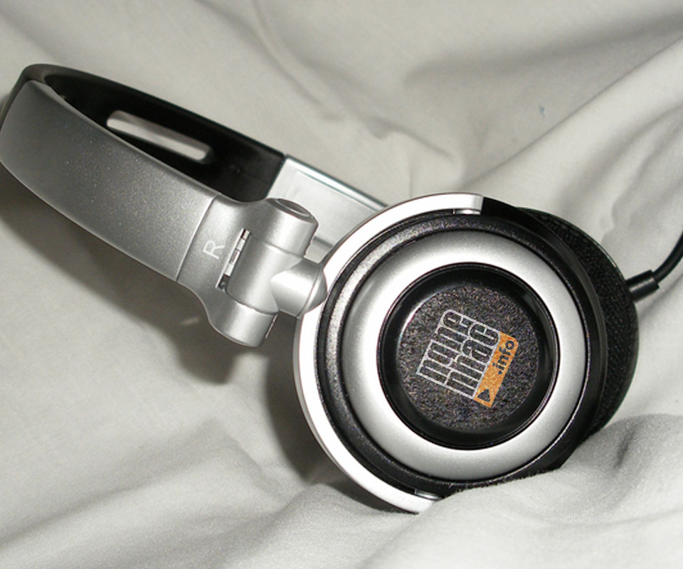
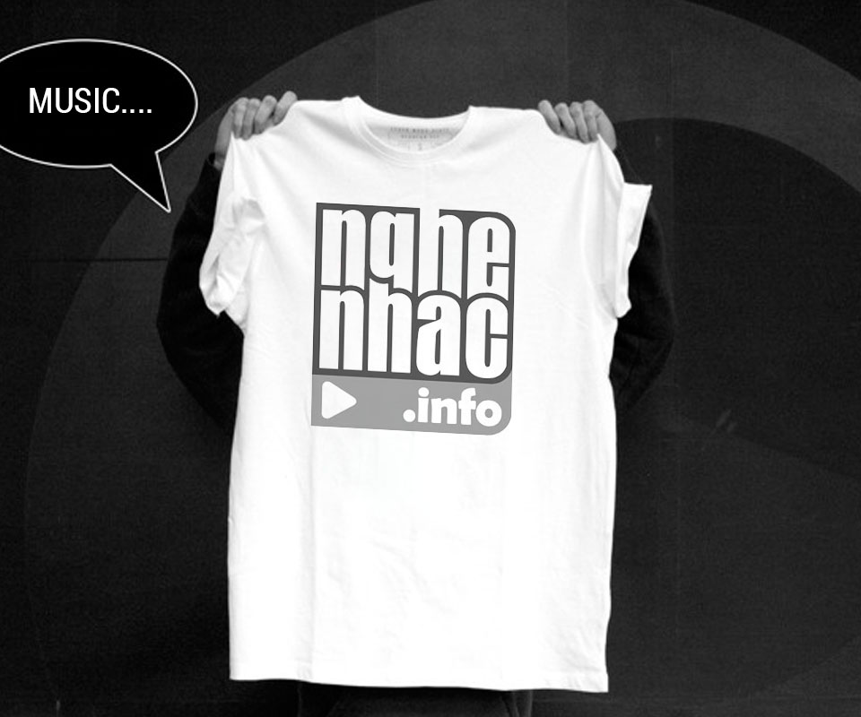
The simple logo can be used in many places: computer screens, tablets, CDs, T-shirts, headphones. Wherever it appears, the logo keeps its two lines of text and the play button, so people recognise it at once.
The CEO of Nghenhac.info remarked that the site has gained a distinctive mark of its own thanks to the logo designed by Sinh Vũ.
A nostalgic logo used in many places
In their own words
The logo Sinh Vũ designed gave Nghenhac.info its own distinctive mark. Among many music sites, ours has a vintage-music feel that listeners recognise at once, from the website to business cards and CDs.