
MFinance, trusted enough by both sides of the money
MFinance connects people with idle capital to people who need it for business, which means convincing two groups who look at money in opposite ways. Sinh Vũ built the positioning, identity system, guidelines and app interface across that gap.

The problem
A capital-matching platform faces a brand problem quite unlike a bank's. A bank speaks to depositors in a steady voice and to borrowers in an assessing one, two roles kept apart. MFinance stands in the middle: the same mark, the same screen, has to make investors see discipline and make people in need of capital feel welcome to approach.
In Vietnam this sector still carries a bad name from predatory lending apps, so people doubt before they trust. MFinance could not afford to look like that crowd, nor should it borrow the airs of a state bank it is not. It needed a face of its own, measured enough to survive scrutiny, warm enough not to feel cold toward someone who needs money.
The approach
Before drawing anything, we sat with the MFinance leadership to read the visual rules of finance: why nearly the whole category picks sober colour, plain-footed type and balanced composition. The answer is not aesthetic but psychological. Someone about to hand over money is looking for signs of solidity, and those conventions are exactly the signs they already know how to read.
From there we settled how to divide the roles. The frame, meaning background colour, structure and typeface, keeps to the category's rules so MFinance never has to argue that it is serious. The mark is allowed to be warm and in motion, because that is where the particular promise is made: capital that passes through here grows for both sides. Knowing where you must look alike is what tells you where it is worth differing.
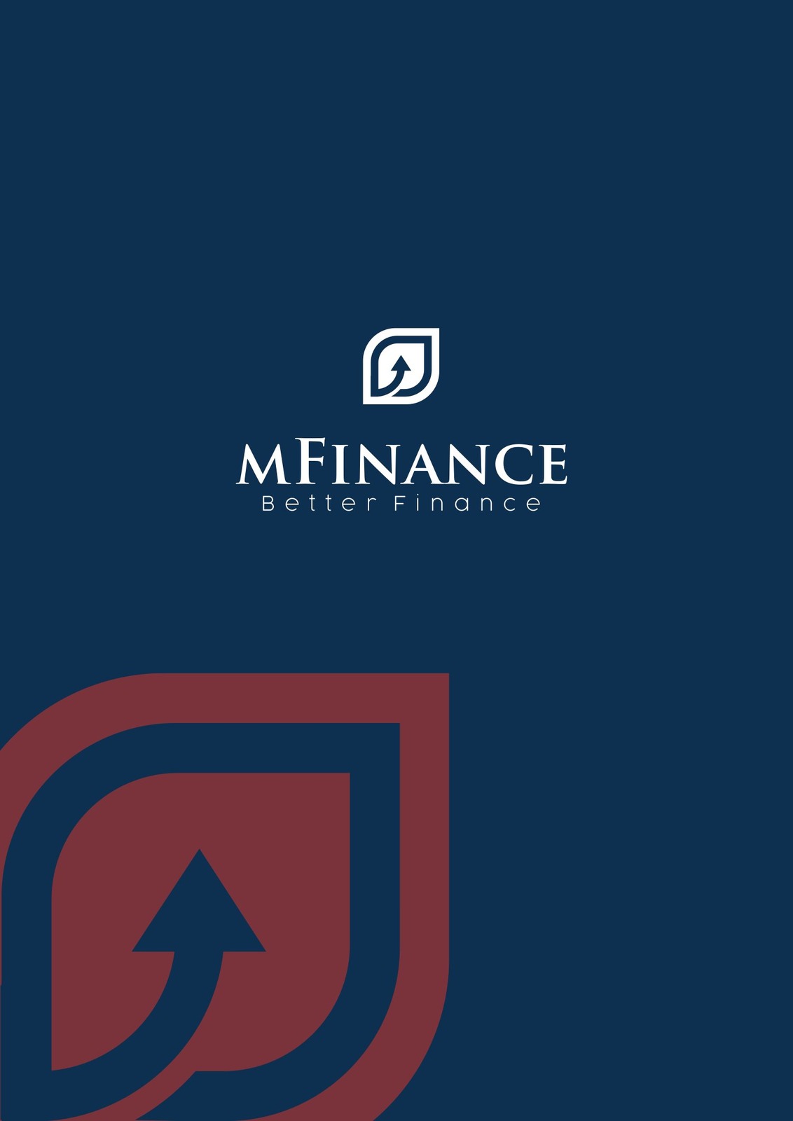
The symbol distils into a rounded droplet with an arrow turning upward inside it. The droplet suggests refinement and softness, the arrow speaks the thing both sides hope for: capital that grows. Coral red is reserved for the mark alone, the one warm note allowed to stand out, bright enough to catch the eye on navy without disturbing the sense of safety.
The lettering runs the other way: MFINANCE is set in serif type, generously spaced, dignified beside a contract. The warm mark and the formal lettering hold each other in place, while the line Better Finance sits beneath as a reminder that this platform exists to make money matters easier, not faster.
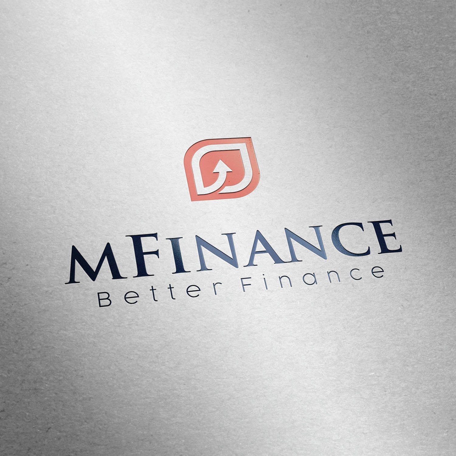
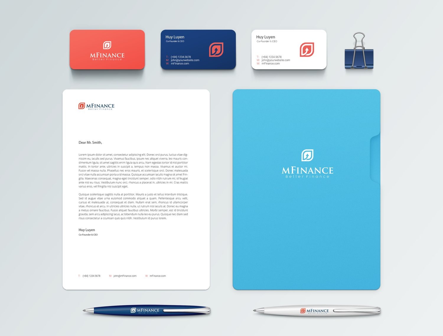
The guidelines were written so MFinance would not break apart as it multiplied: which logo version goes on dark, how much breathing room is the minimum, how ink on paper shifts away from colour on screen, at what size the accompanying type sits. Because of them, someone who joins in the sixth month still produces the MFinance of the first.
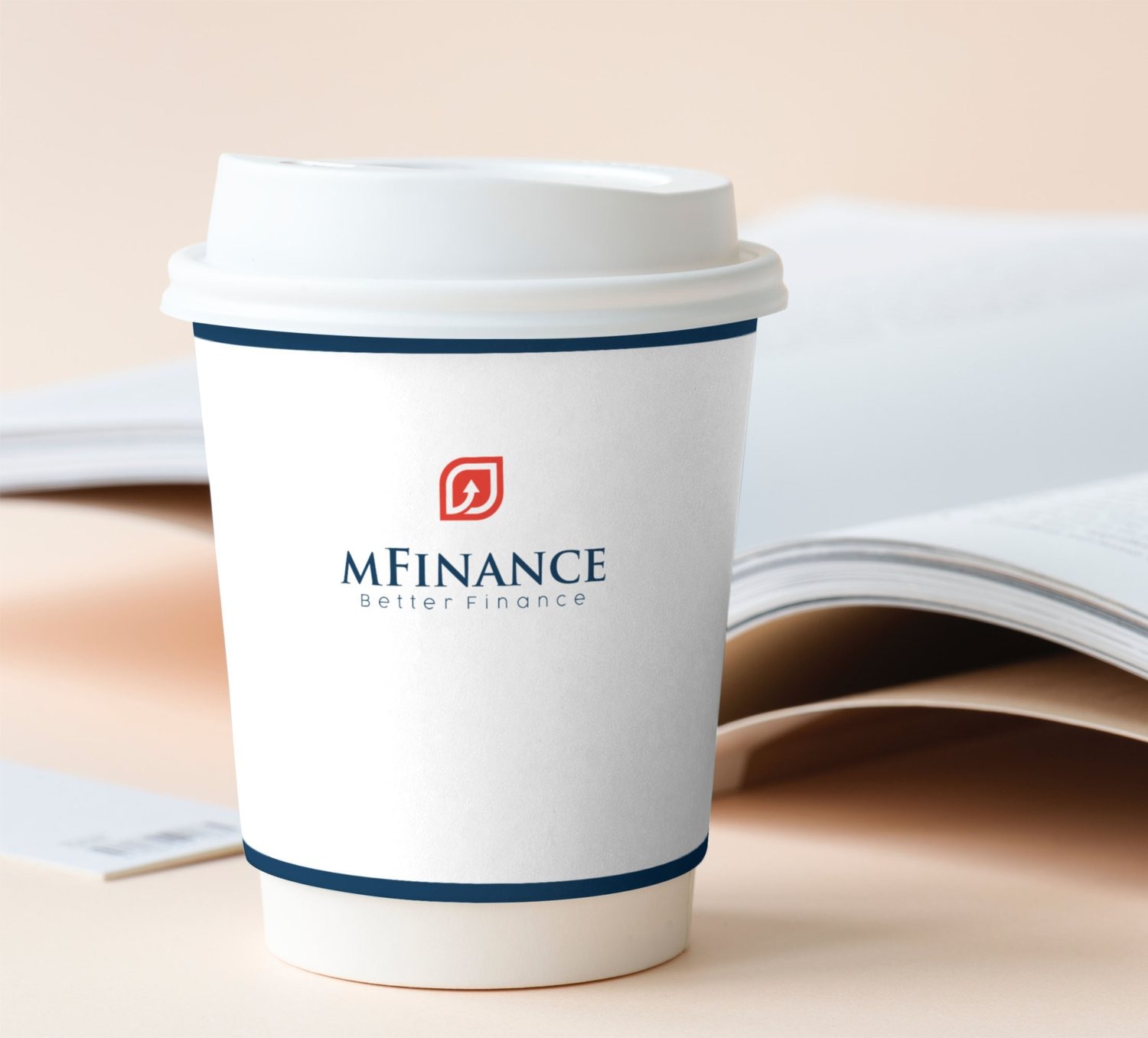
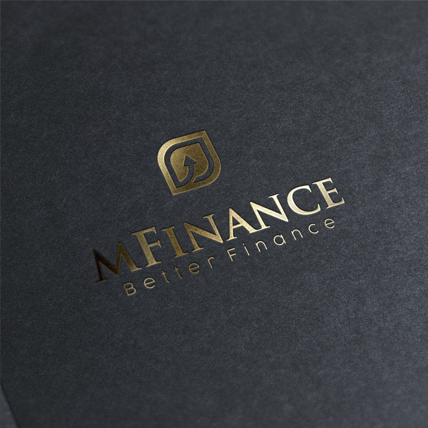
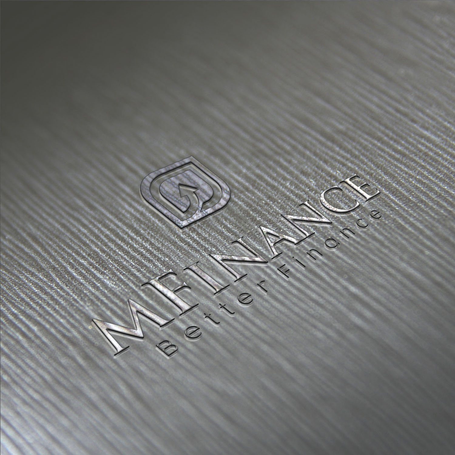
From the guidelines the system moved into office stationery, sales materials and pieces for investor meetings. The mark was tested across finishes: gold foil on dark stock, blind emboss on board, single-colour print on a paper cup. Every drawing looks good on a screen; only the drawing that accounts for the local print trade survives intact once it is in your hand.
Users meet MFinance most often on a phone screen, checking on their own money. The interface follows the order people actually need: the balance sits at the top, recent movements directly beneath, everything else steps back. A clickable prototype was built before engineering began, so the arguments happened while they could still be settled by dragging a few things around.
On the familiar navy, coral red works like a guiding light, appearing only where something must be tapped or noticed. The brand here is not on display, it is at work: it tells users where they are and what matters. On a financial platform, the feeling of being in control is the feeling of being safe.

The result
What MFinance gained was not a handsome set of images but one consistent way of appearing everywhere both sides meet it: the office glass door, the document on the meeting table, the coffee cup at an appointment, the app screen at midnight. Repeated often enough, the same mark becomes the thing people recognise before they read the name.
Endurance is the part worth noting. The identity built for MFinance is still the face the company uses on its official site today, across several changes of product and message. In finance, holding your appearance steady over years is not a matter of taste, it is evidence of discipline, which is precisely what someone about to hand over money is looking for.
One mark, many finishes
Is your problem similar to MFinance?
Tell Sinh Vũ what's on your mind about your brand. Sinh Vũ will point you to the right direction right away.