
ITA Express: a news site in the Tan Tao group's style
ITA Express is the online newspaper of Tan Tao Investment & Industry Corporation (ITACO), covering trade, business exchange and sector news. Sinh Vũ designed the logo and the news site interface. Readers see at once that the site belongs to the Tan Tao group.
A news site must look like part of the group
ITA Express is the online newspaper of ITACO. Its content focuses only on trade, business exchange and sector news. The client asked for two things: a logo in the same style as the Tan Tao Group logo, and a website that is simple and easy to use, even for first-time visitors.
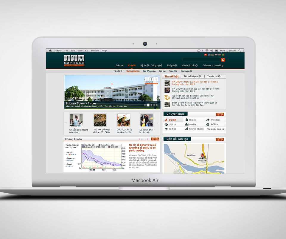
A news site puts a great deal on one screen: top stories, video, stock charts, a map. So the layout has to be clear and tidy. The site also needed to use the group's identity colours, so readers can tell this is a Tan Tao news site and not just any newspaper.
Three letter boxes and a banner of text
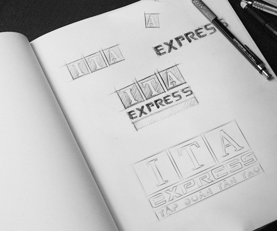
The pencil sketch shows the logo starting from three letters, I, T and A. Each sits in a square box and is a serif letter (with small strokes at the start and end of each line, like printed book type). The word EXPRESS sits directly beneath, bold and square, running as a horizontal band that wraps the three boxes.
The small line TAN TAO GROUP sits in the bottom band. This way the logo carries the news site's own name, yet anyone looking at it knows which group the site belongs to.
An interface in the group's colours
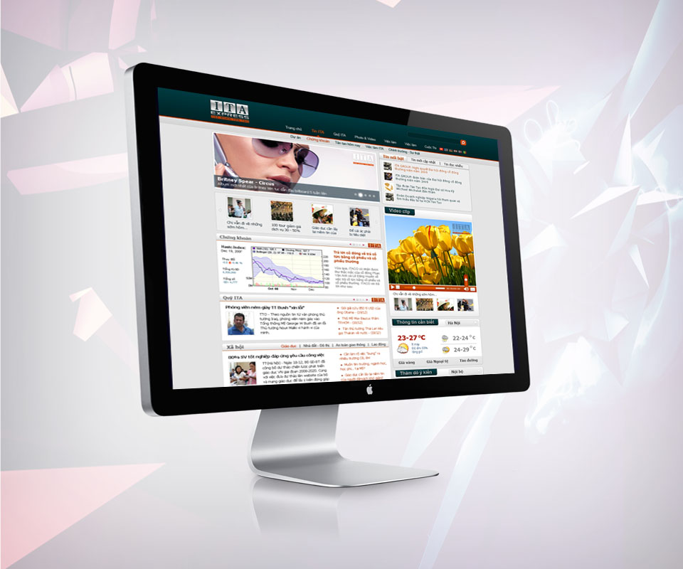
The site uses a deep blue header bar, with the open section shown in orange, following the group's identity colours. Below the bar are two rows of categories, a large news picture and a column of top stories on the right. Next come the blocks for stocks, video and an industrial-park map.
Each block has its own title bar, and every bar carries a small ITA logo at the right corner. Readers scrolling down always know which block they are viewing, and know the news comes from Tan Tao.
The logo on paperwork and everyday items
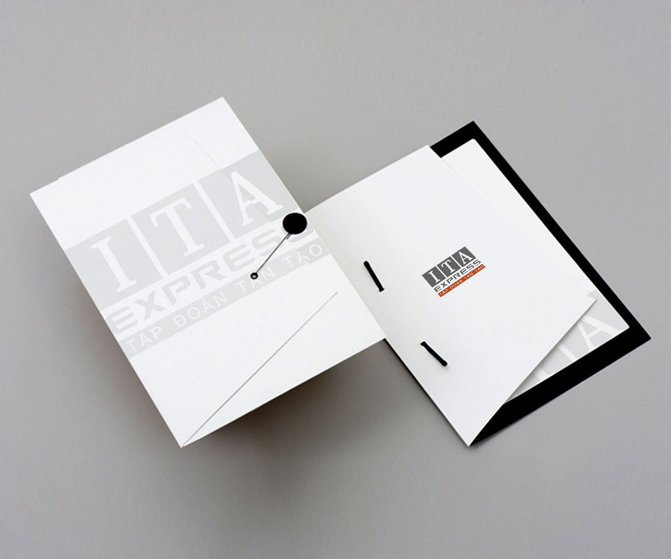
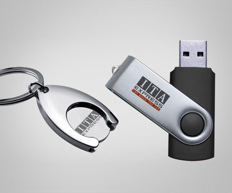
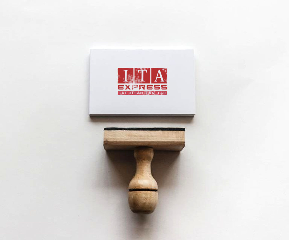
The logo was tried on many items: a file cover, a notebook, a USB stick, a key ring and a card printed like a seal stamp. There is a grey and orange version, an all-red version and a single-colour grey version, depending on the material of each item.
The colour can change, but the three letter boxes I, T, A and the EXPRESS band below stay the same. So the logo is still recognisable whether printed faintly and large on a file cover or engraved small on a metal key ring.
The value
ITA Express has a logo with its own name yet in the same style as the group, and a clear news interface that is easy to scan. According to the client, the site was finished in only 20 days.
Sinh Vũ chose to use Tân Tạo's own identity colours for the news site instead of creating a new palette. The site still has its own name and logo, while readers recognise at once which group the news comes from.
Three letter boxes on many materials

In their own words
Fast, professional design work. Everyone worked well together, and the news site was finished in just 20 days. Readers can tell at a glance that ITA Express belongs to the Tân Tạo group.