Gotadi: hotel booking in three clear steps
Gotadi.com is a hotel booking website, with sections for flights and tours as well. Sinh Vũ designed the interface of the main pages, from searching for a hotel and choosing a room to filling in details and paying.
One website, many things to choose
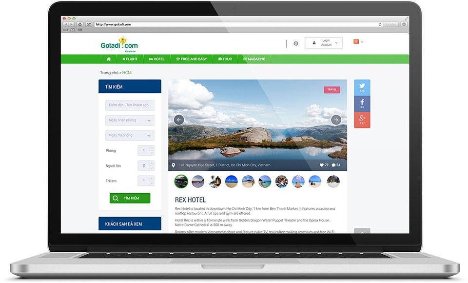
Gotadi.com is where people find and book hotels. The green menu bar at the top of the page is split into Flight, Hotel, Free and Easy (self-guided trips), Tour (group trips) and Magazine.
Someone booking a room weighs many things at once: destination, dates, number of rooms, number of guests, price. So Sinh Vũ arranged each of these in its own block, so that users can see at a glance which step they are on.
Search and compare
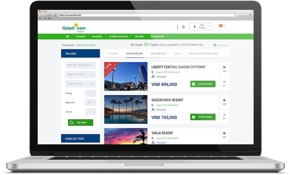
On the hotel page and the results page, the left column always holds a Search box with every field: destination or hotel name, check-in date, check-out date, number of rooms, adults and children. To change a date or destination, users edit it on the spot instead of going back to the home page.
The results list gives each hotel its own row: a large photo on the left, and on the right the name, area, room type, price and a green Choose room button. Tabs above let users sort by Gotadi's suggestions, lowest price, star rating or guest reviews. A red discount label sits at the corner of the photo, so it is seen straight away.
Three steps to book
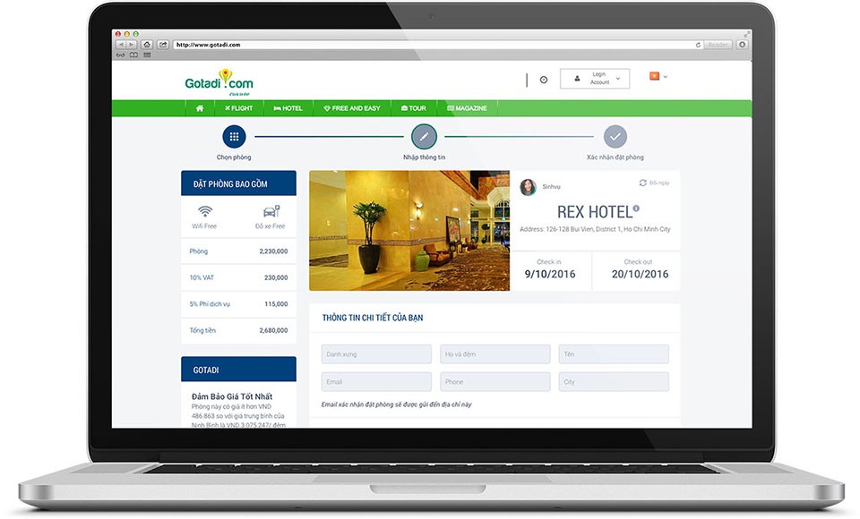
When booking, the top of the page shows a bar of three steps: Choose room, Enter details, Confirm booking. Each step is a circle with an icon, joined by a line, so users know how far they have come and how many steps remain.
The left column is a price breakdown: room charge, 10% value added tax, 5% service fee and the total, along with included facilities such as free wifi and free parking. On the right are the hotel photo, the check-in and check-out dates, then the fields to fill in. The fields are lined up, each with a clear label, so guests can fill them quickly.
Payment and confirmation
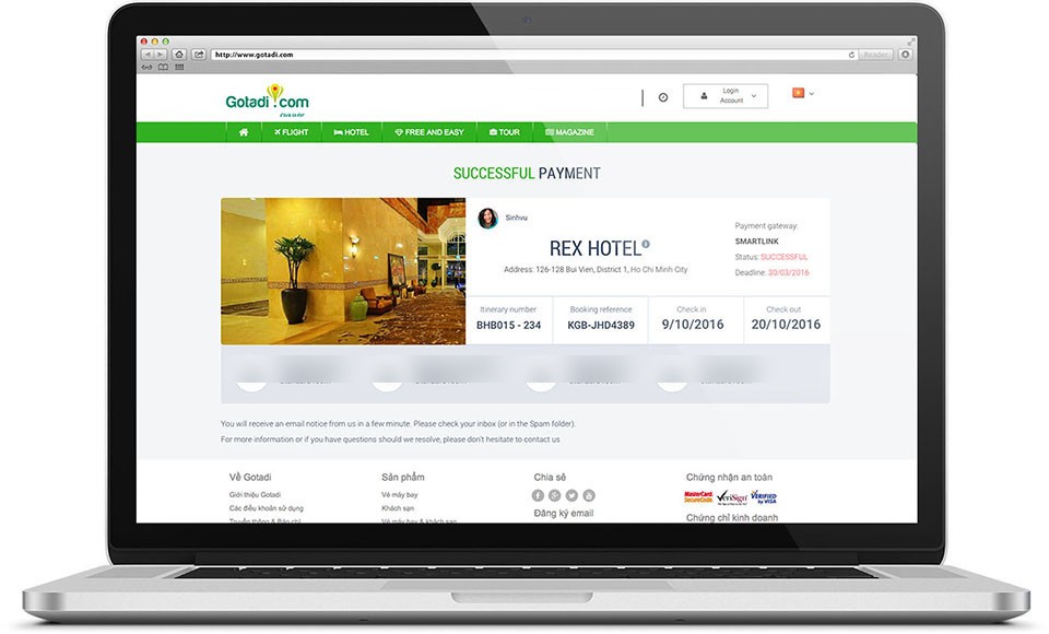
The confirmation page opens with large text reading Successful Payment. Below it is a summary card: hotel photo and name, payment gateway, status, trip code, booking code, check-in and check-out dates. Guests only need to look at this card to know the booking is done.
The footer is split into four columns: about Gotadi, products, share buttons with a newsletter sign-up, and the security badges of Visa and MasterCard. These badges sit on the payment page to give guests more peace of mind when paying online.
The value
The four pages in the project share one frame: the logo and green menu bar above, a dark green title block in the left column, green buttons. Users move from page to page without having to learn the site again.
On a booking website, guests pay only after getting through every step. So Sinh Vũ kept the search box in one fixed place and put the three-step bar at the top of the page, so guests always know where they are and what comes next.
From finding a room to paying
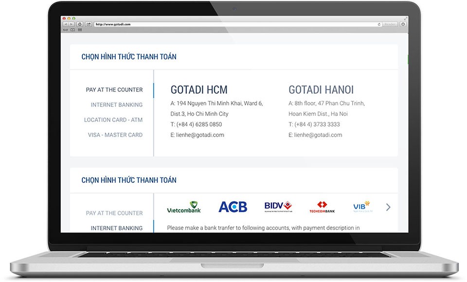
Payment methods