Gieo Mầm Hạnh Phúc, planted into every heart
Gieo Mầm Hạnh Phúc is a nonprofit community project built on the belief that family happiness is something you can learn and something you can plant. Sinh Vũ built the strategy and identity to give that belief a warm enough shape to travel from one heart to a whole community.
Invisible things don't spread
Gieo Mầm Hạnh Phúc began with a simple belief: happiness in marriage and family is not a matter of luck, but something learned and passed on. The two founders, Hương and Hoa, together with leading experts in the field, wanted to carry that belief further, growing it into a club present across many regions.
But kindness that stays invisible is hard to spread. It needs a face so a stranger can recognise and trust it from the first encounter, on a business card, a shirt, or a sign. The difficulty was never drawing something pretty, but keeping the warmth from slipping into cliche: the heart, the hand, the generic pink already worn thin to the point of meaning almost nothing. Sinh Vũ's task was to make the feeling of planting and sharing visible while keeping it real.
Happiness is something you can plant
We did not start from a drawing, but from a word already sitting inside the name: plant. To plant is to put a seed in the ground and trust it will grow. Placed next to that word, happiness stops being a story about soothing sadness and becomes a story about tending something that is rising. This is where Gieo Mầm Hạnh Phúc differs from most groups on the same theme: not sympathy, but hope.
That positioning became the ruler for everything after. Every choice of colour, line, and letterform had to answer one question: does it make people feel they are planting a seed of hope, or merely soothing sadness? Whatever leaned toward the latter, however soft, was set aside.
Drawn without lifting the pen
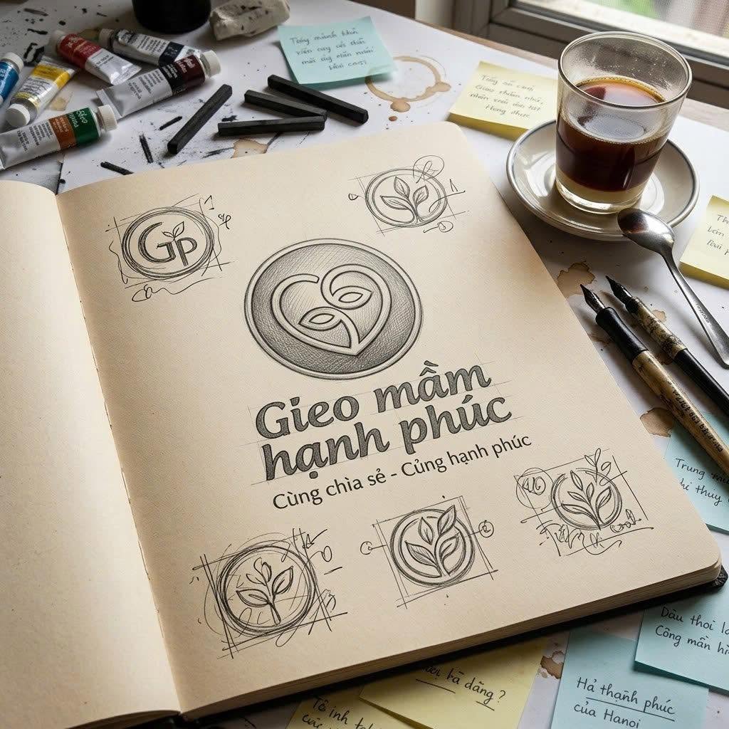
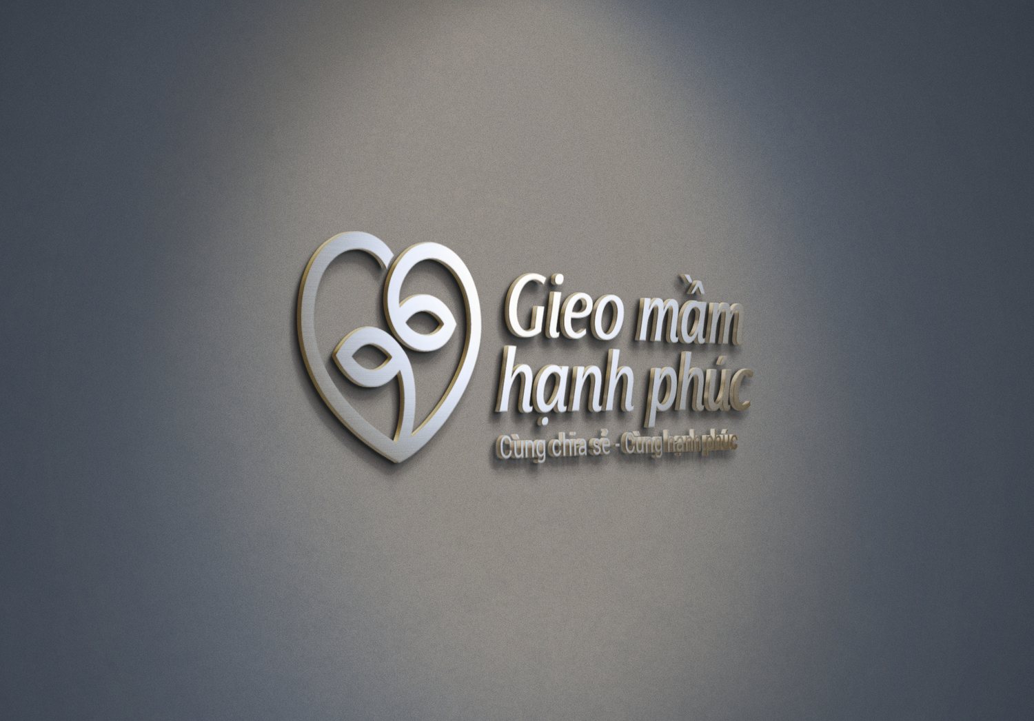
The mark comes down to a single drawing made in exactly one continuous line, without lifting the pen: the same stroke that forms the heart also curves into a two-leaf sprout resting inside it. Sinh Vũ chose deliberately not to separate the two shapes. In this project, loving and planting are the same gesture, so the line could not break either.
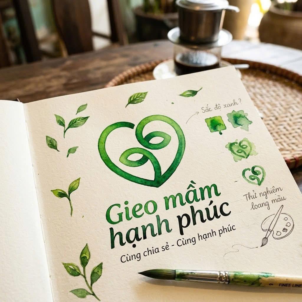
The two leaves reaching from the sprout speak of giving and receiving, true to the club's own words about sharing together, being happy together. Green belongs to the sprout, to rising life; deep indigo belongs to the letterform, to trust and calm. The whole mark reads in a single glance, before anyone has time to read the name.
Living at every touchpoint
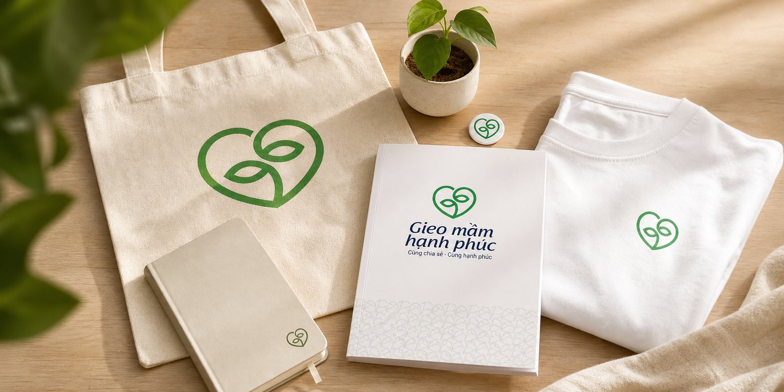
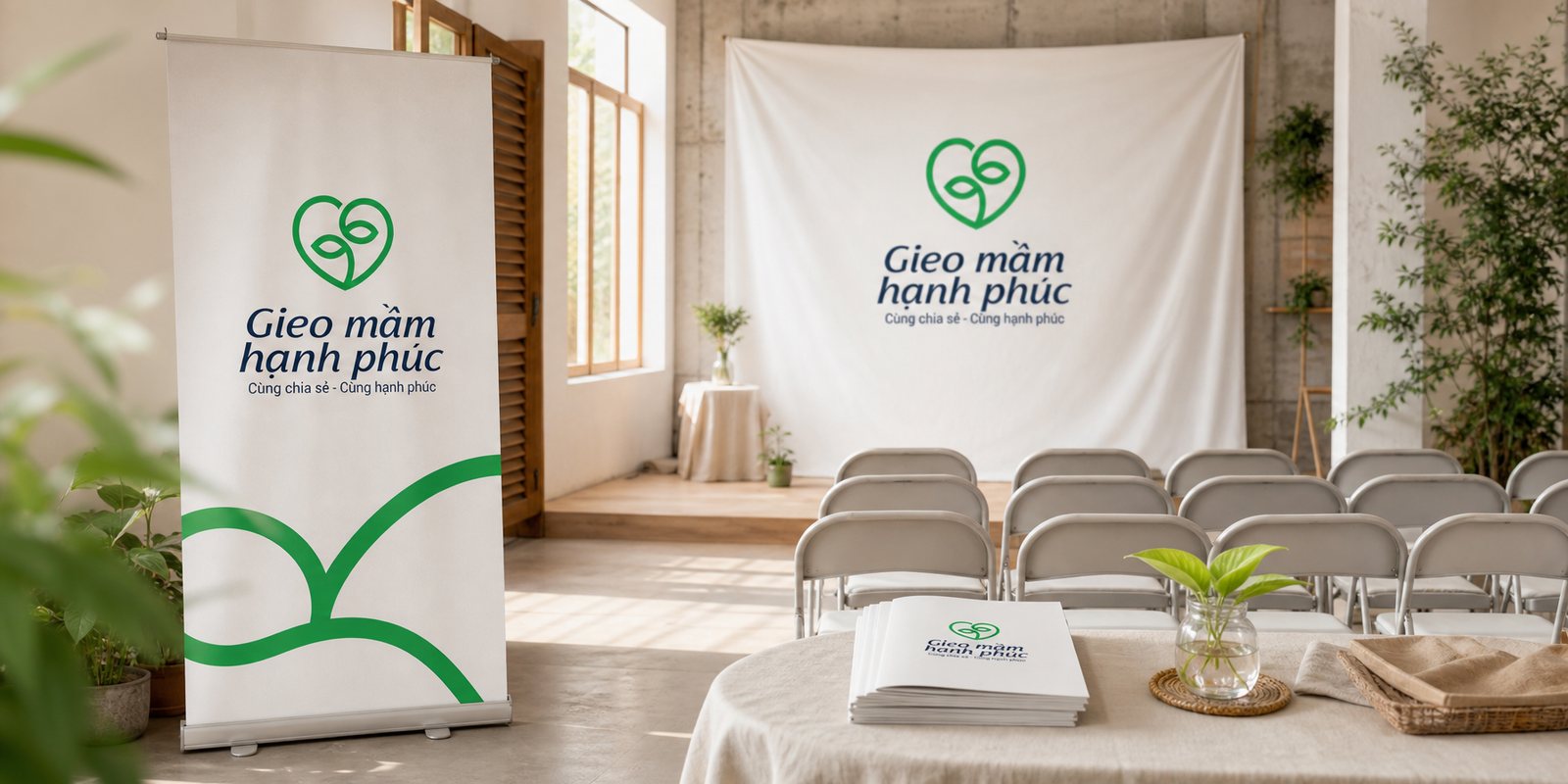
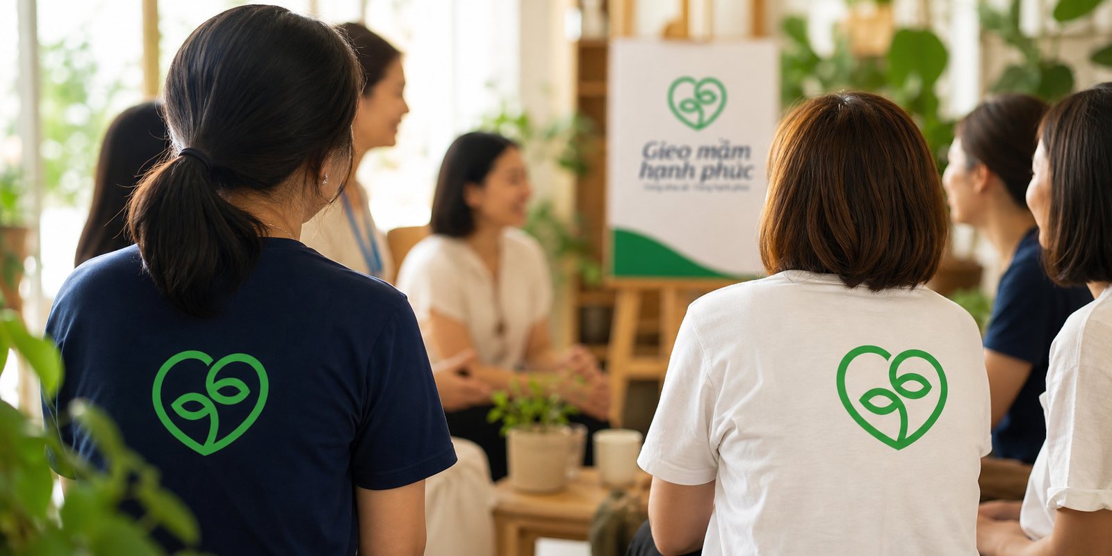
From that mark, we extended a system usable everywhere the club reaches: business cards, letterhead, envelopes, notebooks, member shirts, right down to the signage where people gather. The thread running through all of it is clean, bright, and modern, so a theme easily pulled toward sentimentality keeps its kindness while staying fresh.
Because Gieo Mầm Hạnh Phúc grows through people across many regions, the identity system was built like a toolkit anyone can pick up and use correctly: internal materials and public-facing ones both call on the same face. That way, each newly opened group does not have to rethink the brand, only place the familiar mark once more.
Made together with the people involved
This is a project made together with the people living it. We sat with the members' wishes, recorded them, and studied them closely before drawing a single line, because a community brand is only right when it speaks in the voice of the very people who built it.
What we handed over in the end did not stop at a logo, but an open system with clear guidelines: the mark, the colours, how to apply them across each piece. So that as the club travels further, reaching more regions, the brand stays itself, instead of looking different in every place.
Value
What Gieo Mầm Hạnh Phúc gained was not a mark to admire, but a face that lets kindness travel further. A stranger meeting it on a business card or a shirt already trusts it in part, before hearing the whole story. As the club grows through each region, it grows under one recognisable name, instead of scattering into a different look in every place. For a project that lives on belief and volunteer hearts, a consistent face is not there to look polished, it is what lets the seed be planted so much further.
An idea takes shape, then meets reality
A mark only comes truly alive once it leaves the page: from a pencil sketch, through a wash of watercolour, to a business card placed in someone's hand.