
FTL: a logo meaning fast, accurate, reliable
FTL provides telecommunications solutions and electronic payment systems for banks, financial institutions and mobile operators. The company's leadership wanted the logo to say three things: fast, accurate, reliable. Sinh Vũ designed the logo and brand identity (the system of visuals used consistently across all of the company's documents and objects) around exactly those three.
Three things the leadership wanted to say
FTL works with banks, financial institutions and mobile network operators. The company's leadership wanted the logo to show their determination through three qualities: fast, accurate, reliable.
The brief had two parts. The first was designing the logo and brand identity (the system of visuals used consistently across all of the company's documents and objects). The second was how to put the logo on stationery (business cards, paper bags, hang tags) and on signage.
A flame becomes the crossbar of the f
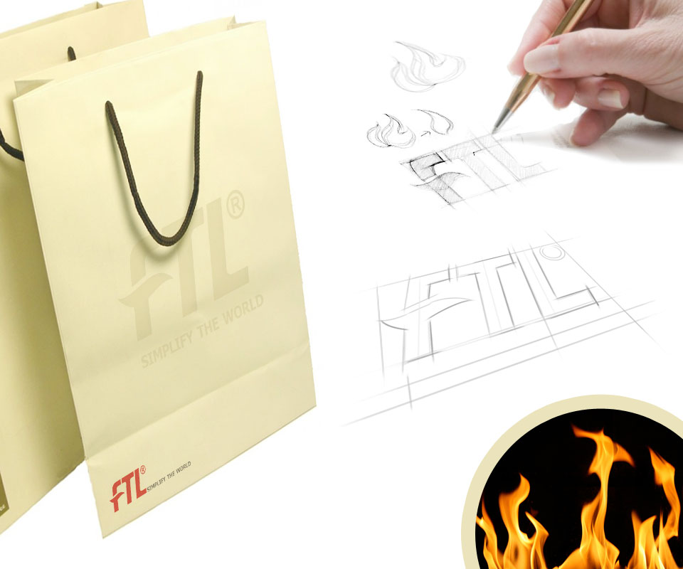
Sinh Vũ chose the flame as the central idea and used it throughout the logo and FTL's identity imagery. Hand sketches tried many flame shapes, then grid lines were drawn to space the three letters F, T and L evenly.
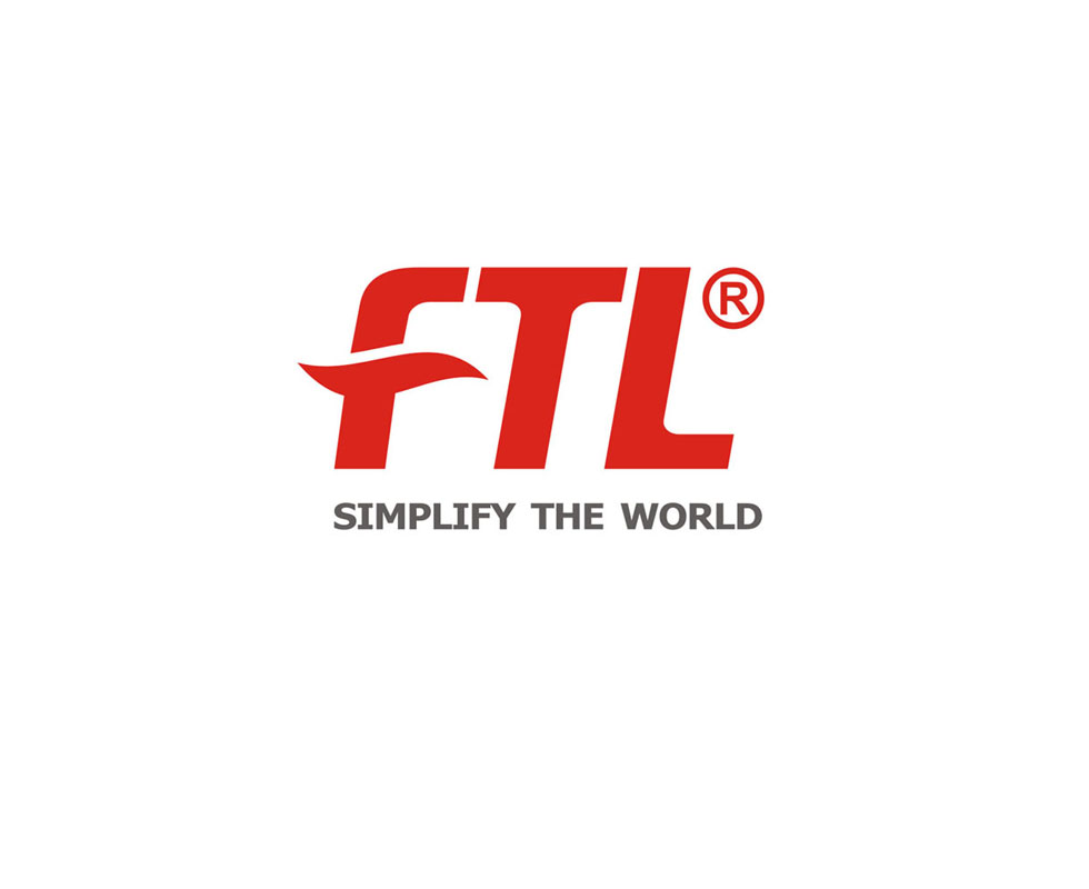
In the final version the flame is reduced to one soft curve, taking the place of the f's crossbar. The three letters are bold, slanted forward and red. Beneath them sits the slogan Simplify the World in grey. The bold letters give a sense of solidity; the slant and the flame stroke give a sense of speed.
The logo on every kind of ground
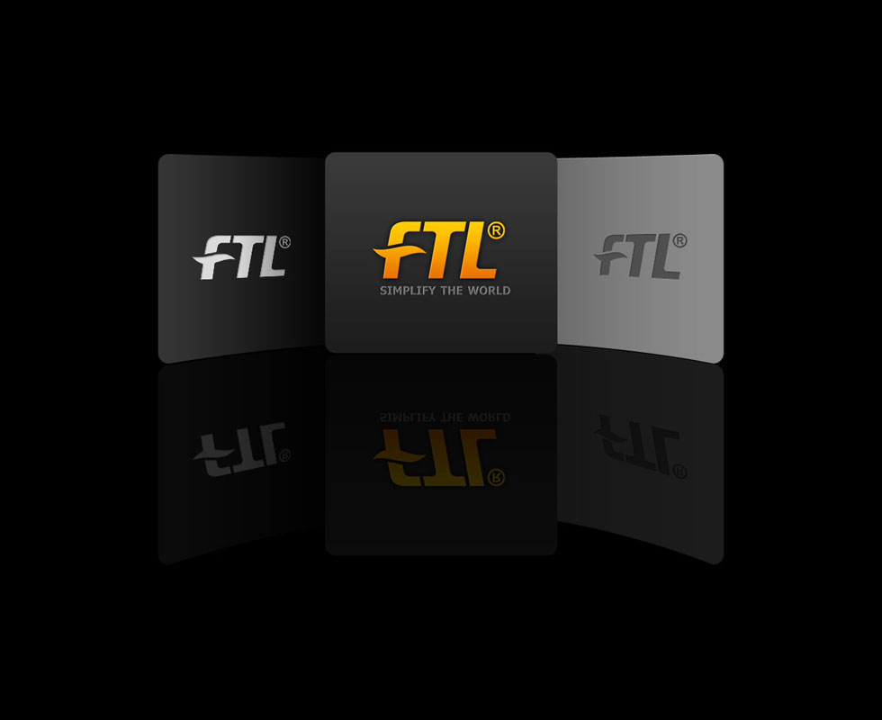
A company's logo has to read clearly on many different grounds, light and dark. So Sinh Vũ prepared several colour versions: a silver-white version and an orange-yellow version for dark grounds, and a dark grey version for light ones.
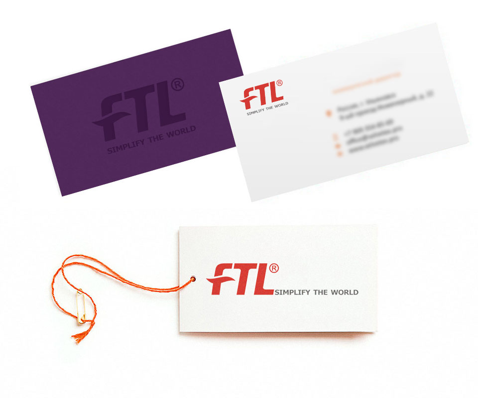
The business card has two sides. The deep purple side carries a blind-printed logo, meaning it is printed in the same tone as the ground so the logo shows only faintly. The white side carries the logo in red, with the contact lines accompanied by small orange icons. The cream paper bag has a large blind-printed logo in the centre and a small red logo at the bottom corner.
The result
FTL has a compact logo whose three letters read clearly. The feeling of speed and solidity is there in the drawing itself. The logo works on white paper, coloured paper and dark grounds without its shape changing.
FTL's chief executive found the design handsome and true to the meaning the company's leadership wants to send to partners and customers.
In their own words
A handsome design that says exactly what FTL's leadership wants partners and clients to hear: fast, precise, reliable. From the logo to business cards and paper bags, the identity carries that spirit throughout.