
FOOD HANOI, flavor pack on the shelf
Food Hanoi, part of the Northern Food Corporation, brings the familiar shopping basket of Vietnamese kitchens, needing each noodle and spice package to stand firm on the shelf. Sinh Vũ created the identity and packaging system so that this timeless flavor can be seen and trusted at first glance.
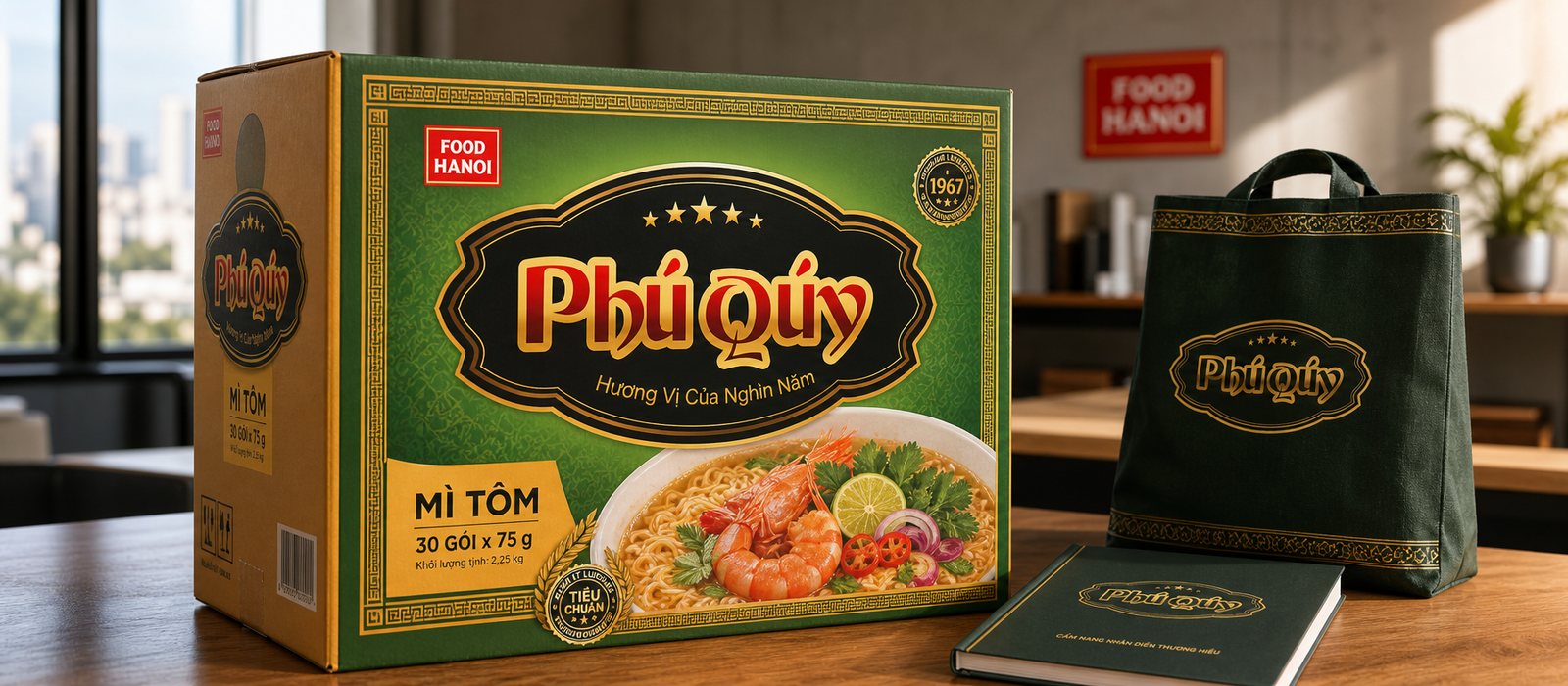
Issue
On supermarket shelves, a noodle or spice package only has a few seconds to be picked up. What customers see before tasting is the packaging: colors, names, and images of the dish. No matter how good the product is, if it wears a dull package, it can easily be overlooked among dozens of similar options.
FOOD HANOI has a valuable asset that few new brands possess: the legacy of a Hanoi food producer, with flavors tied to the millennia-old Thang Long. However, that asset only becomes an advantage when it is visible on the packaging. The challenge is not just to beautify a package, but to transform that depth into something the buyer sees and trusts immediately on the shelf.
How to do it
FOOD HANOI does not sell just one product, but an entire familiar shopping basket: Phú Quý instant noodles, iodized seasoning powder, meat soup seasoning, Life porridge. The first step is to establish a brand architecture, so that a strong parent brand stands behind it, while each sub-label has its own face that fits its product.
Each label carries a personality. Phú Quý is luxurious with a gold emblem on a dark background and four stars, evoking a bountiful meal; the line of spices is neat and reliable, like a kitchen assistant. They are different enough to stand out, yet still recognizable as part of the same family. This is where the identity system differs from just a logo: it allows the business to add product lines without rethinking the brand from scratch.
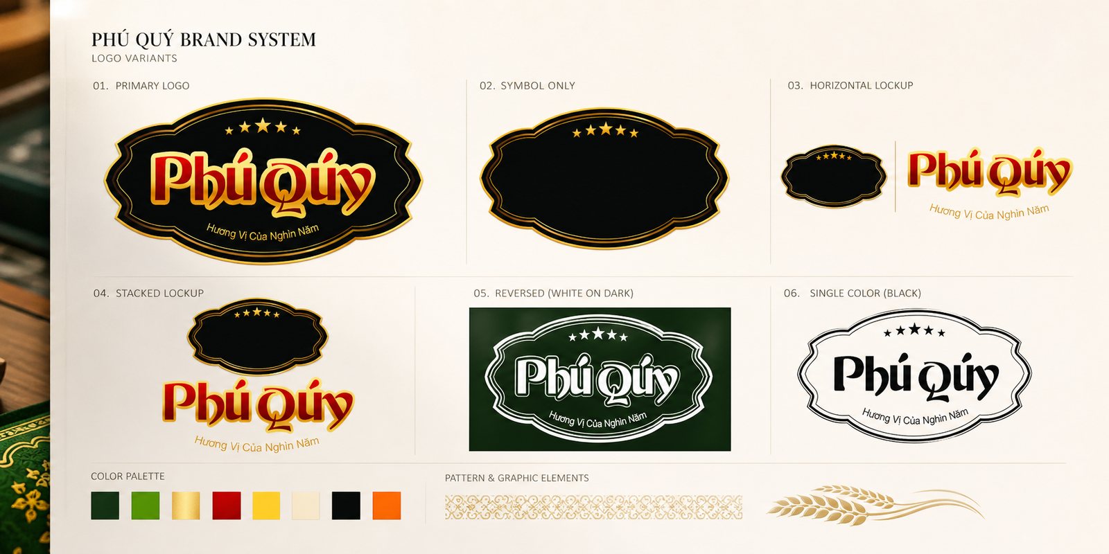
Selling food is about selling cravings. We chose a visual language for each line that stimulates the taste buds: warm, vibrant colors, traditional patterned borders like gift tags, and above all, a mouthwatering image of the dish, showcasing the steaming noodles, shrimp, and meat slices just as they would look when hot water is poured over them.
Interspersed are signals of depth: the seal of the year of establishment, the phrase 'timeless flavor', and the wheat ear. They are not loud, but enough to convey that behind the package is a long-standing producer, not just a newly emerged name.
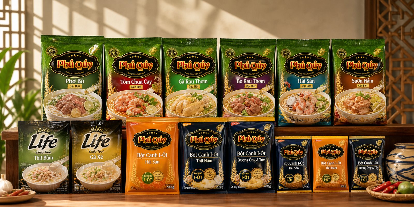
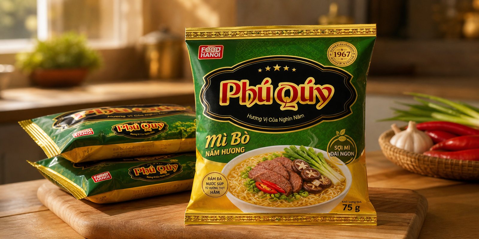
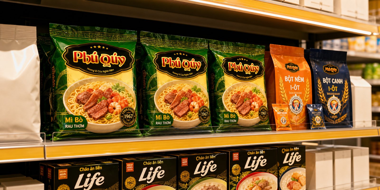
From that language, we designed the packaging system for each line: the Phú Quý instant noodle package, seasoning powder bags, and porridge boxes. Each format has its own challenges; the soft packaging must maintain its display when hung, while the small spice bags must clearly convey their name and purpose within reach. But all follow a common framework, so that when placed side by side, they read as a seamless line under the name FOOD HANOI.
Display is when design gets evaluated. A product line from the same brand, with a consistent color scheme and layout, occupies a neat and eye-catching shelf space, far more appealing than scattered packages. That’s how packaging works in place of the seller: it grabs attention and holds it long enough for a hand to reach out.
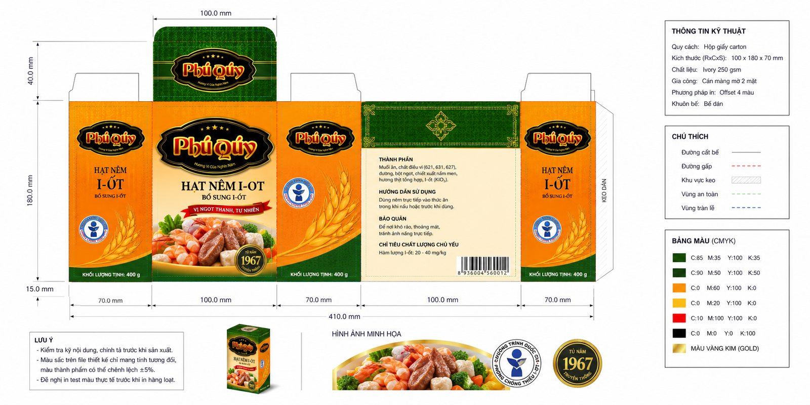
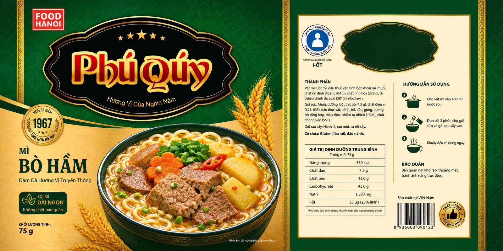
Each food line has more than just one item code, and it’s not printed once and done. We standardized the framework: cutting die layouts for each type of packaging, color specifications, and areas for mandatory information such as ingredients, nutrition, barcode, and expiration date. As a result, whenever FOOD HANOI introduces a new flavor, they have a ready framework to fill in, ensuring consistent colors and patterns regardless of where it’s printed.
Food packaging must also carry trust. We neatly integrated those signals into the design: quality certifications, the iodine deficiency prevention program symbol on the spice line, and easy-to-follow usage instructions. A package that evokes cravings while being trustworthy is the one that sells.
Results
What FOOD HANOI receives is not just a few beautiful, disconnected labels, but a cohesive face that runs consistently from the parent brand to each product line, along with a framework to grow without deviation. Whether it’s the Phú Quý noodle package, seasoning powder bag, or porridge box, they all read as one FOOD HANOI, with a promise of timeless flavor.
For a food producer, that consistency and sense of reliability is what shortens the distance from the shelf to the shopping cart. The packaging system is conceived as a system, not just individual packages; it serves as a support so that each time a new flavor is added, it’s an opportunity to be chosen, not a complete redo.
A row of products, one face
Phu Quy noodle package
Shelf display
Seasoning bag label
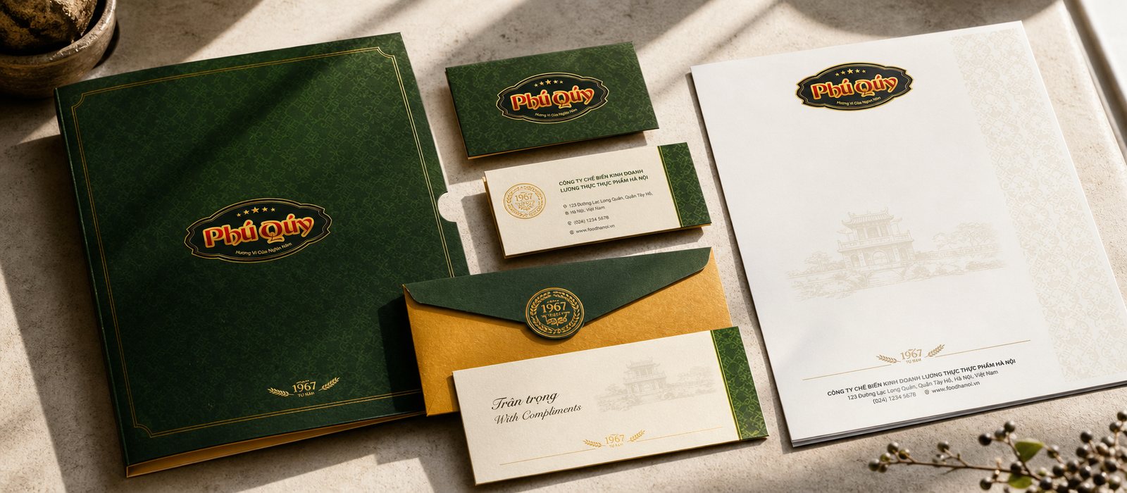
Office publications
Does your challenge resemble FOOD HANOI?
Tell Sinh Vũ what concerns you about your brand. Sinh Vũ will point you in the right direction.