
DDIC, credibility built into form
DDIC gave Sinh Vũ its value system of dedication and trust as a construction contractor, to translate into a brand identity system running from drawings to construction site signage.
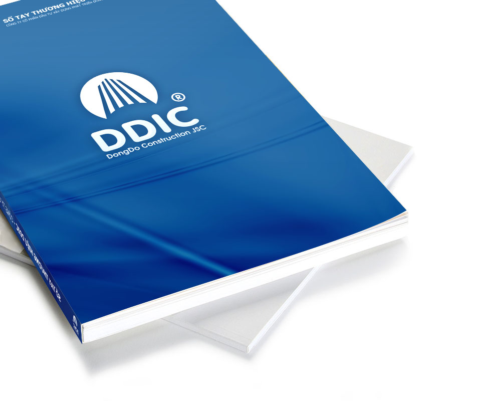
The problem
DDIC's leadership did not describe a logo, they handed over a value system. Tâm means wholehearted dedication and effort in the work. Tín means credibility in safety, quality, schedule and lasting cooperation. Those words are fine in a meeting room, but they are invisible. A contractor cannot carry a speech onto a construction site, into a bid dossier, or onto a sign at the gate.
The task, then, was not to draw something attractive, but to translate. To translate a value system spoken in words into a sign spoken in form, one that reads as construction at a glance, carries the will to keep rising, and stands steady enough beside names that have been in the trade for years. That was the hardest part.
The process
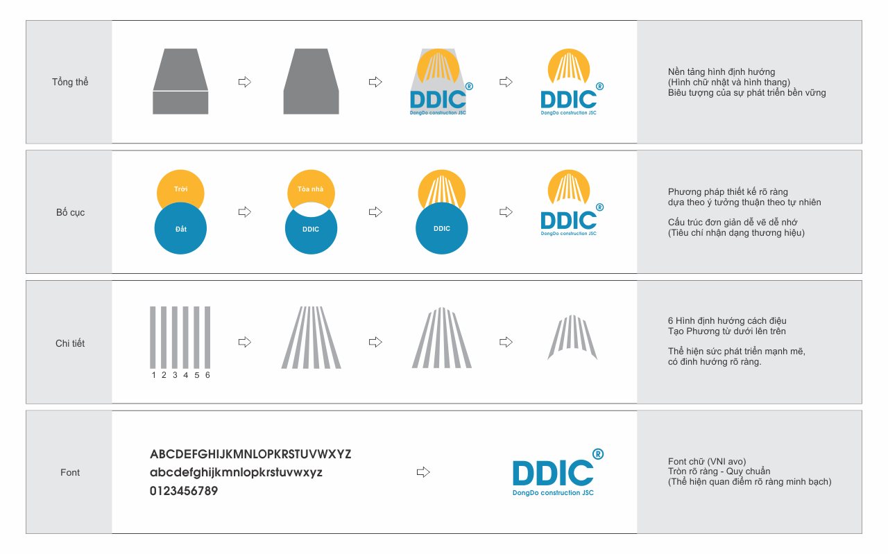
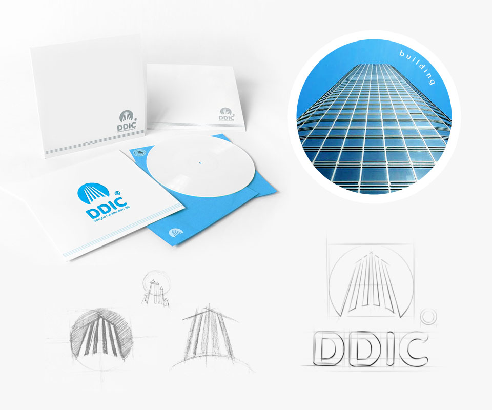
We began from one exact sentence from the leadership: a high-rise block rising under the sun. Rather than illustrate it literally, we reduced it to constructive lines. Vertical bars converge and then open into a circle, at once the shape of a building growing, a ray of sunlight, and the will to rise.
The DDIC wordmark takes a sans-serif cut, firm and even, legible from a distance and unbroken when shrunk onto a seal or the corner of a drawing. A mark for the construction industry must first be as durable as what it represents, usable on steel, on paper, on a lit sign, and still remain one mark.
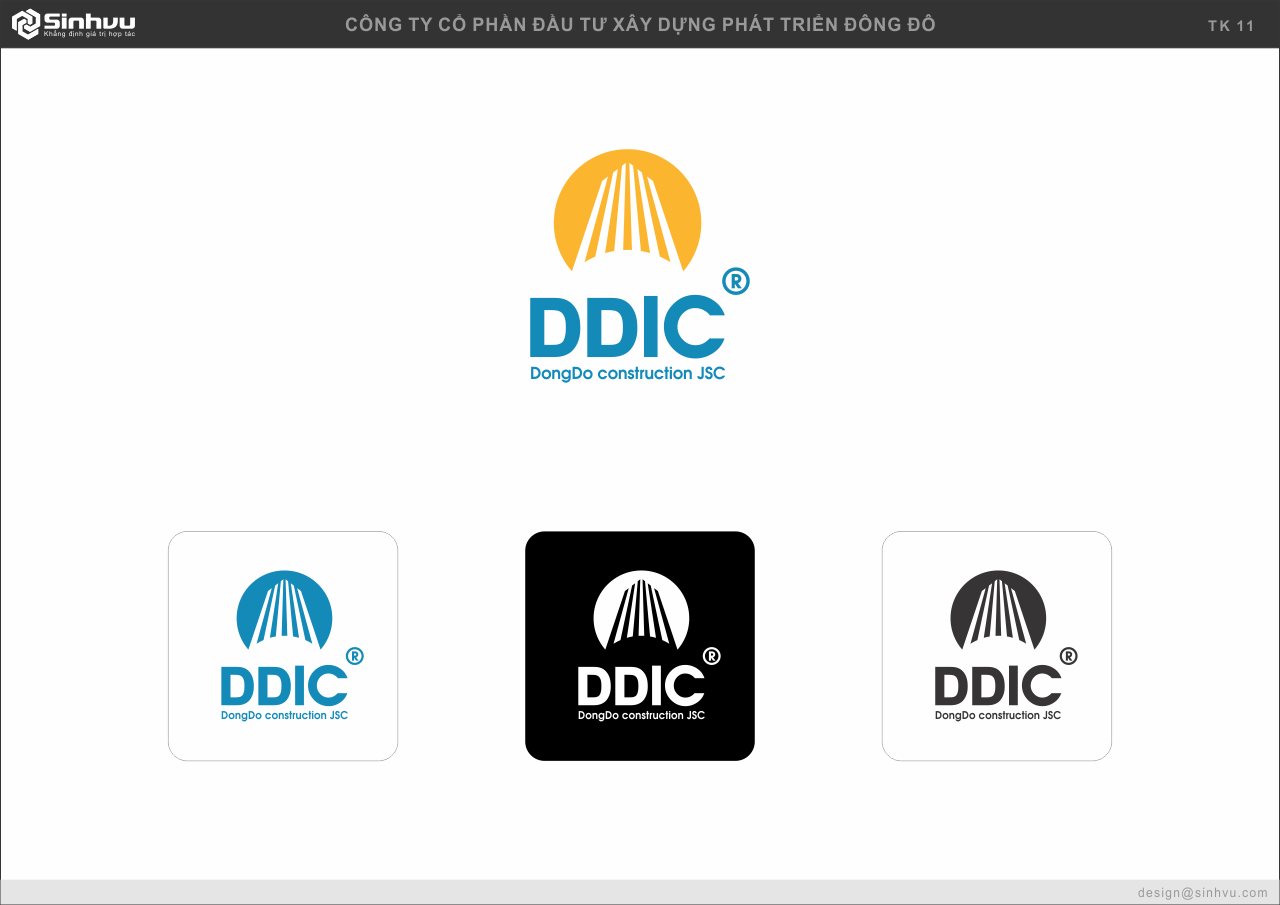
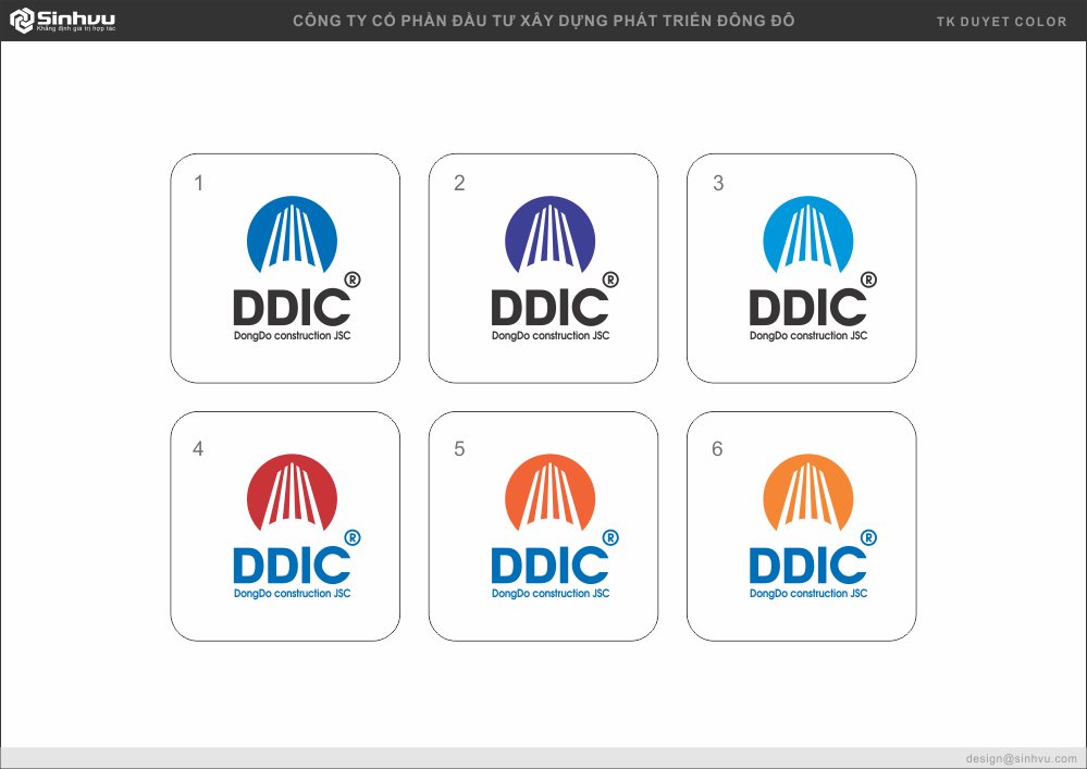
Blue was chosen as the primary colour not to look good, but to speak. The blue of technical drawings, of glass and steel, of the composure a contractor needs to project when signing a commitment to safety and schedule. Against that blue field, the white icon lifts like a structure catching light.
What sets the icon apart from an illustration is that it holds up under interpretation. People in the trade see structure, partners see an ascent, the leadership sees the Tâm and Tín they entrusted to it. One shape, several layers of reading, and every layer leads back to the same character.
A good-looking logo degrades over time if everyone uses it their own way. So we closed off the whole set of rules in a brand guideline: how the logo sits, how much breathing space it needs, how the colour prints on each material, which typeface pairs with which.
For a company that has moved through several rounds of restructuring and many hands on the work, that guideline keeps DDIC today and DDIC a few years from now the same face. It turns identity from a designer's concern into an asset the whole organisation owns.
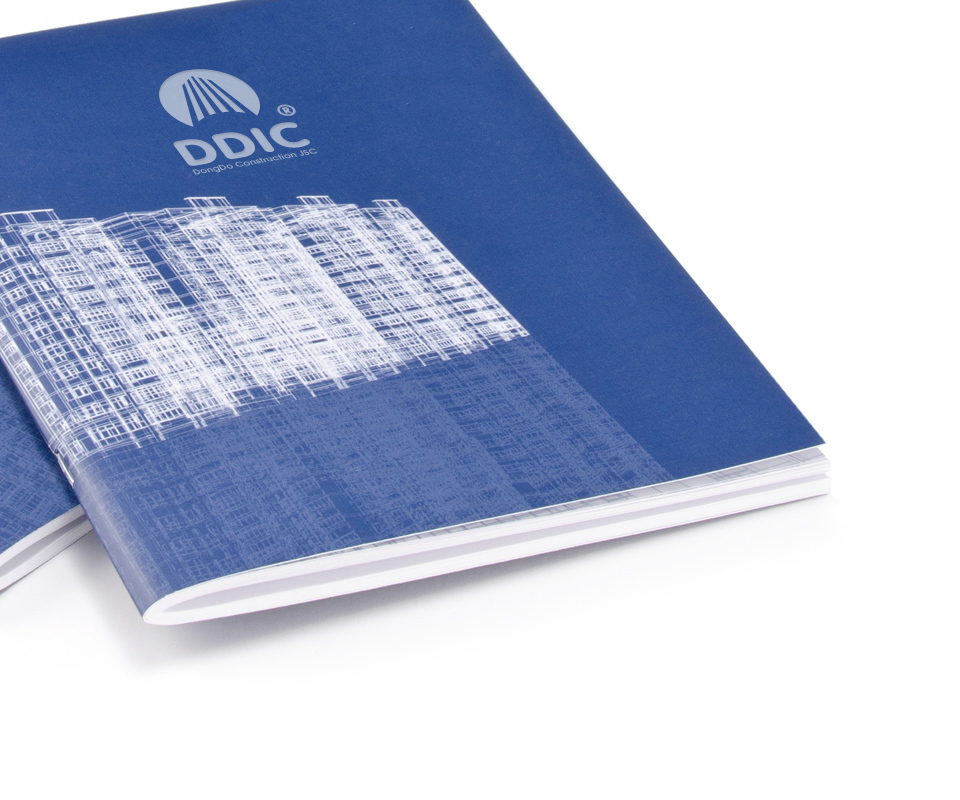
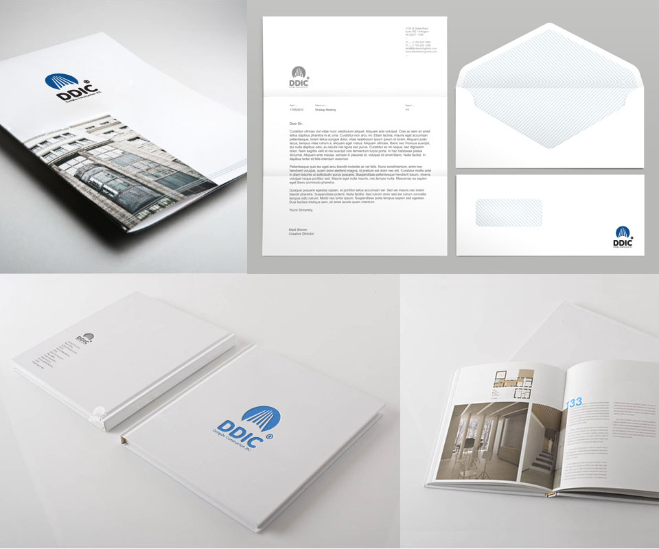
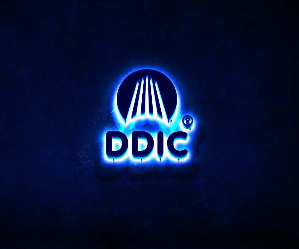
From the mark, we extended the identity system into the toolkit a contractor uses every day: letterhead, envelopes, capability profile, project introduction materials, through to the signage in front of head office. Every touchpoint holds the same proportion, the same blue, the same way of naming itself.
As a result, a bid dossier sent out and a sign lit up at night tell the same story. A client meets DDIC's polish before meeting its people, and in an industry where trust decides the contract, that polish does the work of a great many introductions.
The result
What DDIC received was not a logo file, but an identity system that fully translates its own value system into form. From the small seal on a drawing to the sign in front of the construction site, everything says the same thing: this is a contractor that works with dedication and holds to its word.
For a construction company, a consistent face is not decoration. It arrives at the negotiating table ahead of the people, and it is the impression left behind after a project is handed over. A mark built correctly, like a structure built correctly, stands firm over time.
One mark, living across every surface
From the first colour studies to the lit sign in front of head office, one mark keeps its spirit across every application.
Is your problem similar to DDIC?
Tell Sinh Vũ what is on your mind about your brand. Sinh Vũ will point you to the right direction right away.