
Alt Plus: a one-page website, one coloured tile per section
Alt Plus Vietnam is a subsidiary of Japan's Alt Plus group, founded in Hanoi in 2013; on 1 July 2020 it was renamed Extreme Vietnam Co., Ltd. (EXV). Sinh Vũ designed its website and office stationery. The website is a single page: services, company profile, recruitment, news and contact all sit on the home page, each in its own coloured tile.
One company, much to say
Alt Plus Vietnam began by making and running social games, that is, games played on social networks. The company then grew into mobile apps, websites and research into new technology.
Management wanted the website to say four things: what fields the company works in, which game projects are running, a message from the leadership, and recruitment information. Recruitment had to be tidy, so candidates could find it easily and read it comfortably.
Management was clear: the website had to be a single page (one page), with every main section laid out on the home page rather than hidden in multi-level menus. Visitors see everything on arrival and reach any section with one click.
The home page is a board of coloured tiles
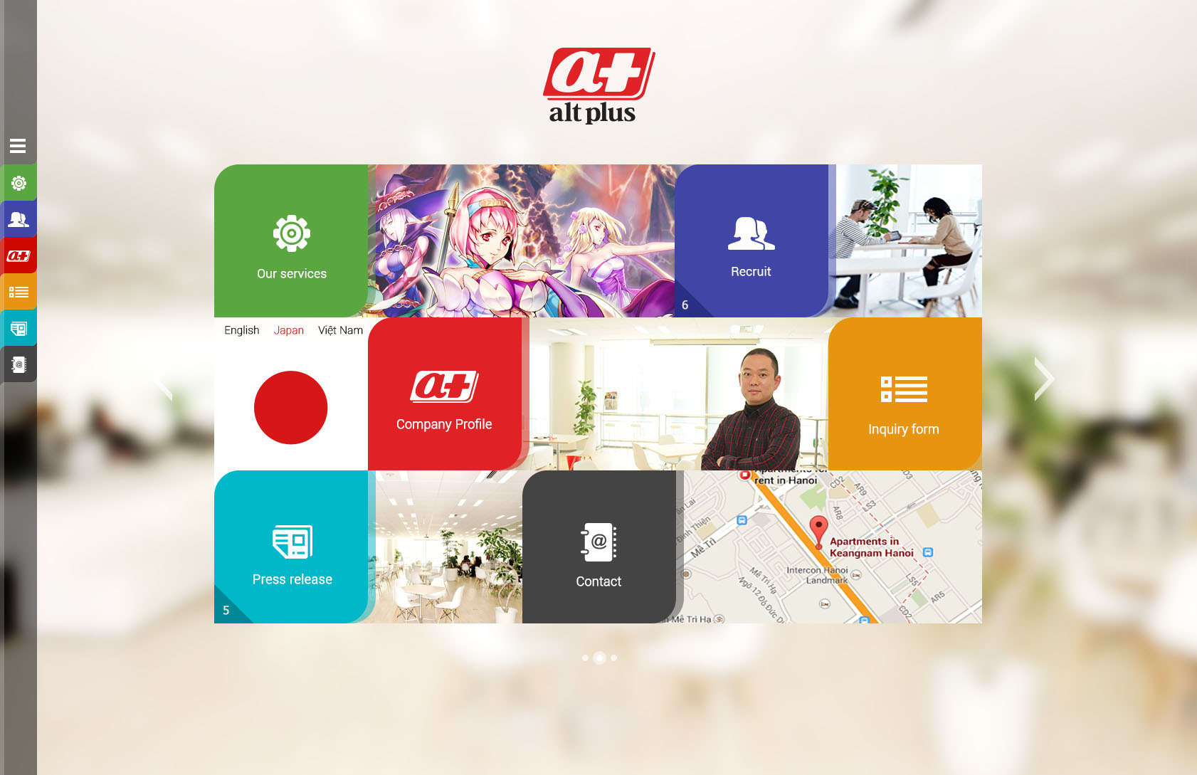
Sinh Vũ divided the home page into rounded square tiles, one colour for each section. Green for services, indigo for recruitment, red for the company profile, orange for the contact form, teal for news, grey for contact details.
Between the tiles sit photographs: the company's game characters, a corner of the office, a person standing in the office, a map showing the way to it. One tile has a switch for three languages, English, Japanese and Vietnamese, because the parent company is in Japan.
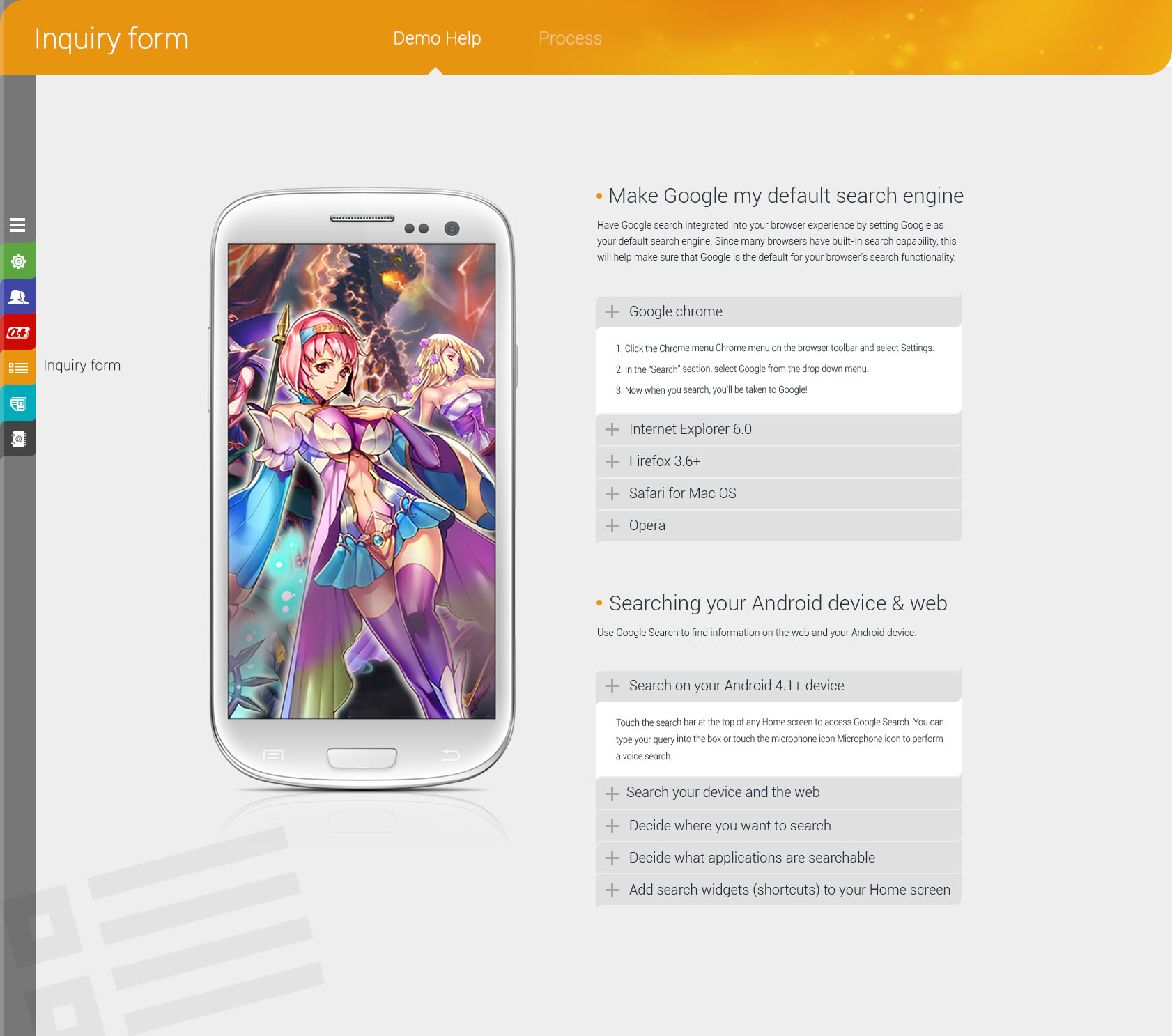
Down the left of the screen runs a vertical tab bar (a column of buttons for moving between sections) in the same colours. From any page, visitors can jump to another section without returning to the home page. The colour tells them which section they are in.
Each section keeps its own colour
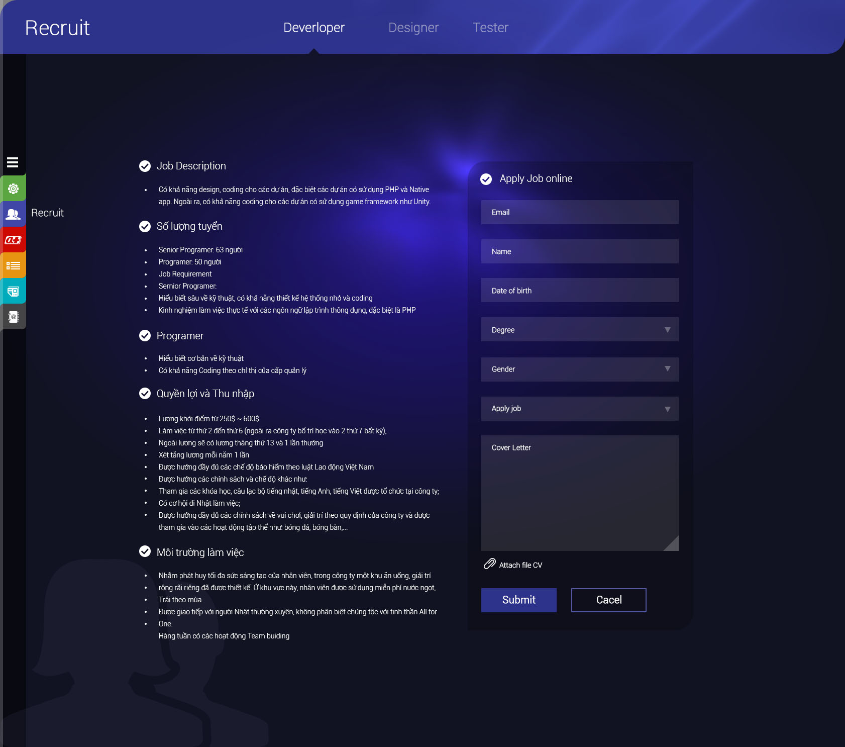
When a section opens, the title band at the top changes to the colour of the tile just pressed. The recruitment page has a deep indigo ground and a separate tab for each role: programming, design, testing. On the left are the job description, the number of places, the benefits and the working environment. On the right is an application form on the page itself, with a place to attach a CV.
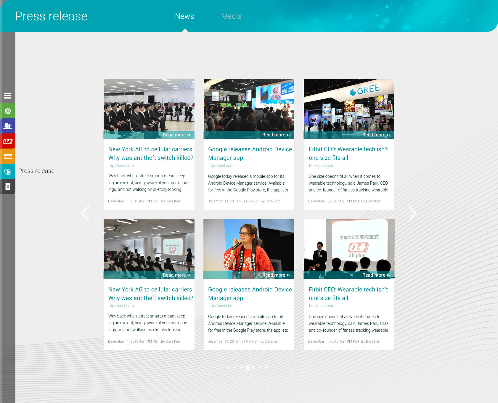
The news page is teal and split into two tabs, articles and pictures. Articles are arranged as cards, each with a picture, title, source and a read-more button, with arrows on either side to move to the next page. When there is a new article, one more card is added and the layout stays the same.
The value
Alt Plus has a website whose arrangement is clear at a glance: one colour per section, and moving around by a fixed tab bar. Visitors never have to guess where to press.
Recruitment, which management set as a priority from the start, has its own tile on the home page and a page with enough information for candidates to apply on the spot. The website is responsive (it adjusts itself to the screen size) and works comfortably on phones.
Every page arranged the same way
In their own words
The design is very impressive. The one-page website puts our services, company profile, careers and contact details right on the home page, each in its own colour block, exactly how we wanted to present the company. Thank you, Sinh Vũ.