
Wala Chat: free messaging, connecting hearts
Wala Chat is a start-up's app for messaging and calling over the internet. Sinh Vũ designed the logo, the app interface on Android and iPhone, and the print pieces that brought Wala to its users.
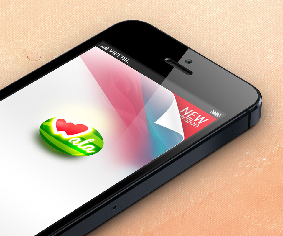
A new app among familiar names
Wala belongs to the group of OTT apps, meaning apps that send messages and make calls over the internet rather than through a phone network, like Line, Zalo, Kakao or WeChat. Users of the time were already used to how these apps worked.
So a new app needed two things: an interface that felt familiar, so people knew how to use it on opening it, and a memorable image tied to its name. Wala gave Sinh Vũ both jobs: the logo and the app interface.
A watermelon with a heart
The Wala logo is a green oval striped like a watermelon rind, with a red heart on top joined to the letter W. Red and green contrast strongly, so the logo stays clear even when shrunk to an app icon on a phone screen.
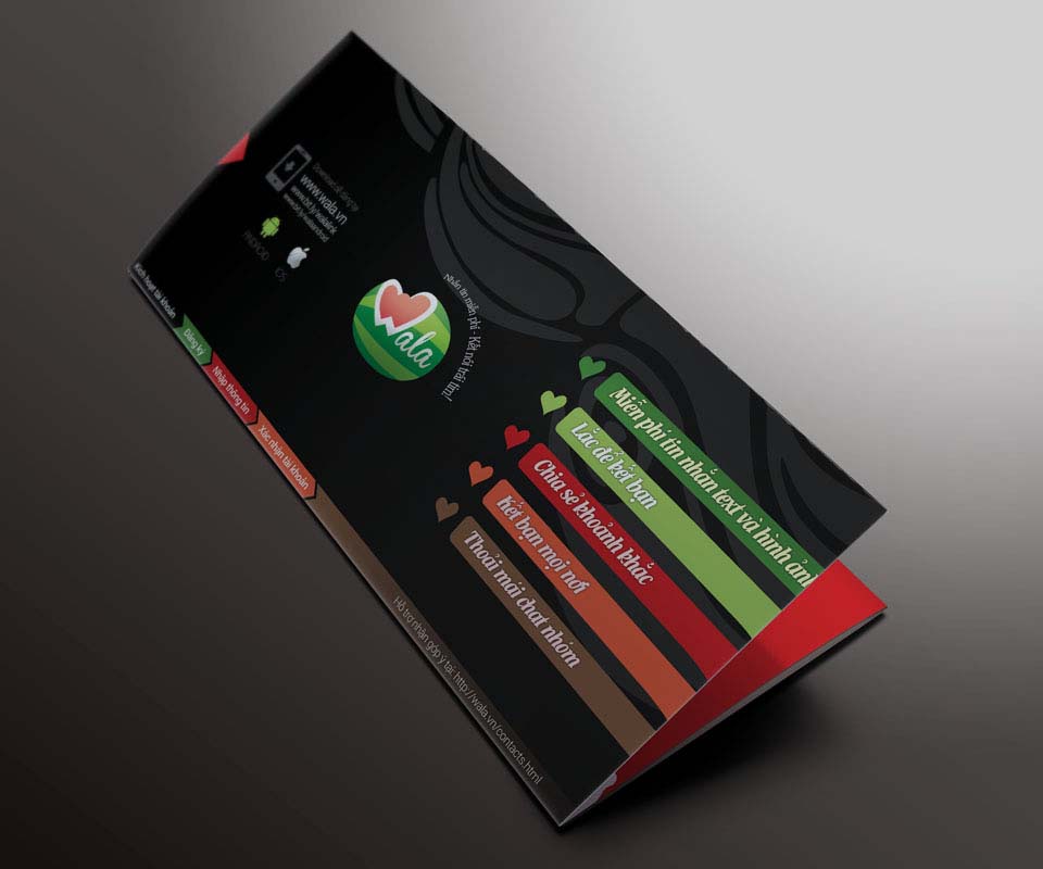
On posters and flyers the logo comes with the line "Free messaging, connecting hearts". The heart in the logo and the line say the same thing: Wala is where family and friends keep in touch.
A flat interface, the same on Android and iPhone
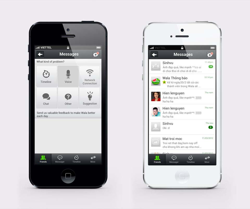
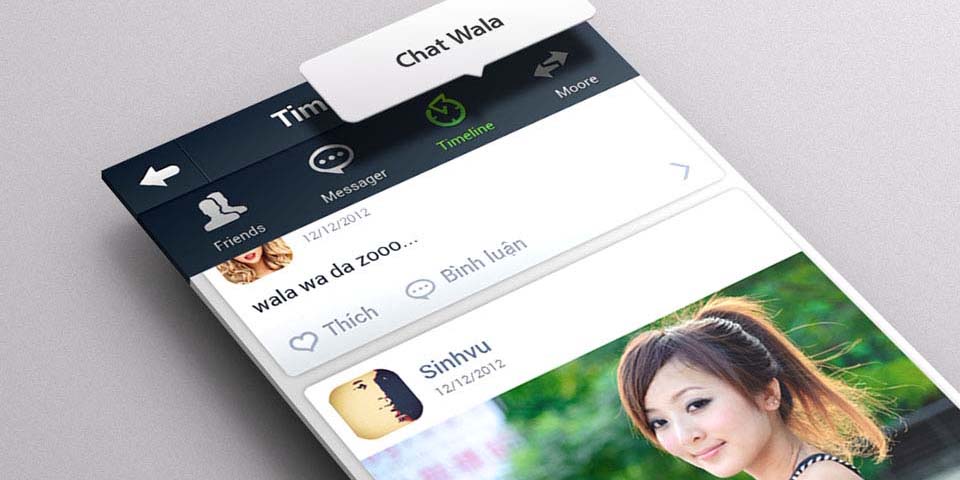
The Wala interface follows flat design: no drop shadows or raised effects, only blocks of colour and simple icons. On the iPhone version, a fixed bar of four items sits at the bottom of the screen: Friends, Messages, Timeline and More, so users never have to guess where to tap.
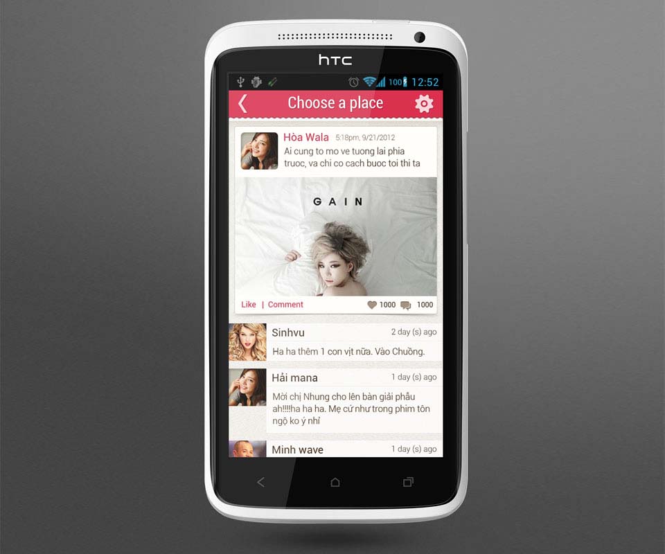
Sinh Vũ built one set of interface components shared by Android and iPhone, including buttons, the tab bar and the message box. This keeps the screens on both systems in the same style, even as Wala released new versions.
Beyond the screen: posters, cards and invitations
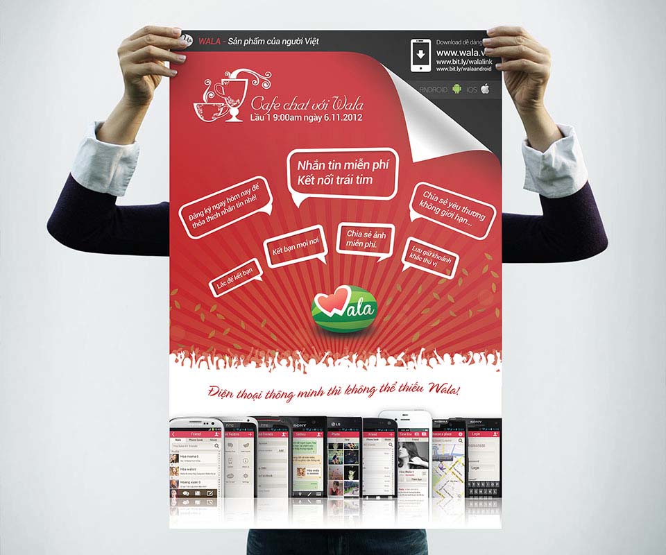
To make people aware of Wala, Sinh Vũ made a poster for the "Cafe chat with Wala" meet-up on 6 November 2012. The red poster has many small speech bubbles, each naming a feature: make friends anywhere, shake to make friends, share photos for free.
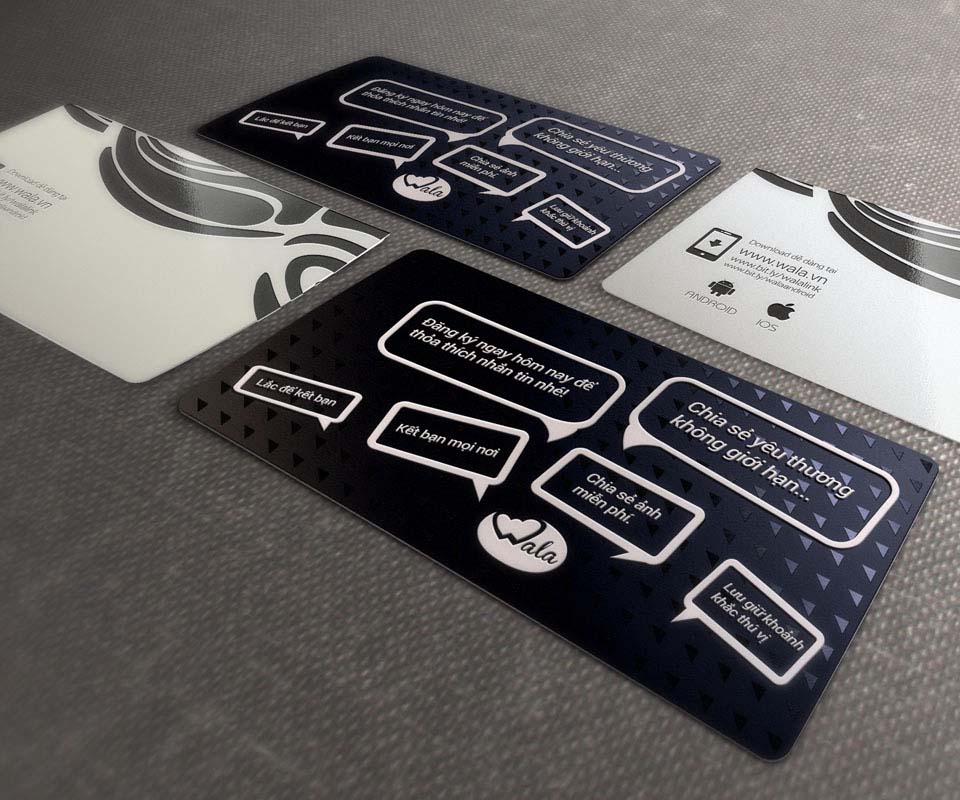
The introduction card uses a dark blue-green ground with white-outlined speech bubbles, and its back gives the download addresses for Android and iOS. The poster, card and flyer all point the viewer to one action: download Wala to the phone.
The value
Wala gained an identity, meaning a logo and colours used consistently everywhere, along with an interface that follows the familiar habits of messaging apps of the time. From the phone screen to the poster and introduction card, users meet the same logo and the same two colours, red and green.
Wala's head said Sinh Vũ gave enthusiastic support even when Wala changed versions. For an app still being refined, staying with the client through many updates matters as much as the first design.
From screen to paper
In their own words
Sinh Vũ researched thoroughly, worked professionally and supported us generously, even whenever Wala changed versions. The design is excellent, from the logo and app interface to the materials that brought Wala to users.