
VSTAR: a star that stays sharp from small screens to big walls
VSTAR is an Internet television service, born when Vietnamese viewers were starting to watch films and football on computers and phones. Sinh Vũ designed its logo and identity so the name is recognisable at every size, from a fingertip app icon to the sign on the office wall.
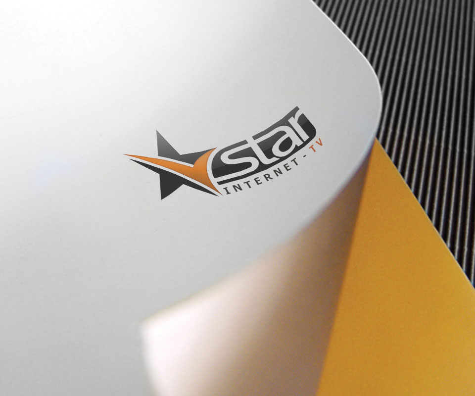
A name that has to live on a small screen
Internet TV was a new market then, and viewers were not used to opening a phone to watch a channel. They chose whichever service looked professional and easy to remember. For VSTAR, what people met most was not a billboard but a small icon on a phone screen and on a WAP page, the stripped-down web pages made for early mobile phones.
So the first problem was size. The logo had to be recognisable at fingertip scale, on the dark background of a video screen, and still look good blown up on an office wall.
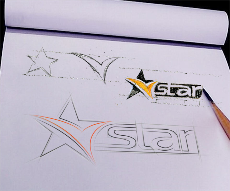
From sketch to star
Sinh Vũ started by hand: a star, a letter V, then the two shapes merged. The orange sweep of the V cuts across the black star like the trail of a shooting star, suggesting speed and prominence, right for a channel that wants to have stars.
The word star is set in a slanted, round-ended type right after the symbol, with INTERNET - TV beneath so viewers know at once what the service is. Black and orange are a strong contrast that stands out on white paper and on dark screens alike.
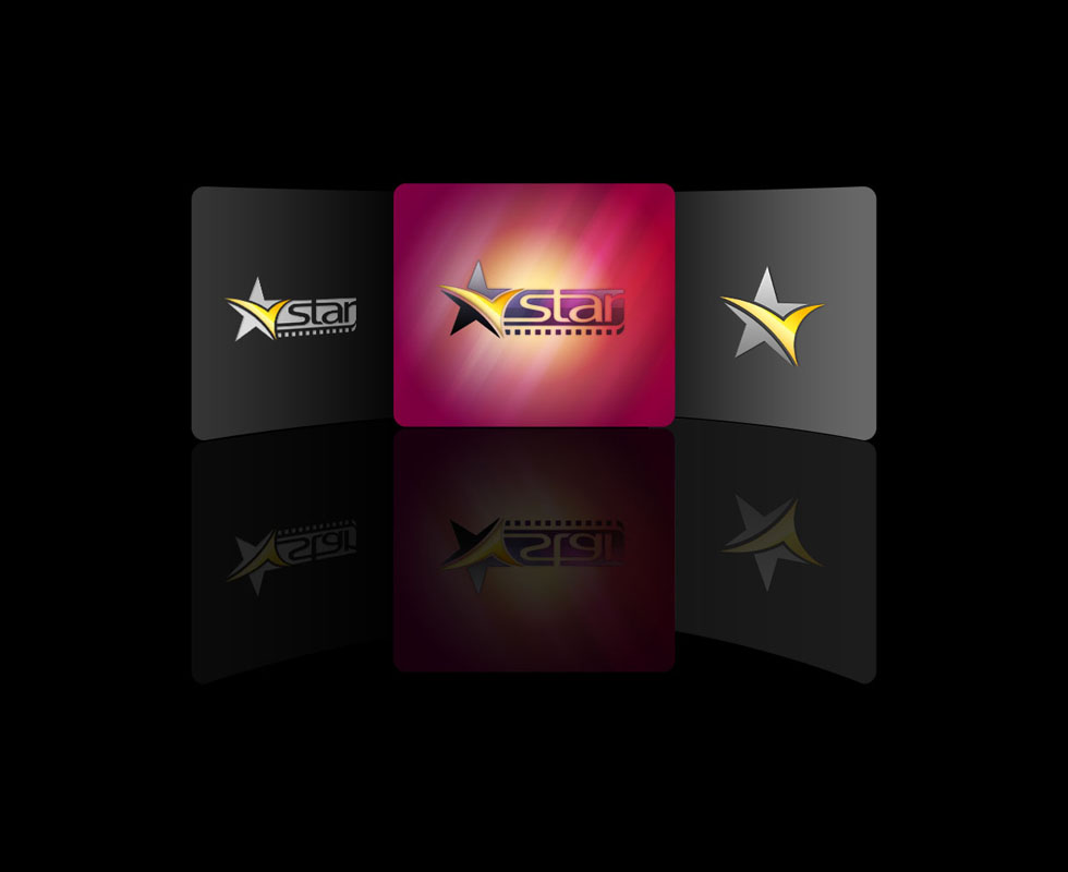
An icon for the app
For phones, Sinh Vũ split the mark into two sizes. The full app icon carries the star and the word on a dark ground with a pink glow. The compact version keeps only the star and its orange trail, used where text would be too small to read.
This two-size approach keeps VSTAR from blurring in the corner of a screen. Viewers recognise the star first and read the name second, just as they recognise a familiar TV channel from the small logo in the corner of the picture.
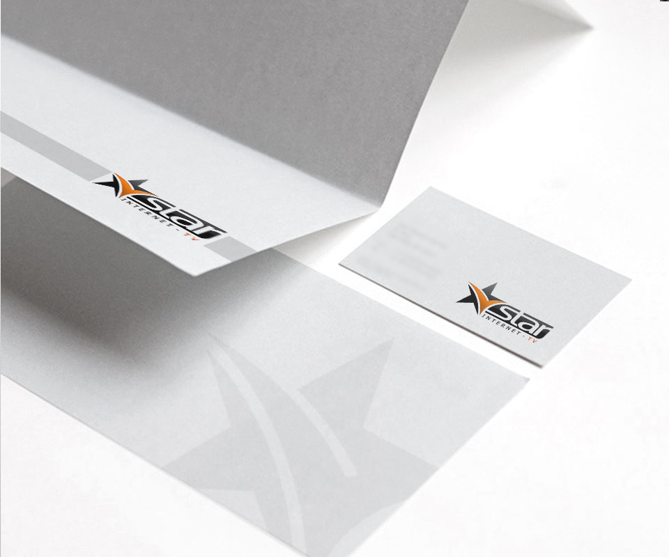
From paper to the office
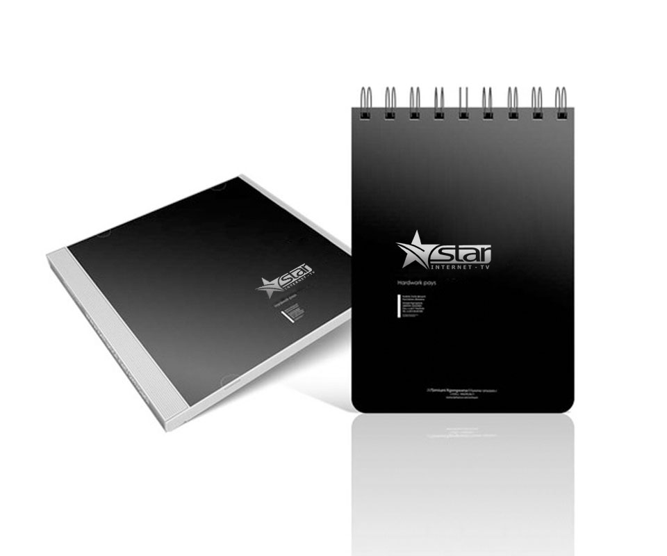
The stationery uses a white-grey ground, the logo neatly in a corner and a large faint star as a pattern. Letterhead, business cards, envelopes and black-covered notebooks all follow the same approach, so a partner holding any of them sees one VSTAR.
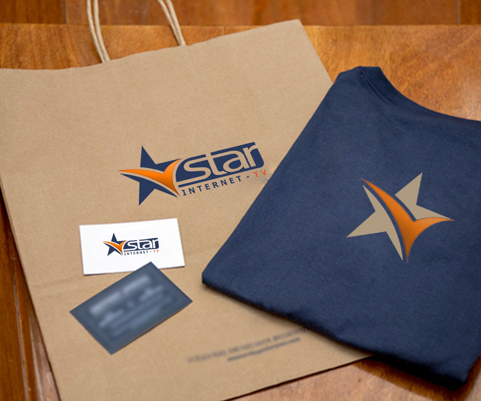
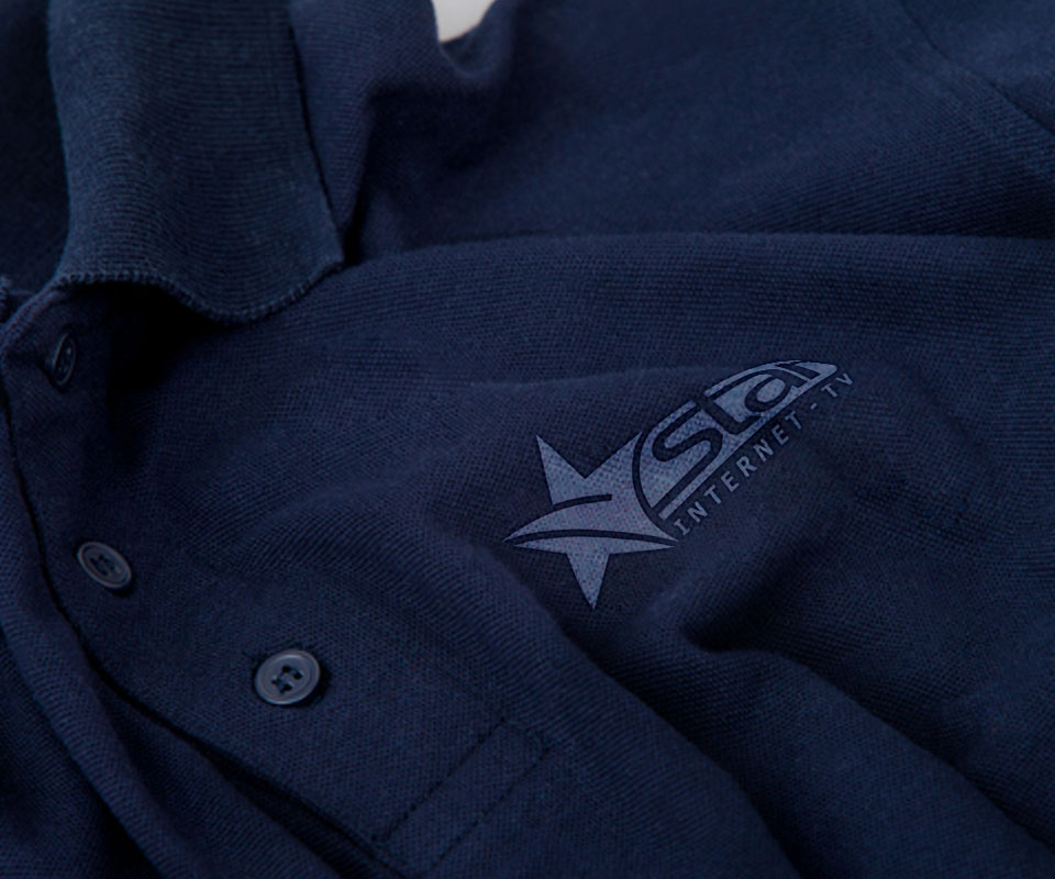
In the office the logo is mounted in relief on a grey wall at the entrance to the meeting room. Paper bags, T-shirts and staff polo shirts use the star at large size, embroidered in a single colour on dark fabric. The star keeps its exact shape from a tiny app icon to a two-metre wall.
The value
VSTAR gained a symbol that works at both ends: compact enough to read on a phone, strong enough to stand on an office wall or a staff shirt. Viewers, partners and employees meet the same star everywhere.
For a digital service, most encounters with customers happen on a small screen. Sinh Vũ therefore designed from the smallest size first and then expanded to paper and the office, so the brand never has to be redrawn when it changes place.
One star, many sizes


In their own words
I am impressed by the professional, determined way Sinh and the Sinh Vũ team work. VSTAR needed a logo that reads at every size, from a small app icon to the office sign, and Sinh Vũ delivered. Our years of work together from 2005 to 2009 are something Vega's leadership will always value.