
VLive: phone video online in a few steps
VLive is a service from VEGA. Users shoot video on a phone, stream it live, or trim and edit it before sharing. Sinh Vũ designed the logo and website interface so that ordinary users can follow it easily, with as few taps as possible.
A new product for ordinary users
VLive lets users put video shot on a phone online: stream it live, or cut and edit it and share it for others to watch. It was a new product for VEGA, with no brand image before it.
VEGA's Chief Executive set a clear requirement: the design had to suit ordinary users. The interface also had to work on a 17-inch computer screen and on feature phones (basic phones with small screens, not yet smartphones).
A logo that shows what the product does
The brief asked for a logo that expressed the personal side of the product: on VLive, each person cuts and edits their own video. So the logo had to show cutting and editing at a glance.
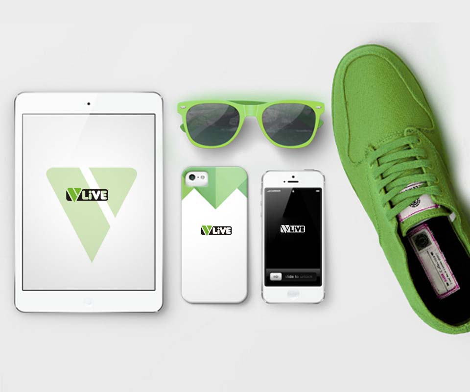
Sinh Vũ drew a green V split in two by a diagonal line, suggesting the act of cutting a piece of video. Beside it sits the word LiVE in white inside a rounded black frame. The strokes are thick with rounded ends, so the logo stays legible when shrunk onto a phone screen.

Few steps, easy to follow
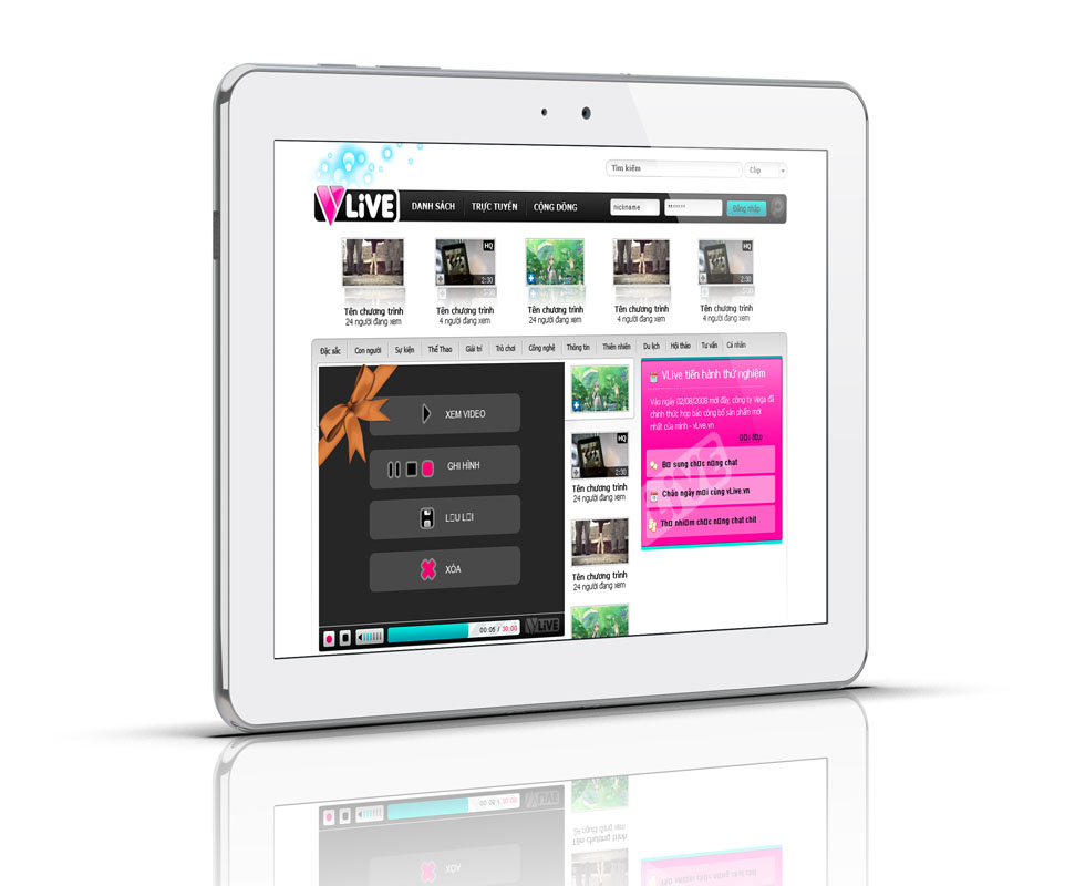
The trial interface has a black navigation bar with three items: List, Live and Community. The search box and the login box sit right at the top. In the middle of the page is a video player with four large buttons stacked vertically: Watch, Record, Save, Delete.
The full home page adds Liveshow (live broadcast programmes), Clip (short videos), Liverecord (recordings of past broadcasts), Blog (article pages) and Photo (pictures), plus a Create Live Show button floating at the right corner. Each main task has its own button with large lettering, so a new user never has to guess the next step.
From screen to phone
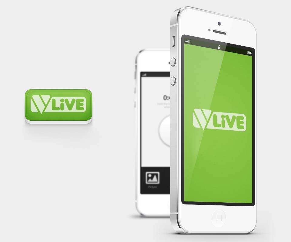
The logo also has an app icon version: a rounded green square with the word VLive in a light colour at the centre. On an iPhone screen, the logo sits on a solid green background.
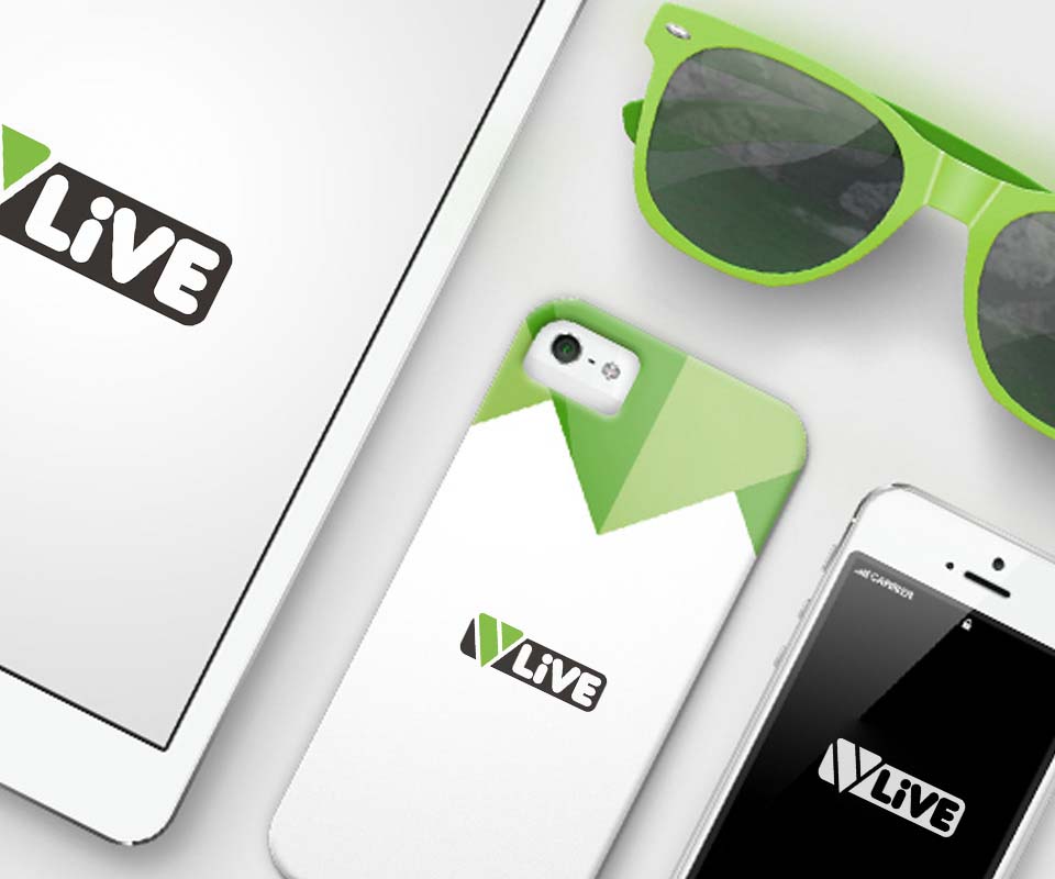
The green, black and white palette was tried out on a phone case, a tablet and the app's launch screen on an iPhone. That way users still recognise VLive when they meet the logo away from the website.
The value
The difficulty with VLive was that it had to work on both a large computer screen and a small-screen basic phone. Sinh Vũ's approach was to keep everything lean: few colours, few details, large buttons.
The logo tells viewers at once what the product is for. The interface does the same: only a few actions are needed to get a video online. For a new product aimed at ordinary users, Sinh Vũ chose that simplicity so that even first-time users can follow it on their own.
One green, black and white palette from website to phone

In their own words
VLive was a new product that needed a new design for everyday users. Sinh Vũ planned carefully so the interface works even on the small screens of basic phones, with as few taps as possible.