
Vietdrinks: Vietnamese drinks to take away
Vietdrinks is the takeaway drinks brand of Fisco Investment Joint Stock Company, sold in shopping centres, airports and the lobbies of large buildings. Sinh Vũ designed the logo, packaging, printed items and sales counter, so that from the cup to the paper wrapping a cake, customers recognise Vietdrinks at once.
Many drinks from a small space
Vietdrinks is a way of selling in shopping centres, airports, building lobbies and large halls. The idea is that a small counter can sell many kinds of drink: fruit juice, coffee and tea, for customers to buy and take away.
Fisco gave Sinh Vũ three hard tasks. First, design a counter about 2 metres wide that is easy to carry, set up and pack away. Second, make every promotional item share one consistent look. Third, make the logo simple and easy to read, suggesting health and feeling close to the buyer.
A handwritten logo, read at a glance
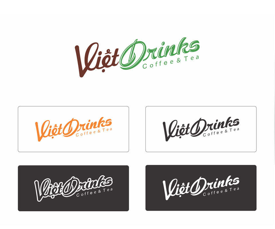
The Vietdrinks logo is stylised handwriting: the V is stretched out, and the D has a curve inside it that suggests a leaf. The small line Coffee & Tea sits directly beneath so passers-by know what the counter sells.
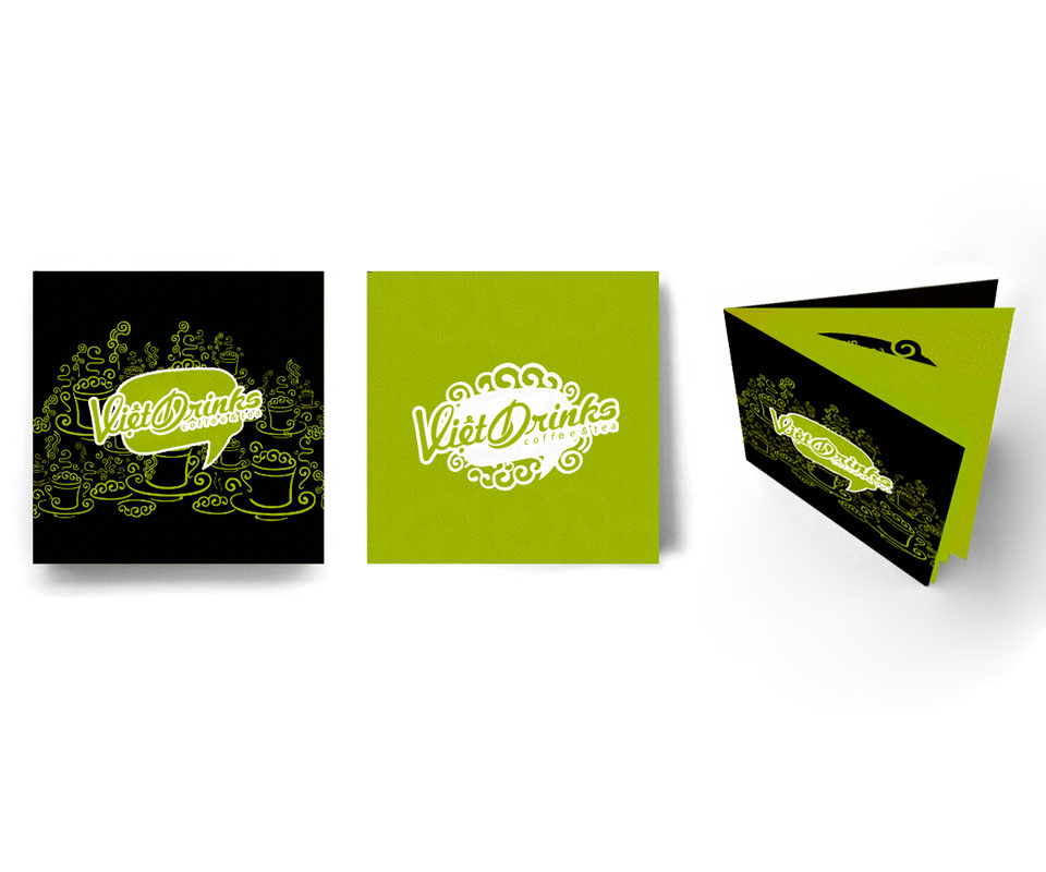
Sinh Vũ prepared several colour versions: brown with green, orange, black, and a white version for dark grounds. With all these versions the logo reads clearly on cups, bags, wrapping paper or signs, without being redrawn for each print.
Artwork for the cup
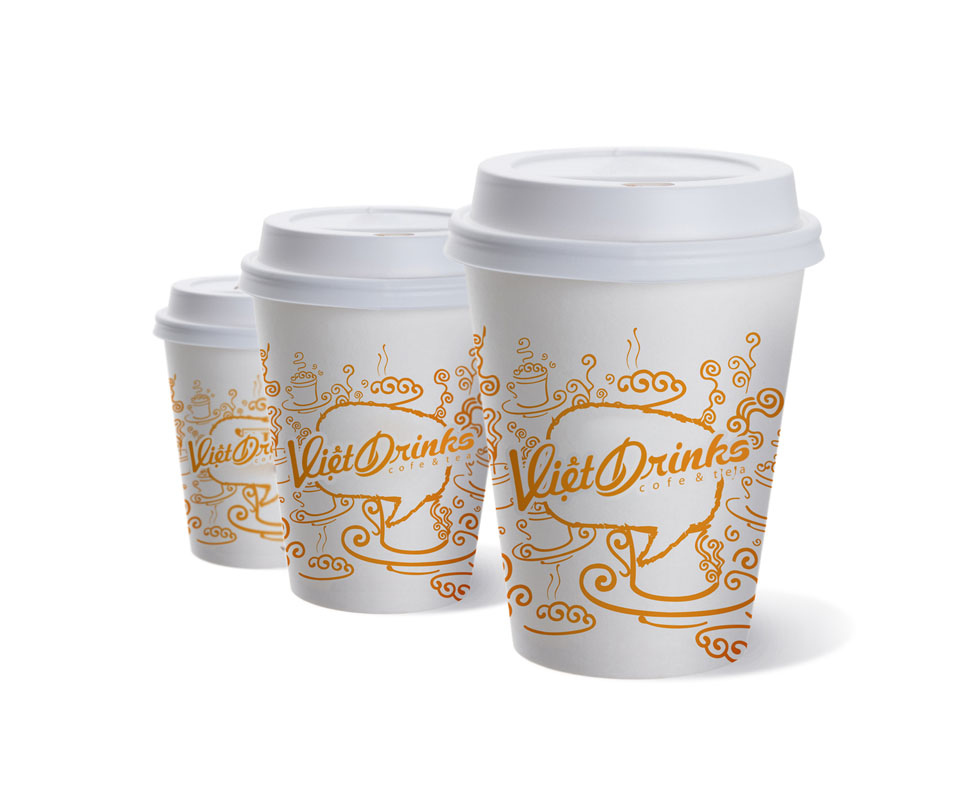
On the paper cup, Sinh Vũ drew an orange pattern of coffee cups, saucers, curls of steam and swirling lines, around a speech-bubble frame with the name Vietdrinks in the middle. All three cup sizes use the same artwork, only larger or smaller.
Customers hold the cup for as long as they drink, so this is where the brand is seen for longest. The artwork makes the cup more cheerful, while the name Vietdrinks remains the most prominent thing on it.
Takeaway packaging and counter supplies
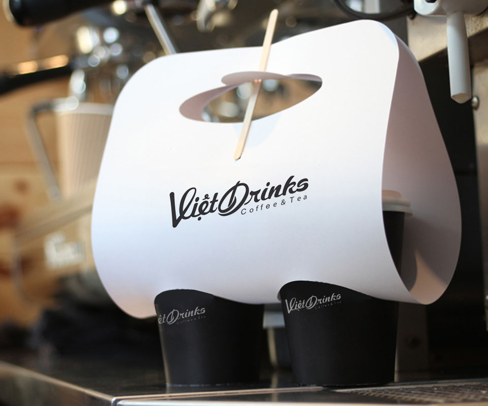
A white paper tray holds two black cups, with a hole at the top for carrying and a stirrer pushed through. The logo is printed in black on the front, so wherever the customer carries the tray, the brand goes too.
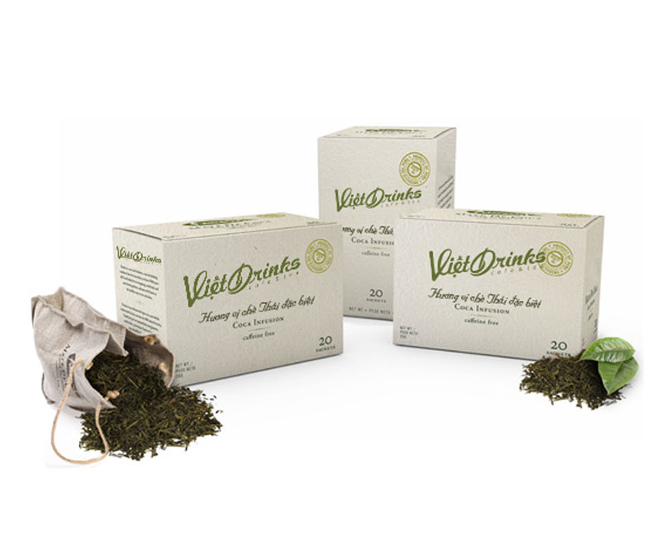
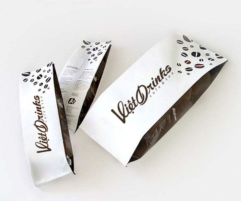
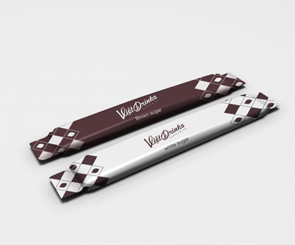
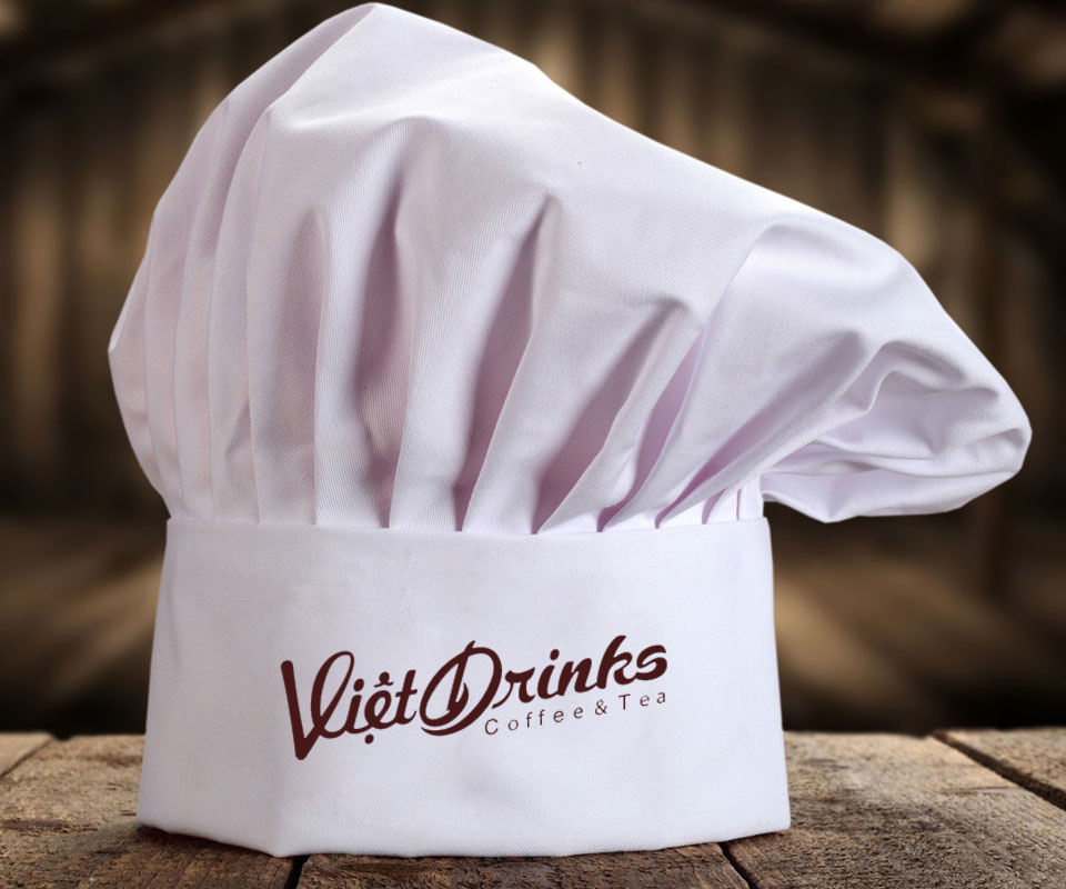
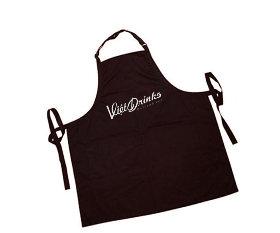
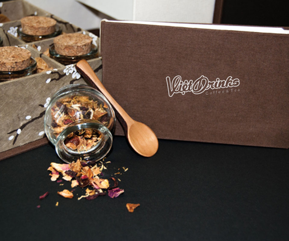
The same logo appears on coffee bags, tea boxes, sugar sachets, and the aprons and caps of the staff. Colour follows the product: coffee bags carry the brown logo, tea boxes the green one, and sugar sachets are brown or white depending on the sugar. The colours differ but the lettering is placed the same way, so items standing side by side still read as one brand.
A counter assembled from small units
So that a small counter would be easy to transport, Sinh Vũ divided the stall into several small units. The units can be joined into one counter or separated, and each is small enough to carry by motorbike.
The counter has an LED lighting system (energy-saving lamps) that connects automatically between units. The shelves fold flat when the counter closes, and join into a larger unit when more room is needed to display goods.
The value
Vietdrinks has a neat, easy-to-read logo and a matching set of packaging and supplies. As a result, a small counter in any airport or building lobby is recognised as the same brand.
One logo, many takeaway items
In their own words
Sinh Vũ works professionally, responsibly and with real passion. From the cup and pastry wrap to the kiosk, customers recognise Vietdrinks at once. Thank you, Sinh Vũ, for standing with Fisco and with the Vietdrinks project in particular.