
Vfun: an entertainment portal on every screen
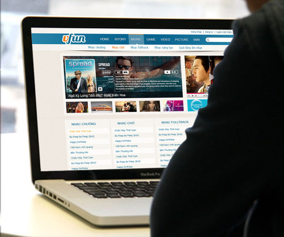
Vfun is Viettel Telecom's entertainment portal, gathering ringback tones, ringtones, films, games and pictures in one place. Sinh Vũ designed the logo and interface so Vfun looks the same on computers, tablets, iPhones and the colourful Nokia phones of the day.
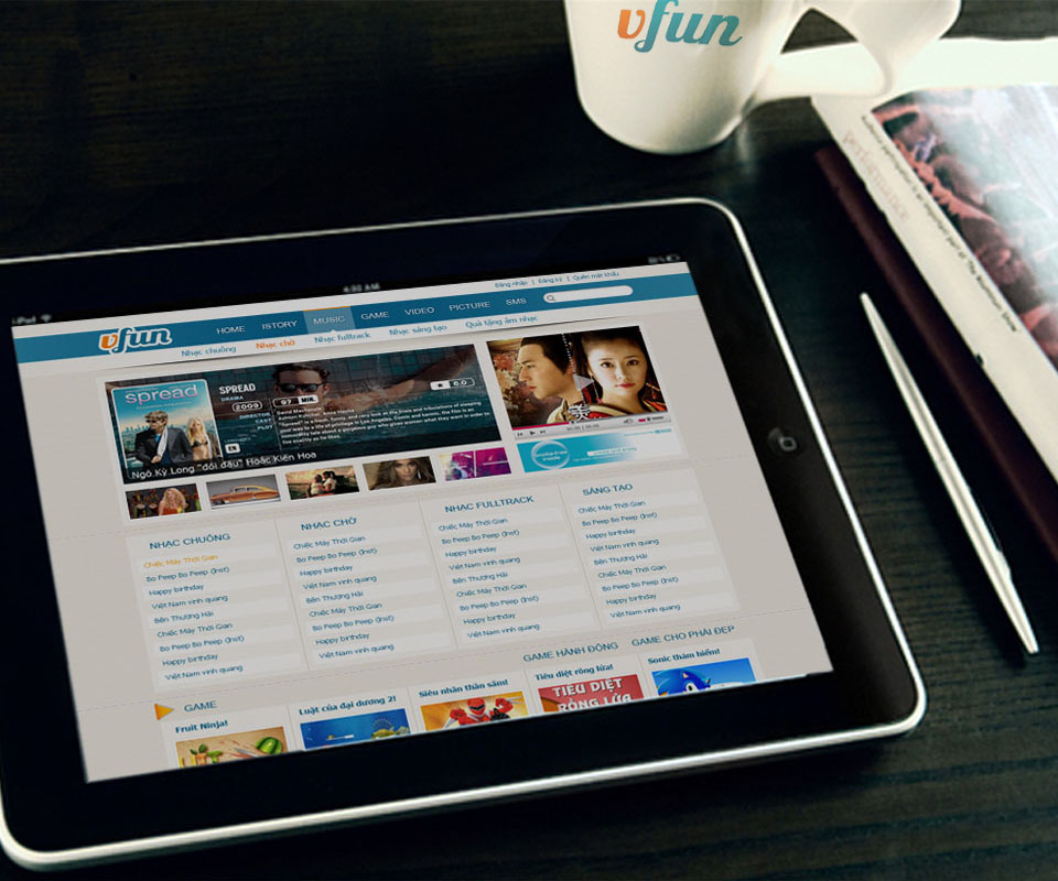
Lots of entertainment, many kinds of screen
Vfun brings a great deal into one portal: ringback tones, ringtones, full tracks, films, games, pictures. Users arrive from every kind of device, desktops, tablets, iPhones, Windows Phones and even WAP pages, the stripped-down web pages for early mobile phones.
The difficulty was keeping all of it looking like one thing. If every screen looked different, users switching devices would feel lost, and Vfun would be just another nameless service in a carrier's list.
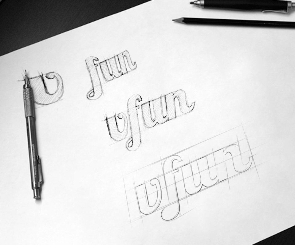
A smiling V
Sinh Vũ sketched again and again until the v and f joined in a single stroke like handwriting. The v is orange, fun is a water blue, and the last stroke curls up like a smile. The name is about joy, so the way it is written had to be joyful too.
The logo is lean, letters only with no separate symbol. Sinh Vũ chose this because Vfun lives mostly on small screens: a clear word reads better than an elaborate drawing.
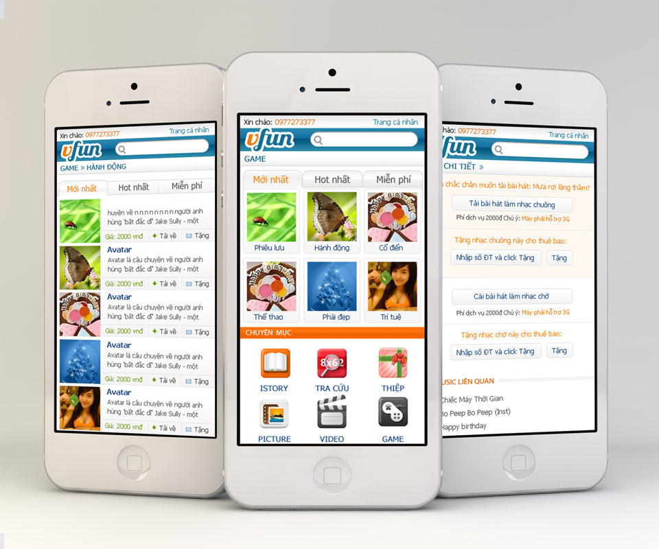
One layout for many devices
The Vfun website has a blue menu bar at the top, a large feature area for new films and music, and below it even columns for ringtones, ringback tones and games. On phones Sinh Vũ kept exactly that order but stacked it in a single column with buttons big enough for a finger.
Sinh Vũ designed separate interfaces for iPhone and Windows Phone, each following its device's habits, but with the same blue, the same logo and the same section names. Users moving from computer to phone still find their ringback tone in the familiar place.
Off the screen
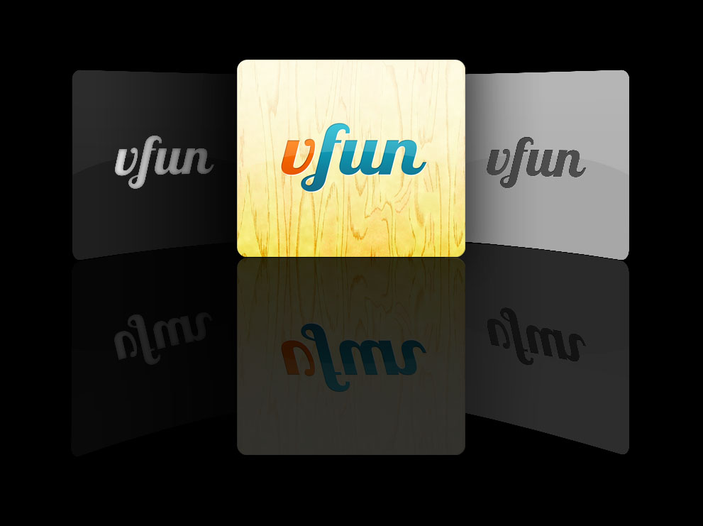
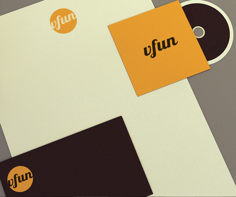
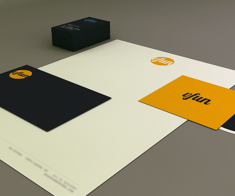
The Vfun stationery uses cream, black and turmeric yellow, with the Vfun wordmark set at an angle on each piece: business cards, letterhead, disc sleeves. The app icon has three versions, on light wood, dark and silver grounds, to suit different screens.
An image of a yellow umbrella standing out among black ones sums up Vfun's spirit: among ordinary days, this is the place for fun. It works for promotions without needing any extra words.
The value
Vfun gained an easy name and a layout that holds on every device. Users arriving from a computer, an iPhone or a Nokia meet the same smiling V and the same arrangement of sections.
Holding one image across many screens means accepting fewer effects on each. Sinh Vũ chose clarity over decoration, so Vfun is recognised wherever users look for it.
A smiling V on every screen
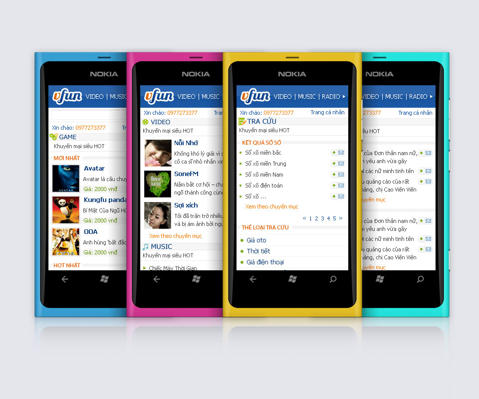

In their own words
Sensible flows and an interface carefully made for end users, from computers and iPhones to older Nokia phones. The logo is simple, friendly and easy to remember.