
True Money: a complex system, easy-to-use screens
True Money is an e-wallet for topping up, withdrawing money, paying bills and paying online. Behind the wallet sits a multi-level admin system used by several groups of people. Sinh Vũ designed the dashboard and a shared set of interface components, so every screen in the system follows the same easy-to-follow layout.
Many groups of users, one system
Behind the True Money wallet is a complex admin system. Several groups of people use it, from managers to everyday users. Each group has different permissions: which parts they may view and which they may edit.
True Money gave Sinh Vũ three pieces of work. First, an overall design for the whole system. Second, the dashboard, the overview screen for monitoring and handling work, which had to be easy to read, easy to operate and transparent. Third, a shared set of interface components (base elements), so the interface on phones and computers stays in step.
Every piece of content is a card
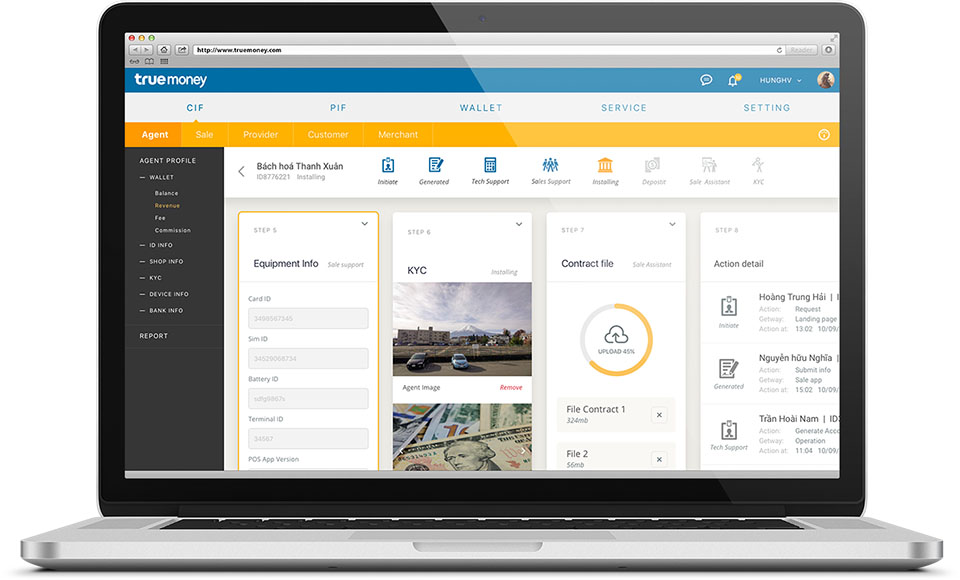
Sinh Vũ studied the interface and user experience (UI and UX: how a screen presents things and how people work with it), then chose one simple principle: all content sits in a card. A card is a separate rectangle with its own name, status and information fields. The selected card has a yellow outline so the eye finds it at once.
On screen, the cards run in a row and are numbered by step of the work. At a glance you can tell which step is finished and which is still under way. The same arrangement repeats in every section, so users learn it once and can use it everywhere else.
One navigation frame for every section
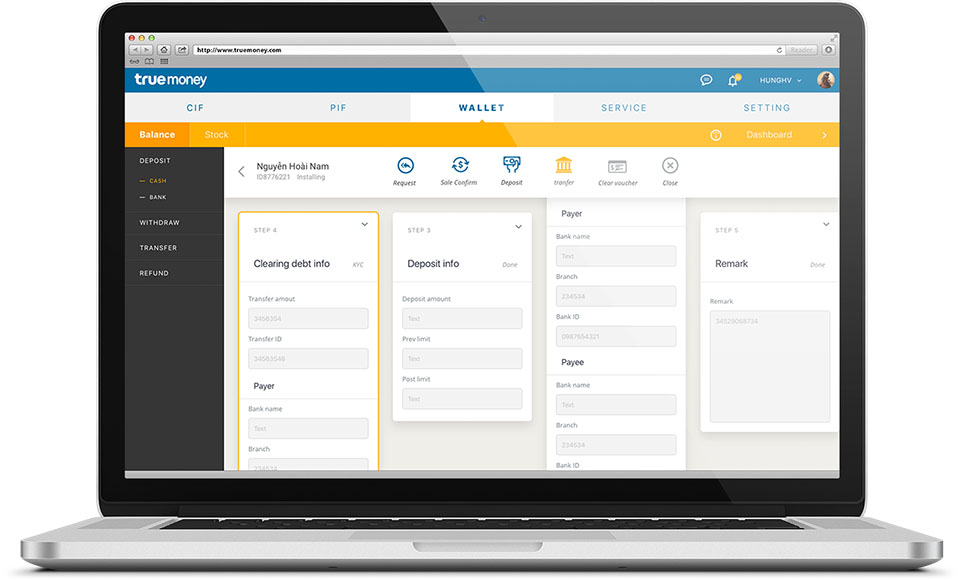
At the top of the screen are five main sections, such as Wallet, Service and Setting. Just below is an orange bar holding the sub-sections. On the left is a dark menu column for each function. Some screens also carry a guidance panel on the right. This frame stays the same on every screen, and only the cards in the middle change.
So the supplier screen, the agent management screen and the phone-card stock screen all share one frame. Users move from one task to another without having to learn the layout again.
60 modules for every situation
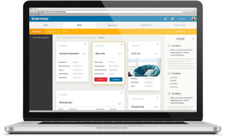
From the card principle, Sinh Vũ built an interface component set of 60 modules. Each module is a ready-made kind of card, such as a contact information card, a text card, an image card in several states, or a chart card.
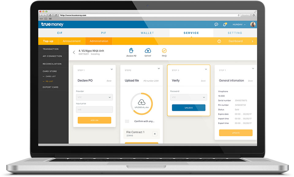
When a new screen is needed, existing modules can be combined instead of drawing everything again. For example, on the phone-card stock screen, a file upload card with a progress ring sits beside an information entry card, and they still look like one family.
The value
True Money gained a consistent interface that is easy to understand, easy to operate and quick to get used to. True Money's side noted that Sinh Vũ had reorganised the old ways of working into one standard, and said plainly that this is a challenge for the development team.
Sinh Vũ accepted that trade-off. A strict set of modules requires developers to follow each rule exactly, and in return users meet the same presentation on every screen.
In their own words
Sinh Vũ designed an entire large platform and reorganised our old user flows into one consistent system. The interface is easy to understand and users pick it up quickly. In return, it was a worthwhile challenge for our engineering team.