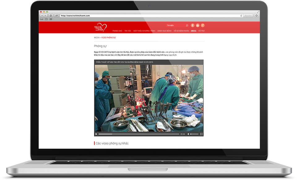
Trái tim cho em: website interface for a charity programme
Trái tim cho em ("A Heart for Her") is a charity programme for heart patients, with its own website at traitimchoem.com. Sinh Vũ designed the interface of this website, that is, how each page is arranged and how it looks on screen. The home page, the list of partner hospitals, the photo page and the video page all share one red menu bar.
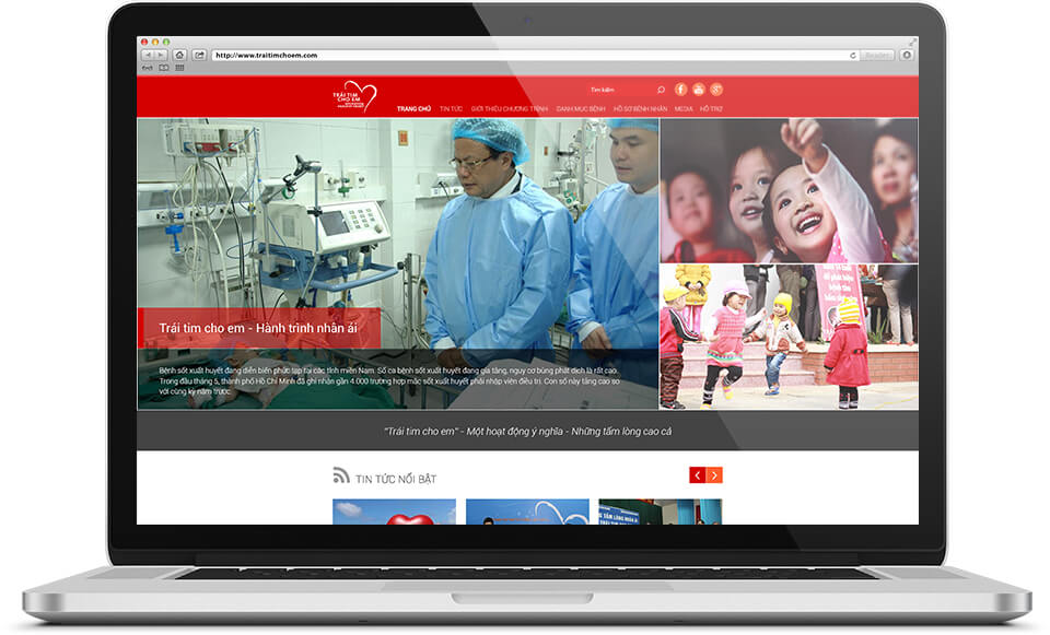
A home page that shows at once what the programme does
Visitors to traitimchoem.com need to know straight away what the programme is. So the top of the home page gives a large picture on the left, with the article title set on a red band and a few summary lines below. On the right are two small photos of children.
Just below is a dark band carrying the line: "Trái tim cho em, a meaningful activity, generous hearts". Next comes the Featured news section, with two arrow buttons for browsing other articles.
The same red menu bar on every page
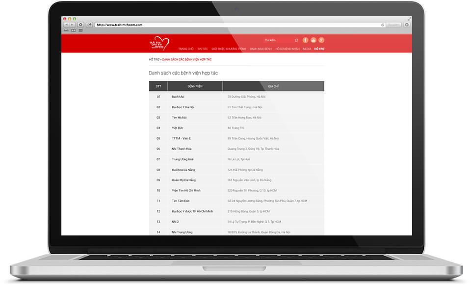
The red bar at the top carries the Trái tim cho em logo, a search box, buttons to Facebook, YouTube and Google+, and seven main sections: Home, News, About the programme, Disease directory, Patient files, Media and Support. The section being viewed is in bold, so readers always know which page they are on.
Under the bar, a small line shows the path to the page, for example from Support into the List of partner hospitals. This page is a table of three columns: number, hospital name and address. Light grey rows alternate down the table so the eye can follow each row without slipping.
Photos and videos of the programme's activities
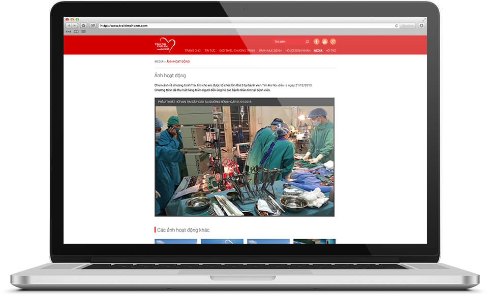
The Media section (pictures and videos) is split into two pages: Activity photos and Documentary videos. Each page opens with a few introductory lines, then a large picture or video player in the middle, with a caption above it.
Below comes the section Other activity photos or Other documentary videos, marked by a small red stroke. After one photo or video, viewers can move on to another without going back to the previous page.
The value
The whole website uses only two main colours, red and white, with one heart logo at the left of the menu bar. Whichever page readers open, they recognise at once that they are still on the programme's website.
Each kind of content has its own section with a plainly named title: news, partner hospitals, photos, videos. Readers see the section name and know where to click.
A red and white website, every section easy to find
Documentary video