
Tinngan.vn: news you can grasp at a glance
Tinngan.vn is Viettel Telecom's news portal. Stories are written short, and there is audio news too (tap and it reads the story aloud). Sinh Vũ designed the logo, web interface, mobile app and the printed items that go with them.
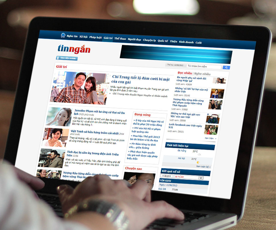
A news site for fast skimming
Viettel Telecom wanted a site that brings news quickly to internet users in Vietnam. Stories are shortened so that readers can skim and still know the day's events. Alongside the written stories there is audio news.
The brief covered a logo and interface for the web and for apps on Android, iOS and Windows Phone. Readers here only skim, so Sinh Vũ chose a simple direction that is easy to tap, and put the effort into small details.
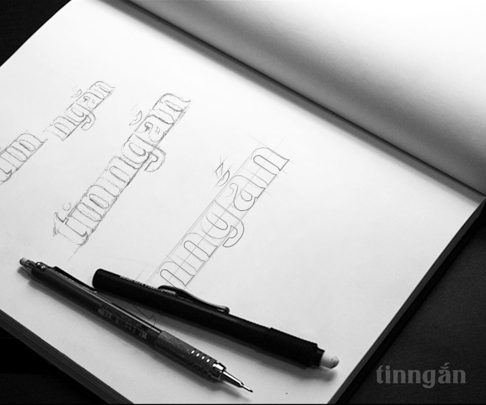
Logo: a lower-case name in two colours
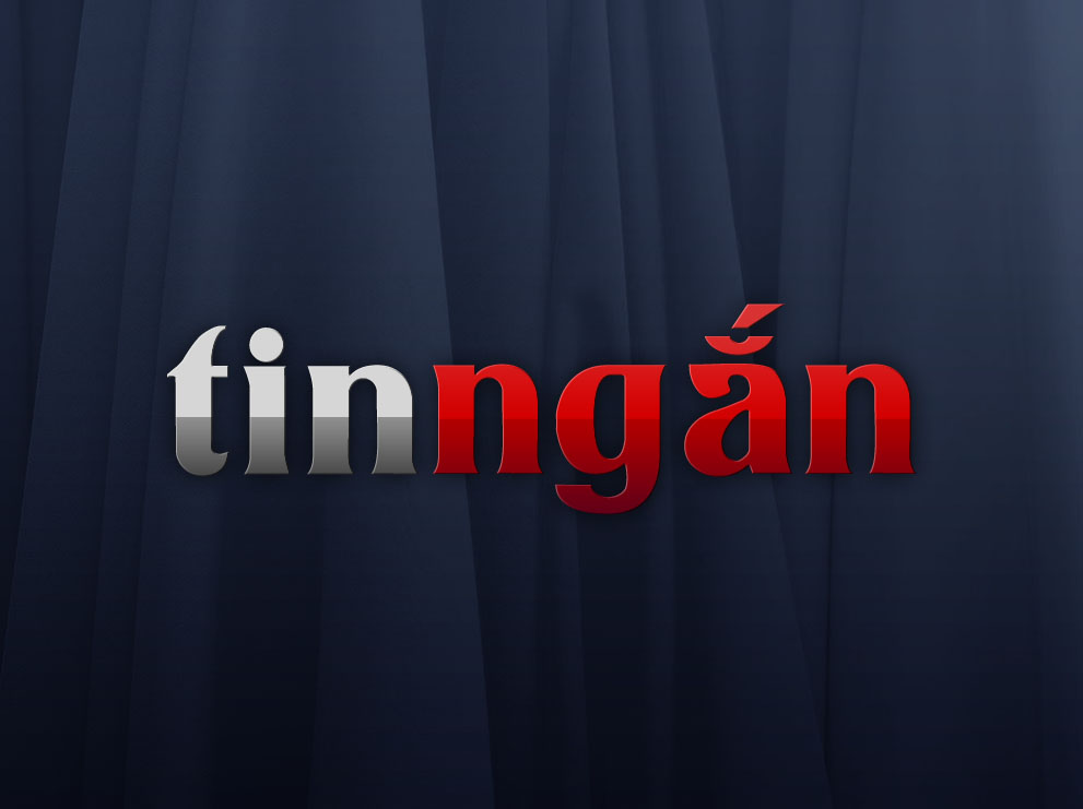
Sinh Vũ sketched the name tinngắn in pencil many times, using a ruled grid to adjust the height of each letter. The logo uses a serif typeface (with small strokes at the start and end of each stroke, common in printed newspapers). The acute accent on the ắ is drawn as one long slanted stroke that is easy to see.
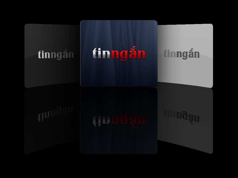
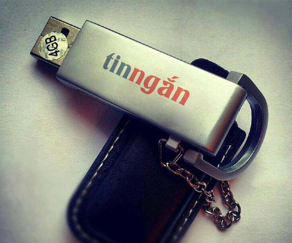
The final version splits the name in two: tin in deep blue and ngắn in red. On a dark ground, tin turns silver. With just two colours, the logo prints on USB drives, sticky notes and folder covers and is still recognised at once.
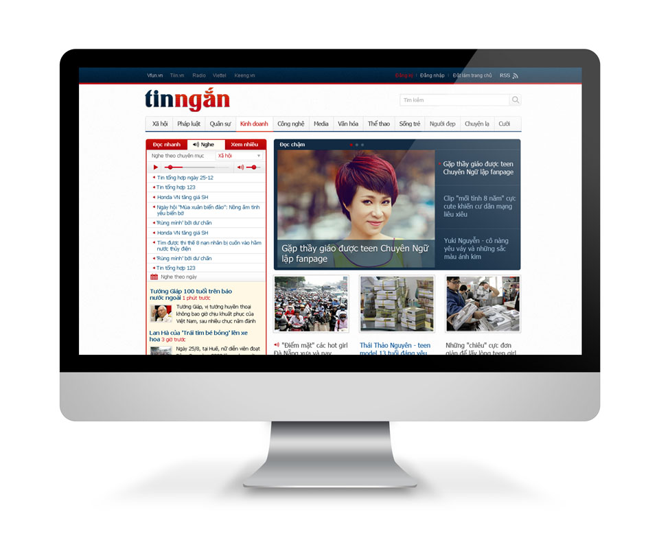
Web interface: quick to read, audio, most viewed
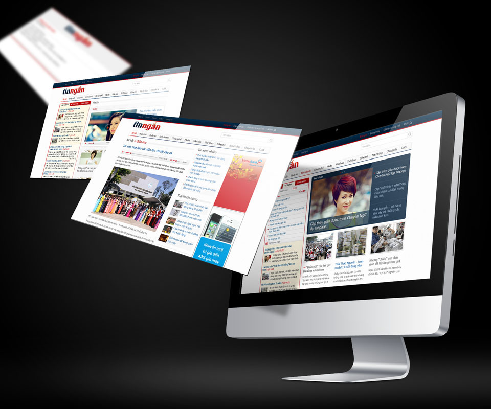
The category bar sits just under the logo: Society, Law, Military, Business, Technology, Sport and many more. The left column is split into three tabs: Quick read, Listen and Most viewed. The Listen tab has an audio player right above the list of stories, so one tap starts playback.
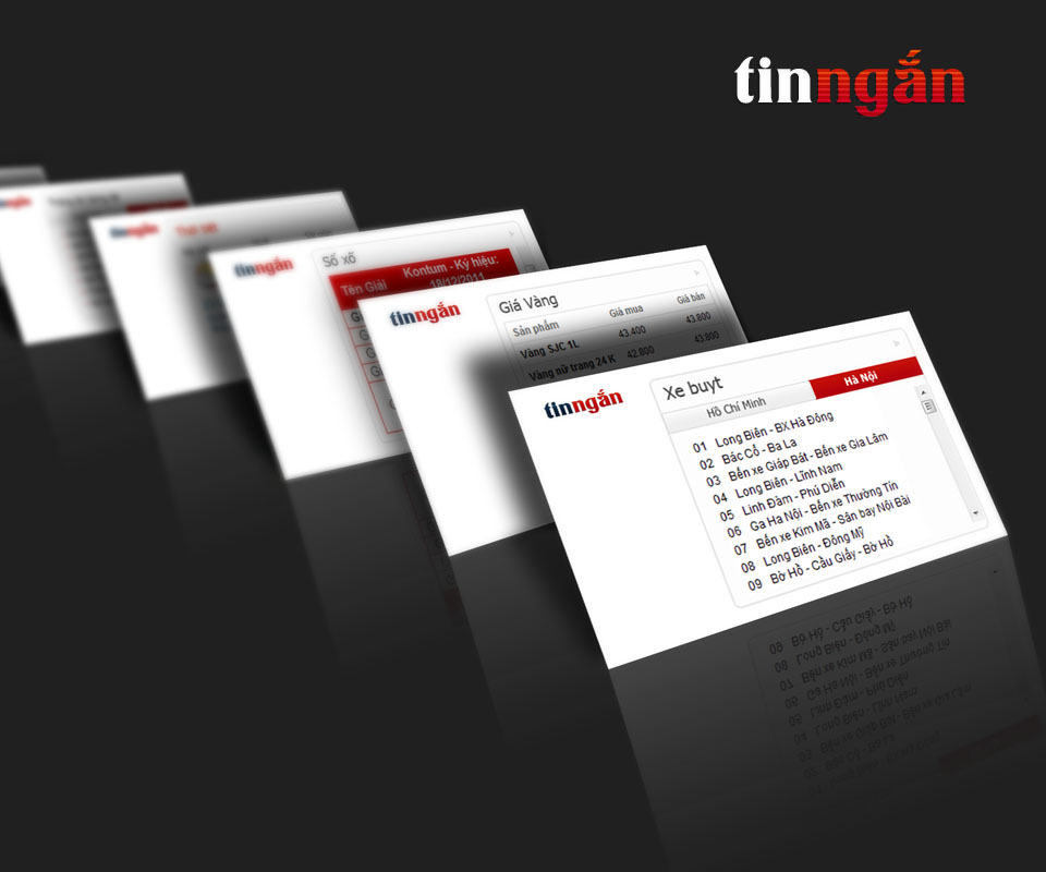
In the middle of the page is the featured story panel, where three stories take turns, with a large picture on the left and the headline on the right. Utilities such as lottery results, gold prices and bus routes are made as small tiles of one style, each with the logo in its corner.
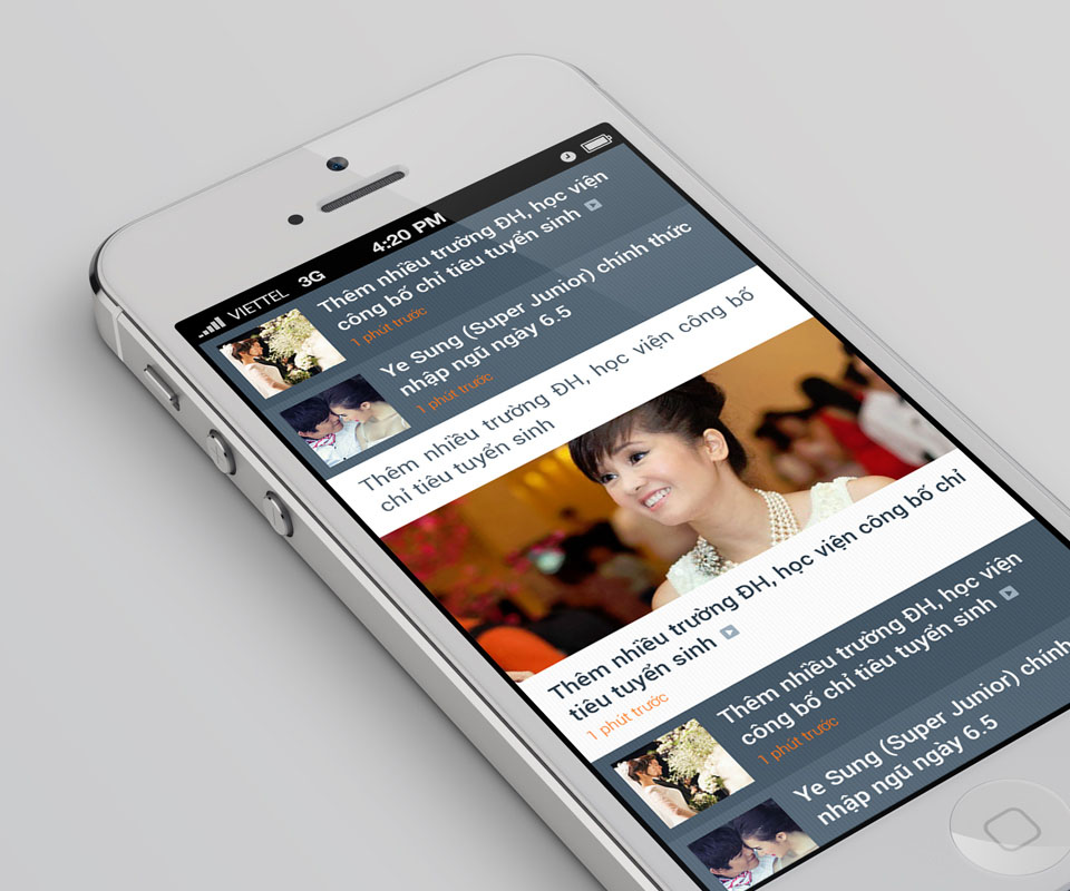
Phone interface: one column, easy for a finger
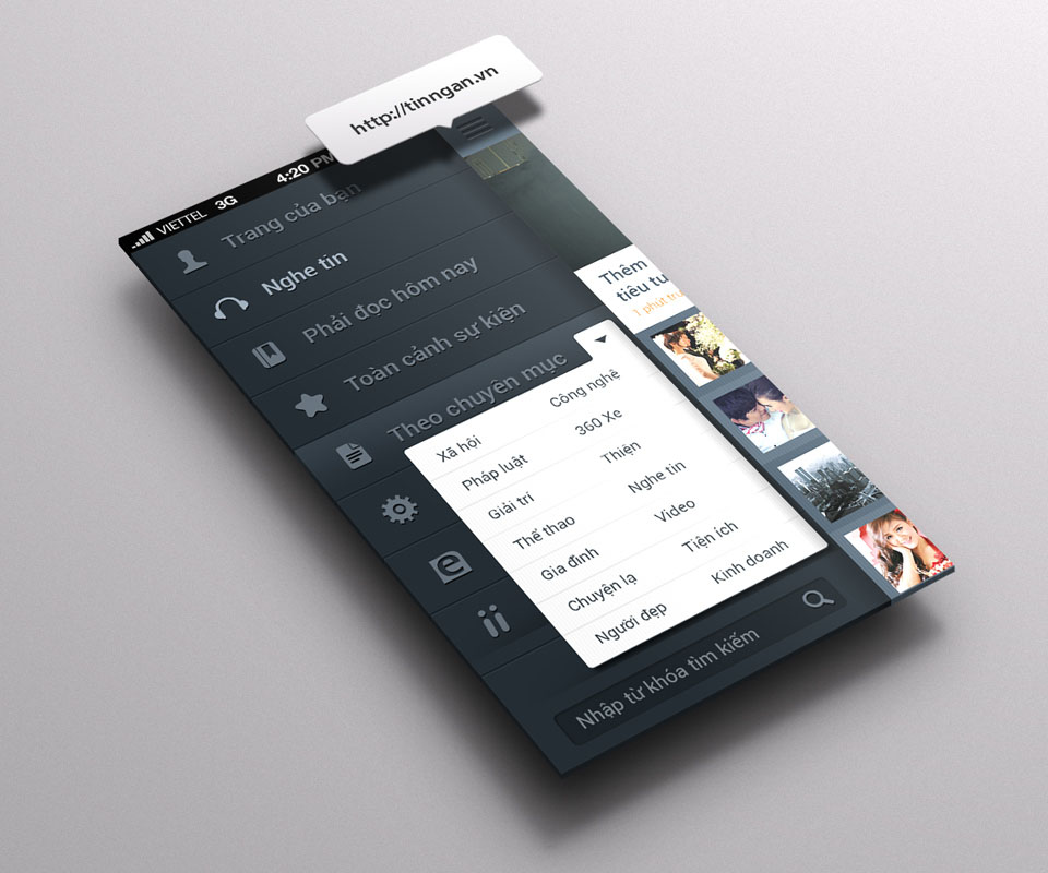
On the phone, Sinh Vũ kept a grey-blue ground and stacked the stories in a single column. Each story has a small picture, a bold headline and an orange line below it showing the time posted. Between items in the list, some stories open as a large picture.
The menu slides out from the left edge and holds Listen to news, Must read today, Event overview and By category, with a search box at the bottom. The same arrangement was made for Android, iOS and Windows Phone.
Result
Tinngan.vn has a logo of its own and a set of interfaces that read the same way on the web and on phones. The site's editor-in-chief remarked that the design is consistent and suits the content and the readers the site is aimed at.
The client's product team also said the designs were easy to approach and easy to put into the real product.
Short news, recognised at a glance
In their own words
The design is consistent from the logo and website to the mobile app, and fits both our short-news content and the readers Tinngan.vn is made for.
I am happy with Sinh Vũ's support throughout product development. The designs were clear and easy to follow, so our team built them into the real product smoothly.