
Tiin.vn: a news site in teenage colours
Tiin.vn is an entertainment news site for teenagers run by Viettel's Content Development Centre. Sinh Vũ designed the logo, palette, news interface and merchandise so young readers open it and feel it is their place, not a newspaper for grown-ups.
A grown-up format for teenage readers
News sites usually look serious: white ground, black text, red headlines, dense columns. That suits readers of current affairs but feels distant to students. Tiin.vn writes about stars, fashion, school and friendship, so it needed a face that speaks in a teenage voice.
The general rule in news is to look serious in order to be trusted. For Tiin.vn, Sinh Vũ deliberately went against that rule, because teenage readers trust the site that looks like them.
Handwriting and candy stripes
The Tiin logo is written like a signature: a soft curling T, the two i letters standing close like two friends. Deep pink with a light shadow, plus a small orange star carrying .vn. It reads young, playful and close.
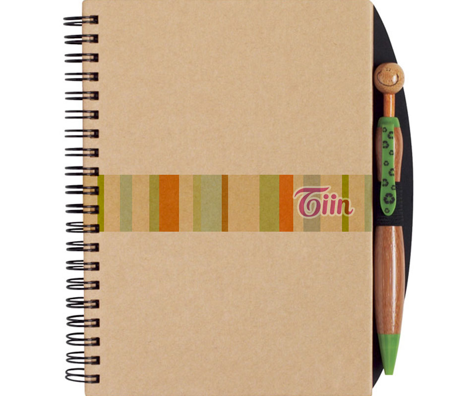
The palette is a set of pastel candy stripes: pink, orange, mint, cream yellow. The stripes became Tiin's own pattern, used behind the logo, on card edges and on bands wrapped around notebooks. Even where there is only a strip of colour, readers recognise Tiin.
The news interface
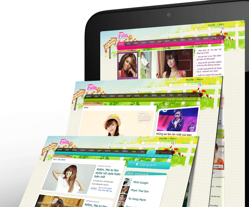
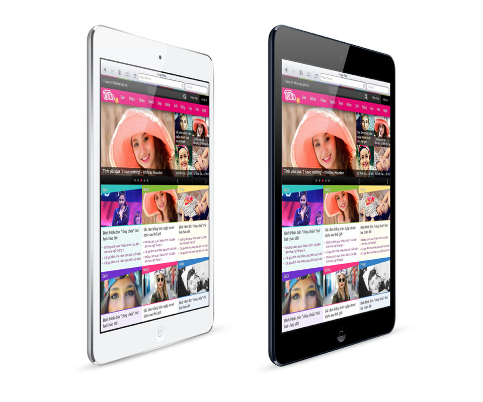
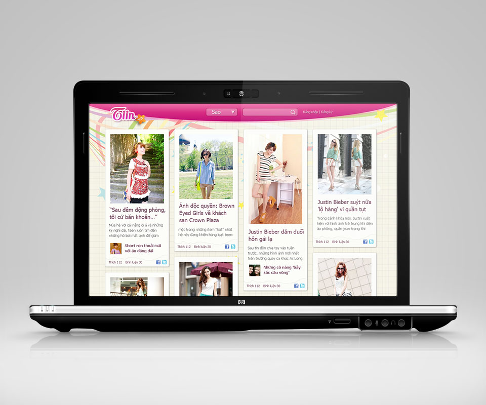
The Tiin.vn homepage arranges stories as large image blocks with little text. Photos of stars and fashion fill most of the screen, short headlines right beneath. Each section takes a colour from the stripe palette, so even a quick skim tells readers where they are.
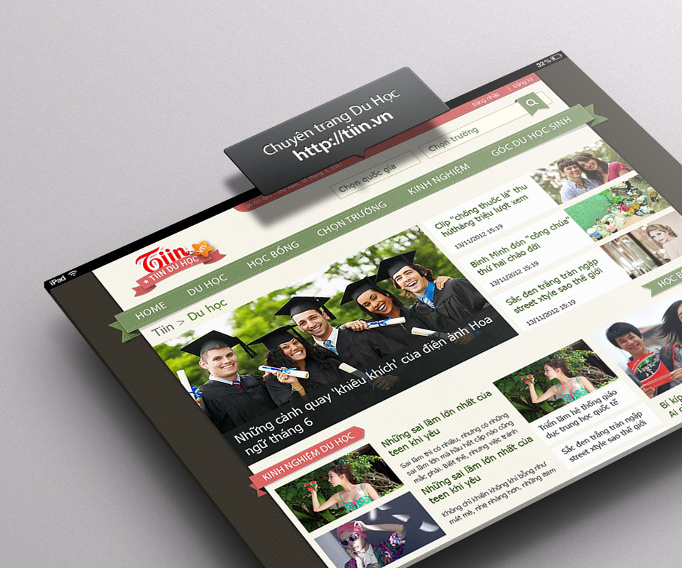
Sinh Vũ also designed special-topic pages, such as a Study Abroad page in green with graduation photos, and tablet versions of the interface. Every page shares the logo and the image-block layout, so although each topic has its own colour, the whole site remains one Tiin.
Merchandise for readers
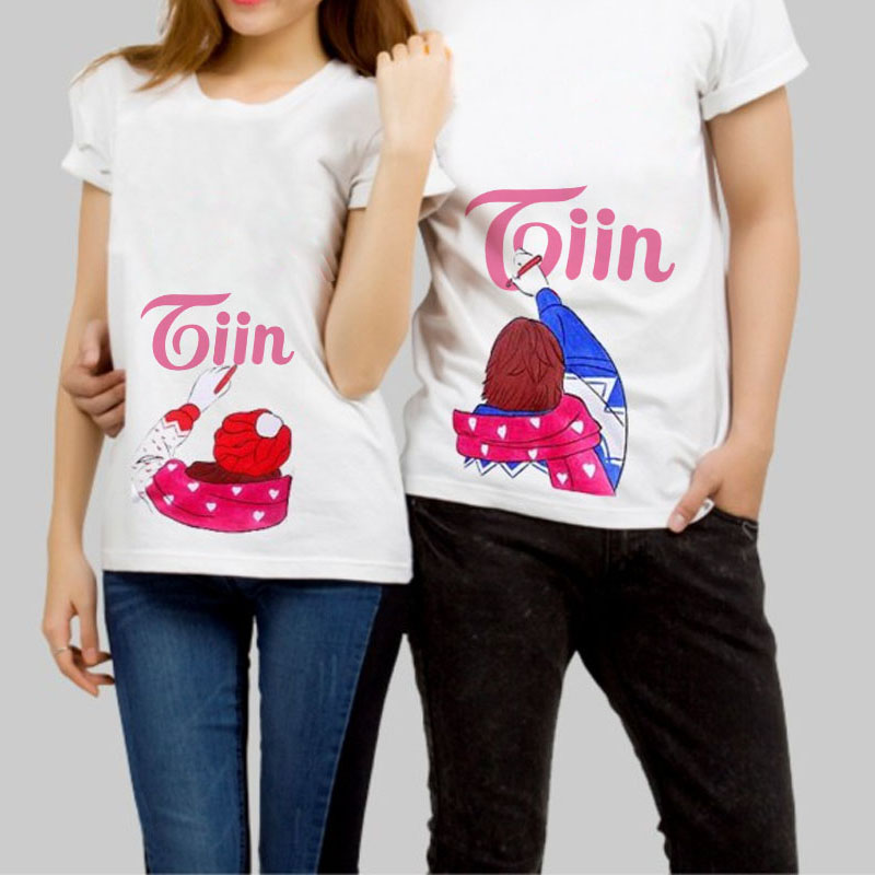
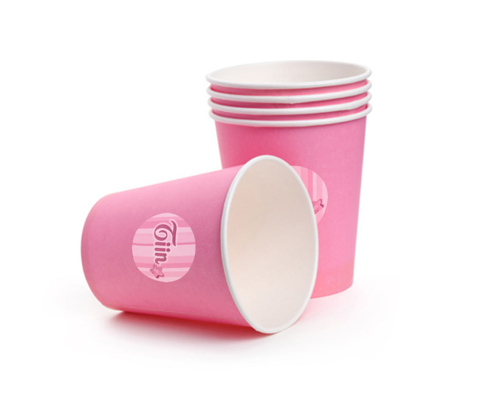
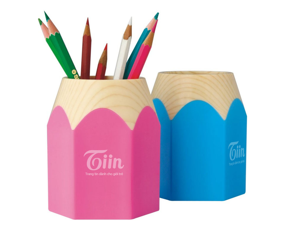
Teenagers like to carry what they love. Sinh Vũ designed a set of items: pink paper cups, pencil-shaped pen holders, kraft notebooks wrapped in a striped band, T-shirts printed with hand-drawn characters. Each uses the candy stripes or the pink Tiin wordmark.
These items follow readers into class, to fan meetings and to the site's events. The Tiin name appears off screen, in readers' everyday lives.
The value
Tiin.vn gained a face unlike other news sites of its time: young, colourful, approachable. Teen readers opening the site, holding the notebook or wearing the shirt all see the same pink and the same candy stripes.
When readers are teenagers, keeping the serious look of the news trade costs readers. Sinh Vũ chose to speak in the readers' voice and kept that voice consistent from the logo down to every item.
Pink and candy stripes that follow readers
In their own words
Good design, logical layout, easy to use. The soft colours suit readers aged 12 to 18, so they open the site and feel it is a place made for them.