
Sóng Vàng: a logo as a layered speech bubble
Sóng Vàng is a technology start-up building an app for quick news lookup on smartphones. The app gathers news from trusted press sources and sorts it by area of daily life. Sinh Vũ designed the speech-bubble logo (the shape of a talking bubble in comics) and the app interface, so that users see at a glance that this is a place that gathers and filters news.
A news-gathering app must be understood at a glance
Sóng Vàng does not write news itself. The app gathers news from trusted press sources and presents it again on the phone for lookup. The brief for the logo was to say exactly that: this is where news is brought together, like a stream of messages.
The second task was the interface. News arrives from many sources and covers many areas. If it is all mixed together, users struggle to find what they need. So the interface had to arrange the information and divide it into groups in an order that is easy to follow.
A layered speech-bubble logo
The logo is a yellow speech bubble. Inside, the two words song and vang sit on two lines, in white, bold and narrow. The tail of the bubble has two parallel lines set apart, looking like two layers laid over each other. This layered drawing speaks of the app filtering news and separating it into parts.
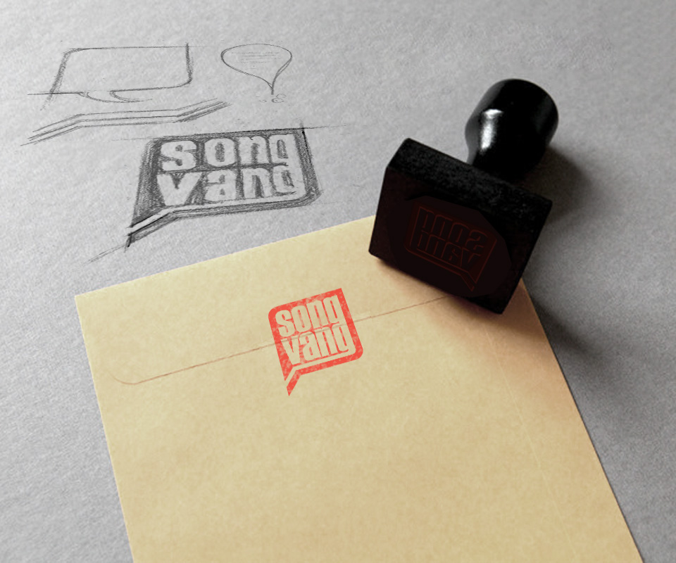
Sinh Vũ sketched in pencil first, trying both rectangular and round bubbles. The chosen version uses a square with all four corners rounded, and the letters fill almost the whole bubble. The logo was also tested as a red ink stamp on a paper envelope, to see whether it stays clear when printed in a single colour.
Dividing information into groups for easy choice
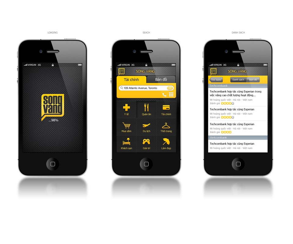
The home screen of the app is a grid of nine tiles, one for each area of daily life: Health, Restaurants, Finance, Shopping, Travel, Fashion, Hotels, Entertainment, Beauty. Each tile has a simple yellow icon on a dark ground. One tap takes the user to the right group.
Within each group, news is tied to individual organisations. In the design, the Finance group lists news under the name of each bank. Each item takes one line with a headline, the organisation's address and a star rating. Users can search by address and view results as a list or on a map. The opening screen and the group screen use a dark ground, so the yellow of the brand stands out clearly.
The logo on everyday items
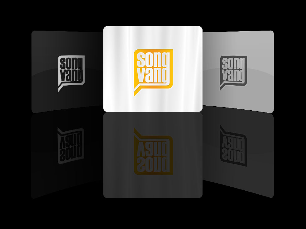
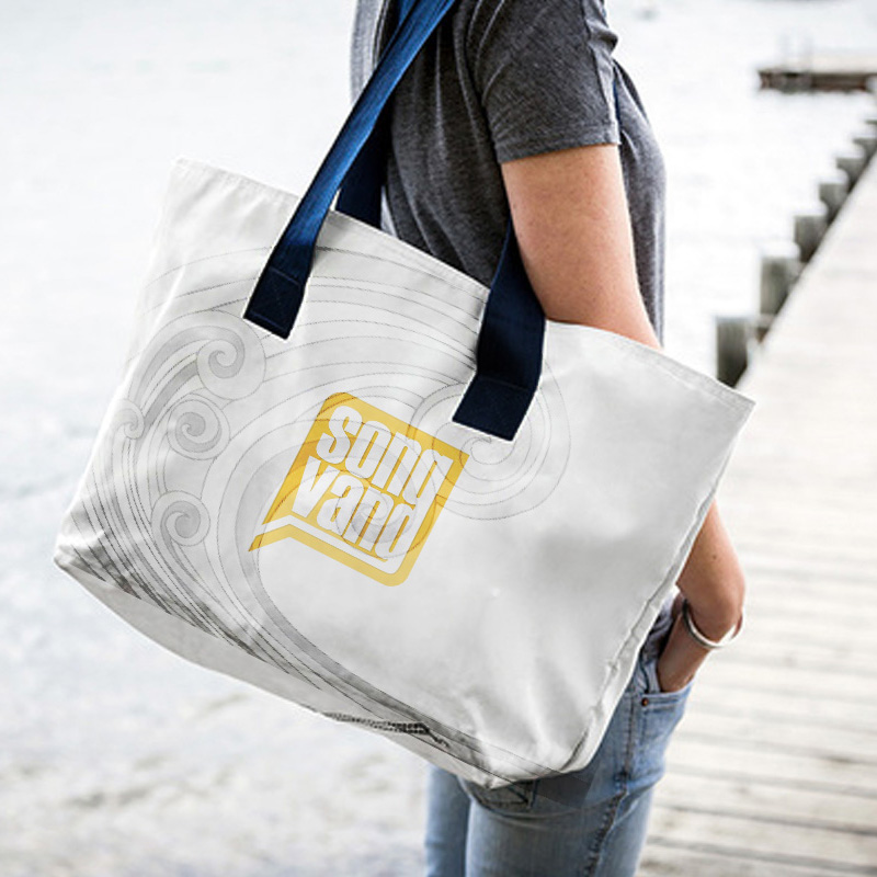
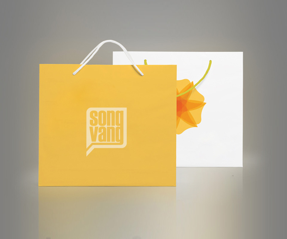
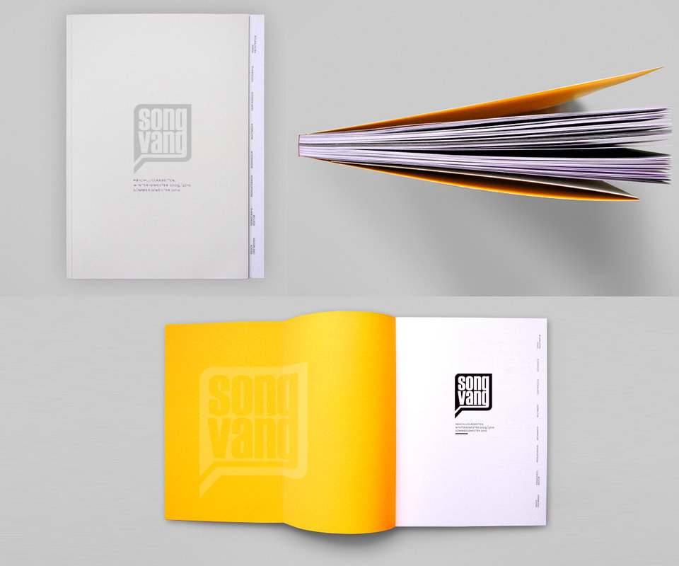
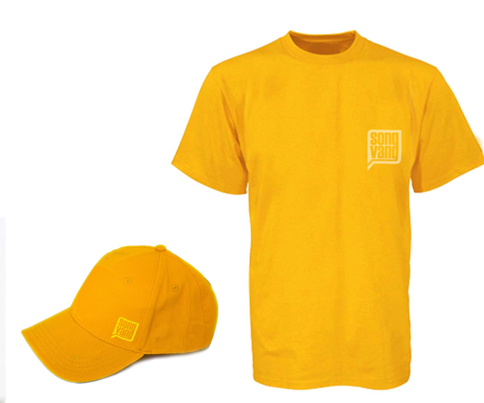
The yellow and the speech bubble were carried onto real items: a yellow paper bag, a white cloth bag, a grey notebook with yellow endpapers, a T-shirt and a cap. Besides the yellow version, the logo has single-colour versions: a light one for black grounds and a dark grey one for grey grounds.
On the cloth bag, fine wave lines are drawn behind the logo, recalling the word sóng (wave) in the name.
The value
Sóng Vàng has a logo that says exactly what the app does, and an interface that divides information into clear groups. The person acting as CTO (chief technology officer) of Sóng Vàng said the design met the goals set from the start, and that the app is easy to use.
The logo and the interface come from the same idea: gather news, then divide it into layers and groups. So whether users look at the logo or open the app, they see the same way of working that belongs to Sóng Vàng.
A yellow speech bubble on paper and cloth
In their own words
The design met the goals we set at the start. The app is easy to use, and news is clearly divided by topic, which keeps readers wanting more.