
Search+: logo and interface for an app that reports as soon as a result appears
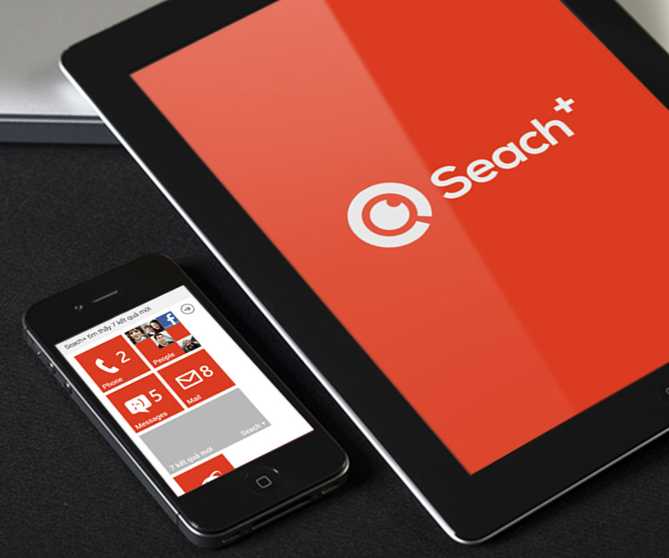
Search+ is an app that looks for information on request. When a suitable result turns up, the app alerts the user at once by email, text message or push notification (a line of news that appears on the phone screen by itself). Sinh Vũ designed the logo and interface so the app looks the same on three phone operating systems: iOS, Android and Windows Phone.
An information-finding app for ordinary users
Search+ was a new product. Its job is to filter search results, because Google often returns too many pages. Users say what they need to find, the app searches by itself and only alerts them when a result matches the request.
The app runs on iOS, Android and Windows Phone, so the logo, colours and screen layout had to be consistent on all three. The users are ordinary people, so the interface needed to be simple, with no doubt about where to tap.
A logo from a coffee cup and the search symbol
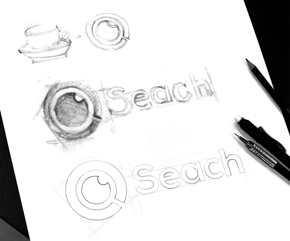
The pencil sketch shows that Sinh Vũ began with a coffee cup on a saucer. The cup was redrawn as a circle with a handle sticking out at the lower corner, like the familiar magnifying-glass symbol for searching. In the middle of the circle sits a small round dot.
The idea behind the logo is a friendly one: you can sit and drink coffee while Search+ looks after the finding. After the sketch, Sinh Vũ rebuilt the logo on a grid (guide lines that keep the strokes even), then chose red-orange as the main colour.
News grouped into tiles, tap to read
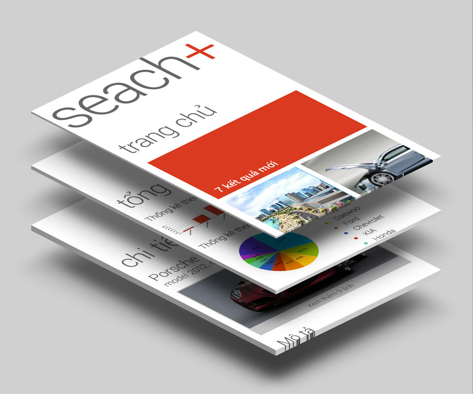
The home screen is laid out as square tiles. A large red-orange tile at the top reports the number of new results, for example "7 new results". The tiles below are the groups of news, such as property or cars and motorbikes. The news is clearly grouped, so users see at once which tile to tap.
Sinh Vũ divided the app into three kinds of screen: the home page, the summary page and the detail page for a single result. The summary page draws the figures as bar and pie charts. The detail page has a large picture with a description below. Each screen does one job, so users move from the overview to the detail without getting confused.
One look on every device
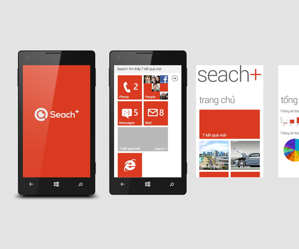
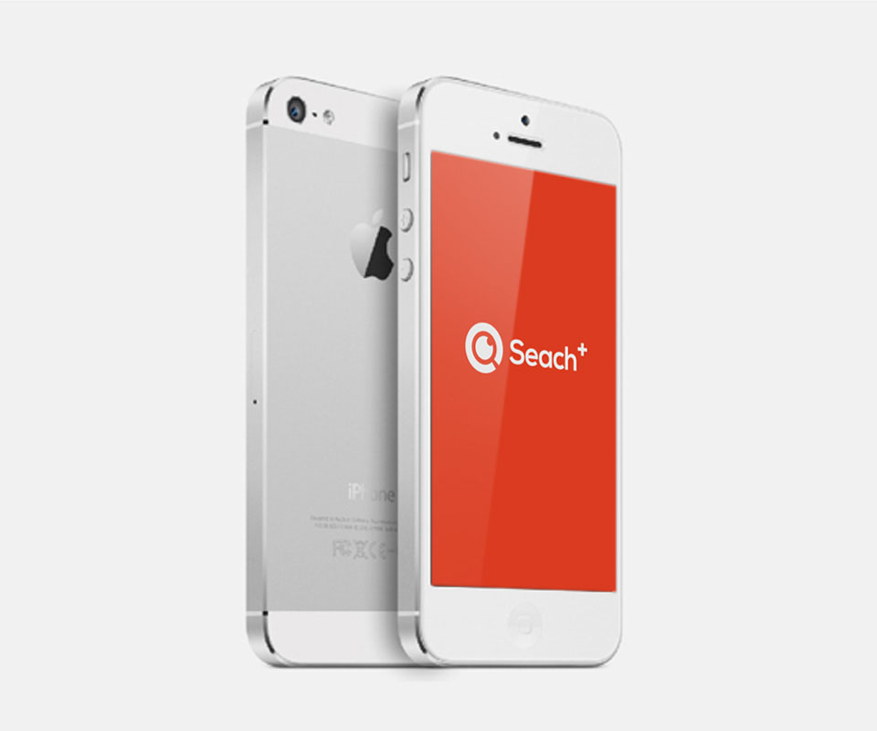
The start screen has a red-orange background with a white logo in the centre, used the same way on Windows Phone, iPhone and tablet. The main interface is divided into square tiles in the familiar Windows Phone style, and it stays clear when opened on an iPhone.
The notification "Search+ found 7 new results" is kept to one short line at the top of the screen. Users only need a glance to know there is news.
The value
Search+ gained a memorable logo tied to the image of a coffee cup, and a simple interface that is consistent across three operating systems. This approach is aimed at ordinary users: no need to know much about technology to use it.
The head of Search+ said the design had solved the product's problem.
One red-orange logo from phone to everyday objects
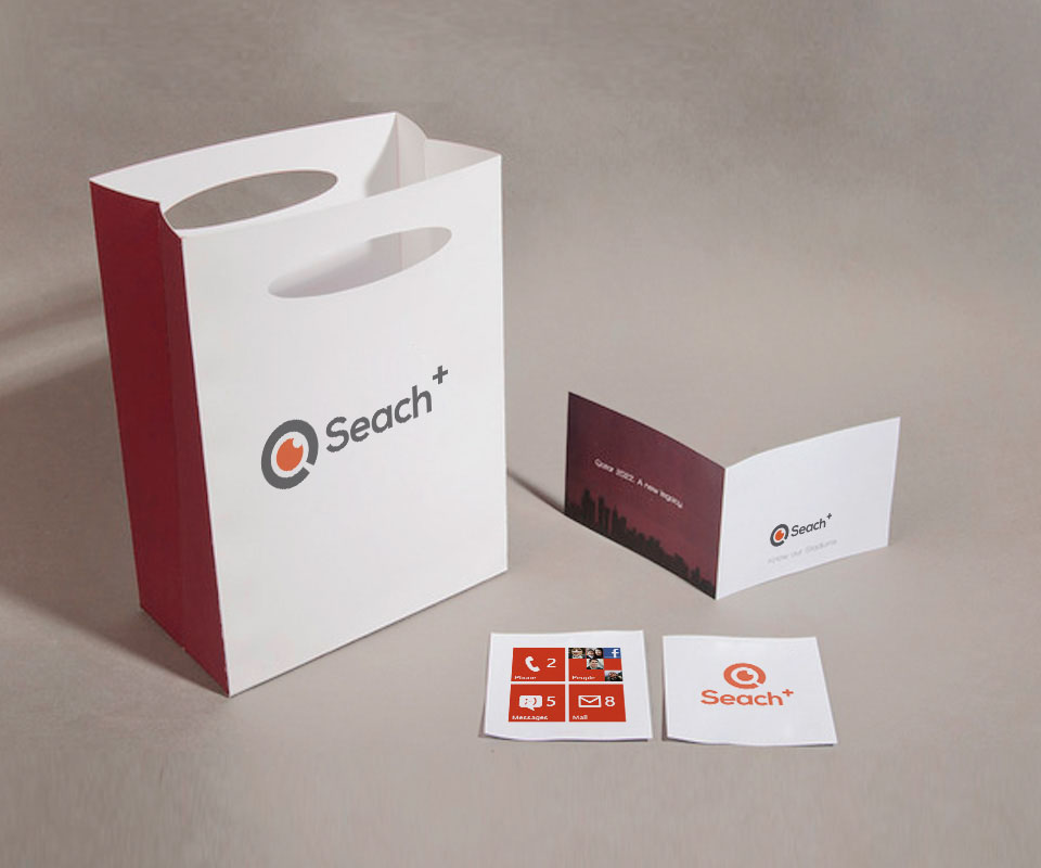
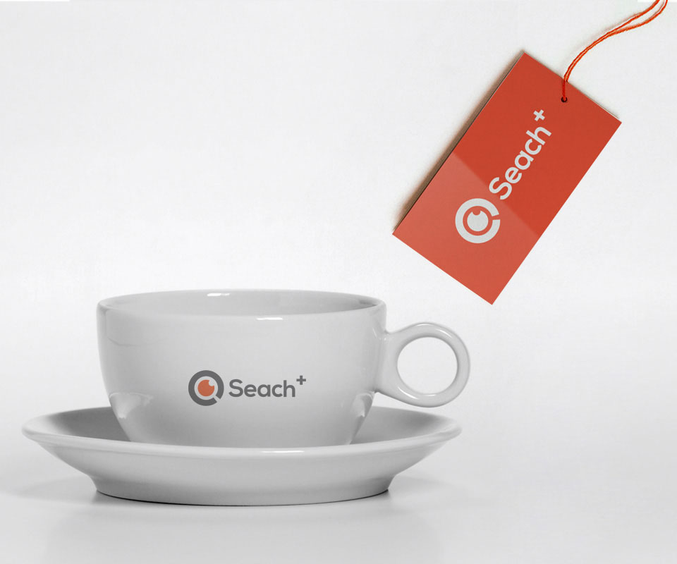
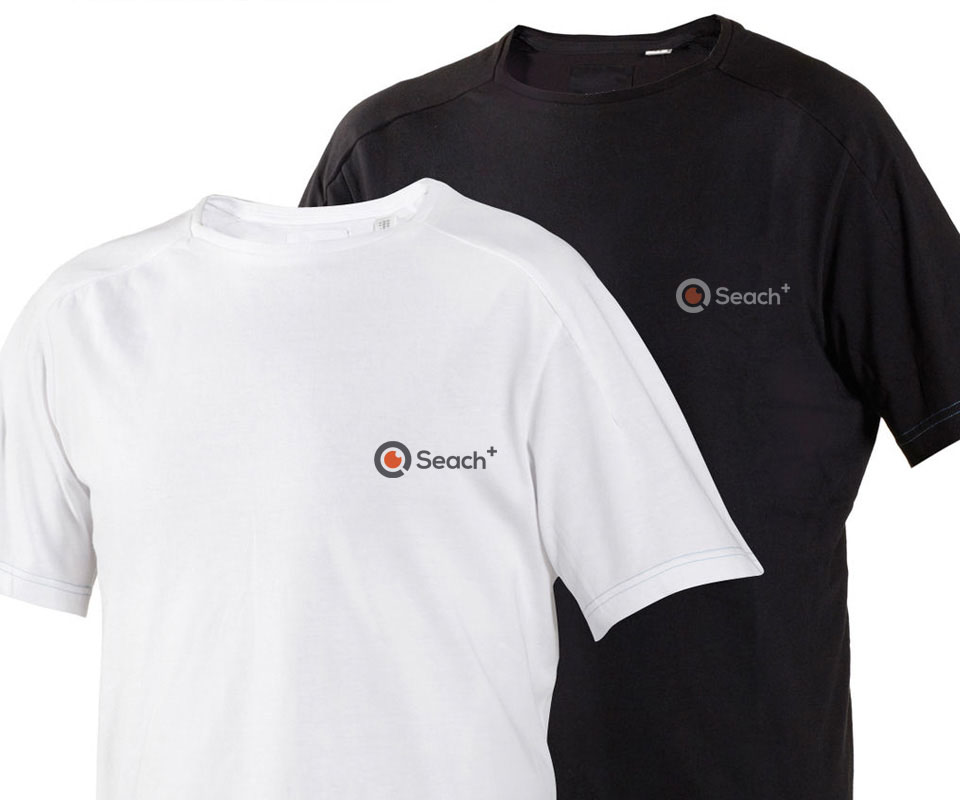
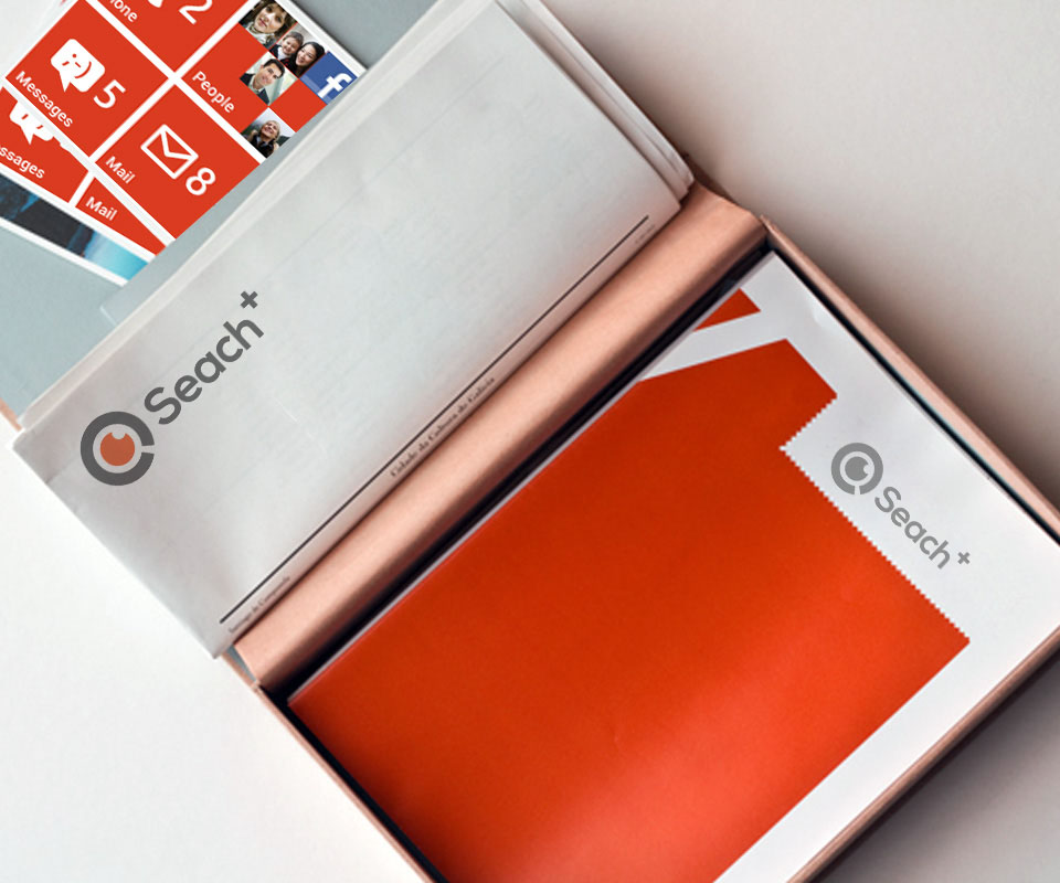
The pictures below are mockups (staged images) showing how the Search+ logo looks on a phone, paper bag, cup, T-shirt and stationery.
In their own words
The design solved Search+'s problem. Because the product is for everyday users, Sinh Vũ focused on making it simple, clear and easy to learn, and kept the interface the same on iOS, Android and Windows Phone.