RichADX: a logo for a mobile advertising service that raises revenue
RichADX is a partnership between Google and MOG Vietnam that helps developers of mobile apps and games earn more from Google's advertising. Sinh Vũ designed a logo that speaks about the advertising trade, then carried it onto office stationery, a folded leaflet, a brochure and gifts.
The brief: a logo that speaks about advertising
Google chose MOG Vietnam as the first reseller in South-East Asia for Google AdX, Google's advertising platform for app owners. RichADX is the name of that project. MOG Vietnam brings the platform to developers of mobile apps, then stays with them through the whole process of tuning their ads to earn as much as possible.
RichADX's clients build apps for Android, iOS, Unity (a tool for making games) and games written in the C++ language. Because it serves so many different groups, RichADX needed a logo that speaks about advertising in general and is not tied to any one platform.
RichADX was then a project aimed at the future. The hard part was turning a plan still ahead of it into a shape that people understand at a glance.
An arrow joined into the letter X
Sinh Vũ kept the name RichADX as the lettering of the logo: RICH in dark blue, AD in yellow. Right after the D comes a yellow arrow pointing forward. That arrow is the left half of the letter X, and the right half is drawn with horizontal stripes in dark blue. The arrow fits the client's idea: a service for the future. Under the logo sits the line Safe Monetization Solutions, meaning solutions for earning money safely.
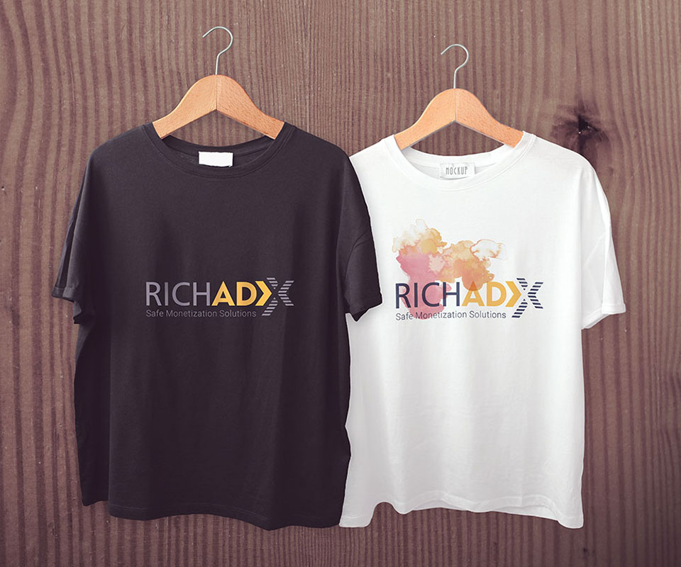
The logo has a deep-coloured version for light grounds and a pale version for dark grounds. In the T-shirt photo, the black shirt carries the light grey lettering and the white shirt carries the dark blue lettering, and both read clearly.
The brochure and the leaflet
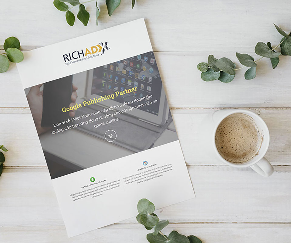
The brochure puts the logo at the very top. Below it is a photo of a hand holding a phone beside a tablet, then the line Google Publishing Partner in yellow. The next sentence says RichADX helps developers optimise advertising revenue on mobile apps, that is, arrange the ads so they earn more money. At the foot of the page are two short points: increase revenue and save time.
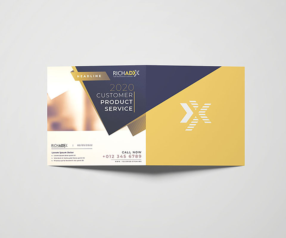
The folded leaflet uses two large blocks of colour, dark blue and yellow, cutting across each other. One half carries only a white striped X on a yellow ground. The other half has the logo, a heading on the dark blue block and an area for a photo.
Office stationery and gifts
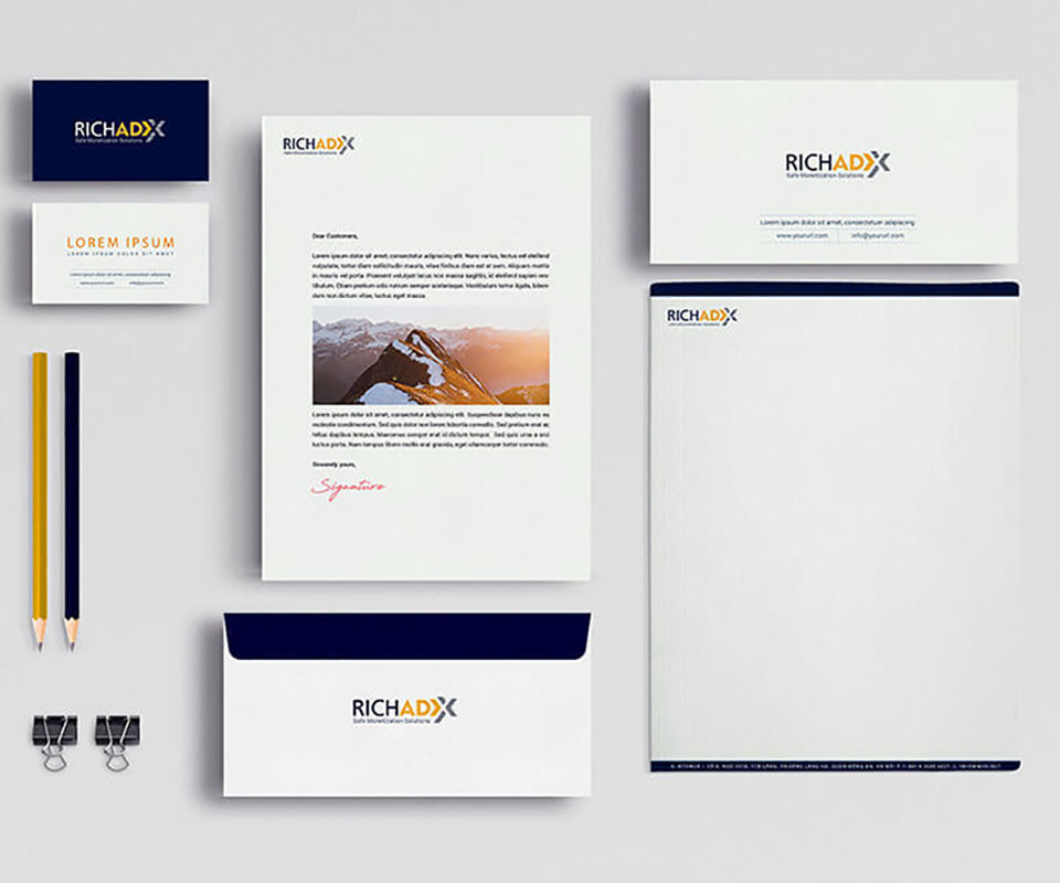
Alongside the logo come three groups of applications: office stationery, items used online and items for introducing and promoting the service. The stationery set includes business cards, letterhead paper, envelopes and headed paper. The business card is dark blue on one side and white on the other. The envelope has a dark blue flap and a white body. Two pencils, yellow and dark blue, repeat the two main colours.
The logo is also placed on a white ceramic mug and a T-shirt, and embossed on white paper. Embossing is pressing paper so the shape stands up without any ink. Even with no colour, people still recognise the logo by the arrow and the stripes of the X.
The value
RichADX has a compact logo: the name and an arrow pointing forward sit in one shape. From the leaflet and the brochure to the mug, people meet the same striped X and the same two colours, dark blue and yellow, so they know it is one brand.
The logo uses simple shapes, so it stays clear when printed small on a business card, on a black or white shirt, and even when it is only a raised shape on paper with no ink.
The RichADX logo on every printed item