Reeng: calls and messages that show when they are free
Reeng is an internet calling and messaging app that Viettel built in 2013 to compete with Viber, Line and WeChat. The industry calls this kind of app OTT: a service that runs over an internet connection rather than the regular phone network. Sinh Vũ sketched the logo concept and icon set and designed the Android interface, through two review rounds with Viettel's VAS and Social Network Centre.
Viettel needed an app that could stand next to Viber and Line
By 2013, smartphone users in Vietnam were used to free messages and calls on Viber, Line, Kakao and WeChat. Viettel treated Reeng as a strategic product to compete with them, so its demands on the interface were strict, and its review report says so in the opening lines.
Reeng had one thing the foreign apps did not. Besides calls and messages between two phones running Reeng, users could also call and text phones without the app, even basic feature phones, at a fraction of the normal price. Viettel called this IP-GSM: calling from the internet into the regular phone network.
A logo that grew from yin and yang into a speech bubble
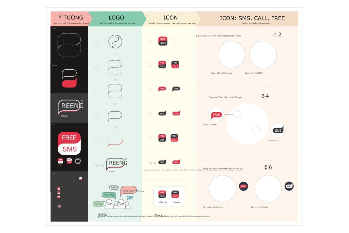
Sinh Vũ started from the yin-yang symbol: two halves wrapped around each other, like two people talking. Step by step the circle became a rounded square, then a speech bubble carrying the word REENG. The lower part of the bubble is red, echoing the two halves it came from.
The concept board placed the logo, the app icon and their use on screen side by side. Viettel could judge the logo in the exact place it would appear in the app, rather than as a shape on its own.
One look at the icon tells you free or paid
Viettel asked for an icon for calls to regular phones that was clear without any text, because this was Reeng's biggest difference. Sinh Vũ built a two-state icon set: a red FREE label for free calls and messages between Reeng users, and a dark label for paid calls and messages to the regular network.
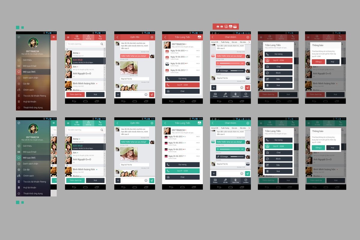
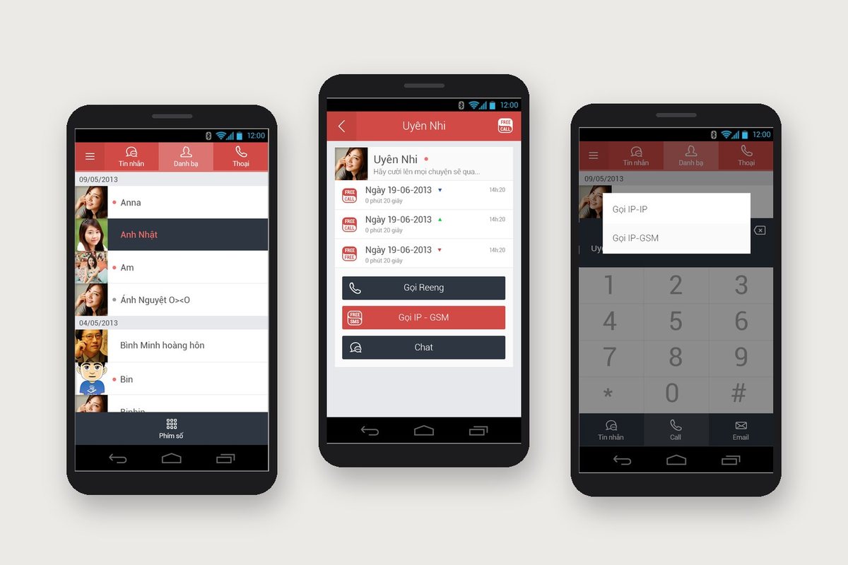
On the contact card, three large buttons stack vertically: Reeng call, IP-GSM call and Chat. The button for calling a regular phone is red so it stands out. When users dial a number, the app asks whether to call over the internet or to the regular number. They always choose before the call, so they know whether it will cost money.
Messages in text, photos and voice
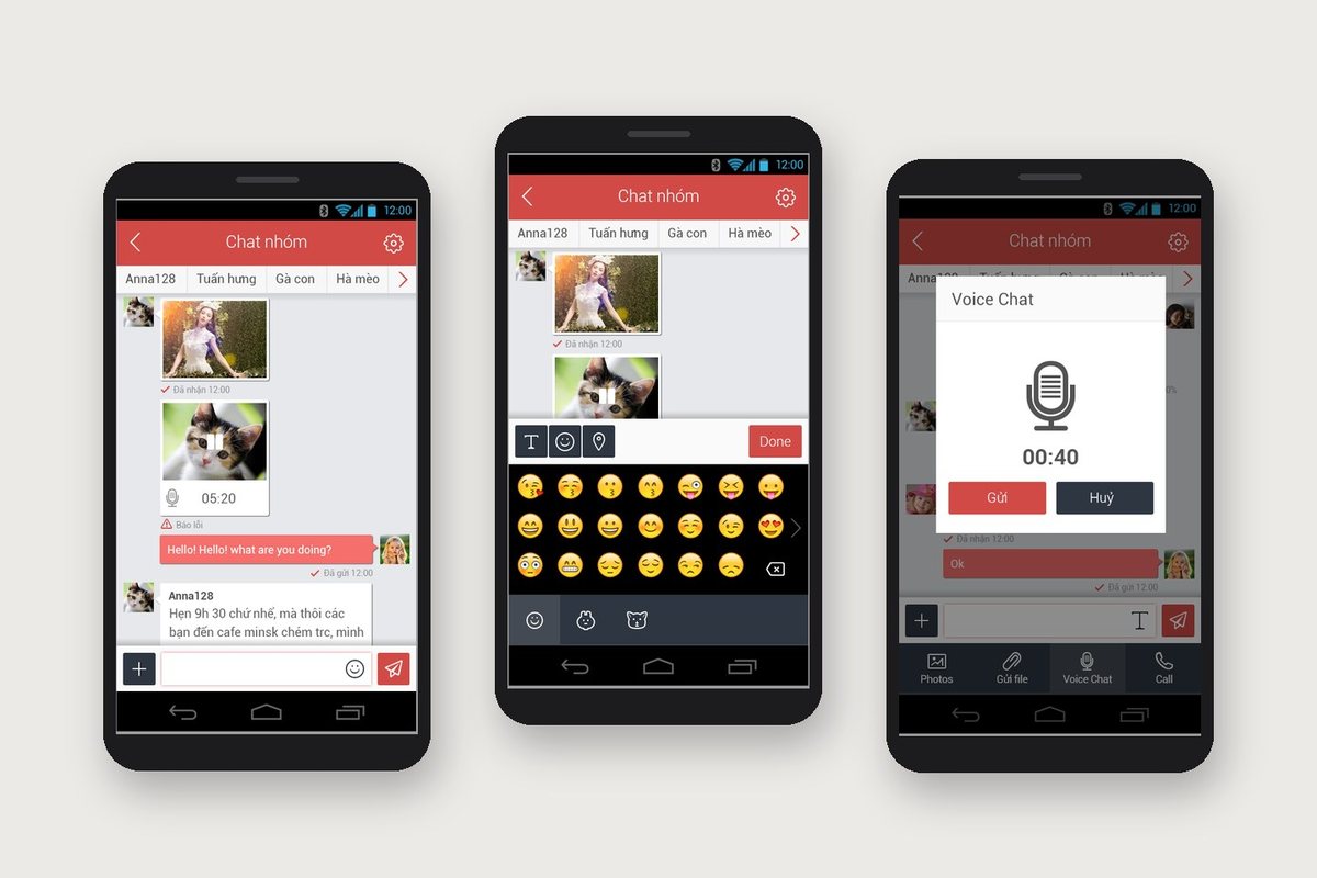
The group chat screen has a row of member names across the top. Sent photos appear as small frames with the time received. The bottom bar holds four actions: send a photo, send a file, record a voice message and call. Tap record and a small box shows a microphone and a seconds counter, with Send and Cancel.
Viettel's comments went deep into detail: upload bars for photos and voice messages needed a sensible length, failed messages needed a mark, and the emoji panel needed a button back to the text keyboard. The final version has screens for each of those cases.
Two review rounds, a full screen set for developers
Viettel sent its reviews twice, on 8 and 16 September 2013. Many comments came from running the app on real phones. A background photo on the menu slowed the app, so it became a solid colour. Round avatars could not be drawn by the app at the time, so they became squares. The avatar area was too large for small screens, so it was reduced.
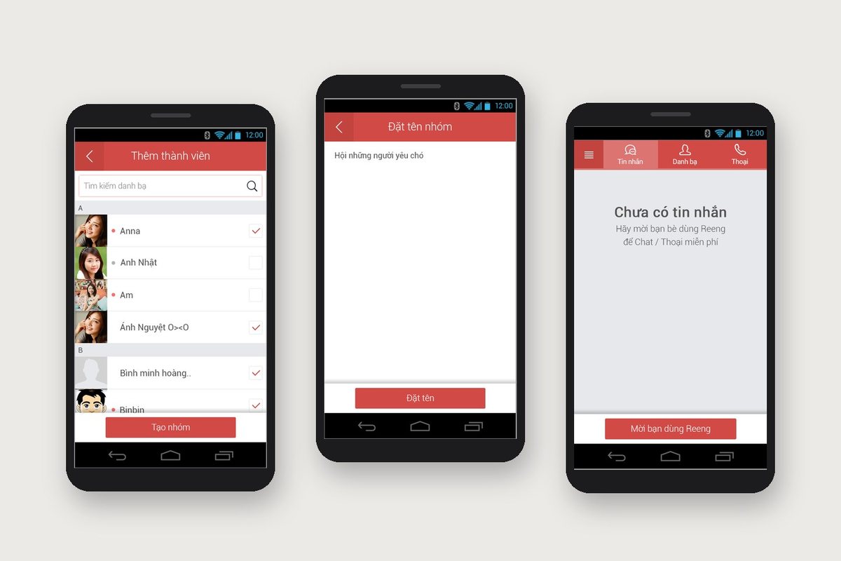
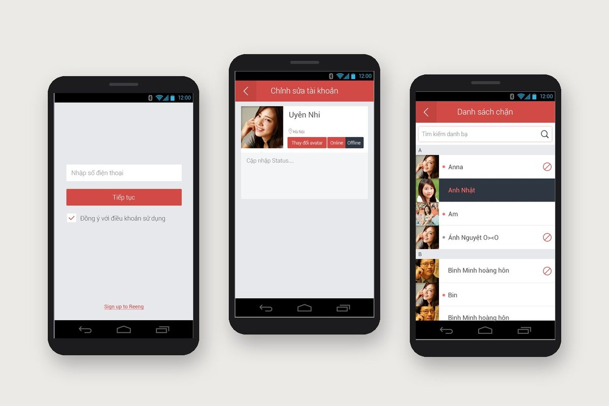
The final version has nearly 80 screens, from sign-in by phone number, contacts and call log to group creation, a block list and language settings. Each screen comes with its pop-up messages, so developers had a picture for every situation instead of guessing.
What Viettel received
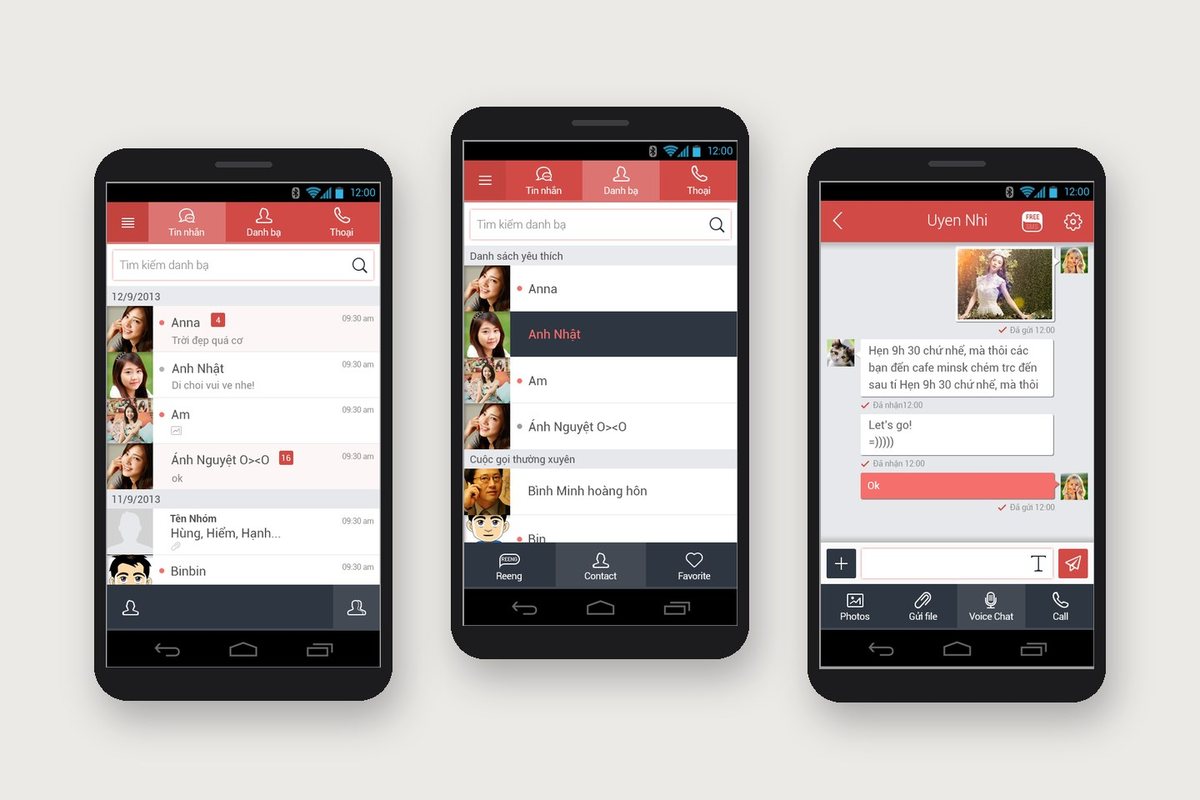
Reeng has one interface language from start to finish: a red bar on top, red buttons for the main action, dark navy buttons for secondary ones, thin-line icons. People used to Viber or Line could switch to Reeng without learning a new way of using it.
More importantly, Viettel's own strength, cheap calls to regular phones, comes first. It has its own icon and always shows clearly where users tap to call.
The Reeng interface version by version