Photo Location: photos tied to where they were taken
Photo Location is a phone app for viewing and sharing photos by place. Sinh Vũ designed the logo and the interface of its screens: the opening screen, map, place lists, photo page, camera screen and profile page.
Photos found by where they were taken
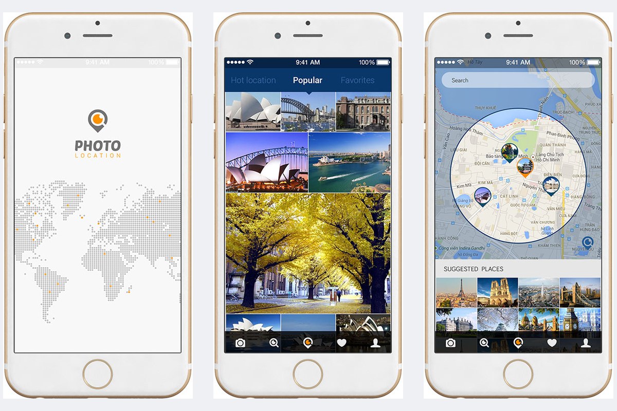
The Photo Location logo is a map pin whose centre is drawn as a camera lens. The opening screen places the logo on a world map made of grey dots, with a few orange dots scattered across it. From the very first screen, users see that the app is about photos and places.
Photos in the app are grouped by place: a city, a beach, a lake. Under each photo sit the name of the place, its address, the number of likes and the number of comments.
The bottom of the screen holds a bar of five icons: camera, magnifying glass, a location pin in the middle, heart and a person. The bar appears on almost every screen, so users can switch to another task with a single tap from wherever they are.
Finding photos on the map
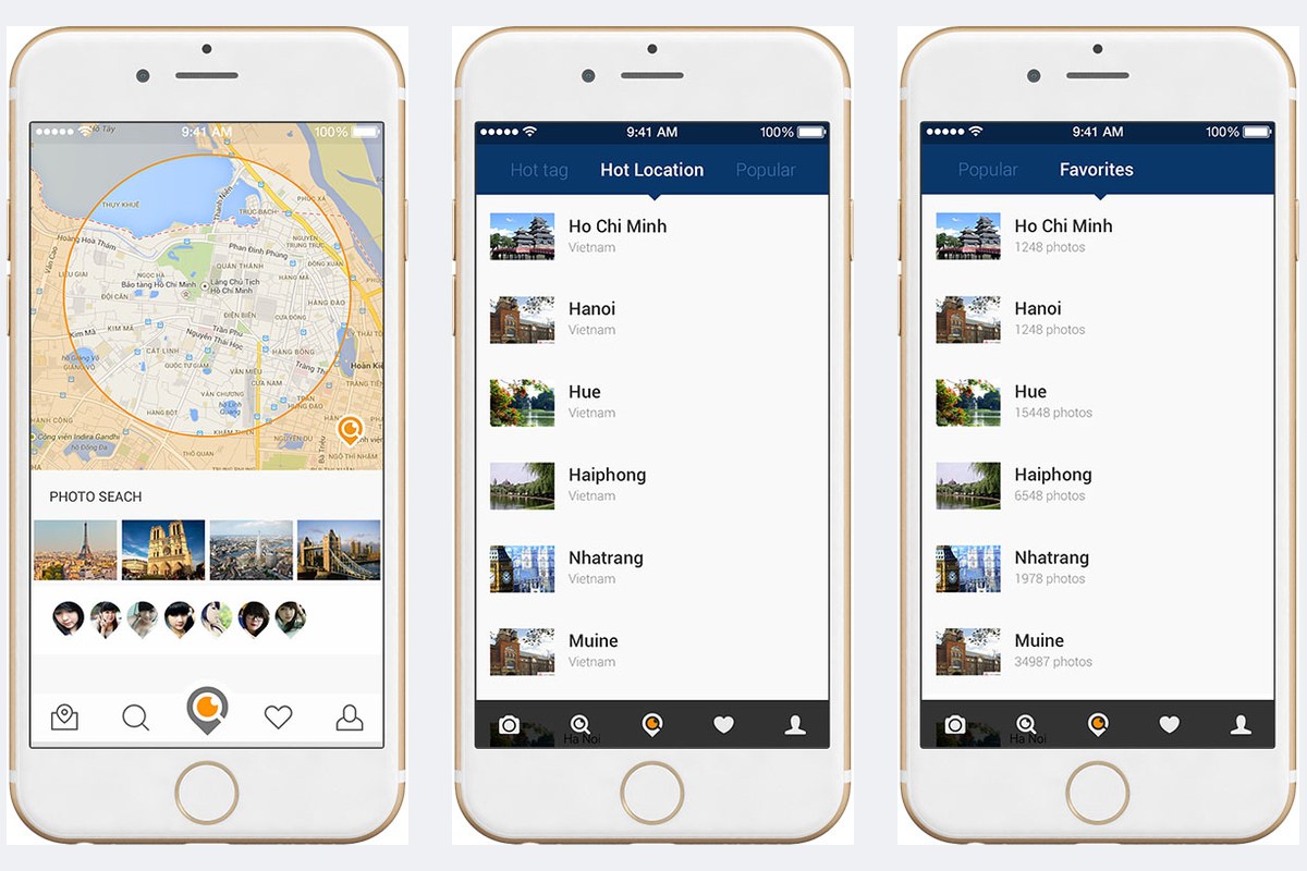
The map screen draws a circle around the area being viewed. Photos taken inside the circle appear as small pins with a picture inside. Below the map is a row of suggestions labelled Suggested places (places worth a look), and a tap opens one straight away.
Besides the map there are lists, switched with the tab bar at the top of the screen: Hot location (places people are paying attention to), Popular (widely liked photos) and Favorites (saved items). Each row has a small picture and the name of a city. The line beneath gives the country, or the number of photos posted at that place.
Viewing photos and comments
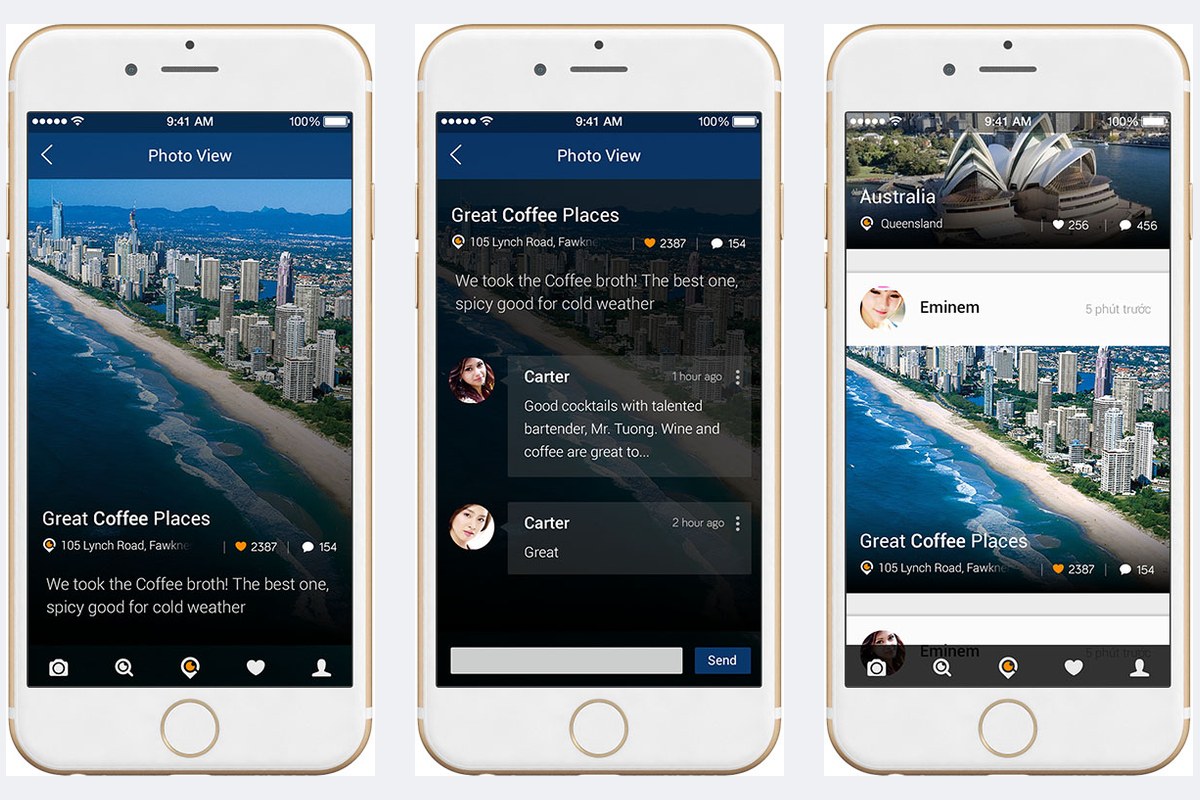
The photo page, labelled Photo View, lets the picture fill almost the whole screen. The place name, address, likes and comments sit over the darker area at the bottom of the photo. The text stays easy to read without covering the main scene.
Comments have a screen of their own: each comment shows an avatar, the writer's name and the time it was written, with a text box and a Send button at the bottom. The feed of newly posted photos reuses the same way of naming the place and showing the numbers as the photo page, so users do not have to learn anything twice.
Shooting, choosing a tone and sharing
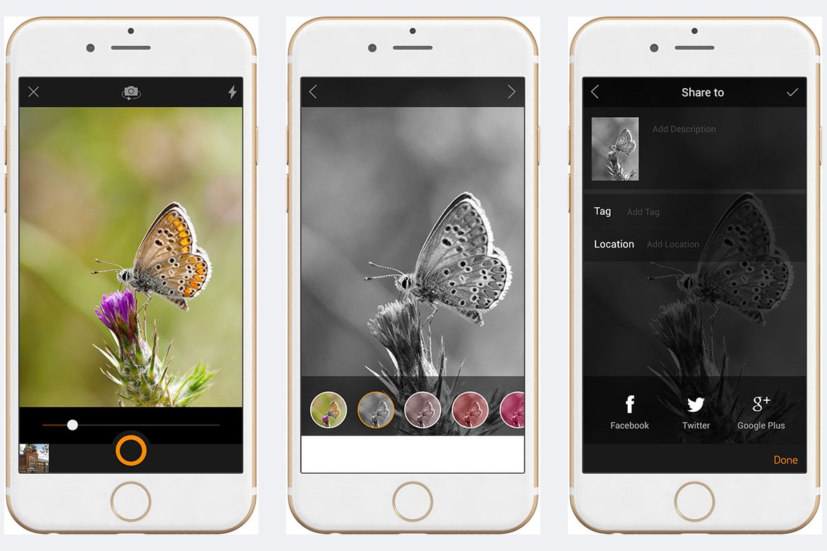
The camera screen gives the frame almost the whole display. The shutter button is a circle with an orange rim at the bottom, a slider sits above it, and the top corners hold a button to switch cameras and a flash button.
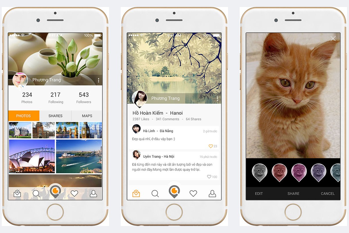
After shooting, users pick a tone for the photo from a row of small round previews: the original colours, black and white, and a few pink and red tones. The final screen, labelled Share to, has a box for a description, a box for a tag (Tag), a box for the place (Location) and three buttons for Facebook, Twitter and Google Plus. Each screen does one job, so users get through all three steps without confusion.
The value
The app does many things: searching by map or list, viewing photos, commenting, shooting and sharing. Sinh Vũ had almost every screen share one bar of icons at the bottom and one deep blue at the top of the screen. Orange is kept for the places that need a tap or attention. As a result, users feel at home whichever screen they move to.
The photo is always the largest thing on each screen. Text and buttons are kept few and small, so users look first at the picture and where it was taken.
From the opening screen to the profile page
Profile page