
Panasonic Theme: a flat, consistent interface for a new phone
Panasonic R&D Center Vietnam needed its own theme (the icons, colours and screen layout) on the Android operating system for Panasonic's new line of phones. Sinh Vũ designed the full set of system icons, home screen widgets and app sorting menus, all in one flat design style.
A theme made for a new line of phones
Panasonic R&D Center Vietnam is the research and development (R&D) company of the Panasonic group in Vietnam, founded in April 2007. It develops software and researches household electronic products.
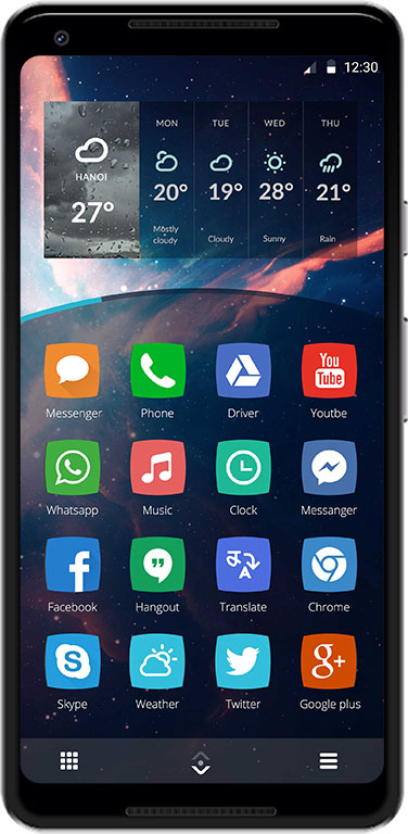
For its new phone line, Panasonic needed its own theme running on Android. The theme covers system icons and widgets (small blocks of information placed right on the home screen, such as weather and a clock). The most important requirement: the interface had to show the character of the new product line.
Flat icons, one colour per app
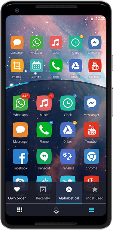
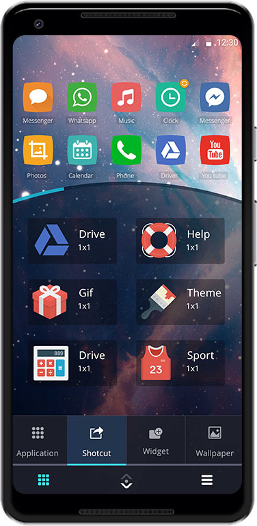
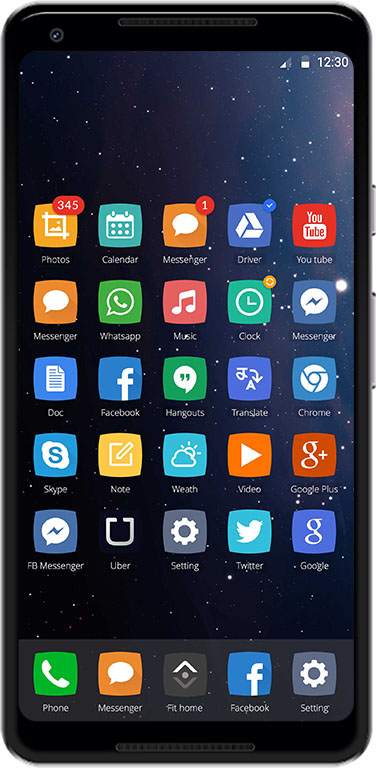
In 2015, flat design (plain blocks of colour, with no drop shadows or raised effects) was becoming the trend. Sinh Vũ chose this direction for Panasonic. Each app has its own coloured tile: orange for messages, green for calls, red for YouTube, blue for Drive. A white drawing sits in the middle of the tile, so each app is recognised at a glance.
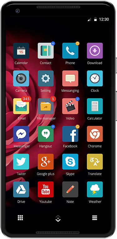
The icon tiles have slightly curved edges and softly rounded corners, so the whole grid looks smooth. The red unread count, the green tick and the orange dot all sit in the same top right corner of the tile. Users only need to look in one place to see which app has news.
Sorting and finding apps
The app sorting screen shares its colours and tile style with the icon set. The home screen is split into two areas by a curved line: two rows of apps above, a list of apps below. A bar of four tabs lets users order apps by their own arrangement, by most recently opened, alphabetically or by most used.
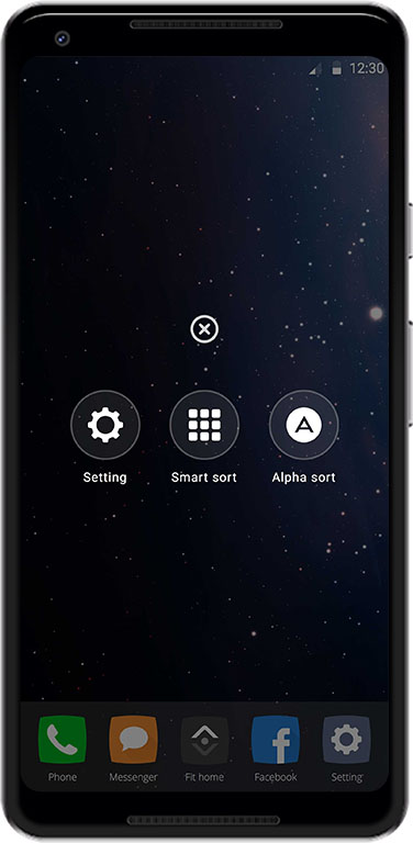
The menu is round, with buttons arranged around a centre. The picture shows a three-button menu: Setting, Smart sort and Alpha sort. Sub-menus and the blocks of content that slide around a centre follow the same style. This suits the phone's features and the way Panasonic wanted to present its new line.
The same icons on many wallpapers
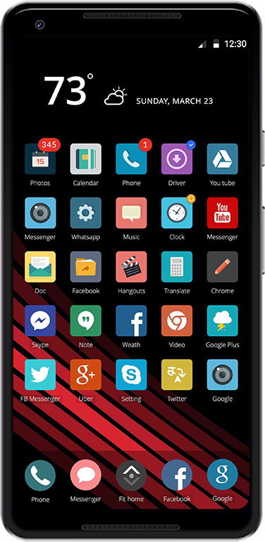
Sinh Vũ placed the icon set on several different wallpapers: a starry sky, deep red roses, red and black stripes. On the rose wallpaper, the icon tiles are squarer and more muted in colour, suiting the dark ground.
Even when the wallpaper changes, much stays the same: the position of the unread count, the style of the app names under the icons, the three buttons at the bottom of the screen. So users can change the wallpaper as they like and the phone still looks like one theme.
Value
The theme uses one shared way of showing icons, widgets and menus. A manager at Panasonic described the design as good, complete and consistent, meeting the project's requirements.
A phone theme has a great many small details, so it is easy for each place to look different. Sinh Vũ set a few clear rules in advance for tile colour, corner rounding and the position of notification marks, then applied them evenly to every icon and every menu.
One theme, many screens
In their own words
Good, polished and consistent design that met every requirement of the project. The icons, home-screen widgets and menus all follow one flat style, giving Panasonic's new phone line its own coherent interface.