
OpAlarm: an app that alerts you to the listings you want
OpAlarm is an app by Sóng Vàng Co., Ltd. Users set what they are looking for, and the app searches many e-commerce sites (websites for buying and selling online) by itself and tells them when a matching listing appears. Sinh Vũ designed the logo, the mobile app interface and the website for OpAlarm.
A familiar kind of app, with high demands on the interface
OpAlarm lets users search many e-commerce sites at once, instead of opening each site in turn. Search apps of this kind are already familiar in the market. To be chosen, OpAlarm had to be easier to use and feel new.
So the client set high demands for the UI (the user interface, what people see on screen) and the UX (the user experience, how convenient it is to use). Sinh Vũ took on the logo, the mobile app and the website. The product was researched carefully against current interface trends, to bring a fresh experience to a kind of app that seemed to have been done many times.
A logo shaped like the sound waves of an alarm bell
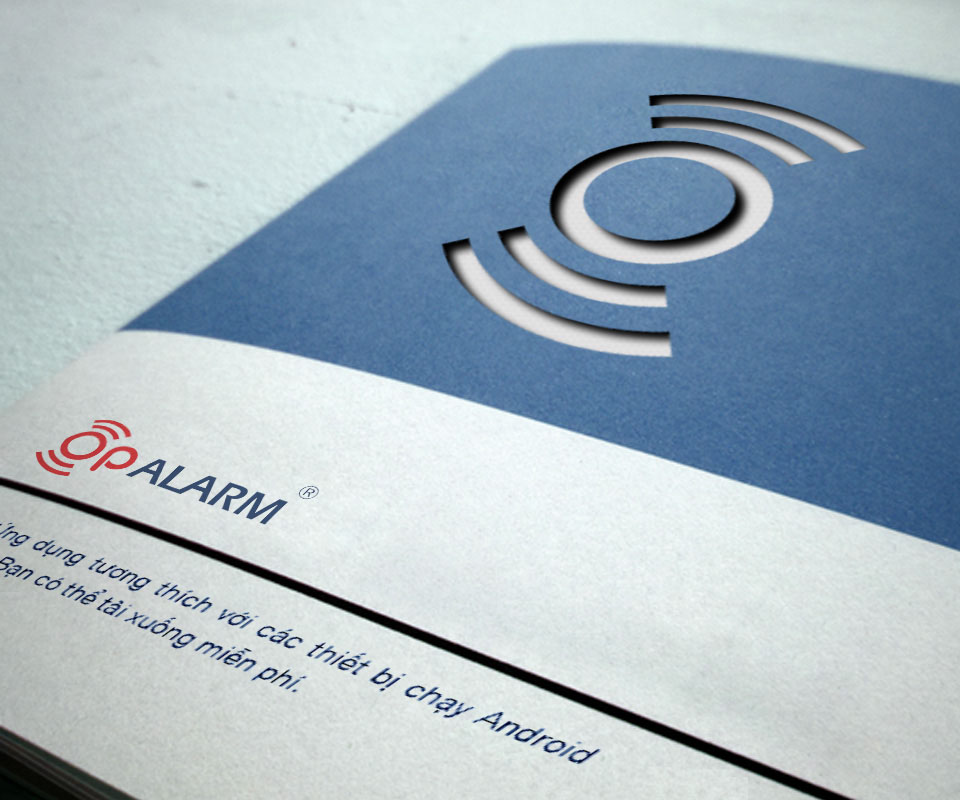
The name OpAlarm contains the word alarm, a bell that warns. The logo takes exactly that idea: around the letter o, arcs spread out to both sides, like sound waves when a bell rings. The letters op are lower case and ALARM is upper case, set together on one line.
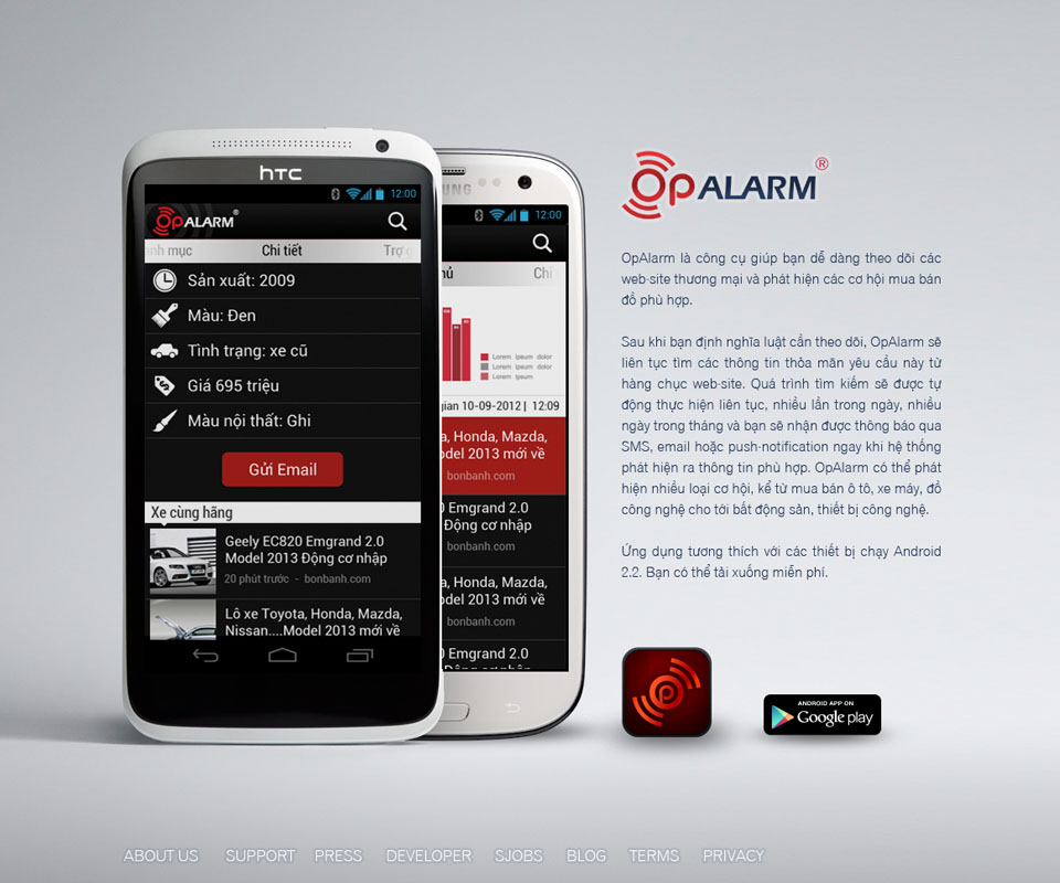
The logo comes in a red version and a deep blue version. On a dark ground, ALARM turns light grey so it stays readable. The symbol part of the logo is separated out as the app icon (the small picture on a phone screen that is tapped to open the app), placed in a rounded square on a dark ground. The shape has few strokes, so it is still recognisable when small.
A black and red interface, large type, quick to scan
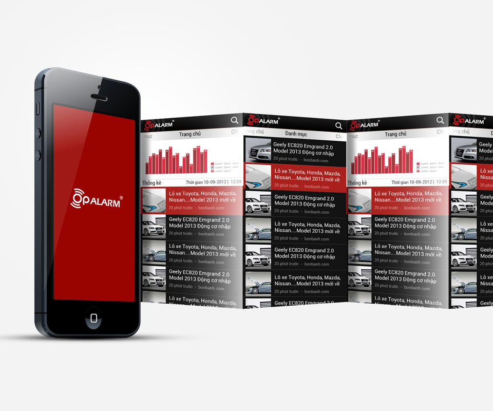
The list of listings uses a black background. Each row has a product photo on the left and a white title on the right, with a line below saying how long ago it was posted and which site it came from. The selected listing is filled red so it stands out in the list. The home page has a Statistics section with a red bar chart.
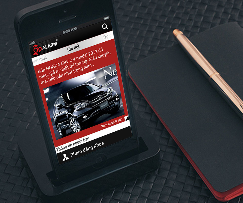
The detail screen places the listing title on a deep red band, a large photo in the middle, and the seller's details below. The main facts, such as year of manufacture, colour, condition and price, are set out line by line, each with a small icon beside it.
The interface uses few colours and large type that stands out from the ground, so it is easy to read. The client remarked that the app displays well even on low-cost phones.
The logo on stationery and uniforms
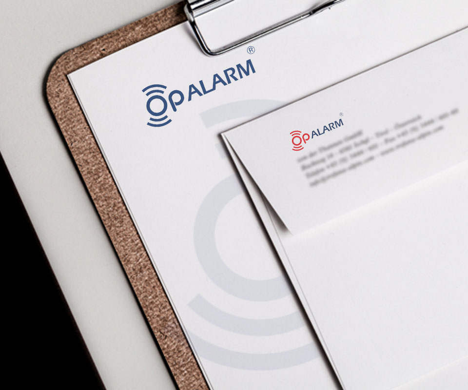
The logo was tried out on office stationery. The letterhead (a sheet printed in advance with the logo, used for letters and documents) carries the deep blue logo, with very faint arcs printed on the page. The envelope uses the red logo. The black folder cover is printed with the red and light grey logo.
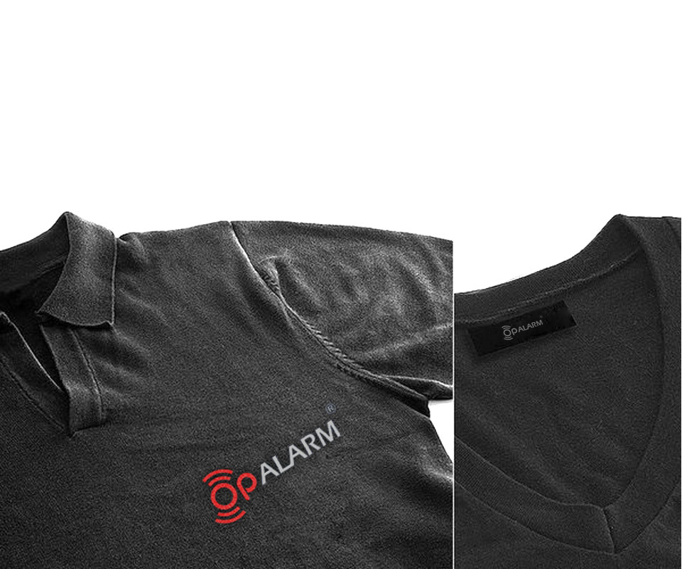
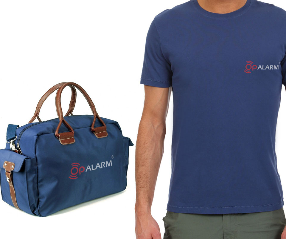
On polo shirts, T-shirts and bags, the logo sits small on the chest or in the middle of the bag. The neck label is printed with the logo too.
The value
OpAlarm has a logo that says what the app does, and an interface for scanning listings quickly. From the icon alone you can guess it is an alert app, and opening the list shows at once which listing is new. The client's chief executive said the interface suits the nature of the product, displays well and is trustworthy.
With an app that tracks information, people open it wanting to see what they need straight away. So Sinh Vũ chose clear type, few colours and a layout that repeats evenly, so users do not have to learn how to read again each time they move to a new screen.
Logo and interface on screen, stationery and uniforms

In their own words
The interface and flow suit what OpAlarm does: users set what they are looking for, then wait for the app to alert them. It displays well even on low-cost phones, which gives users a sense of reliability.