
Mana Portal: a logo and news app with a character of its own
Mana Portal is an app by Thế Giới Di Động (Mobile World), installed on Nokia phones, that continuously gathers news from more than 70 Vietnamese online newspapers in one place. Sinh Vũ designed the logo and app interface so that Mana Portal is easy to recognise among the many news apps already on the market.
Another news app in an already crowded market
The idea behind Mana Portal was clear: gather news from Vietnamese online newspapers into one app, so readers can pick up a phone and see stories from many sources. The difficulty was that the market already had quite a few similar apps.
So the brief to Sinh Vũ was demanding. The logo and app interface needed a distinct feature of their own, so that users would recognise Mana at a glance and not confuse it with other news apps.
A logo of three wavy ribbons
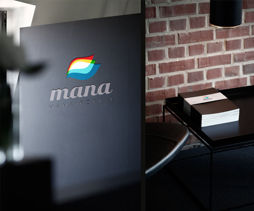
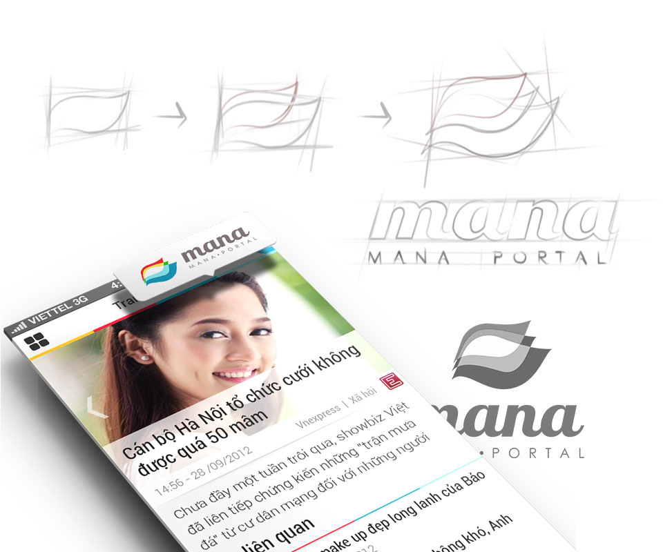
Sinh Vũ sketched by hand many times to find the shape of the logo symbol: three curved, wavy ribbons stacked on top of one another. The sketches moved from a few rough strokes to a tidy curve before becoming the finished logo. The symbol uses four colours, red, yellow, green and sea blue, placed above the word mana in slanted, rounded lettering.
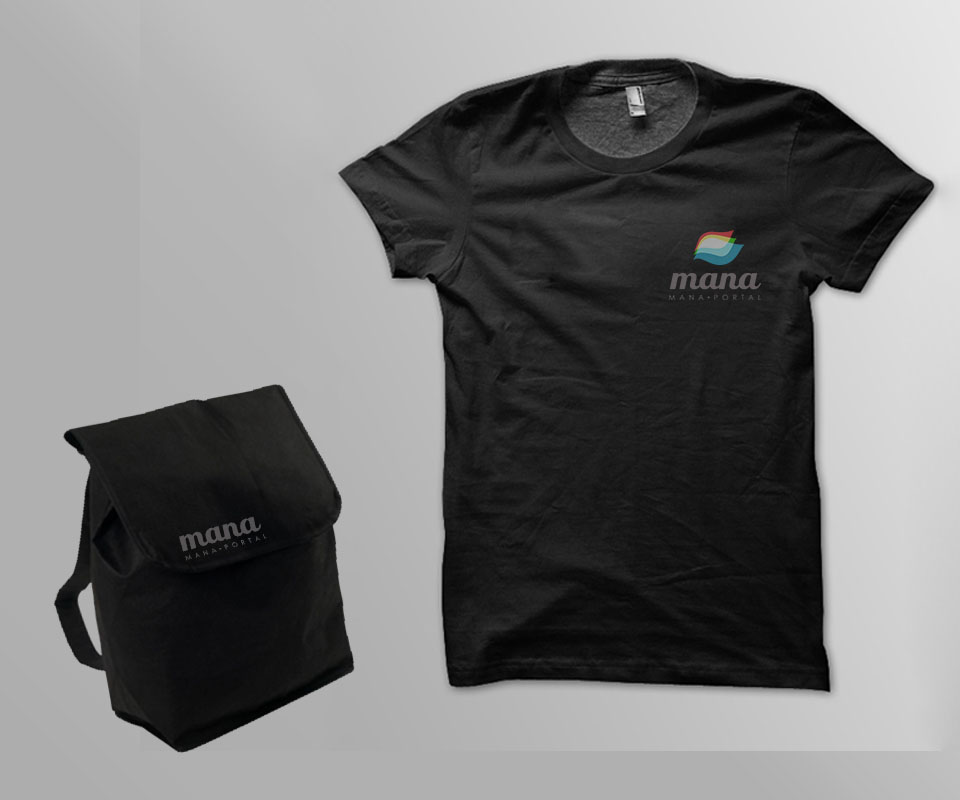
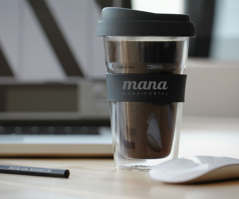
The small line MANA PORTAL sits below, with the letters spaced wide so it stays readable when printed small. The logo also has a single-colour grey version, usable on dark grounds such as shirts, bags and cups.
The image below shows the logo sketch in three steps, the finished grey logo and the news screen on a phone.
A clean news screen that is easy to read
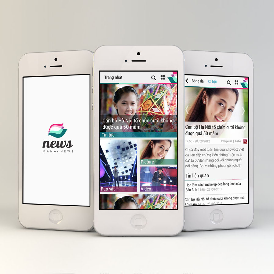
The app's front page puts one large story with a picture at the top. Below it are small tiles leading to each section, such as news, classifieds, pictures and videos. The headline sits directly on the picture, and each article names its original newspaper and section so readers know where the story comes from. A thin band of colour taken from the logo runs across the top of the screen.
Before drawing, Sinh Vũ studied how existing news apps arrange their screens, then improved the places that were awkward. The aim was for users to meet a fresh experience, not a copy of an app they already knew. The app was installed across several Nokia phone models, so the interface was designed for several screen sizes.
The image below this text shows the news app on three iPhones: the opening screen, the front page and an article page.
A calendar app sharing the same logo
The three-wave symbol is also used for the Mana Calendar app, shown as a separate project. Each app shifts the symbol's colour slightly so they are easy to tell apart, but keeps the same shape and typeface. So whichever app people open, they recognise it as Mana.
Result
Mana Portal has a logo that is easy to tell apart and one style of interface shared by the news app and the calendar app. Whether reading the news or checking the date, users see the same brand.
The app's owner said they were pleased with Sinh Vũ's advice and design, and wanted to work together again on later projects.
The logo and app on devices and merchandise
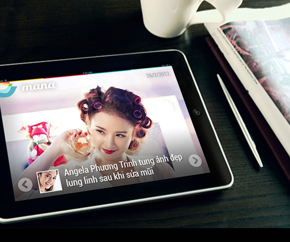
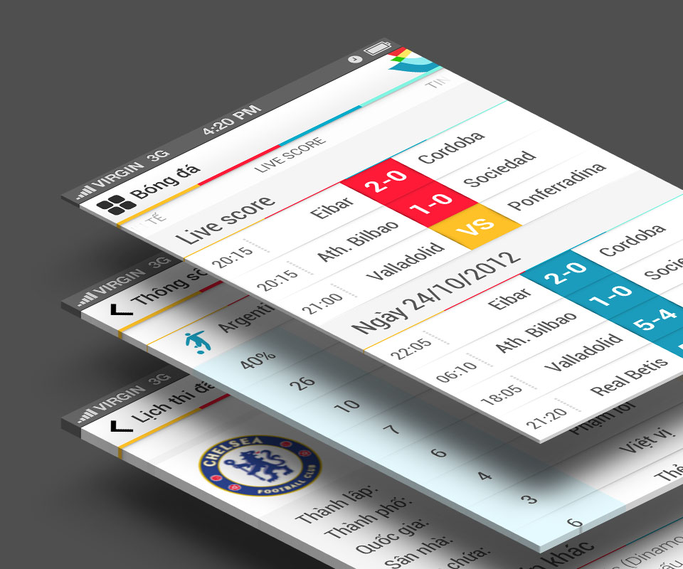
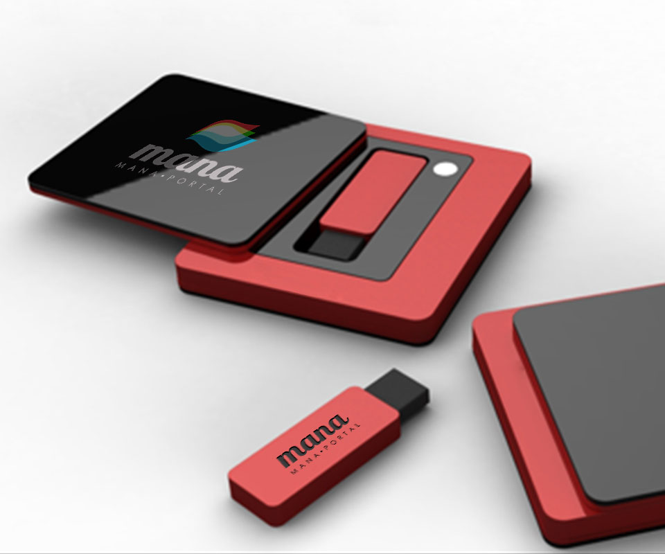
The images below are mock-ups (staged images) showing the interface on each type of device and the logo on real items.
In their own words
I am pleased with the advice and design Sinh Vũ gave Mana Portal. The logo and interface make the app easy to spot among the many news readers on Nokia phones. We will certainly work with Sinh Vũ again on future projects.