
LiuGems, eight colours holding one form
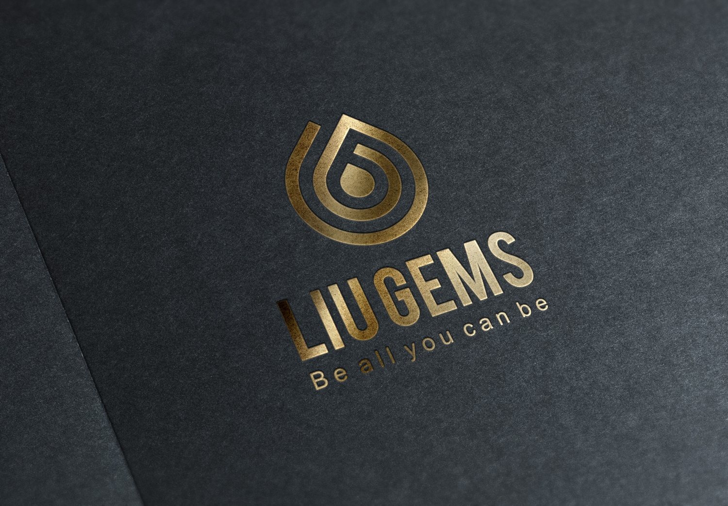
LiuGems sells natural-stone jewellery to people who believe minerals carry energy, a trade where beauty tends to arrive improvised and promises tend to run ahead of proof. Sinh Vu gave LiuGems a mark with real geometric discipline, eight colourways for eight stone families, a brand guideline, print, gift packaging and a system that runs all the way out to the shopfront.
The problem
People come to feng-shui stones at the moments they most need something to lean on: a job change, a move, an illness, a new company. They walk in carrying a question nobody can answer for them, and then decide almost entirely on whether the person behind the counter feels trustworthy.
The trouble is that the whole trade looks identical: calligraphy, red velvet, yellow light, incense. The serious sellers and the ones trading on superstition stand side by side and look the same from outside. LiuGems wanted to stand clearly on the serious side, and needed a set of signals that said so before any staff member opened their mouth.
Six pieces of work
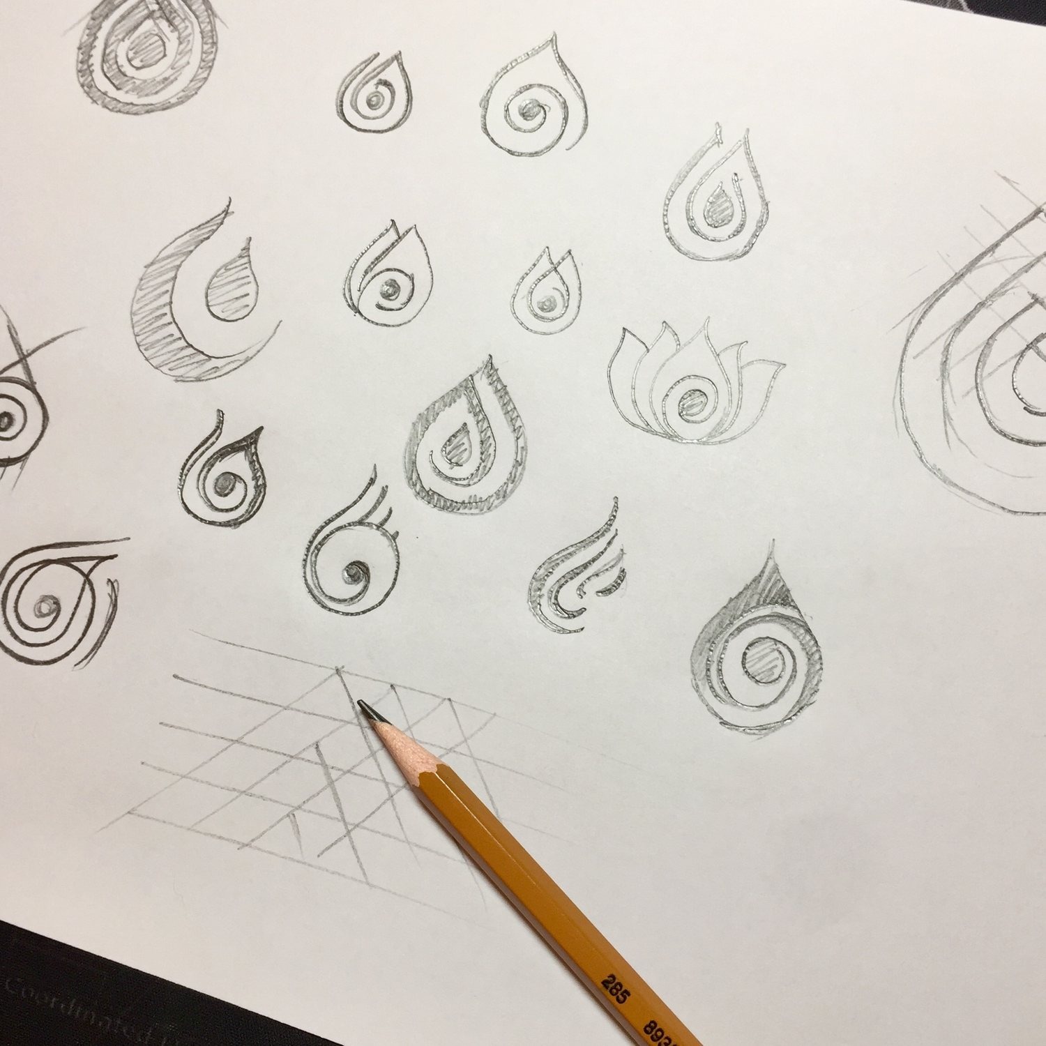
The first tool was a pencil, not software. The sketch pages fill with droplets spiralling inward, some opening like lotus petals, some coiled tight as a shell. Sinh Vu was not drawing a stone. We were drawing what a stone is believed to give: a current of energy running inward, into the person wearing it.
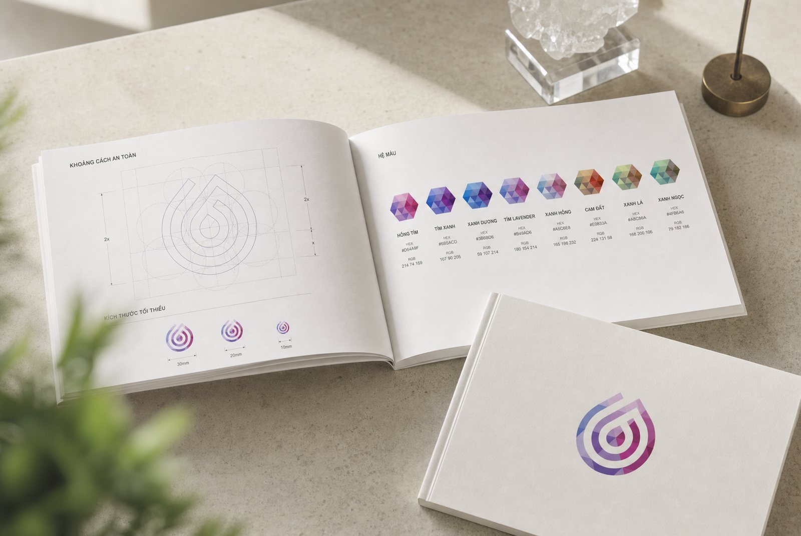
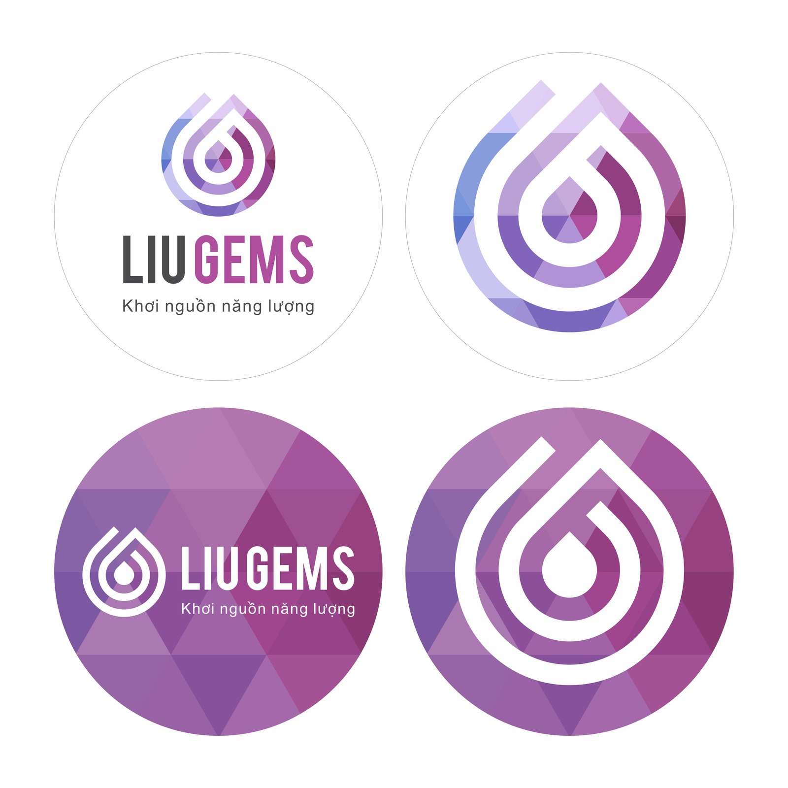
The chosen route was then rebuilt on a grid of seven equal overlapping circles, geometry that shows up in temple ornament and in old books of construction alike. Out of that grid comes a droplet with a spiral at its core. This is the first answer to the trust problem: the brand speaks about energy, but its mark can be drawn with a compass, measured, and reproduced exactly ten years later.
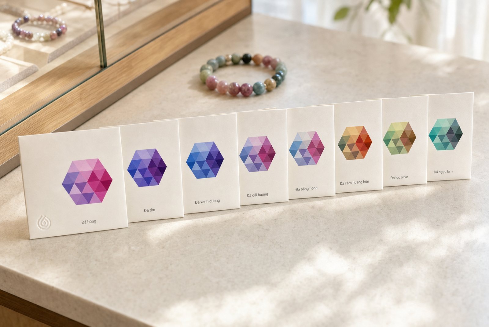
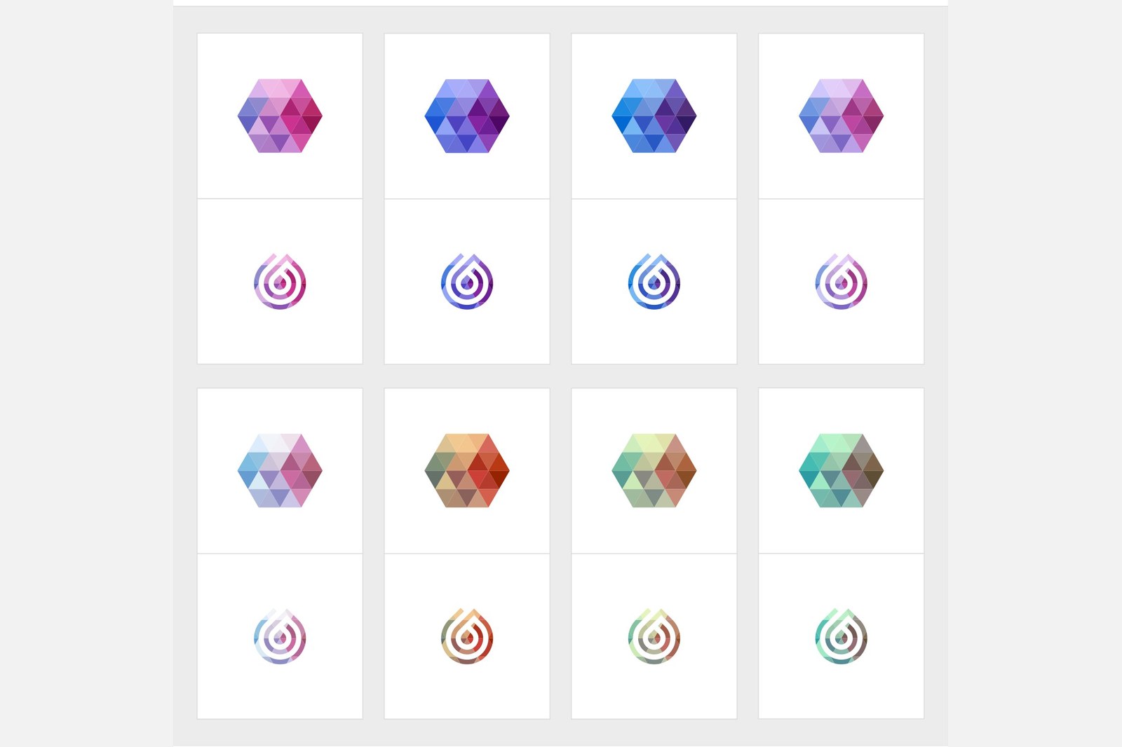
LiuGems carries many stone families, each tied to its own band of colour. Let every family grow its own mark and within a few years nobody remembers the parent brand. Sinh Vu kept the droplet fixed and changed only the gradient running through the strokes: magenta, blue-violet, cobalt, lavender, ice, burnt orange, olive and jade. Placed together the eight read instantly as one family; taken apart, each has enough character to carry a display case on its own.
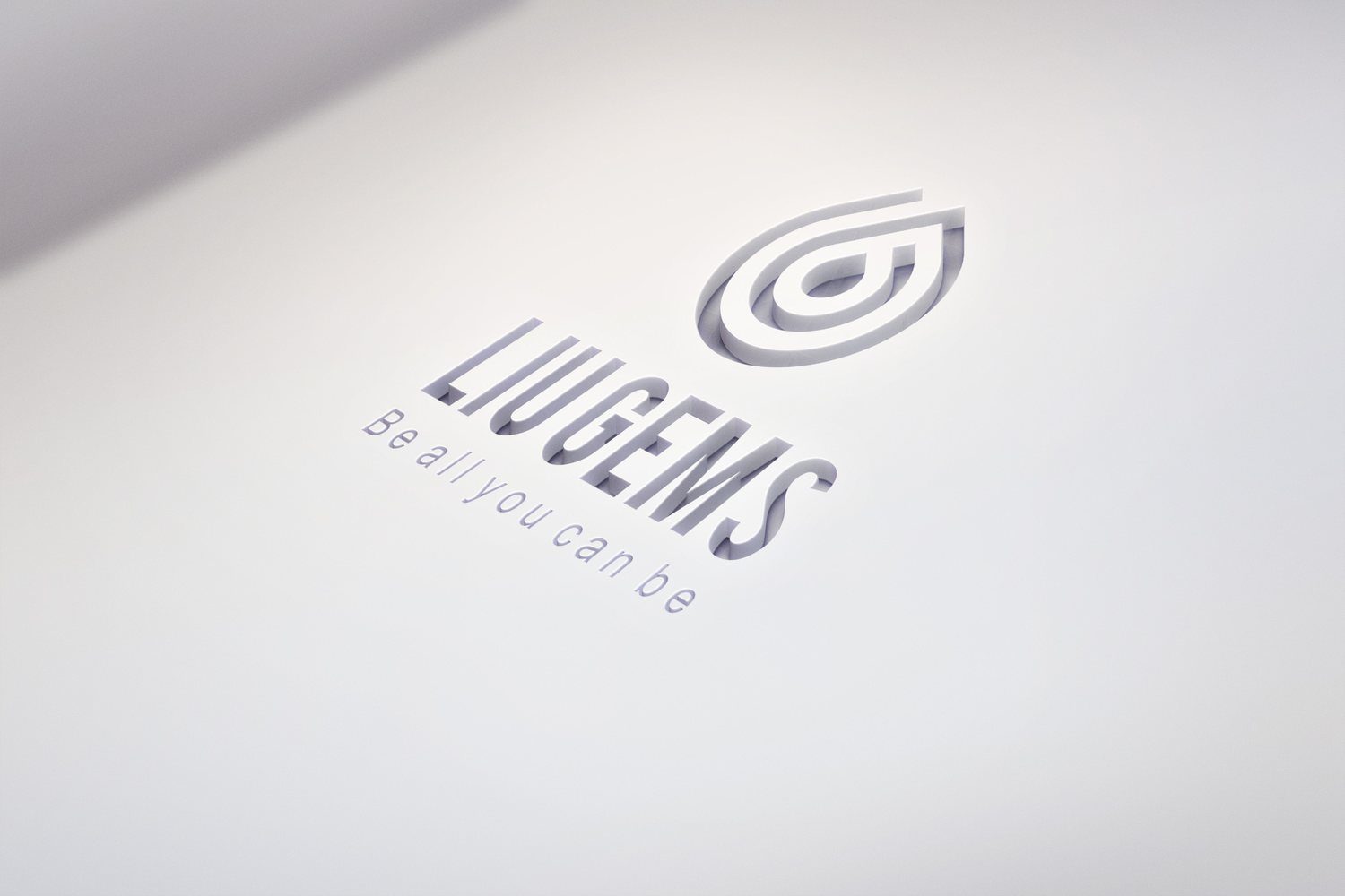
Each colourway comes with a hexagon split into small triangles, at once the cross-section of a cut stone and the shared pattern behind every printed piece. The final test was to take the colour away entirely: the mark blind-embossed into white paper, no ink, only the shadow sitting in the debossed groove. The droplet still reads as a droplet, the wordmark still reads. The form holds before colour ever speaks.
The LiuGems guideline pins down what slips first once a brand gets crowded: clear space around the mark, the ratio of mark to wordmark, behaviour on light and dark grounds, the name of each of the eight colourways, and the uses that are simply forbidden. It is written so that someone who never sat in a meeting with Sinh Vu still gets it right.
The clear-space page sets the mark back onto the same grid of seven circles that produced it, with dimension arrows and three shrinking sizes marking where printing has to stop. The facing page lays out all eight colourways, each with its own name and print reference. A new hire on the shop floor opens the guideline and knows which colourway belongs to which stone family, without chasing anyone and without guessing.
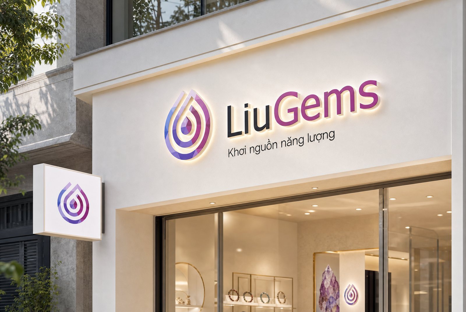
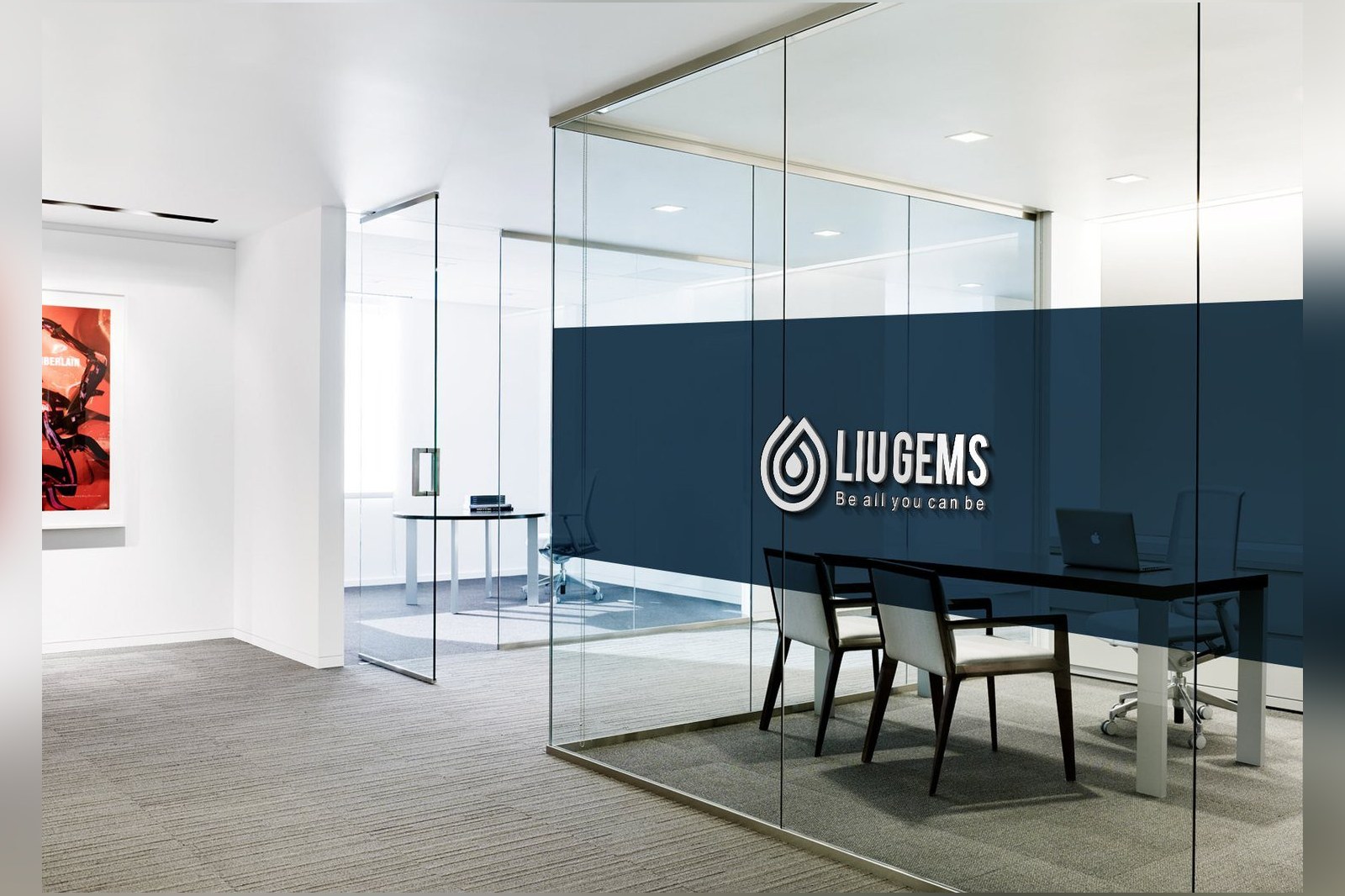
Signage is where an identity takes its hardest test: sun, rain, distance, and the three seconds someone gives it walking past. The mark became a halo-lit dimensional sign with the tagline set neatly under the wordmark, plus a projecting light box so people on foot catch it side-on rather than only head-on.
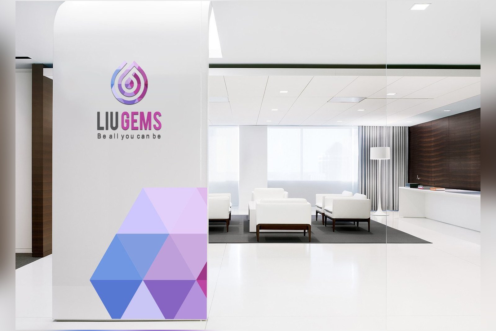
Inside the lobby the same signals carry through onto standees and wall panels, same proportions, same clear space, same gradient. A customer crosses from pavement to interior without hitting a seam, never feeling they just walked past two different brands.
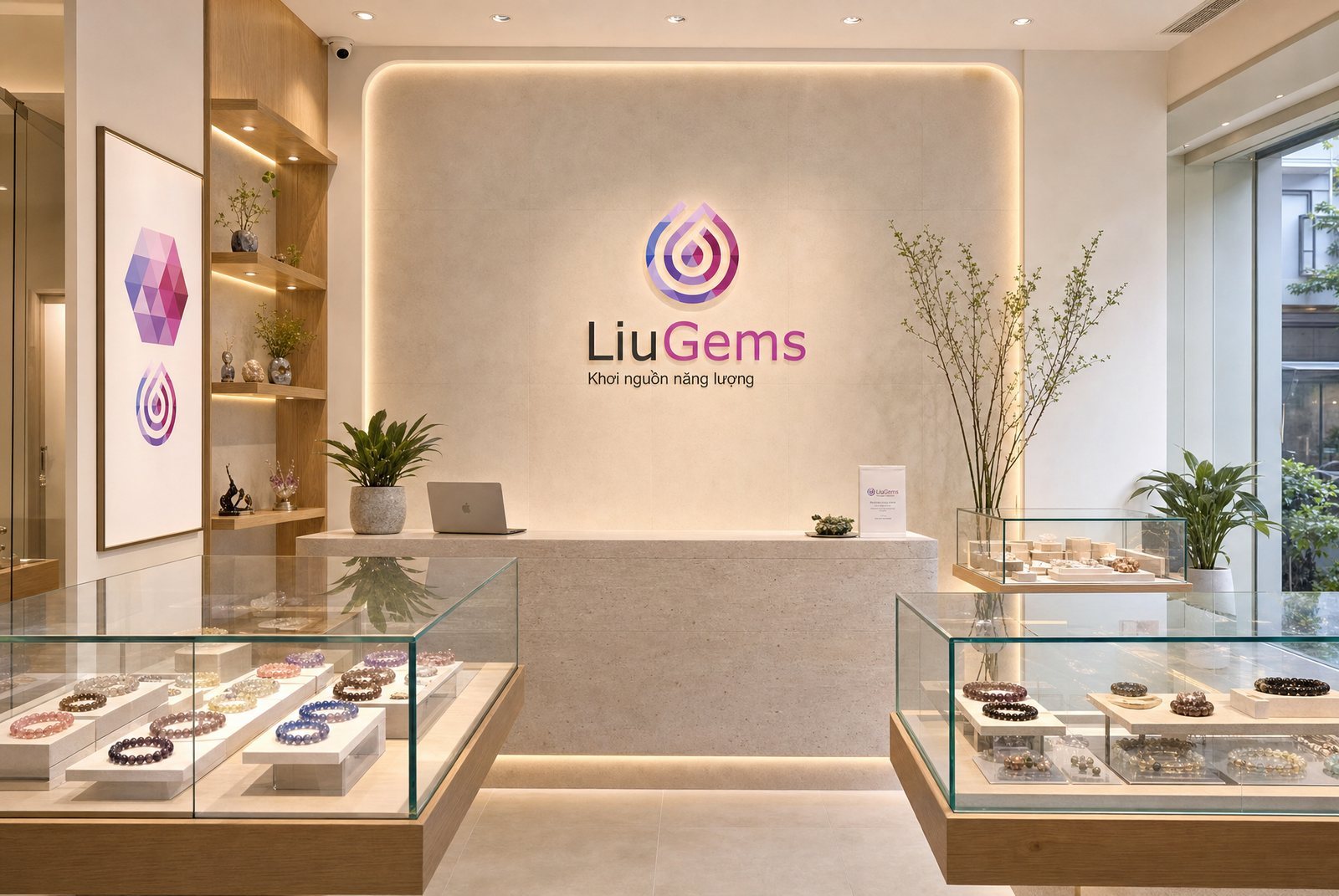
The retail space is built on pale wood, honed stone and warm indirect light, dropping the red velvet and hard yellow lamps of the old convention entirely. The brand wall behind the counter lets the mark stand large on a flat ground, and the cases hold a soft light so the stones can say their own part. The eight hexagons hang on the wall like artwork, while also serving as the colour chart staff point to while advising.
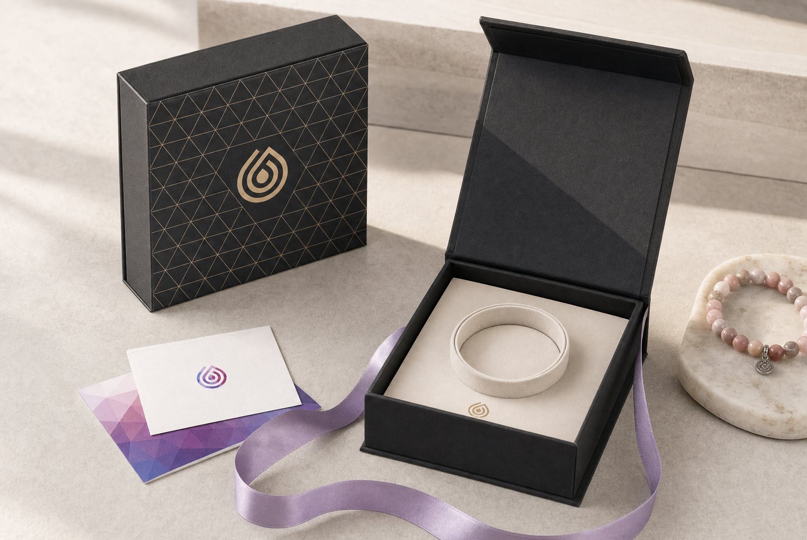
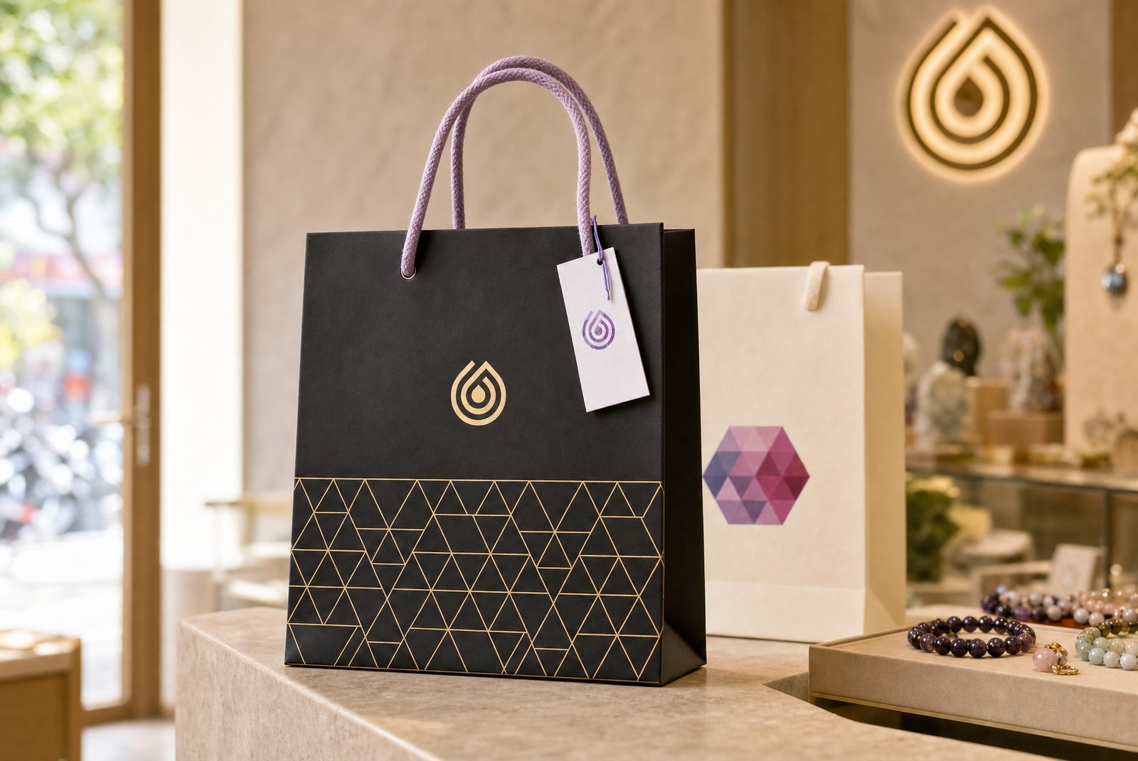
What the customer carries out is a black paper box with a foil-stamped triangle pattern and a violet ribbon. Buy a bracelet for your mother and the first thing she touches is not the stone, it is the box. Packaging finishes the job that a staff member's greeting can never follow through on: it travels home with the gift.
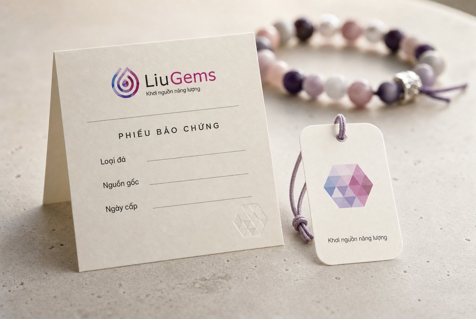
Feng-shui stone retail slides easily into promising too much: cures illness, turns fortune, summons wealth. The LiuGems print work runs the other way. The certificate card carries three lines to fill in, stone type, origin, date of issue, with a blind-embossed hexagon seal in the corner. No mythology, no claim of powers, no figure anyone is asked to take on faith.
The hang tag carries the hexagon pattern and the line Khoi nguon nang luong, enough to suggest and not enough to promise. Design here does the work of a contract lawyer: state only what can be checked, and hand the rest back to the wearer's own belief. That self-imposed limit is exactly what makes the brand credible, far more than any loud claim would.
What was delivered
The handover runs from the original construction drawings through to the things staff hold every day, so LiuGems can keep running without calling a designer for every small job.
Process
Read the trade before the brand
Survey how feng-shui stone retail presents itself, and find where LiuGems can stand apart without losing the category.
Draw by hand
Dozens of droplet and spiral routes in pencil, choosing a direction before touching a machine.
Rebuild on the grid
Take the chosen route onto a grid of seven equal circles, fixing proportion and stroke weight.
The eight-colour system
Build a gradient for each stone family plus the shared hexagon pattern, and test the colourless version.
Guideline and print
Write the usage rules, then produce catalogue, brochure, business card and office stationery.
Take the system to the point of sale
Signage, standees, wall panels, gift packaging, certificate cards and the full in-store application.
The result
Now, whenever LiuGems opens a new stone family, the job is to pick a colourway from the eight that already exist and drop it into the fixed form. What used to be a meeting from scratch is now an afternoon. A store on a new street works the same way: signage, standee, wall panel and gift box all have an approved master ready to send straight to the printer.
What LiuGems got was not a handsome logo. In a trade that sells on belief, the things customers examine hardest are the smallest: whether the box is square, whether the certificate promises more than it can prove, whether the sign still holds its colour after five years. LiuGems ended up with a set of signals that survives that scrutiny, and a way of talking about energy without overstating it.
Eight colours, and what holds them together
The master colour chart, the hexagon pattern, and the small touchpoints a customer holds.
Customers have to trust you first, like LiuGems?
Tell Sinh Vu what is on your mind about how your brand looks at the point of sale.