
HCATV, lit up into a world of entertainment
After more than twelve years as a technical cable provider, the Hanoi cable television station wanted viewers to see a home of entertainment. Sinh Vũ refreshed the HCATV identity, turning the name into two glowing screens while keeping the HCA that belongs to Hanoi, and changing entirely how it feels.
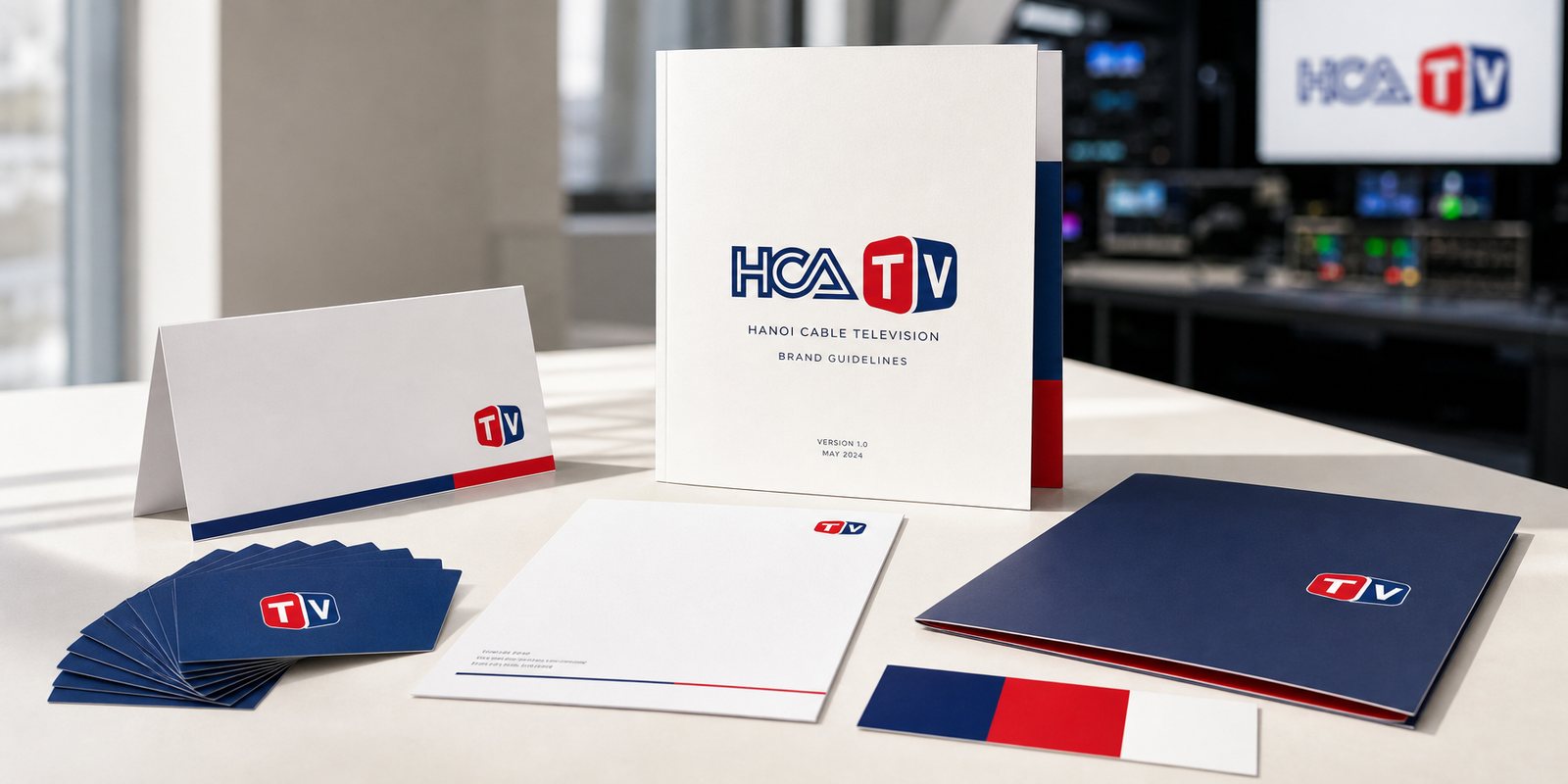
The problem
HCATV began with the cable. For more than twelve years the name meant engineering: signal lines, set-top boxes, a monthly bill. Hanoi knew the station, but remembered it as a service, not as the place they chose for their evenings.
As digital infrastructure arrived and hundreds of channels crowded onto one remote, a technical station is easy to lose. The Hanoi cable television station set itself a clear ambition: to become a world of entertainment for the times. What we were asked for was not a prettier logo, but a changed image, so that HCATV would stop speaking about cable and start speaking about content.
The approach
Before touching the form, we asked the root question: what should viewers remember about the station? Not the transmission technology, but the feeling that switching on means something worth watching. The new positioning pulled HCATV out of the role of a technical provider and into the role of the one who brings entertainment home.
We kept the letters HCA, short for Hanoi Cable, because they are the station's origin and its local trust. But the part behind them, TV, was raised to the lead role: where the content appears. The positioning decision sits inside how the name reads, Hanoi and cable as the ground, the screen and the content stepping forward.
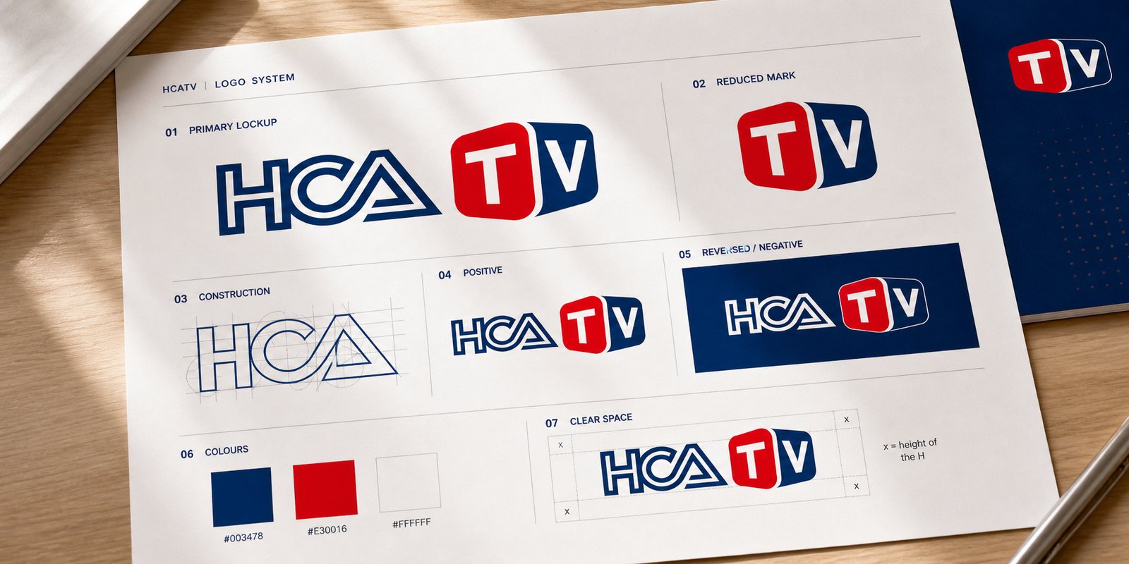
The new logo keeps HCA drawn in one continuous outline, three letters joined without a break, like a signal line running all the way from the station to the home. The stroke of the A closes into a triangle, echoing the button every viewer knows: press to play.
Then the two letters TV leave the wordmark and step into two rounded screen blocks, one on red and one on navy, built with depth like a real television. Navy for the credibility of an established station, red for the pulse of broadcasting, used just enough to catch the eye without shouting. At this point the name is no longer a technical abbreviation; it has become two screens, switched on.
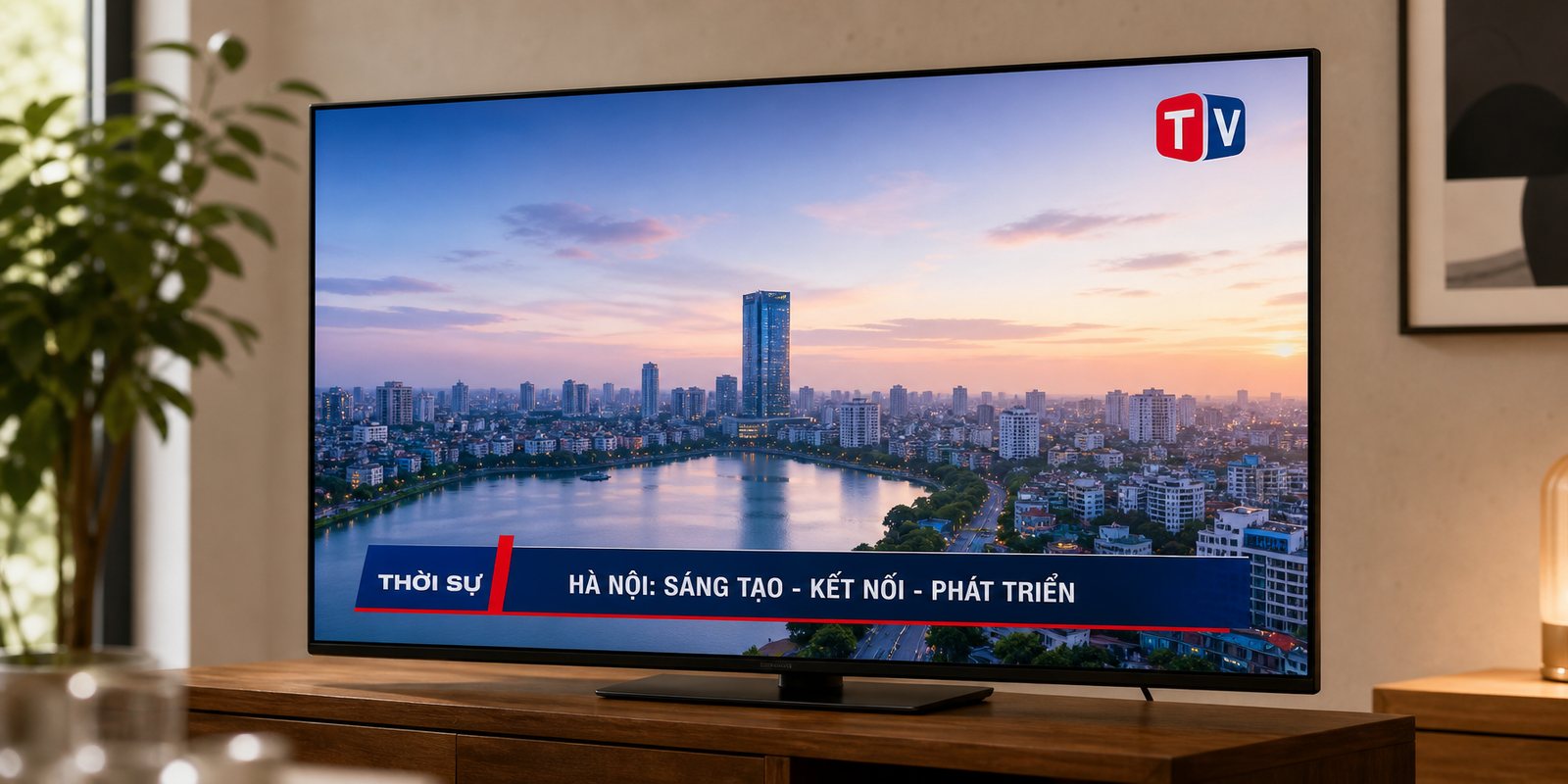
On air, a brand does not sit still on paper. It is the small bug in the corner running all session, the lower-third bar introducing a programme, the ident that opens each slot. With hundreds of channels crowding together, a viewer has only a moment to recognise where they are.
We built the on-air graphics so the red screen block works at the smallest size: a frame comes up and you know the channel, even with the sound off. The bug reads over dark footage and bright news alike, keeping the right margin, the right on-screen colour. That tiny corner becomes the signature HCATV runs all day.
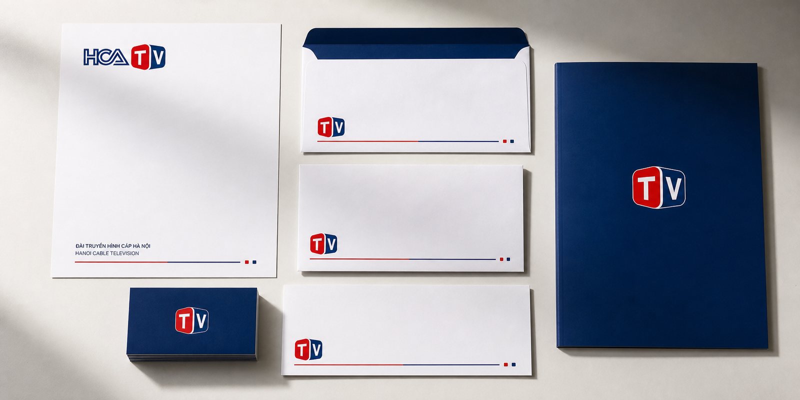
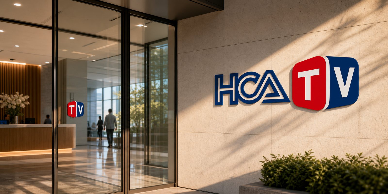
A television station does not only live on air. It signs advertising contracts, receives partners, sends official letters, mounts signage at its headquarters. We carried the HCATV identity off the screen: business cards, letterhead, envelopes, signage, so every touchpoint speaks in the same polished voice.
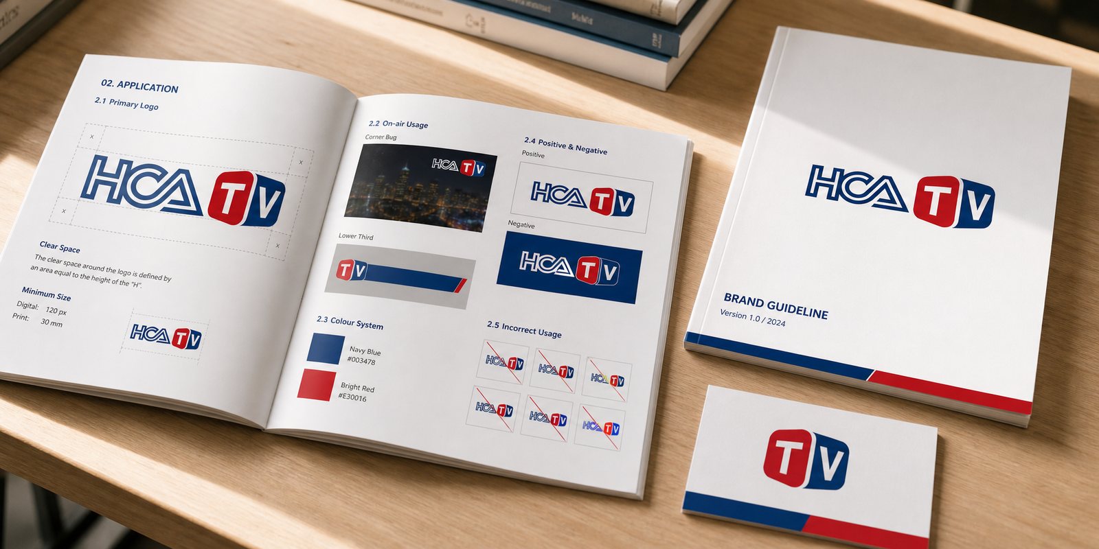
To keep that face from drifting across hundreds of broadcast hours and many hands, we wrote the guidelines: when to use the full mark, when to reduce to the screen block, how far from the edge, how the colours print. Because of them, HCATV is always the same face, on a large screen or a business card across a table. The identity stops depending on the person making it.
The result
What the Hanoi cable television station gained was not a new logo stuck onto the screen, but a new image: from a technical cable provider, HCATV stepped out as an entertainment station viewers recognise at once. The HCA of Hanoi is still there, holding the roots, but the TV now lights up, exactly the world of entertainment for the times the station set out to be.
For a television station, a consistent image is credibility made visible. When the name lights up into a screen, in the corner of a frame or on the sign at headquarters, viewers trust the content behind it. That is how a local station stands level with the big ones, every evening, right on the television in the living room.
Bright on air, polished off screen
The HCATV guideline handbook
Signage at headquarters
Does your challenge look like HCATV?
Tell Sinh Vũ what is on your mind about your brand. Sinh Vũ will point you to the right direction right away.