Green Cross Medical, a cross that cares
Green Cross Medical carries the cross familiar to healthcare, and Sinh Vũ set it inside a heart to build a brand identity that could not be mistaken for anyone else's.
A cross everyone already has
The cross is the most legible symbol in healthcare. Pharmacies, clinics, hospitals, ambulances all carry it, and people understand it in a fraction of a second: healthcare is here. Green Cross Medical inherits that instant recognition from its own name.
But that familiarity is also a trap. A symbol that belongs to everyone stands out for no one. On a street with five pharmacies, five green crosses light up looking exactly alike; the group gets recognized as a category, not remembered as a name. The problem was never a missing symbol, it was a symbol shared with an entire industry.
Keep the mark, change what it means
The easy path is to invent a clever new mark and drop the cross altogether. We chose not to. A worried patient does not decode metaphors, they scan for the sign they already trust. Throwing away the cross would trade a lifetime of learned meaning for a moment of novelty.
So we kept the cross and changed what surrounds it. The positioning was set: Green Cross Medical is not one more place that knows how to treat, it is a place that treats with genuine care. Every design decision after that answered one question, does this make the group warmer without making it any less medical.
A heart holding the cross
The mark folds the whole idea into one shape: a heart drawn in a single continuous line, opening its arms around a solid cross. At a glance it says two things at once, the cross for steady medical hands, the heart for the care that carries that medicine to people. No explanation needed, the meaning arrives before the name is even read.
We drew the heart as one decisive stroke, not a sealed round shape, so it reads more like an embrace than a sticker. The cross keeps its square corners for credibility, the heart curves to soften those corners. This is where the logo becomes a signal: the cross can stand alone on a small icon, the lockup of heart and cross carries the full name, and neither can be mistaken for anyone but this brand.
The color of reassurance
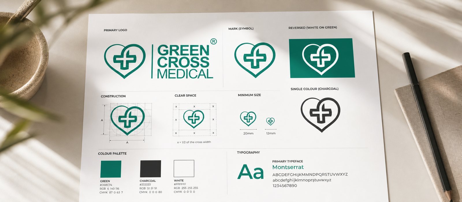
Blue was a given, but which blue was the real question. We moved away from the bright blue of a pharmacy shelf toward a deep teal, a blue with more trust and composure, clean yet still warm. A charcoal anchors the wordmark so the brand reads steady and professional, not childish.
The typeface is a plain sans serif set at a confident weight: a medical group asking people to entrust their health needs a voice that is plain and firm, without ornament. The restraint here is not emptiness, it is an attitude of care given a visible shape.
Built to be repeated
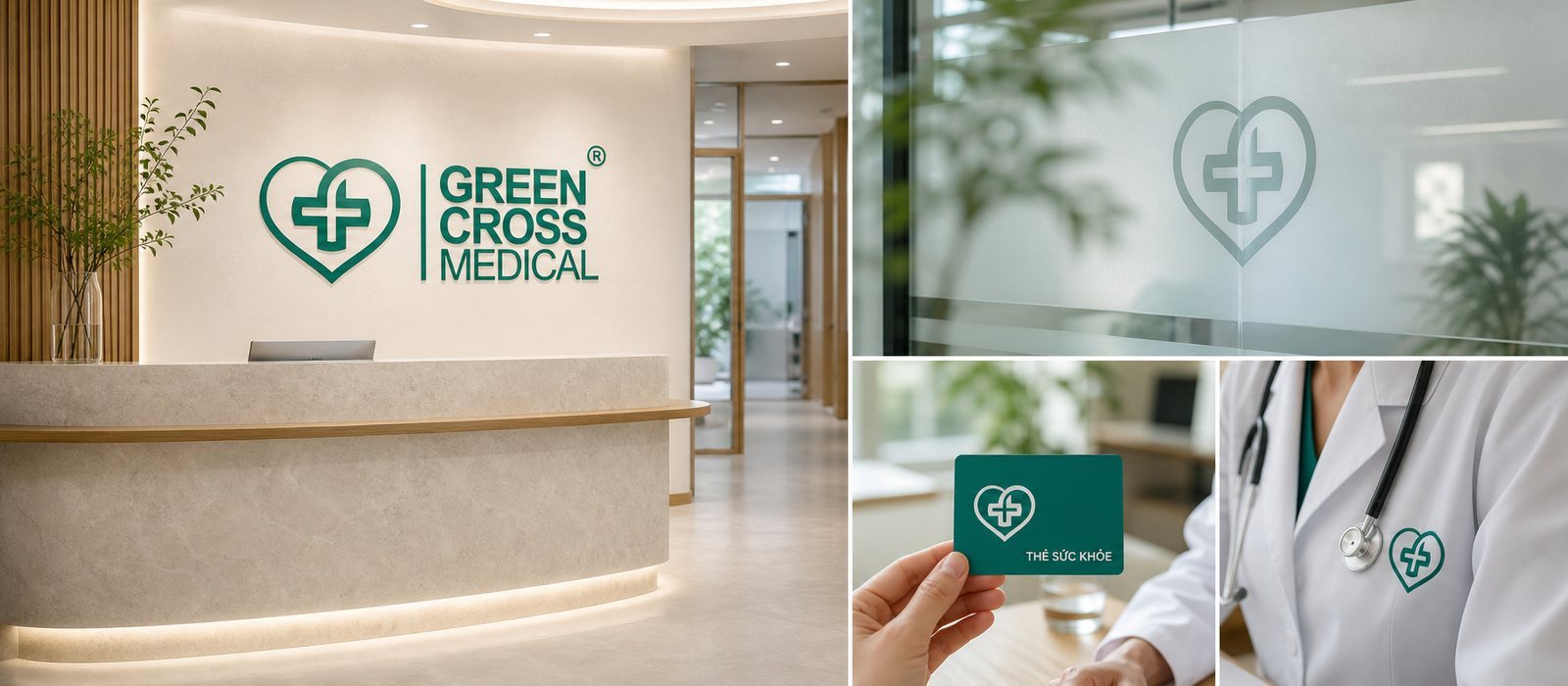
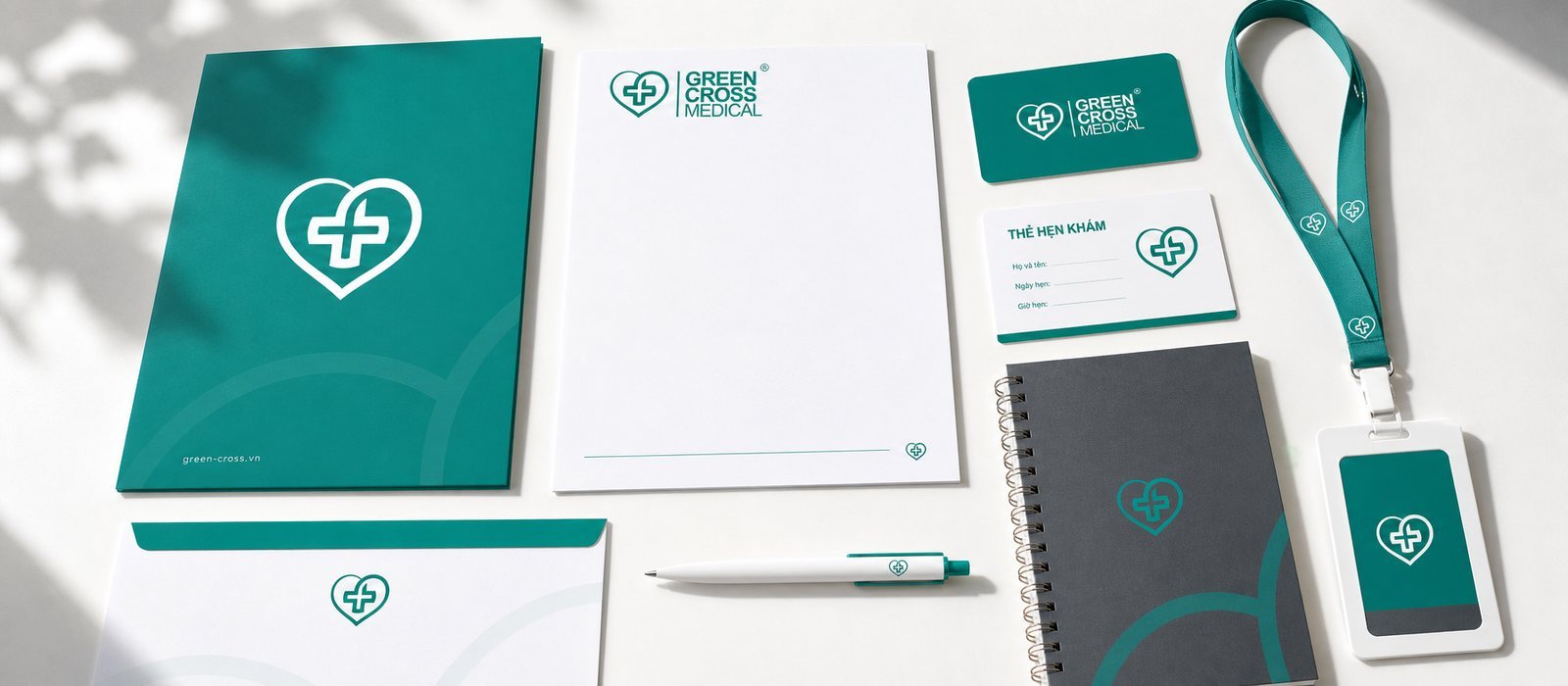
A medical group does not live on a single sign. It lives on a storefront lit up at night, on the reception wall, on a doctor's coat, on a prescription envelope, on the checkup card tucked into a patient's wallet. So we did not hand over a logo, we handed over a system: the full lockup, the icon standing alone, monochrome and reversed versions, a construction grid with clear-space rules, so the mark holds up whether embossed on a card or lit three meters tall.
We tested the icon at small and large sizes, in color and in print ink, on light and dark backgrounds, because a sign for an entire group is only finished once it can live everywhere the group intends to grow. Built this way, opening another clinic is no longer a new design job, it is simply placing the same familiar sign once more.
The value
What Green Cross Medical has now is not a nicer-looking cross, it is a cross that finally belongs to them alone. On that same crowded street, the group now reads in a single glance as a place of care, warm before a word is spoken, and medical competence goes without saying. As the group opens more clinics, the identity does not dilute, it simply repeats. That is the difference between hiring someone to draw a logo once and owning a brand the group can keep growing inside for years.
A sign that holds up everywhere
A single symbol for an entire group is only complete once it holds up at every touchpoint, from the card in a wallet to a sign lit three meters tall.