
Giaoduc.net: a seedling for young talent
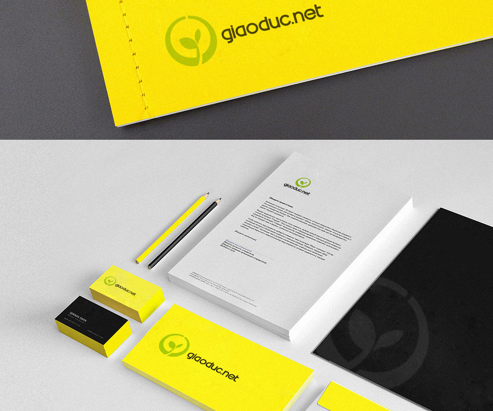
Giaoduc.net is the education news site of the Tân Tạo group, written for Vietnamese school and university students. Sinh Vũ designed a seedling logo inside a circle, with office stationery and promotional items in two colours, yellow and green.

A place to nurture young talent
Giaoduc.net is the education news site of the Tân Tạo group, formerly the website hoatrangnguyen.com. Its main readers are Vietnamese school and university students.
Tân Tạo commissioned Sinh Vũ for two things: the logo, and the printed items and promotional goods used to publicise the site. The logo had to show a place where talent is nurtured, that is, where the abilities of young Vietnamese are cared for from an early age.
A seedling in a circle
Sinh Vũ chose a seedling that has just sprouted two leaves, set inside a green circle with a small gap at the top. The shape is simplified, meaning it is reduced to a few flat areas of colour rather than drawn like a real plant.
A shape this simple stays clear whether printed small on a business card or set large on a jacket. The word giaoduc is lowercase, rounded and black. The .net part takes the green of the seedling. A growing seedling is the logo's way of showing faith in the future of young people.

Yellow and green on office stationery
The office stationery uses bright yellow as its main ground, paired with the green of the logo. Yellow is used for the notebook cover, business cards and pencils. Black is used for one side of the business card and for the document folder, where the logo is printed faintly and enlarged.
Yellow makes the set cheerful and suited to young people. The letterhead keeps a white ground with a small logo at the top of the page, so it is still serious enough when the site sends a letter out.
The logo on promotional items
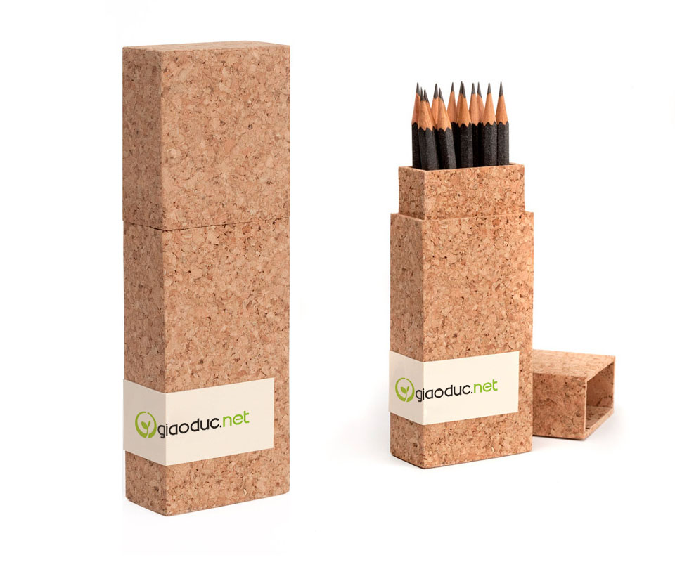
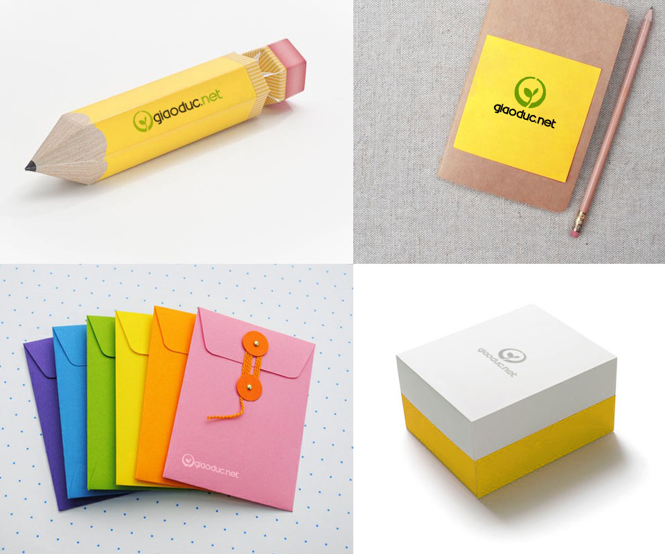
Sinh Vũ placed the logo on a black cloth bag, a yellow jacket, a cork pencil case, a gift box shaped like a pencil, sticky notes, multicoloured envelopes and a white and yellow gift box. The seedling stays the same on every item. Only the colour of the lettering changes with the ground so that it always reads clearly.
Most items are things for study, such as pencils, notebooks and book bags. These are what students use every day, so the logo reaches exactly the people who read the site.
The value
Giaoduc.net gained a simple logo: a seedling pushing up inside a circle. The shape says exactly what Tân Tạo's leadership wanted the site to do, which is to nurture young talent.
From that logo, the stationery, gifts, jackets and bags share one shape and two colours, yellow and green. Wherever readers meet the site, they recognise the same brand.
A seedling logo on school supplies

In their own words
A clear design that carries our leadership's message. The seedling in a circle, in yellow and green, evokes exactly the image of growing students that Giaoduc.net stands for.