
Đồ Đồng Việt: identity for the exhibition of Vietnamese bronzeware
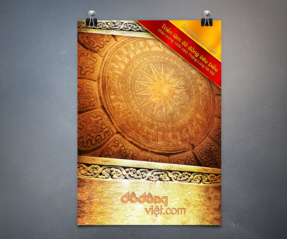
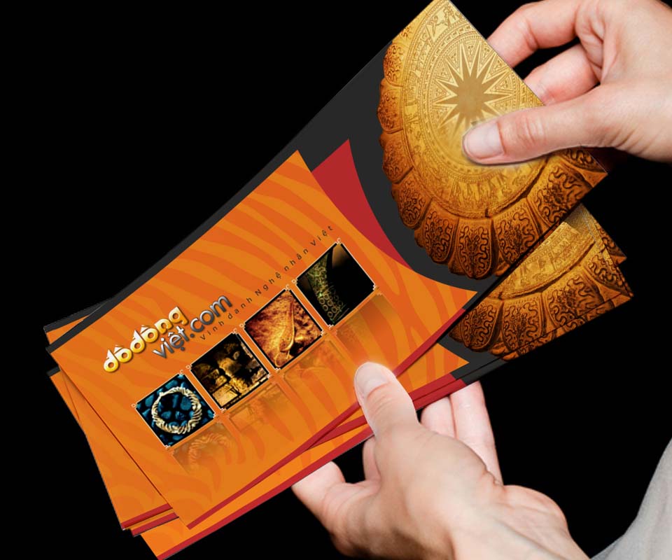
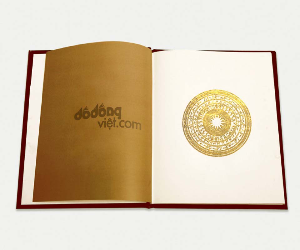
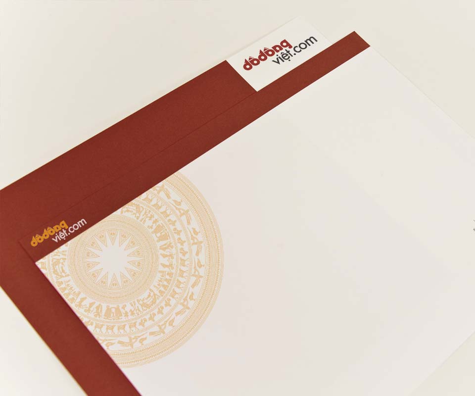
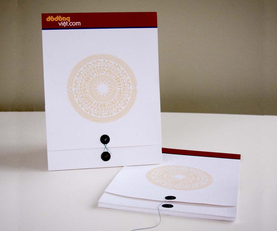
Đồ Đồng Việt is an exhibition that honours Vietnam's bronze-casting villages and shows bronze antiques. Sinh Vũ made the exhibition's identity, that is, the logo together with the colours and pattern shared by every printed piece. The logo takes its idea from the bronze drum pattern. Two colours, bronze gold and plum red, run through the poster, folded leaflet, catalogue (a book introducing the exhibits) and the organisers' papers.
Honouring the craft of bronze casting
The national exhibition of Vietnamese bronzeware had two aims: to honour the villages that cast bronze, and to show the bronze antiques handed down by earlier generations. The organisers needed a logo that evoked ancient cultural value, a website, and promotional materials (printed pieces used to invite visitors and introduce the exhibition) such as invitations, a catalogue, posters and a stand at the trade fair.
Guests usually meet an invitation, a poster or a folded leaflet before they reach the exhibition. So everything had to share one logo, one palette and one pattern. Whoever picks one up knows it belongs to the same event, and understands at once that it is about Vietnamese bronze.
A logo drawn from the bronze drum
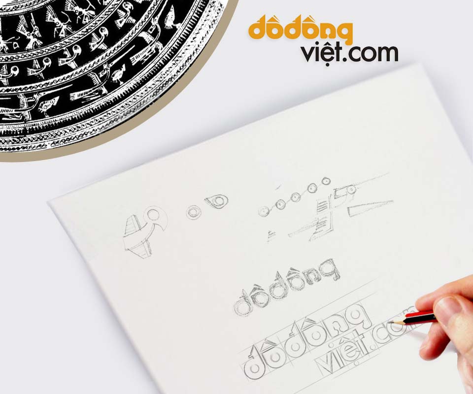
The logo grew from the concentric rings of pattern on the face of a bronze drum, that is, circles nested around a single centre. It carries the exhibition's website name: "đồđồng" in orange-gold, "việt.com" in grey. The rounded letters stand in a straight row like the rings on the drum face, and the hat of the letter ô is drawn as a small triangle. The logo comes with the line "Honouring Vietnamese Artisans".
The pencil sketch shows the lettering tried again and again on squared grid paper, beside a few trial strokes of a bird and a chain of circles taken from the drum's patterns. In the corner of the sheet is a black-and-white print of a bronze drum face, where Sinh Vũ took those patterns from.
Bronze gold and plum red
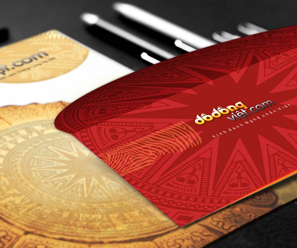
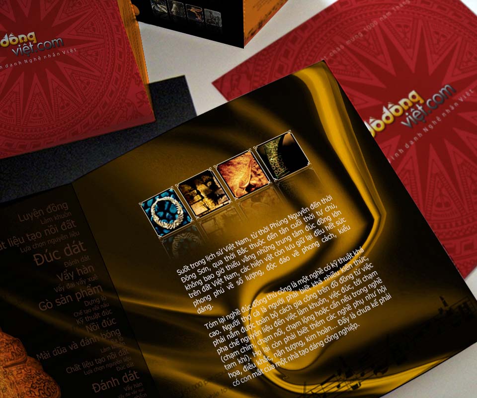
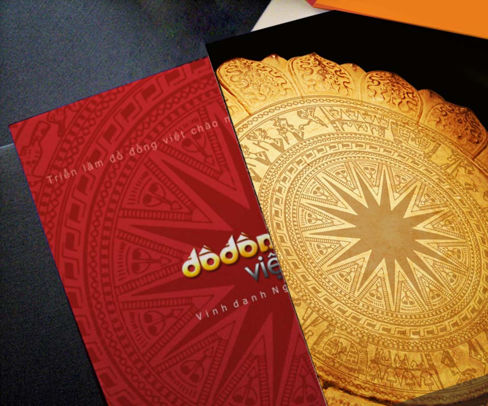
All the materials use two main colours: bronze gold and plum red. They recall Vietnam's traditional values, which suits an exhibition about an ancient craft. On the red cover, the many-pointed star at the centre of the drum is enlarged and printed slightly darker than the ground, as a faint watermark pattern. The gold logo sits in the middle, so it stands out clearly.
Beside the red cover is a sheet printed with the gold drum face. The two sheets differ in colour but share one pattern, so placed side by side they still read as a set.
From poster to catalogue
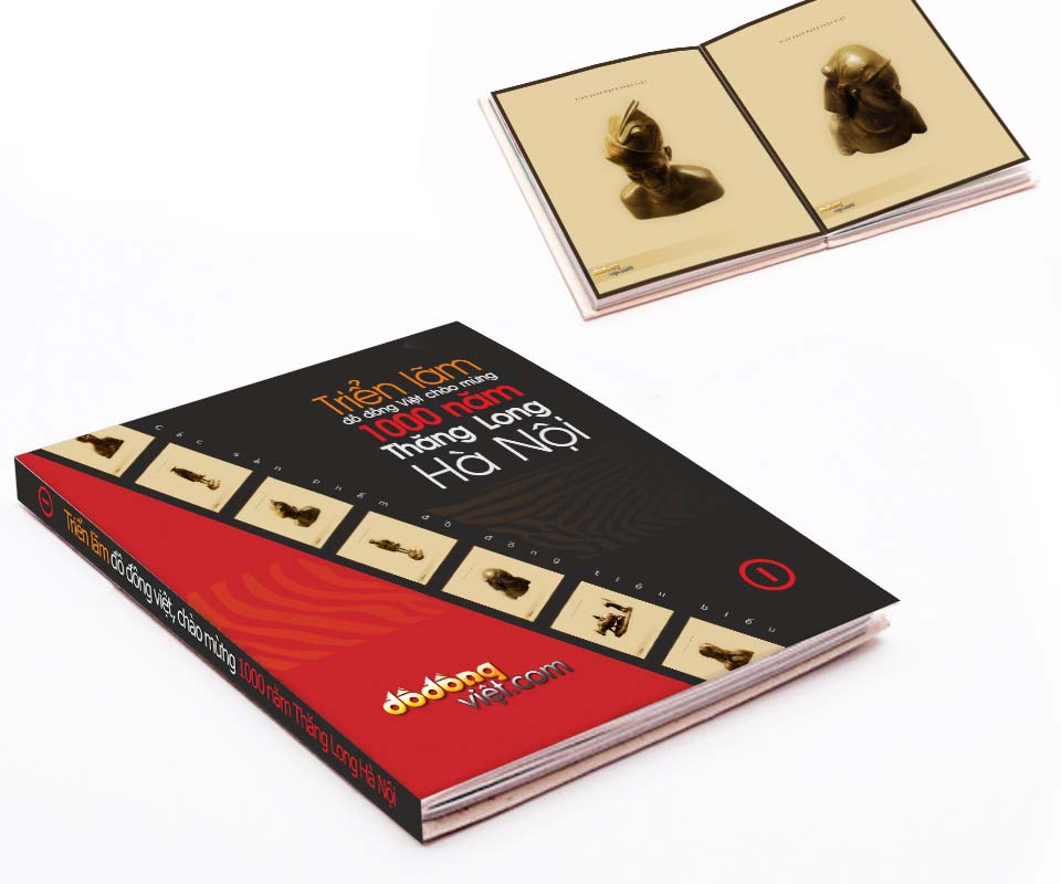
The catalogue has a black and red cover, with a row of bronze statue photographs running diagonally across it like a strip of film. The title reads "Vietnamese bronzeware exhibition celebrating 1,000 years of Thăng Long Hanoi". Inside, each page holds a single bronze statue on a cream ground, so viewers can focus on the piece.
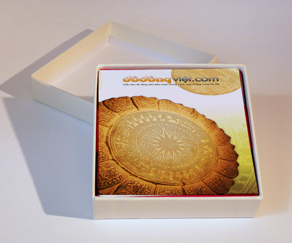
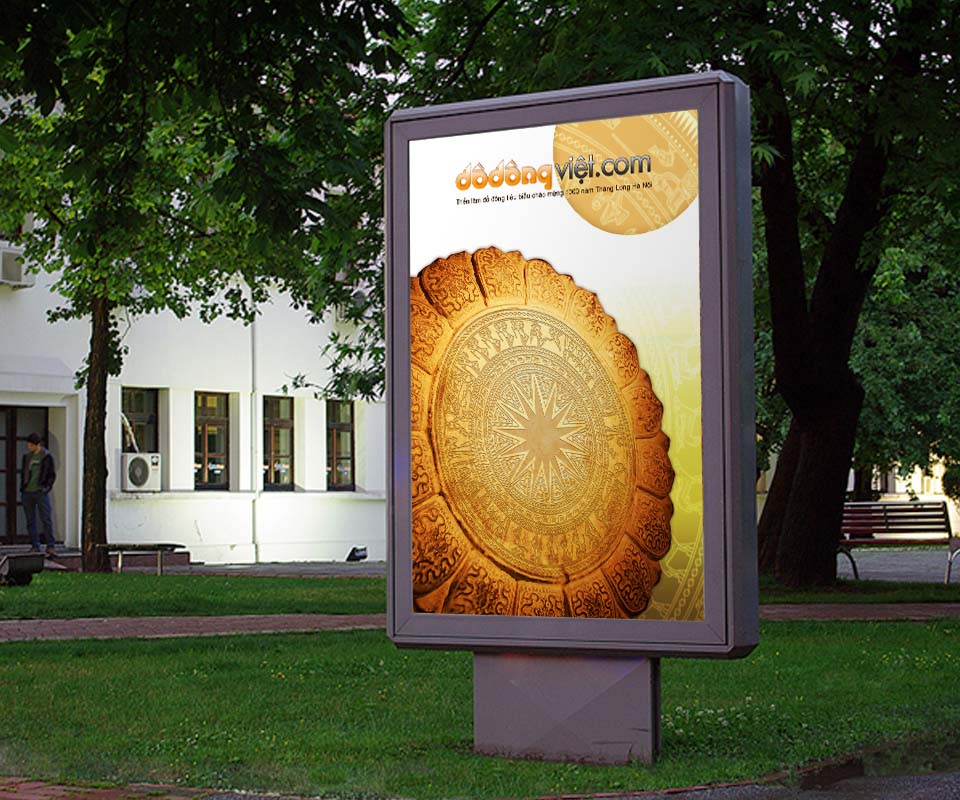
The same logo, colours and pattern are used on the poster, the folded leaflet, the box for the printed materials, the outdoor signs, the letterhead and the document folder. Someone who passes the outdoor sign and later receives an invitation still recognises the same exhibition.
The value
The exhibition has a logo that points straight to the bronze drum, and a set of materials that share one way of presenting, from outdoor posters to the organisers' working papers. The person in charge of the exhibition said the design was beautiful and professional, and helped introduce Vietnamese culture and people.
Sinh Vũ chose the bronze drum pattern because it is an image Vietnamese people have known for a very long time. Placing that image beside a new name lets viewers understand at once that the exhibition is about Vietnamese bronze, with no need for further explanation.
One bronze drum pattern across every piece

In their own words
A beautiful, professional design. The logo draws on bronze drum patterns, and the bronze-gold and plum-red palette runs from posters and invitations to the artefact catalogue. The identity helped introduce Vietnamese culture and people to every visitor.