
Chè Mai: logo and packaging for exported Vietnamese herbal tea
Chè Mai makes Vietnamese herbal teas, exported and sold in supermarket chains across Europe. Sinh Vũ designed a logo from a teacup and a lotus flower, then a matching set of packaging for the different teas.
Vietnamese herbal tea in European supermarkets
Chè Mai makes Vietnamese herbal teas such as bitter melon tea, green tea, black tea and artichoke tea. The products are exported and sold in supermarket chains across Europe.
Chè Mai asked Sinh Vũ for two things. The first was a logo that shows this is tea made from Vietnamese plants. The second was a set of packaging, with a way of packing suited to tea exported to Europe. Logo and packaging had to match, so that different teas are still recognised as one brand.
The logo: a teacup and a lotus in one circle
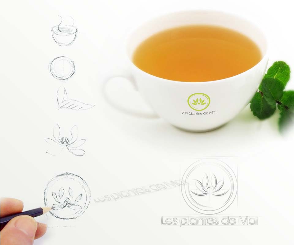
Sinh Vũ sketched each shape in pencil: a steaming teacup, a circle, a tea leaf, a lotus. These were then combined into one symbol, a lotus sitting inside a round stroke. The circle suggests the rim of a teacup, and the lotus suggests the plants of Vietnam. The circle is left open at one point, like a hand-drawn line still in motion.
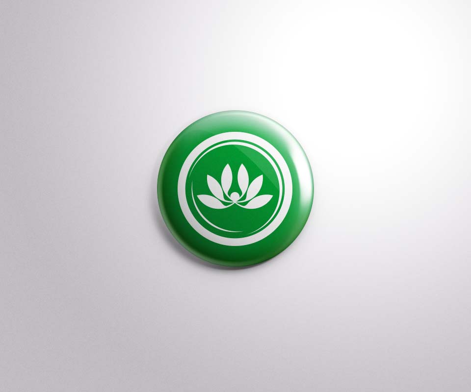
The brand name is in French, Les plantes de Mai (meaning the plants of Mai), set in a fine line just beneath the symbol. The main logo is green. There is also a white version on a green ground, as on the lapel badge in the photo.
Brown paper boxes: each tea shows its own ingredient
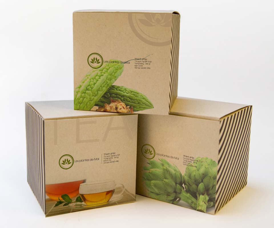
The tea boxes are made of kraft paper, the natural brown paper that is not bleached white, which suits the idea of tea made from plants. Each box is printed with a picture of that tea's ingredient: a bitter melon, a cup of tea, an artichoke bud. Buyers can see what tea is inside even if they cannot read the words on the box.
One edge of each box carries diagonal black stripes, the same on all three boxes. The logo and the small line of information (ingredients, weight, unit, price) sit in the same place on every box. So when the boxes stand side by side, they plainly belong to one brand.
Many ways to pack, one logo
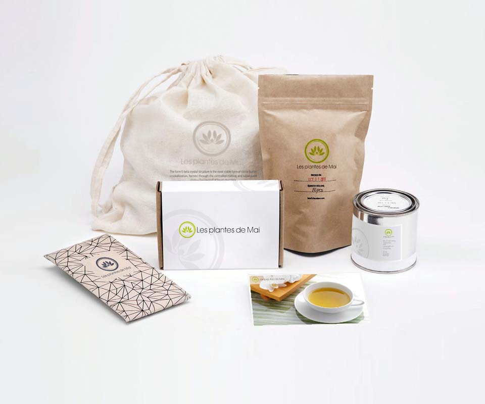
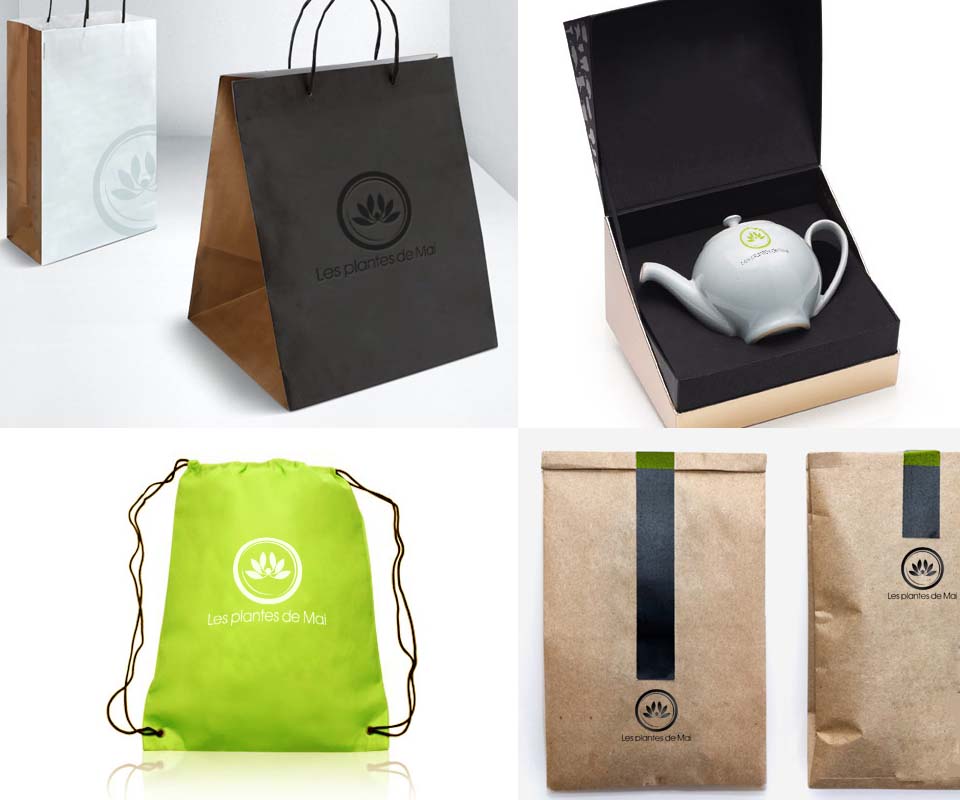
Besides the boxes, Sinh Vũ looked at other ways of packing tea for export to Europe: a drawstring cloth bag, a brown paper bag that stands up, a white box, a labelled tin, a brown paper envelope sealed with black tape, and a wrap printed with a pattern. Each material is different, but the lotus logo and the name Les plantes de Mai stay the same.
The design set also includes a rigid black-lined box for a porcelain teapot printed with the logo, black and white paper carrier bags, and a green drawstring bag. The logo stays clear on each item, whether the ground is black, white or green.
The value
Chè Mai has a logo that says in a picture what the product means to say: this is tea, made from Vietnamese plants. Chè Mai's board chose this direction from the very first design.
The logo and the arrangement of information are kept the same across boxes, bags, tins and the teapot box. When Chè Mai adds a new tea, only the ingredient picture needs changing, since the rest of the packaging is already in place.
A lotus logo on every kind of packaging
In their own words
Wonderful design. The tea cup and lotus logo, together with consistent packaging for every tea line, gives Chè Mai a professional look on European supermarket shelves. Thank you, Sinh Vũ.